1Objectives
By the end of this lesson you will be able to:
Choose the right graph for a variable (histogram/boxplot for numerical, bar chart for categorical) — a review and extension of Lesson 7.
Add clear titles and axis labels to a
gf_plot so it stands on its own.Build a graph that stays readable for a colorblind reader and in grayscale, using an Okabe–Ito-safe palette instead of relying on color alone.
Write one honest, meaningful sentence describing what a graph shows (its “alt text”) — the same standard this book itself is held to.
Every plot in this lesson uses the running coffee_wait_sim.csv data from
Lesson 6 and the built-in KidsFeet dataset from
Lessons 6–7. Every number and every picture below was
produced by one committed script, data/make_L10_figures.R — run it yourself
(Rscript data/make_L10_figures.R from the r-help/ folder) to reproduce
everything on this page exactly.
library(mosaic)
library(BSDA)
set.seed(1209)
coffee <- read.csv("data/coffee_wait_sim.csv")
data(KidsFeet)2Quick review: picking the right graph
Lesson 7 introduces the gf_ (“ggformula”) plotting family, using
the exact same y ~ x formula grammar as favstats() and tally()
(Lesson 6). The choice of which gf_ function almost always
comes down to one question — what kind of variable are you plotting?
| Question | Plot | Function |
|---|---|---|
| What’s the shape of one numerical variable? | Histogram | gf_histogram(~x, data=) |
| How does one numerical variable compare across groups? | Boxplot | gf_boxplot(y ~ g, data=) |
| How many cases fall in each category? | Bar chart | gf_bar(~x, data=) |
This lesson does not introduce a new plot type — it takes plots you already know how to build and makes them readable by everyone: a classmate with color-vision deficiency, a reader who printed your homework in grayscale, or a screen-reader user who cannot see the picture at all. A plot with no title, no axis labels, and only-by-color groups might make sense to you, sitting right next to the code that built it — but a graph has to stand on its own.
3Step 1: a title and axis labels
Compare gf_boxplot(wait_minutes ~ day_type, data = coffee) with nothing
added, to the same plot with three extra pieces piped on:
gf_boxplot(wait_minutes ~ day_type, data = coffee, fill = ~day_type) %>%
  gf_labs(title = "Coffee-cart wait times, weekday vs. weekend",
          x = "Day type", y = "Wait time (minutes)",
          fill = "Day type")
gf_labs() (short for “labels”) takes named inputs — title, x, y, and
even fill (which relabels the legend) — the same named-input pattern you saw
with round(x, digits = 2) back in Lesson 4. Without it, ggplot2
(the plotting engine underneath every gf_ function) falls back to raw column
names like wait_minutes and day_type as the axis text — technically
correct, but not written in plain English for whoever reads it next.
fill = ~day_type also colors each box by group — but by default, ggplot2
picks colors that are not guaranteed to be tellable apart by a colorblind
reader. That’s Step 2.
4Step 2: a colorblind-safe palette
This book’s fix is the Okabe–Ito palette: eight specific colors, chosen by vision researchers, that stay distinguishable under the most common forms of color blindness (and hold up in grayscale far better than default software colors do).
okabe_ito <- c("#E69F00", "#56B4E9", "#009E73", "#F0E442",
               "#0072B2", "#D55E00", "#CC79A7", "#000000")
Each entry is a hex code — a six-digit code standing for one exact color
(#0072B2 is a strong blue, #E69F00 a warm orange, and so on). You apply
the palette to a plot’s fill or color with scale_fill_manual() or
scale_color_manual(), wrapped inside gf_refine() (a general-purpose “add
one more ggplot2 layer” function):
gf_boxplot(wait_minutes ~ day_type, data = coffee, fill = ~day_type) %>%
  gf_refine(scale_fill_manual(values = okabe_ito[c(5, 1)])) %>%
  gf_labs(title = "Coffee-cart wait times, weekday vs. weekend",
          x = "Day type", y = "Wait time (minutes)",
          fill = "Day type")
okabe_ito[c(5, 1)] pulls the 5th and 1st colors from the palette (blue and
orange) — one per group. Here is the real plot that code produces:
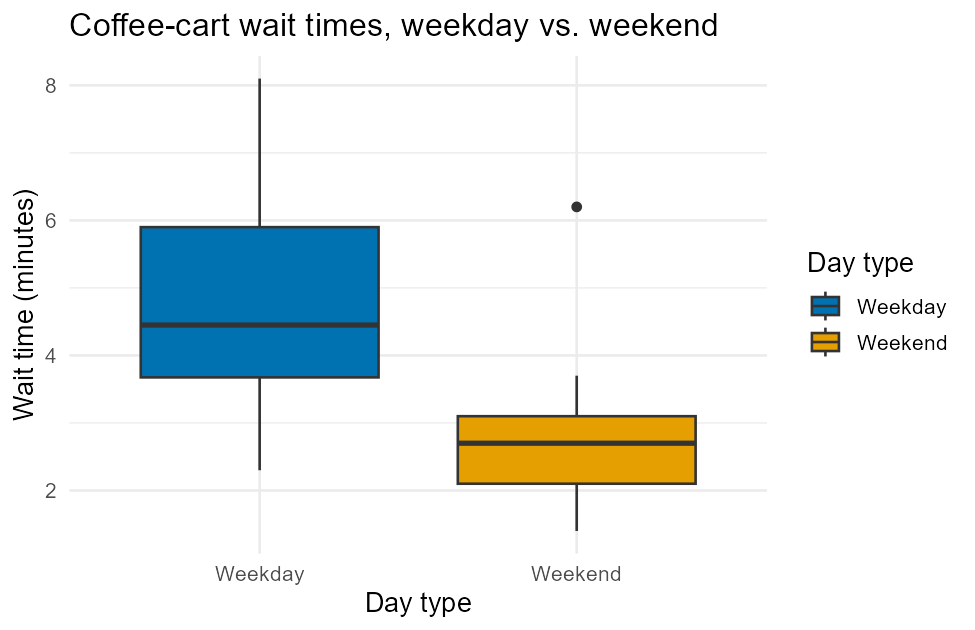
Figure 1:Boxplots of coffee-cart wait time by day type, colorblind-safe palette, matching the favstats() table below.
favstats(wait_minutes ~ day_type, data = coffee) day_type min Q1 median Q3 max mean sd n missing
1 Weekday 2.3 3.675 4.45 5.9 8.1 4.716667 1.752833 12 0
2 Weekend 1.4 2.100 2.70 3.1 6.2 2.925000 1.521043 8 0Notice the picture and the table tell the same story — a median wait around
4.45 minutes on weekdays versus 2.70 on weekends — because a good graph is
always a picture of numbers you could also print in a table. Neither box’s
color is doing work the x-axis labels (Weekday, Weekend) aren’t already
doing — the color is a helpful extra cue, never the only one.
5A styled bar chart, for comparison
The same two ingredients — gf_labs() for text, gf_refine(scale_fill_manual(...))
for color — apply identically to a categorical variable’s bar chart:
gf_bar(~ day_type, data = coffee, fill = ~day_type) %>%
  gf_refine(scale_fill_manual(values = okabe_ito[c(5, 1)])) %>%
  gf_labs(title = "Customers timed, by day type",
          x = "Day type", y = "Number of customers", fill = "Day type")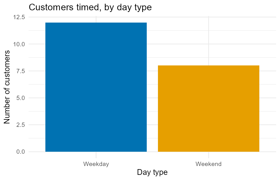
Figure 2:Bar chart of customers timed, by day type, matching the tally() counts below.
tally(~ day_type, data = coffee)day_type
Weekday Weekend
12 8 Bar heights (12, 8) match the tally exactly — a bar chart is simply a picture
of a frequency table, the same relationship gf_histogram() and favstats()
have.
6Step 3: never color alone — add shape, linetype, or a facet
A palette swap fixes which colors you use, but a reader with total color blindness, or reading a black-and-white printout, still can’t use color at all. The fix: back up color with a second, non-color cue — shape, linetype, direct text labels, or separate panels (faceting, below).
gf_point(width ~ length, data = KidsFeet, color = ~sex, shape = ~sex, size = 2.5) %>%
  gf_refine(scale_color_manual(values = okabe_ito[c(5, 6)])) %>%
  gf_labs(title = "Foot width vs. length, by sex",
          x = "Foot length (cm)", y = "Foot width (cm)",
          color = "Sex (B/G)", shape = "Sex (B/G)")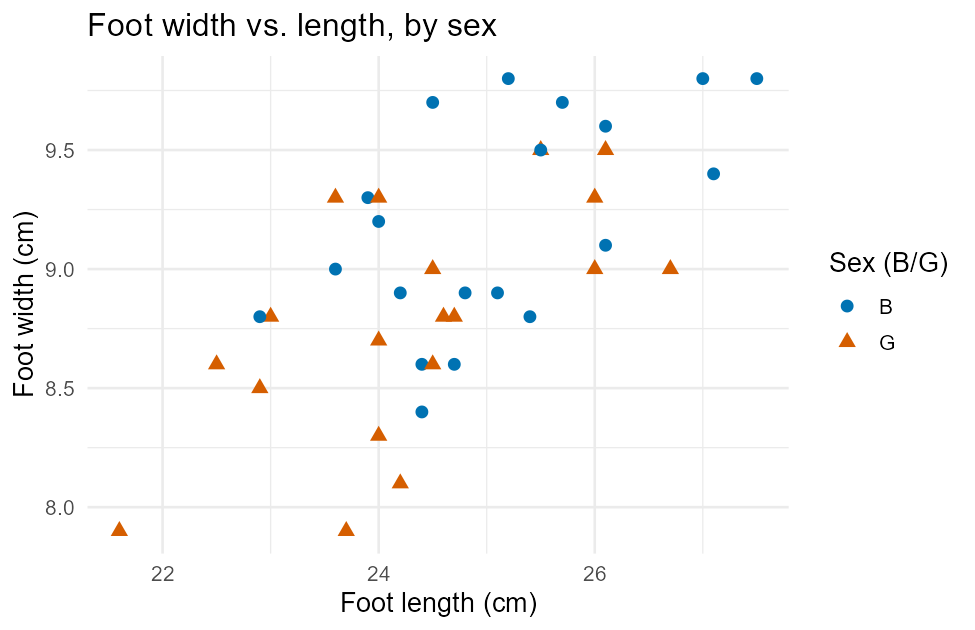
Figure 3:Scatterplot of foot width vs. length from KidsFeet, grouped by sex with both color and shape.
shape = ~sex (added right alongside color = ~sex) draws boys as circles
and girls as triangles, in addition to two different colors. Now a reader who
cannot distinguish blue from orange — or a copy printed on a black-and-white
printer — can still read the groups apart by shape alone. This is exactly
what the WCAG 2.1 AA rule from Step 2 means by “never distinguish groups by
hue alone.”
7Step 4: faceting — one panel per group
Faceting splits a plot into a small grid of panels, one per group, instead of overlaying groups with color at all. It is often the single most accessible way to compare more than two groups:
gf_histogram(~ length, data = KidsFeet, binwidth = 1,
             fill = "#009E73", color = "white") %>%
  gf_facet_wrap(~ sex) %>%
  gf_labs(title = "Foot length, by sex (faceted)",
          x = "Foot length (cm)", y = "Number of kids")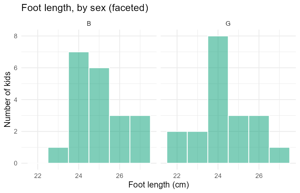
Figure 4:Foot length faceted by sex — one histogram panel per group, no color grouping needed.
gf_facet_wrap(~ sex) is simply piped onto an ordinary histogram — faceting
is an add-on step, not a different plot type, and it works after gf_boxplot,
gf_bar, or gf_point exactly the same way. Each panel’s label (B, G) is
real text, not a color-coded legend entry, so the group identity never
depends on being able to see color at all.
8Saving a plot to a file
Every figure in this lesson was saved from R with ggsave(), so it could be
embedded in this page. You’ll use the exact same function to save a plot for
a lab write-up or homework submission:
my_plot <- gf_boxplot(wait_minutes ~ day_type, data = coffee, fill = ~day_type) %>%
  gf_refine(scale_fill_manual(values = okabe_ito[c(5, 1)])) %>%
  gf_labs(title = "Coffee-cart wait times, weekday vs. weekend",
          x = "Day type", y = "Wait time (minutes)", fill = "Day type")

ggsave("images/L10-box-wait-daytype.png", my_plot, width = 6.5, height = 4.2, dpi = 150)
Two things make this work. First, %>% (piping) only builds a plot object —
nothing is saved to a file until you actually assign the whole pipe to a name
(my_plot <-) and hand that object to ggsave(). Second, ggsave()'s first
input is the file path to write, using the same kind of relative path
you’ve used since Lesson 6: "images/L10-box-wait-daytype.png"
saves inside an images folder sitting right next to your script or
notebook. On CSUB JupyterHub, that new file shows up in the file browser panel
on the left, where you can right-click it to download.
9Writing alt text: the same standard as this book
Alt text (short for “alternative text”) is a one- or two-sentence written
description of what a figure shows, attached to the image so a screen reader
can read it aloud, and so it still communicates something if the image itself
never loads. Every {figure} block in this lesson carries one — look back at
any image above and you’ll find an :alt: line right next to it.
Good alt text is not “a boxplot” or “a graph of the data” — that tells a reader nothing they couldn’t already guess. It answers one specific question:
10Summary
Recap: histogram/boxplot for a numerical variable, bar chart for a categorical one — Lesson 7’s
gf_functions, unchanged.gf_labs(title =, x =, y =, fill =)replaces raw column names with plain English, so a plot stands on its own without you narrating it.gf_refine(scale_fill_manual(values = okabe_ito))(orscale_color_manual) applies the Okabe–Ito colorblind-safe palette — required by this book’s WCAG 2.1 AA standard for every plot that groups by color.Color is never the only cue: back it up with
shape =, a facet (gf_facet_wrap(~g)), or direct axis/panel labels.ggsave("path/file.png", my_plot, width =, height =, dpi =)saves a plot you first assigned to a name — the same relative-path habit asread.csv().Alt text answers: what kind of plot, of what variable(s), showing what pattern? Not “a graph of the data.”
11Check your understanding
You build
gf_bar(~ major, data = students)with no other code. List two specific things this lesson says to add before it’s ready to show someone else, and the exact R that adds each one.Why is
fill = ~groupalone not enough to meet this book’s accessibility standard, even after you apply the Okabe–Ito palette?Give one example of a non-color cue you could add to a scatterplot with two groups, and the R argument that adds it.
Write real alt text (one or two honest sentences) for the bar chart of day-type counts earlier in this lesson, without re-reading its
:alt:text first.