1Why this chapter: an oilfield in numbers
Drive north out of Bakersfield on Highway 65 and you pass the nodding pumpjacks of the Kern River and Cymric oil fields — the visible edge of the industry that has paid Kern County paychecks for a century. Over the last decade that industry shrank. California crude-oil production fell from 201,283 thousand barrels in 2015 to 109,828 thousand barrels in 2024, and over the same years the Bakersfield-area oilfield workforce (the “Mining & Logging” payroll line) fell from 11.4 thousand jobs to 7.2 thousand jobs.
Two questions follow naturally, and they are the two questions of this whole chapter:
Do the two numbers move together? When production is high, are jobs high? That is a question about correlation — the strength and direction of a straight-line relationship.
Can we put a number on the trade-off? “Each extra million barrels of production is worth about how many oilfield jobs?” That is a question about regression — fitting a line and reading its slope.
Here is the picture. Each point is one year, 2015–2024.
Figure 1:California crude-oil production versus Bakersfield-area oilfield payroll, 2015–2024. Each point is one calendar year; the orange line is the least-squares fit. The points rise from lower-left to upper-right, so years with more production tended to have more oilfield jobs.
The cloud of points slopes upward. By the end of the chapter you will be able to say how strongly (“the correlation is Unexecuted inline expression for: round(cor(energy$crude_mmbbl, energy$ces_mining_logging_thsd), 3)” — a number you will learn to read), how steep (“about 37 jobs per million barrels”), and whether the pattern could be a fluke (“no — the slope is statistically significant”). Every one of those numbers comes from the same real Kern data.
2Learning objectives
By the end of this chapter you will be able to:
Compute and interpret the correlation coefficient , and recognize its limits — it measures linear association only, it is sensitive to outliers, and it never proves causation. (Apply)
Fit a least-squares regression line in R and interpret the slope and intercept in the units of the problem. (Apply)
Use the model for prediction and interpret and a residual plot. (Apply)
Diagnose outliers, leverage, and influential points and describe their effect on the fitted line. (Analyze)
Conduct inference on the slope (a hypothesis test and a confidence interval) and state the conditions a regression requires. (Apply)
This chapter expands ISRS sections 5.1–5.4 (line fitting and correlation, least squares, outliers, and inference for regression). It assumes you have met numerical summaries (Chapter 2) and inference for means (Chapter 10) — the slope test reuses the same -distribution logic.
31. Correlation: measuring straight-line association
3.1Intuition
Two numerical variables are positively associated when large values of one tend to come with large values of the other (oil up, jobs up). They are negatively associated when large values of one come with small values of the other (as you will see: oil up, total county payroll down, because the economy diversified away from oil). The correlation coefficient puts a single number on two things at once:
Direction — its sign (+ for upward, − for downward).
Strength — its magnitude, from 0 (no straight-line pattern) up to 1 (the points fall exactly on a line).
Think of as a strength-and-direction dial pinned between -1 and +1. A value near means a tight line; a value near 0 means a shapeless blob (or a curved pattern that a straight-line measure cannot see).
3.2Formula
For data pairs , the Pearson correlation coefficient is
Defining every symbol the first time it appears:
— the number of paired observations (here, years).
— the -th value of the explanatory variable (the predictor on the horizontal axis; here, crude production).
— the -th value of the response variable (the outcome on the vertical axis; here, oilfield jobs).
— the mean of the values; — the mean of the values.
The numerator is large and positive when and are both above (or both below) their means together.
The two square roots in the denominator rescale that quantity so the result is always between -1 and +1, with no units — is the same whether oil is in barrels or millions of barrels.
3.3Properties to remember
always.
has no units and does not change if you rescale or shift either variable.
measures linear association only. A perfect U-shape can have .
is not resistant: a single far-out point can swing it dramatically.
Correlation is symmetric: of with equals of with .
3.4R
In R, cor() computes directly. With mosaic you can write it in the same
y ~ x formula grammar you use everywhere else — read it as “jobs versus
crude.”
# Correlation between oilfield jobs and crude production:
cor(ces_mining_logging_thsd ~ crude_mmbbl, data = energy)
This returns Unexecuted inline expression for: round(cor(energy$crude_mmbbl, energy$ces_mining_logging_thsd), 4)
(a value computed from kern_energy_employment). A correlation of about 0.86
is strong and positive: the upward line in Figure 1 is real and tight.
42. The least-squares regression line
4.1Intuition
A correlation says the points trend upward; a regression line draws the one straight line that best summarizes that trend. “Best” has a precise meaning. For any candidate line, each data point sits some vertical distance above or below it — that gap is the residual. The least-squares line is the unique line that makes the sum of the squared residuals as small as possible. Squaring keeps positive and negative gaps from cancelling and punishes big misses hardest, so the line is pulled to run through the “middle” of the cloud.
4.2Formula
We write the fitted line as
where:
(read “y-hat”) — the predicted value of the response for a given . The hat always means “estimated/predicted,” not observed.
— the intercept: the predicted when .
— the slope: the change in for a one-unit increase in . This is the number that answers “jobs per million barrels.”
— a value of the explanatory variable you plug in.
The least-squares estimates are
with the building blocks
where and measure how much and each spread out, and measures how they vary together; are the sample standard deviations of and (Chapter 2). Two facts worth memorizing fall straight out of these formulas:
The line always passes through the point of averages — substitute into and you get .
The slope shares the sign of the correlation, because and are positive: a positive gives a positive slope.
4.3R
Fit the line with base R’s lm(y ~ x, data = D) — the same formula grammar
again — and read it with mosaic’s msummary(), which prints the coefficient
table (each estimate with its standard error, -statistic, and -value),
plus and the residual standard error.
fit <- lm(ces_mining_logging_thsd ~ crude_mmbbl, data = energy)
msummary(fit)   # coefficient table (estimate, SE, t, p), R^2, residual SE
The intercept is the (Intercept) row and the slope is the crude_mmbbl row of
that table. Pull the key components out as plain numbers:
b0 <- coef(fit)[["(Intercept)"]]   # b0, the intercept
b1 <- coef(fit)[["crude_mmbbl"]]   # b1, the slope
R2 <- rsquared(fit)                # R^2 (mosaic helper)
c(intercept = b0, slope = b1, R_squared = R2)
From the real Kern data these are Unexecuted inline expression for: round(b0, 4),
Unexecuted inline expression for: round(b1, 4), and Unexecuted inline expression for: round(R2, 4)
(all derived from kern_energy_employment). The fitted line is therefore
The slope is shown rounded to four decimals. R carries more digits behind the scenes, so a prediction you compute from the printed equation may differ from R’s answer in the last digit — that is rounding, not an error.
Reading the slope. A slope of 0.0367 thousand jobs per million barrels means each additional million barrels of annual production is associated with about more oilfield jobs. Reading the intercept. would be the predicted payroll at zero production — but zero is far outside the observed range (production never dipped below ~110 million barrels), so the intercept here is a mathematical anchor, not a real-world forecast.
gf_point(ces_mining_logging_thsd ~ crude_mmbbl, data = energy,
         color = okabe_ito[1], size = 2.4) %>%
  gf_lm(color = okabe_ito[6]) %>%
  gf_labs(title = "Least-squares fit: Kern oilfield jobs vs crude production",
          x = "California crude production (million barrels/year)",
          y = "Bakersfield-area oilfield jobs (thousands)") %>%
  gf_theme(theme_minimal(base_size = 13))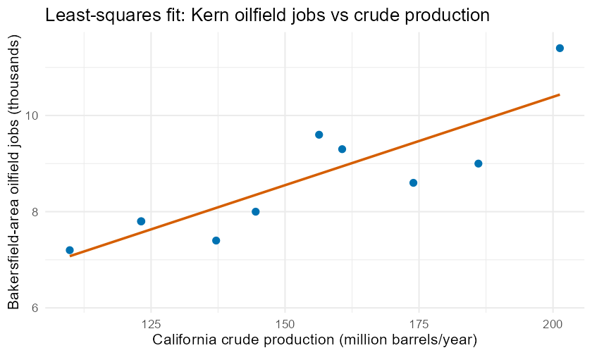
The least-squares line through the Kern energy data (its equation is , with ). The line minimizes the total squared vertical distance from the points.
The fit above is the answer; the simulator below lets you discover it. On a small simulated scatter, drag the slope slider and watch the residual segments and the running SSE total. Because the intercept is always set to the best value for whatever slope you pick, every line pivots through the centroid — and the SSE drops to its single lowest point exactly at the least-squares slope, then climbs again. That lowest point is what “least squares” means.
Figure 2:Interactive least-squares explorer — drag the slope slider and watch the green residual segments and the SSE total in the title shrink to their minimum exactly at the least-squares slope (the grey dotted target line), then grow again. The data are simulated with a fixed seed; every candidate line pivots through the green centroid . The full kernel-free Plotly source lives on the regression SSE simulator page.
53. Prediction, R², and residuals
5.1Intuition
Once you have a line you can predict: plug an into . But a prediction is only as trustworthy as the line is tight, and two summaries tell you how tight it is.
— the coefficient of determination — is the fraction of the variation in that the line explains. It runs from 0 (the line explains nothing) to 1 (the line explains everything). For one predictor, .
The residual standard error — the typical size of a residual — tells you, in the units of , how far off a prediction is likely to be.
A residual plot (residuals on the vertical axis against or against ) is the single most useful diagnostic: if the line fits well, the residuals should scatter randomly around zero with no curve and no fanning.
5.2Formula
— the predicted value at the -th observation.
— the sum of squared errors (the quantity least squares minimizes).
— the degrees of freedom: we used two pieces of the data to estimate and , so two are “spent.”
5.3R
rsquared(fit)                    # fraction of job-variation explained
se_resid <- summary(fit)$sigma   # residual standard error, in thousands of jobs
se_resid

# Predict oilfield jobs in a year with 140 million barrels of production
# (b0 and b1 were pulled out above):
b0 + b1 * 140
For the Kern data, Unexecuted inline expression for: round(R2, 4) — about 73% of the
year-to-year variation in oilfield jobs is explained by crude production
(kern_energy_employment). The residual standard error is
Unexecuted inline expression for: round(se_resid, 4) thousand jobs, so a typical prediction is off by
roughly 700 jobs. Predicting a 140-million-barrel year gives about
Unexecuted inline expression for: round(b0 + b1*140, 2) thousand jobs.
Now the residual plot:
resid_df <- data.frame(
  crude = energy$crude_mmbbl,
  residual = resid(fit)
)
ggplot(resid_df, aes(x = crude, y = residual)) +
  geom_hline(yintercept = 0, linetype = "dashed", colour = okabe_ito[8]) +
  geom_point(colour = okabe_ito[1], size = 2.4) +
  labs(
    title = "Residual plot: no obvious pattern is good news",
    x = "California crude production (million barrels/year)",
    y = "Residual (thousands of jobs)"
  ) +
  theme_minimal(base_size = 13)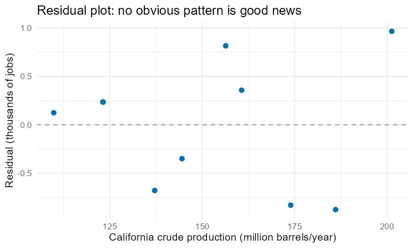
Residuals (observed minus predicted oilfield jobs) plotted against crude production. Points scatter around the dashed zero line with no strong curve, supporting the straight-line model; the highest point is the 2015 over-prediction.
64. Outliers, leverage, and influence
6.1Intuition
Because least squares minimizes squared distances, unusual points can pull the line toward themselves. Three labels keep them straight:
An outlier is a point with a large residual — it sits far from the line.
A high-leverage point has an extreme value (far left or far right). It has the potential to move the line a lot, just by where it sits.
An influential point is one that actually does change the slope or intercept noticeably when removed. A point is influential when it is high leverage and off the trend.
The practical test is honest and simple: refit without the suspect point and see if your conclusions move.
6.2R
In the Kern data, 2015 is the extreme- year (highest production on record) and has the largest residual (+Unexecuted inline expression for: round(max(resid(fit)), 2) thousand jobs): the oilfield employed more people in 2015 than the line predicts. The COVID year 2020 is a natural suspect too. Let us refit without 2020 and compare the correlation.
# Correlation with all 10 years:
cor(ces_mining_logging_thsd ~ crude_mmbbl, data = energy)

# Correlation after dropping the 2020 (COVID) year:
no2020 <- energy[energy$year != 2020, ]
cor(ces_mining_logging_thsd ~ crude_mmbbl, data = no2020)
The correlation barely moves — from Unexecuted inline expression for: round(cor(energy$crude_mmbbl, energy$ces_mining_logging_thsd), 4)
to Unexecuted inline expression for: round(cor(no2020$crude_mmbbl, no2020$ces_mining_logging_thsd), 4)
(kern_energy_employment). So 2020, despite being a dramatic year, is not
influential here: the relationship is robust to it. That is exactly the kind of
check a careful analyst runs before trusting a line.
75. Inference for the slope
7.1Intuition
We have a slope from ten years of data. If we had a different ten years, we would get a slightly different slope. So the slope we computed is an estimate of an unknown true slope (the Greek letter “beta”) that describes the underlying relationship. The central question of regression inference is: could the true slope actually be zero? A true slope of zero would mean no linear relationship — the apparent tilt is just sampling noise.
We answer it the same way we tested a mean in Chapter 10: form a -statistic and read a p-value.
7.2Formula
A confidence interval for the true slope is
where:
— the unknown population slope we are inferring about.
— the standard error of the slope: how much would bounce from sample to sample.
— the test statistic: how many standard errors the observed slope sits away from zero.
— the critical value from the -distribution with degrees of freedom (e.g.
qt(0.975, df)for 95% confidence).— the significance level (the risk of a false alarm you accept, commonly 0.05).
The four conditions the test requires (remember them as L-I-N-E): Linearity (the scatter looks straight), Independence (observations gathered independently), Normal residuals (roughly symmetric, no skew), and Equal spread (residual scatter constant across ).
7.3R
The msummary(fit) table above already carries the slope’s standard error,
-statistic, and -value in its crude_mmbbl row; confint() adds the 95%
interval. Pull the slope-row pieces out for the sentence below:
confint(fit)                                        # 95% CIs for (Intercept) and slope
tstat <- coef(summary(fit))["crude_mmbbl", "t value"]      # t = b1 / SE(b1)
pval  <- coef(summary(fit))["crude_mmbbl", "Pr(>|t|)"]     # two-sided p-value
dfree <- df.residual(fit)                                  # n - 2
ci    <- confint(fit)["crude_mmbbl", ]                      # CI for beta1
c(t = tstat, df = dfree, p = pval)
For the Kern data: Unexecuted inline expression for: round(tstat, 3) on Unexecuted inline expression for: dfree degrees of
freedom, Unexecuted inline expression for: signif(pval, 3), and the 95% confidence interval for
the slope is (Unexecuted inline expression for: round(ci[1], 4), Unexecuted inline expression for: round(ci[2], 4))
(kern_energy_employment). Because — and equivalently, because the
interval excludes 0 — we reject : there is statistically significant
evidence of a positive linear relationship between crude production and oilfield
employment in Kern County over 2015–2024.
Going deeper (optional)
Everything you need for the course is above. This box is for the curious — it is not required and will not appear on assessments. It explains why the machinery works.
Why “least squares” and not “least distance”? We pick the line that minimizes — the sum of squared vertical gaps. Two reasons. First, squaring removes the sign, so points above and below the line do not cancel out. Second, squaring makes the total a smooth, bowl-shaped function of and with exactly one lowest point; setting its two partial derivatives to zero (the calculus you may meet later) yields precisely the formulas and . Minimizing the sum of absolute gaps instead is possible (it gives “robust” regression) but has no tidy closed form and is less sensitive to the conditions we test here.
Why is “the fraction of variance explained”? Split each point’s distance from into two pieces: the part the line captures and the part it misses, the residual . Squaring and summing gives an exact identity,
and is literally the share of the up-and-down variation in that the line accounts for. That is why means the line is no better than guessing every time, and means the residuals are all zero.
Correlation vs. causation — the sharper version. A strong is consistent with three different worlds: causes , causes (reverse causation), or a third variable drives both (confounding — see Chapter 1). An observational correlation cannot tell these apart. Only a randomized experiment, which breaks the link between the treatment and any lurking variable, licenses a causal claim. This is exactly why a clinical trial randomizes patients instead of just correlating who happened to take a drug.
Why extrapolation is dangerous, geometrically. A straight line is often a fine local approximation to a curved reality over the range you observed. Push far past that range and the true relationship can bend, flatten, or reverse, while the line keeps marching at a constant slope — so the error grows without warning. Our intercept ( barrels) is the textbook trap: no Kern year came close to zero production, so is an algebraic anchor, not a forecast.
8Worked examples
8.1Worked Example 1 — Correlation by hand (Kern energy)
Question. Using the 2015–2024 Kern data, find the correlation between crude production (million barrels) and oilfield jobs (thousands), and state direction and strength.
Intuition. The scatterplot tilts upward, so expect a positive ; the points hug a line fairly tightly, so expect it to be well above 0.5.
Formula. .
Computation.
x <- energy$crude_mmbbl
y <- energy$ces_mining_logging_thsd
xbar <- mean(x); ybar <- mean(y)
Sxx <- sum((x - xbar)^2)
Syy <- sum((y - ybar)^2)
Sxy <- sum((x - xbar) * (y - ybar))
r_manual <- Sxy / sqrt(Sxx * Syy)
r_manual
cor(x, y)   # check against the built-in
Interpretation. Both give Unexecuted inline expression for: round(cor(x,y), 4)
(kern_energy_employment). The relationship is positive (oil and jobs rise
together) and strong (well above 0.7 in magnitude). The hand computation and
cor() agree to the last digit, confirming we understand what the function does.
8.2Worked Example 2 — Fit, predict, and interpret (Kern energy)
Question. Fit the least-squares line predicting oilfield jobs from crude production. Interpret the slope, then predict the jobs for a year with 160 million barrels.
Intuition. A positive correlation forces a positive slope. With about 37 jobs per million barrels, 160 million barrels should predict somewhere near 9 thousand jobs.
Formula. , , .
Computation.
fit2 <- lm(ces_mining_logging_thsd ~ crude_mmbbl, data = energy)
b1_2 <- coef(fit2)[["crude_mmbbl"]]     # slope
b0_2 <- coef(fit2)[["(Intercept)"]]     # intercept
c(slope = b1_2, intercept = b0_2, pred_at_160 = b0_2 + b1_2 * 160)
Interpretation. The slope Unexecuted inline expression for: round(b1_2, 4) thousand jobs per million
barrels means about 37 jobs per million barrels (multiply by 1000). At 160
million barrels the model predicts
Unexecuted inline expression for: round(b0_2 + b1_2*160, 3) thousand jobs — about 8,920 jobs
(kern_energy_employment). Because 160 sits inside the observed range
(110–201 million barrels), this is an interpolation and is trustworthy.
8.3Worked Example 3 — A negative relationship (Kern energy)
Question. As oil production fell, what happened to the total Bakersfield-MSA payroll (all jobs, not just oilfield)? Compute the correlation and slope of total nonfarm employment on crude production.
Intuition. If the regional economy diversified as oil declined — adding warehouses, health care, and logistics jobs — total employment might have risen while oil fell, giving a negative correlation.
Formula. Same as before, now with total nonfarm payroll.
Computation.
cor(ces_total_nonfarm_thsd ~ crude_mmbbl, data = energy)
fit3 <- lm(ces_total_nonfarm_thsd ~ crude_mmbbl, data = energy)
coef(fit3)[["crude_mmbbl"]]   # slope
rsquared(fit3)                # R^2
Interpretation. The correlation is
Unexecuted inline expression for: round(cor(energy$crude_mmbbl, energy$ces_total_nonfarm_thsd), 4) — strong
and negative (kern_energy_employment). The slope
Unexecuted inline expression for: round(coef(fit3)[["crude_mmbbl"]], 4) says total payroll fell by about 0.45 thousand jobs
(≈450 jobs) for every million-barrel increase in oil — i.e., as oil declined,
total employment grew. With Unexecuted inline expression for: round(rsquared(fit3), 4), crude production
tracks about 79% of the variation. The contrast with Example 2 is the lesson:
oilfield jobs and total jobs moved in opposite directions over this decade.
8.4Worked Example 4 — Slope inference and conditions (Kern energy)
Question. Is the oilfield-jobs relationship from Example 2 statistically significant? Test at and give a 95% CI for the slope. Check the LINE conditions.
Intuition. The points hug the line tightly with years, so the slope is probably several standard errors from zero — expect a small p-value.
Formula. , df ; reject if .
Computation.
tstat2 <- coef(summary(fit2))["crude_mmbbl", "t value"]
dfree2 <- df.residual(fit2)                              # n - 2 = 8
pval2  <- coef(summary(fit2))["crude_mmbbl", "Pr(>|t|)"]
ci2    <- confint(fit2)["crude_mmbbl", ]                 # 95% CI for the slope
c(t = tstat2, df = dfree2, p = pval2)
ci2
Interpretation. Unexecuted inline expression for: round(tstat2, 3) on 8 df gives
Unexecuted inline expression for: signif(pval2, 3), far below 0.05, so we reject . The
95% CI for the slope, (Unexecuted inline expression for: round(ci2[1],4), Unexecuted inline expression for: round(ci2[2],4)),
excludes 0 — consistent with the test. Conditions: Linearity holds
(Figure 1 is straight); Equal spread and Normal residuals look
acceptable in the residual plot (ch13-fig-resid); Independence is the shakiest —
these are consecutive years of one county, so a careful analyst flags possible
year-to-year dependence as a caveat. (Result from kern_energy_employment.)
8.5Worked Example 5 — Regression on simulated crop data
Question. In the simulated Kern crops dataset, does almond yield per acre predict total crop value? Fit the line and report , , and the slope’s significance.
Intuition. Higher yield per acre across many fields could raise total value, so expect a positive slope — but simulated noise may make it less tight than the energy data.
Formula. Same least-squares machinery; value (million USD), yield per acre.
Computation.
crops <- read.csv("data/processed/kern_crops_sim.csv")
almonds <- subset(crops, commodity == "ALMONDS")
almonds$value_mil <- almonds$value_usd / 1e6
fit5 <- lm(value_mil ~ yield_per_acre, data = almonds)
r5   <- cor(value_mil ~ yield_per_acre, data = almonds)     # r
R2_5 <- rsquared(fit5)                                       # R^2
p5   <- coef(summary(fit5))["yield_per_acre", "Pr(>|t|)"]    # slope p-value
c(r = r5, R_squared = R2_5, slope_p = p5)
Interpretation. For the simulated almonds, Unexecuted inline expression for: round(r5, 3) and
Unexecuted inline expression for: round(R2_5, 3), with slope p-value
Unexecuted inline expression for: signif(p5, 2) — a statistically significant positive
relationship in the synthetic data (kern_crops_sim). The point of the example
is the procedure, not the agronomy: the same lm(y ~ x, data =) call works on
any pair of numerical variables, and msummary() walks you through every piece
of the fit.
9Try it yourself
Shiny — Statistics Explorer, “Correlation & Regression” module (
shiny-explorer/, modulemod_regression). Drop in any two numerical columns, watch the scatterplot, fitted line, , , and slope test update live — and copy the exactlm()/cor()R code each action generates. Launch locally withshiny::runApp("shiny-explorer").Jupyter lab —
labs/lab13-regression.ipynb(R kernel). A guided walkthrough that re-creates this chapter’s Kern energy regression step by step, then turns you loose onkern_crops_simand anopenintrodataset of your choice with starter code and a reflection prompt.
Both tools use the same mosaic/lm() functions you used above, so the syntax
you learn here is the syntax you use everywhere.
10Chapter summary
Correlation measures the direction (sign) and strength (magnitude, 0 to 1) of a linear relationship. It is unit-free, symmetric, not resistant to outliers, and never proves causation.
The least-squares regression line minimizes the sum of squared residuals. The slope is the predicted change in per one-unit increase in ; the intercept is at (often an extrapolation). The line always passes through .
is the fraction of variation in explained by the line; the residual standard error is the typical prediction error in -units.
A residual plot with no pattern supports the straight-line model. Outliers (big residual), leverage (extreme ), and influence (actually moves the line) are diagnosed by refitting without the suspect point.
Inference on the slope uses on df. A small p-value (or a CI excluding 0) means a statistically significant linear relationship. The conditions are LINE: Linearity, Independence, Normal residuals, Equal spread.
For the real Kern energy data: Unexecuted inline expression for: round(cor(energy$crude_mmbbl, energy$ces_mining_logging_thsd), 3), slope Unexecuted inline expression for: round(b1, 4) thousand jobs per million barrels, Unexecuted inline expression for: round(R2, 3), Unexecuted inline expression for: signif(pval, 2).
11FAQ
Q1. What is the difference between and ? (from -1 to 1) carries the direction of the relationship; (from 0 to 1) is squared and gives the fraction of variation explained but loses the sign. Report to describe direction and strength; report to describe predictive accuracy.
Q2. Does a significant slope mean causes ? No. Significance means the slope is unlikely to be zero by chance — it says nothing about causation. Causal claims need an experiment with random assignment (Chapter 1, Chapter 8), not an observational regression.
Q3. Can I predict outside the range of my data? You can compute it, but you shouldn’t trust it. Predicting beyond the observed range is extrapolation, and the linear pattern may not hold there. Our intercept ( barrels) is a stark example — no Kern year had zero production.
Q4. My residual plot has a clear curve. What now? A curved residual plot means a straight line is the wrong model. The relationship may be genuinely nonlinear; options include transforming a variable (e.g. taking a logarithm) or fitting a curve — topics beyond this chapter, but the residual plot is what tells you a line won’t do.
Q5. Why divide by for the residual standard error? Because two degrees of freedom are used up estimating the intercept and the slope. Dividing by (rather than ) corrects for that and gives an unbiased estimate of the typical residual size — the same idea as dividing by for a sample standard deviation in Chapter 2.
Q6. Does it matter which variable is and which is ? For correlation, no — is symmetric. For regression, yes — the line that predicts from is different from the line that predicts from . Choose to be the variable you want to predict or explain.
Q7. I have only 10 data points. Is that enough to regress? It can be, if the relationship is strong and the conditions hold — our Kern example reaches significance with . But small samples make every estimate shaky; always report the confidence interval so readers see how much the slope could plausibly vary.
12Practice problems
In one sentence, define the correlation coefficient , naming both the quantity its sign conveys and the quantity its magnitude conveys.
A scatterplot of two variables shows a tight, perfectly U-shaped curve. Will be near +1, near -1, or near 0? Explain in terms of what can and cannot detect.
Compute
cor(energy$crude_mmbbl, energy$kern_unemp_rate). State the value, its direction, and whether the strength is weak, moderate, or strong.True or false, with a one-sentence reason: “If , the two variables are unrelated.”
Using the fitted line (jobs in thousands, in million barrels), predict oilfield jobs for a year with 130 million barrels of production. Show the arithmetic.
In Problem 5’s model, interpret the slope 0.0367 in words and units, including the “per 1000” conversion to whole jobs.
Explain why the intercept should not be reported as “the number of oilfield jobs when production is zero” for this dataset.
The regression line always passes through one particular point. Name it, and verify it by plugging into the fitted equation and comparing to Unexecuted inline expression for: round(mean(energy$ces_mining_logging_thsd), 3).
For the Kern energy fit, . Write one sentence interpreting this value for a county economic-development officer.
The residual standard error for the oilfield-jobs model is about 0.70 thousand jobs. Explain what this number tells a planner who is using the model to forecast.
Define residual in a single sentence, and state what the residuals should look like in a residual plot when a straight-line model fits well.
Fit
lm(ces_mining_logging_thsd ~ crude_mmbbl, data = energy)and read off the 95% confidence interval for the slope withconfint(). Does it contain 0, and what does that imply for the hypothesis test?Distinguish an outlier from a high-leverage point in regression, and say what makes a point influential.
The year 2015 has the largest residual and the most extreme . Describe the procedure you would run to decide whether 2015 is influential, and what result would tell you it is not.
State the null and alternative hypotheses for the test of a regression slope, using the symbol , and say in plain words what claims about the relationship.
A slope test returns on 8 degrees of freedom with . At , state the decision and write a one-sentence conclusion in context for the Kern oilfield data.
List the four regression conditions (the LINE mnemonic) and, for the Kern energy data, name the one most open to question and why.
Correlation between two variables is . Without computing anything else, what is the sign of the least-squares slope, and why must they agree?
Compute the correlation between
crude_mmbblandmining_logging_share_pct(the oil sector’s share of total payroll). Is it stronger or weaker than the correlation with oilfield jobs (Unexecuted inline expression for: round(cor(energy$crude_mmbbl, energy$ces_mining_logging_thsd),3))? Speculate briefly why.A colleague predicts oilfield jobs for a year with 300 million barrels of production using our line. Explain why this prediction is untrustworthy, naming the relevant term.
Using
lm(), regressces_total_nonfarm_thsdoncrude_mmbbl. Report the slope and explain why its sign is the opposite of the oilfield-jobs slope, in terms of the regional economy.Explain the difference between and the slope . Can two datasets have the same but very different slopes? Give the reason.
A student says, “, so 73% of the time the model predicts jobs correctly.” Identify the misconception and state what actually means.
For the simulated almond data (
crops <- read.csv("data/processed/kern_crops_sim.csv"), almonds only), fitvalue_mil(value in million USD) onyield_per_acreand report . Why must you label any conclusion as based on synthetic data?Suppose you rescale crude production from million barrels to billion barrels (divide by 1000). Which of these change and which stay the same: , , the slope , the slope’s p-value? Justify each.
The slope’s 95% confidence interval is about thousand jobs per million barrels. Translate this interval into whole jobs per million barrels and write the plain-language sentence you would give a decision-maker.
Give a real-world pair of variables you would expect to be positively correlated but where one does not cause the other, and name a plausible lurking variable.
Why is the slope test in this chapter built on the -distribution with degrees of freedom rather than the normal distribution? Connect your answer to one-sample inference from Chapter 10.
A regression has . Compute and write one sentence contrasting what the two numbers say about the relationship.
In two or three sentences, explain to a non-statistician why “the correlation between ice-cream sales and drowning deaths is high” does not mean ice cream is dangerous, using the vocabulary of this chapter.
13Resumen en español
Resumen del capítulo
En este capítulo usted aprendió a medir y modelar la relación lineal entre dos variables numéricas, usando como hilo conductor los datos reales del campo petrolero del Condado de Kern.
El primer concepto clave es el coeficiente de correlación (correlation coefficient), representado con la letra . Este número, siempre entre -1 y +1, describe simultáneamente la dirección (si es positivo, las dos variables suben juntas; si es negativo, una sube mientras la otra baja) y la fuerza de la asociación lineal (cuanto más cerca esté de , más ajustados quedan los puntos alrededor de una línea recta). En los datos de Kern, la producción de petróleo crudo y el empleo en extracción muestran una correlación de aproximadamente 0.86: positiva y fuerte. Una advertencia importante: la correlación mide únicamente asociación lineal y jamás demuestra causalidad (causality). Una variable de confusión (lurking variable) — por ejemplo, el precio global del petróleo — podría explicar por qué ambas variables se mueven juntas.
El segundo concepto es la línea de regresión de mínimos cuadrados (least-squares regression line), escrita como . El intercepto (intercept) es el valor predicho cuando , y la pendiente (slope) es el cambio en por cada unidad adicional de . Para los datos de Kern, la pendiente de aproximadamente 0.037 miles de empleos por millón de barriles equivale a unos 37 empleos por cada millón de barriles adicionales de producción.
— el coeficiente de determinación (coefficient of determination) — expresa qué fracción de la variación en queda explicada por la línea. Un valor de 0.73 significa que el de la variación anual en el empleo oilfield se asocia con la producción de crudo.
Para evaluar si la pendiente es estadísticamente significativa, se usa el estadístico de prueba con grados de libertad, exactamente como en la inferencia para medias del Capítulo 10.
En R, las funciones principales son lm(y ~ x, data =) para ajustar la línea y msummary() para leer la tabla de coeficientes (estimación, error estándar, y valor p), junto con confint() para el intervalo de confianza de la pendiente.