1Objectives
By the end of this lesson you will be able to:
Summarize a numerical variable, overall and by group, with
favstats().Build one-way and two-way frequency and proportion tables with
tally().Build a histogram, boxplot, bar chart, and scatterplot with the
gf_*(ggformula) family.Facet a plot into small multiples with
gf_facet_wrap().Apply the Okabe–Ito colorblind-safe palette to any plot with a color/fill grouping.
2EDA: look before you test
Exploratory data analysis (EDA) means looking at your data — numbers and
pictures — before you run any formal test. Every inference method later in
this guide (starting L10) has conditions to check, and you
cannot check a condition like “roughly symmetric” or “no extreme outliers”
without first looking. favstats(), tally(), and the gf_* plotting
family are your looking tools. This lesson uses the running survey_sim
dataset throughout — reload it if you’re starting a fresh session:
suppressMessages({library(mosaic); library(BSDA)})
survey <- read.csv("data/survey_sim.csv")3Numerical summaries with favstats(), by group
L05 introduced favstats(). Here it is again, now grouped by a
categorical variable — the formula pattern you’ll use constantly:
favstats(sleep_hours ~ pet, data = survey) pet min Q1 median Q3 max mean sd n missing
1 Cat person 4.2 6.075 6.65 7.20 9.1 6.687500 1.0268667 40 0
2 Dog person 3.9 6.050 6.80 7.55 8.8 6.763636 1.0660352 55 0
3 Neither 5.3 6.600 7.00 7.50 8.6 7.000000 0.8631338 25 0Read this the same way as any favstats() table: one row per group (40 cat
people, 55 dog people, 25 neither — the group sizes are right there in the
n column), each with its own five-number summary, mean, and SD. Reading
across, the three groups’ medians (6.65, 6.80, 7.00 hours) are close — pet
preference does not look strongly related to sleep in this sample. That kind
of read-back, in one sentence, is exactly what an EDA step should produce.
4Frequency and proportion tables with tally()
A one-way tally counts one categorical variable:
tally(~ major_area, data = survey)major_area
Business Kinesiology Nursing Other STEM
31 24 19 22 24 31 of 120 students in this sample listed Business as their major area, and so on — a frequency count, one number per category.
A two-way tally cross-classifies two categorical variables into a contingency table — L11’s chi-square tests are built directly on tables shaped exactly like this one:
tally(pet ~ class_year, data = survey) class_year
pet Freshman Sophomore Junior Senior
Cat person 9 14 11 6
Dog person 16 11 16 12
Neither 5 11 6 3Each cell is a count of students with that exact combination — e.g., 9
freshmen are cat people. Raw counts alone can be hard to compare across
columns of different sizes, so add format = "proportion" to convert each
column into proportions that sum to 1:
tally(pet ~ class_year, data = survey, format = "proportion") class_year
pet Freshman Sophomore Junior Senior
Cat person 0.3000000 0.3888889 0.3333333 0.2857143
Dog person 0.5333333 0.3055556 0.4848485 0.5714286
Neither 0.1666667 0.3055556 0.1818182 0.1428571Now you can read straight across a row meaningfully: roughly 29–39% of students in every class year are cat people — a fairly stable proportion across years, which is the kind of pattern raw counts alone can hide.
5Plots: the gf_* (ggformula) family
Every gf_* function follows the identical formula pattern as favstats()
and tally() — gf_type( y ~ x, data = ), read the same “y broken down by
x” way. This section builds one plot type at a time, all from survey.
5.1Histogram: one numerical variable
gf_histogram(~ sleep_hours, data = survey, binwidth = 0.5,
             fill = "#0072B2", color = "white") %>%
  gf_labs(title = "Sleep hours, first-day campus survey (n = 120)",
          x = "Hours of sleep last night", y = "Number of students")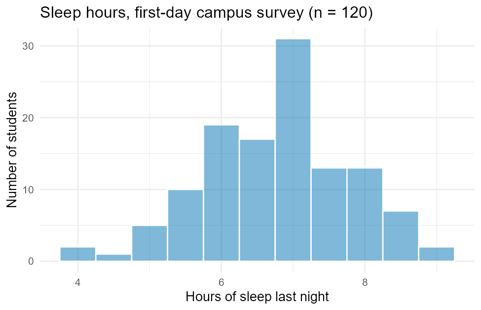
Figure 1:Histogram of sleep hours from the first-day campus survey.
binwidth = 0.5 sets each bar to cover half an hour; fill sets the bar
color (here, one of the Okabe–Ito colorblind-safe colors used throughout
this book — see the callout below); color = "white" draws a thin border
between bars so adjacent bars stay visually separate. %>% (the pipe)
means “take what’s on the left, feed it into the next function” — it lets
you build a plot in readable steps instead of one long nested call. Reading
the picture: the distribution is roughly bell-shaped, centered a little
below 7 hours, with a noticeable dip around 5–5.5 hours and a tall spike
right at 7 — worth a mental note, though with only 120 students some bumps
are just sampling noise.
5.2Boxplot: one numerical variable, by group
gf_boxplot(sleep_hours ~ pet, data = survey, fill = ~pet) %>%
  gf_refine(scale_fill_manual(values = c("#E69F00", "#0072B2", "#009E73"))) %>%
  gf_labs(title = "Sleep hours by pet preference",
          x = "Pet preference", y = "Hours of sleep last night",
          fill = "Pet preference")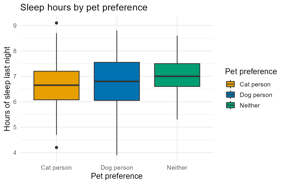
Figure 2:Boxplots of sleep hours by pet preference, matching the favstats() table above.
This is the same sleep_hours ~ pet formula you used with favstats()
above, now as a picture — and it shows the same story: three boxes with
close, overlapping medians. fill = ~pet colors each box by group;
scale_fill_manual(values = c(...)) inside gf_refine() forces those
colors to specific Okabe–Ito hex codes rather than ggplot2’s (not
colorblind-safe) defaults. Note the plot also labels each group on the
x-axis — color is a helpful visual grouping cue here, never the only way
to tell the groups apart, which is what accessibility standards require.
5.3Bar chart: one categorical variable
okabe_ito <- c("#E69F00", "#56B4E9", "#009E73", "#F0E442",
               "#0072B2", "#D55E00", "#CC79A7", "#000000")
gf_bar(~ major_area, data = survey, fill = ~major_area) %>%
  gf_refine(scale_fill_manual(values = okabe_ito)) %>%
  gf_labs(title = "Declared major area, first-day campus survey",
          x = "Major area", y = "Number of students")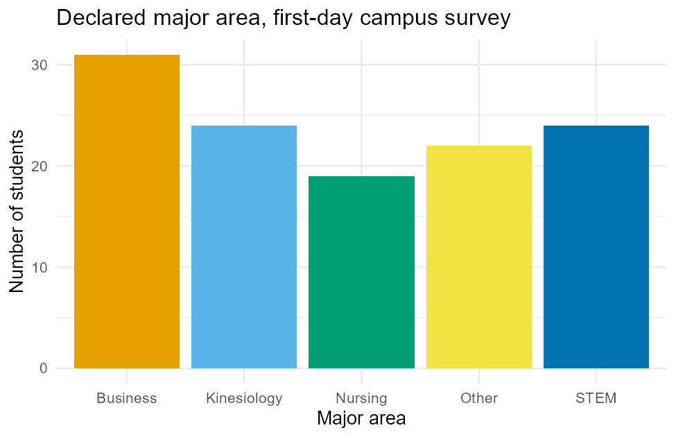
Figure 3:Bar chart of major area, matching the tally(~ major_area) counts above.
gf_bar() counts rows per category automatically — it’s the picture version
of the tally(~ major_area) table above; you can check the bar heights
against those exact counts (31, 24, 19, 22, 24). Each category also gets its
own Okabe–Ito color and, more importantly, its own labeled position on the
x-axis, so the category identity never depends on color perception alone.
5.4Scatterplot: two numerical variables, with a fitted line
gf_point(exam_score ~ study_min, data = survey, color = "#0072B2", alpha = 0.75) %>%
  gf_lm(color = "#D55E00") %>%
  gf_labs(title = "Exam score vs. weekly study time",
          x = "Weekly study time (minutes)", y = "Exam 1 score (points)")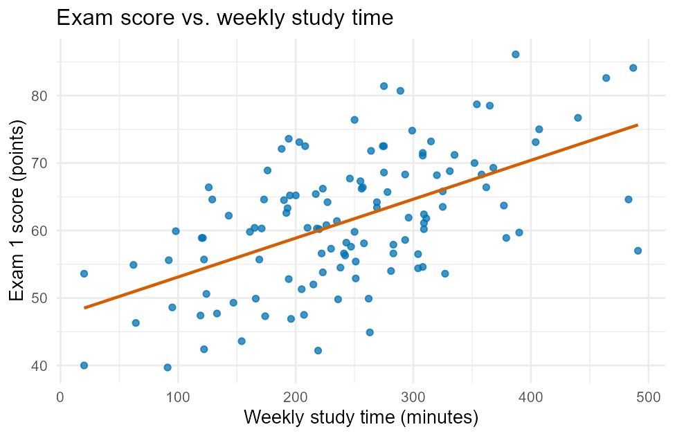
Figure 4:Scatterplot of exam score vs. weekly study time, with a fitted line from gf_lm().
gf_point(y ~ x, data = ) puts study_min on the x-axis and exam_score
on the y-axis; gf_lm() (piped right after) adds a fitted straight line —
L12 covers fitting and interpreting that line in full. The
numerical version of “how strong is this pattern” is the correlation
coefficient:
cor(exam_score ~ study_min, data = survey)[1] 0.5594575A correlation of about 0.56 matches what the picture shows: a real, positive, but not perfectly tight relationship — more study time tends to go with a higher score, with plenty of individual scatter around the trend.
6Faceting: one plot per group, side by side
Faceting splits a single plot into a grid of small panels, one per level of a grouping variable — useful when a color-by-group plot would get too crowded, or when you want each group’s shape to be easy to compare on its own axis:
gf_histogram(~ sleep_hours, data = survey, binwidth = 0.5,
             fill = "#009E73", color = "white") %>%
  gf_facet_wrap(~ class_year) %>%
  gf_labs(title = "Sleep hours by class year",
          x = "Hours of sleep last night", y = "Number of students")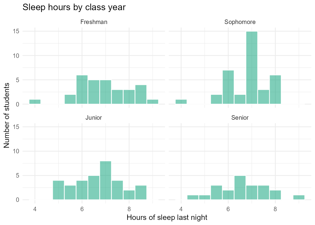
Figure 5:Sleep hours faceted by class year — one histogram panel per group.
gf_facet_wrap(~ class_year) is simply piped onto the same histogram code
from the very first example — faceting is an add-on step, not a different
plot type. Each panel keeps the same x-axis (hours of sleep) so the four
groups’ shapes are directly comparable at a glance; the labeled panel strips
(Freshman, Sophomore, ...) identify each group by text, not color, which
is why faceting is often the most accessible way to compare more than two or
three groups.
7Choosing a plot: a quick guide
| Question | Plot | Function |
|---|---|---|
| What’s the shape of one numerical variable? | Histogram | gf_histogram(~x, data=) |
| How does one numerical variable compare across groups? | Boxplot | gf_boxplot(y ~ g, data=) |
| How many cases fall in each category? | Bar chart | gf_bar(~x, data=) |
| How are two numerical variables related? | Scatterplot | gf_point(y ~ x, data=) |
| Compare a plot’s shape across many groups at once? | Faceted version of any of the above | %>% gf_facet_wrap(~g) |
8Summary
favstats(y ~ g, data=)andtally(~x, data=)/tally(y ~ x, data=)(addformat = "proportion"for proportions) are the numerical and categorical summary workhorses of EDA.gf_histogram,gf_boxplot,gf_bar, andgf_pointfollow the samegoal( y ~ x, data = )formula pattern as every othermosaicfunction;gf_lm()adds a fitted line to a scatterplot.%>% gf_facet_wrap(~g)splits any plot into one labeled panel per group — add it to an existing plot, don’t rebuild from scratch.Every plot with a color/fill grouping uses the Okabe–Ito palette via
scale_*_manual(values = ...), and color is always backed by a label — never the only way to tell groups apart.The full script that generated every figure in this lesson is committed at
data/make_L07_figures.R— run it yourself to reproduce every picture and every number exactly.