1Objectives
By the end of this lesson you will be able to:
Explain what a sampling distribution is and why it’s different from the distribution of the raw data.
Simulate a sampling distribution of the mean with the
do(1000) * mean(~x, data = resample(D))pattern.Plot a simulated sampling distribution with
gf_histogram()and read its shape, center, and spread.Compare a simulated standard error to the theoretical value .
Explain, using your own simulation, what the Central Limit Theorem (CLT) says and why it matters for inference.
2One sample, or many samples?
Every statistic you’ve computed so far — favstats()'s mean, tally()'s
proportion — came from one sample of 120 students. But that one sample
was never guaranteed to look exactly like a different sample of 120
students would have. A sampling distribution is the distribution you’d
get if you could repeat “take a sample, compute a statistic” over and over
— not the distribution of individual students, but the distribution of the
statistic itself, across many hypothetical samples. You can’t actually
resurvey the whole population a thousand times, but you can simulate it,
and that simulation is this lesson’s whole point. Reload the toolkit and data if
you’re starting fresh:
suppressMessages({library(mosaic); library(BSDA)})
survey <- read.csv("data/survey_sim.csv")
set.seed(2200)3A skewed population, on purpose
To see the sampling-distribution idea do real work, we need a population
that isn’t already bell-shaped — otherwise “the sampling distribution
looks normal” wouldn’t be surprising. commute_min (minutes to campus) is
exactly that: it’s generated from a right-skewed Gamma model in
data/make_survey_sim.R (a few very long commutes stretch the distribution
out to the right).
favstats(~ commute_min, data = survey) min Q1 median Q3 max mean sd n missing
7 15 22 30 79 26.21667 16.0043 120 0The mean (26.2) sits noticeably above the median (22) — a classic right-skew signature, confirmed by the plot:
gf_histogram(~ commute_min, data = survey, binwidth = 5,
             fill = "#D55E00", color = "white") %>%
  gf_labs(title = "Population: commute minutes, all 120 surveyed students",
          x = "Commute time (minutes)", y = "Number of students")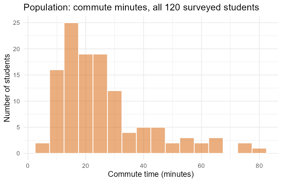
Figure 1:The population we’ll repeatedly resample from — deliberately skewed, not bell-shaped.
This whole survey data frame — all 120 rows — is our stand-in
population for this lesson. Its true mean is minutes
and its true standard deviation is minutes; both are known
exactly because we have the entire population, not just a sample of it.
4resample(): one simulated sample from D
resample(D, size = n) draws n rows from data frame D with
replacement — a mosaic function built for exactly this kind of
simulation. One call gives you one simulated sample:
set.seed(2200)
one_resample <- resample(survey, size = 30)
dim(one_resample)
head(one_resample[, c("student_id", "commute_min")], 4)
[1] 30 10
student_id commute_min
44 S044 28
65 S065 9
47 S047 23
24 S024 1730 rows, same 10 columns as survey — and because it’s with replacement,
the same student (row 44, 65, ...) can appear more than once across many
calls, and some students won’t appear at all in a given call. That
“with replacement” detail matters: it’s what lets resample() stand in for
“draw a fresh sample from the population” even though it’s technically
reusing the same 120 rows every time.
5The core pattern: do(1000) * mean(~x, data = resample(D))
One resample gives one simulated sample mean. Wrapping it in do(1000) *
repeats the whole “resample, then compute the mean” process 1000 times,
building an actual simulated sampling distribution:
set.seed(2200)
sim30 <- do(1000) * mean(~ commute_min, data = resample(survey, size = 30))
head(sim30, 4)
mean
1 26.70000
2 32.23333
3 26.43333
4 23.06667Read this the way you’d read any do() output (L08 used the
same pattern for rflip()): each of the 1000 rows is one simulated
“resample 30 students, compute their mean commute time” experiment. Row 1’s
simulated sample happened to average 26.70 minutes; row 2’s, 32.23 minutes;
and so on — 1000 different simulated sample means, one whole distribution’s
worth. Summarize and plot that distribution exactly like any other numeric
column, because that’s exactly what it is:
favstats(~ mean, data = sim30) min Q1 median Q3 max mean sd n missing
18.73333 24.19167 25.96667 28.03333 35.46667 26.14273 2.864828 1000 0gf_histogram(~ mean, data = sim30, binwidth = 1,
fill = "#0072B2", color = "white") %>%
gf_labs(title = "Sampling distribution of the mean, n = 30 (1000 reps)",
x = "Sample mean commute time (minutes)", y = "Number of simulated samples")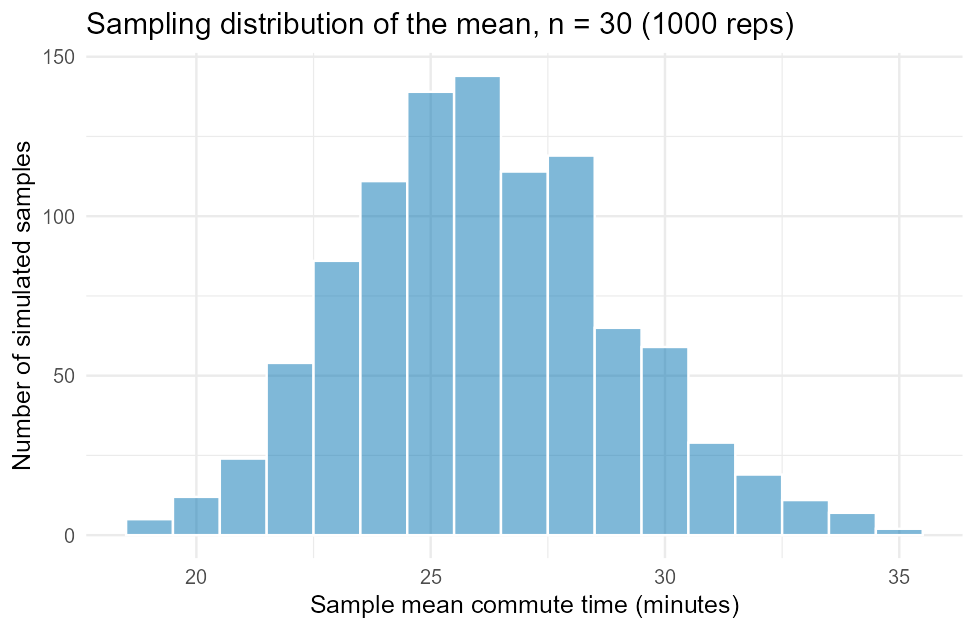
Figure 2:The simulated sampling distribution of the mean, n = 30 — symmetric and bell-shaped, unlike the skewed population it came from.
Compare this figure to the population histogram above: individual commute times are right-skewed and spread from 7 to 79 minutes, but sample means of 30 commute times are roughly symmetric and bell-shaped, clustered tightly between about 19 and 35 minutes. That gap between “what one observation looks like” and “what an average of many observations looks like” is the entire reason sampling distributions matter for inference — it’s coming back in L10 the moment we build a confidence interval.
6Simulated SE vs. the theoretical formula 
The standard error (SE) of the mean is the standard deviation of the sampling distribution itself — how much the sample mean typically bounces around from sample to sample. You just simulated that distribution, so you can read its SE straight off the simulation, with no formula at all:
sd(~ mean, data = sim30)[1] 2.864828Statistical theory gives a formula for the same quantity, using only the population SD and the sample size :
sd(~ commute_min, data = survey) / sqrt(30)[1] 2.9219722.86 (simulated) vs. 2.92 (formula) — close, not identical, because a
simulation of 1000 reps is itself a sample of the true sampling
distribution and carries its own small amount of noise. Run more reps
(do(10000) * ...) and the two numbers converge even closer. This
agreement is the real payoff of simulating first: the formula isn’t a
mysterious rule to memorize, it’s a shortcut for something you can also just
go and simulate directly.
7The Central Limit Theorem, illustrated by changing 
The Central Limit Theorem (CLT) says: as sample size grows, the
sampling distribution of the mean gets closer to a normal (bell) shape and
narrower around — no matter how skewed the original population is.
commute_min’s skewed population is the perfect test case. Repeat the exact
same simulation at three sample sizes:
set.seed(2200)
sim5   <- do(1000) * mean(~ commute_min, data = resample(survey, size = 5))
set.seed(2200)
sim100 <- do(1000) * mean(~ commute_min, data = resample(survey, size = 100))
sd(~ mean, data = sim5)
sd(~ commute_min, data = survey) / sqrt(5)
sd(~ mean, data = sim100)
sd(~ commute_min, data = survey) / sqrt(100)[1] 7.362373
[1] 7.157339
[1] 1.578016
[1] 1.60043| n | Simulated SE | Theoretical SE () |
|---|---|---|
| 5 | 7.36 | 7.16 |
| 30 | 2.86 | 2.92 |
| 100 | 1.58 | 1.60 |
Every row agrees closely, and the SE shrinks as grows — exactly what predicts, since a bigger sits in a bigger denominator. Faceting the three sampling distributions side by side shows the shape half of the CLT, not just the spread:
sim5$n   <- "n = 5"
sim30$n  <- "n = 30"
sim100$n <- "n = 100"
all_sims <- rbind(sim5[, c("mean", "n")], sim30[, c("mean", "n")], sim100[, c("mean", "n")])
all_sims$n <- factor(all_sims$n, levels = c("n = 5", "n = 30", "n = 100"))

gf_histogram(~ mean, data = all_sims, binwidth = 2,
             fill = "#009E73", color = "white") %>%
  gf_facet_wrap(~ n, scales = "free_y") %>%
  gf_labs(title = "Sampling distribution of the mean narrows and normalizes as n grows",
          x = "Sample mean commute time (minutes)", y = "Number of simulated samples")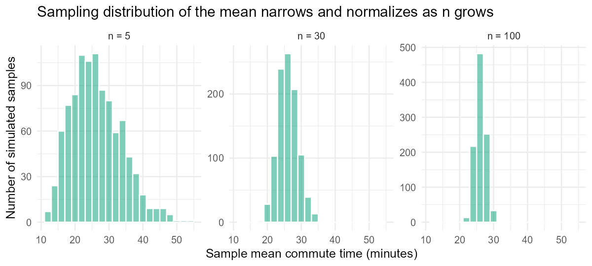
Figure 3:The same skewed population, resampled at three sample sizes: as n grows, the sampling distribution of the mean narrows and its shape straightens out toward normal.
The n = 5 panel still shows a hint of the population’s right skew (a
longer tail on the right) and is noticeably wide. By n = 100, the skew has
essentially vanished and the panel is tight and symmetric around the
population mean. Nothing about commute_min itself changed between panels
— only the sample size used to build each mean. That is the Central Limit
Theorem, not as a memorized statement, but as something you just watched
happen in three histograms, generated from data you know is skewed to begin
with.
mosaic’s %>% gf_facet_wrap(~n) is the identical faceting tool from
L07 — one more place a skill you already have keeps paying off.
8Summary
A sampling distribution is the distribution of a statistic (like ) across many hypothetical samples — not the distribution of the raw data.
resample(D, size = n)draws one simulated sample ofnrows from data frameD, with replacement;do(1000) * mean(~x, data = resample(D, size = n))repeats that 1000 times, building a full simulated sampling distribution you canfavstats()andgf_histogram()like any other numeric column.The simulated standard error (
sd()of the sampling distribution) closely matches the theoretical formula — the formula is a shortcut for what you can also simulate directly.The Central Limit Theorem: as grows, the sampling distribution of the mean narrows (SE shrinks, since is in the denominator) and its shape moves toward normal — even when, as with
commute_min, the underlying population is skewed.The full script that generated every figure and number in this lesson is committed at
data/make_L09_figures.R— run it yourself to reproduce every output exactly.