Every fall, the SPCA-style shelter near campus takes in a few hundred cats and dogs and tracks two simple facts about each one: how big it is, and whether it gets adopted. Down the street, a coffee shop tracks a different pair of facts: what time of day a customer orders, and what they order. Both places are sitting on categorical data — labels, not numbers — and both questions (“does size matter for adoption?” “does the order change by time of day?”) are questions about whether two categories move together. This week you’ll learn to organize that kind of data honestly, read it out of a table, and take your first step into probability: using what already happened to say something about what’s likely to happen next.
1Counting categories: frequency tables and honest bar charts
A frequency is just a count: how many observations fall in a category. A relative frequency divides that count by the total, so categories of different sizes become comparable — usually written as a proportion (a decimal between 0 and 1) or a percent (the proportion × 100).
Worked Example 1 — Shelter intake by size. A local animal shelter records the size (Small,
Medium, Large) and adoption outcome (Adopted, Not adopted) of its last intakes (simulated
data, shelter_sim, generated with set.seed(1209) so the numbers below are exactly reproducible).
The frequency table for size alone is:
| Size | Frequency | Relative frequency (%) |
|---|---|---|
| Small | 71 | 29.6% |
| Medium | 102 | 42.5% |
| Large | 67 | 27.9% |
| Total | 240 | 100.0% |
Medium-size animals are the most common intake (42.5%), and Small and Large are fairly close (29.6% vs. 27.9%).
Why the y-axis matters. The same three counts (71, 102, 67) can be drawn to tell two different stories. An honest bar chart puts 0 at the bottom of the y-axis, so bar height is proportional to count: Medium’s bar is genuinely about 1.5× as tall as Large’s (). Now suppose someone draws the same chart but starts the y-axis at 60 instead of 0 — a common trick. Measured from that new baseline, the visible bar lengths become , , and , so Medium’s bar now looks about times taller than Large’s — about four times more dramatic than the real 1.52-times difference, from identical data. A bar chart’s y-axis should always start at 0; if it doesn’t, treat every visual comparison with suspicion. The same caution applies to pie charts: humans are bad at comparing the areas of wedges (especially more than 3–4 of them, or any wedge drawn in fake “3-D” that distorts the front slices), so a table or bar chart is almost always the more honest and more readable choice.
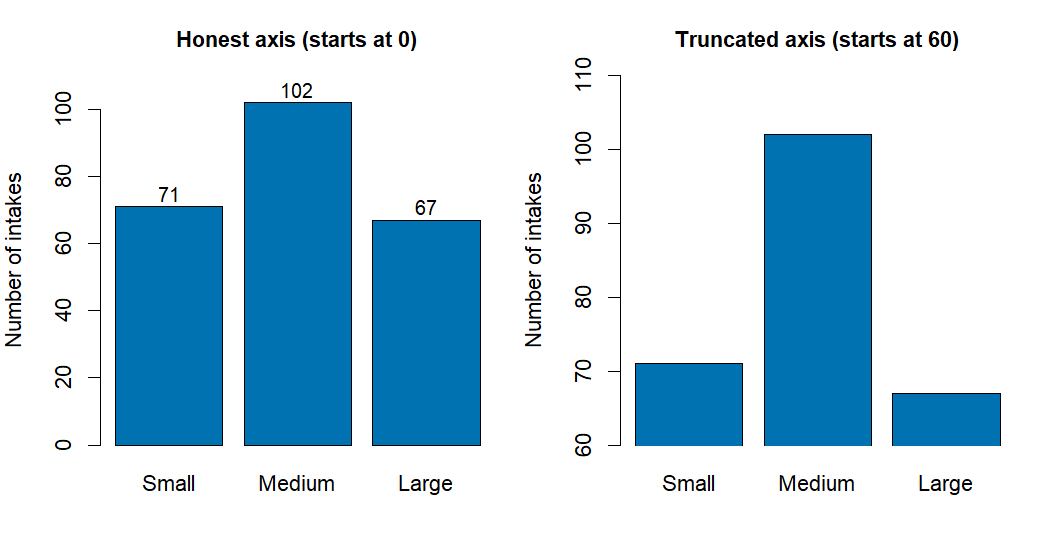
Figure 1. Two bar charts of the same shelter-size counts (Small 71, Medium 102, Large 67) sit side by side. The left chart’s axis starts at 0, and Medium’s bar looks moderately taller than the others. The right chart’s axis is truncated to start at 60, stretching the same gaps so Medium’s bar towers roughly six times over Large’s — a visually exaggerated impression built from unchanged numbers.
2Two-way tables: marginal, joint, and conditional proportions
A two-way (contingency) table cross-tabulates two categorical variables at once — one across the columns, one down the rows — so you can see how they relate. Three kinds of proportions come out of the same table:
Marginal proportion — a proportion for one variable alone, found in the table’s outer margin (row totals or column totals) ignoring the other variable.
Joint proportion — the proportion of all observations that fall in one specific cell (one category of each variable at once): .
Conditional proportion — the proportion of one variable’s categories within a single row or column of the other variable: . This is the one that answers “given size X, what fraction were adopted?”
Worked Example 1, continued. Crossing size with adoption outcome gives:
| Small | Medium | Large | Total | |
|---|---|---|---|---|
| Adopted | 55 | 64 | 25 | 144 |
| Not adopted | 16 | 38 | 42 | 96 |
| Total | 71 | 102 | 67 | 240 |
Marginal: Overall, of all intakes were adopted (ignore size entirely).
Joint: of all 240 animals were both Small and Adopted (); were both Large and Not adopted ().
Conditional (column-wise, adoption rate within each size): ; ; .
Those three conditional numbers — 77.5%, 62.7%, 37.3% — tell a clear story: the adoption rate drops steadily as size goes up. That pattern is exactly what a segmented (stacked) bar chart or a mosaic plot is built to show. In a segmented bar for each size category, the “Adopted” portion shrinks from about three-quarters of the Small bar, to about two-thirds of the Medium bar, to just over a third of the Large bar. Because the conditional proportions change noticeably across size categories, size and adoption outcome appear associated — if they weren’t, all three bars would show roughly the same 60% adopted / 40% not-adopted split as the marginal total.
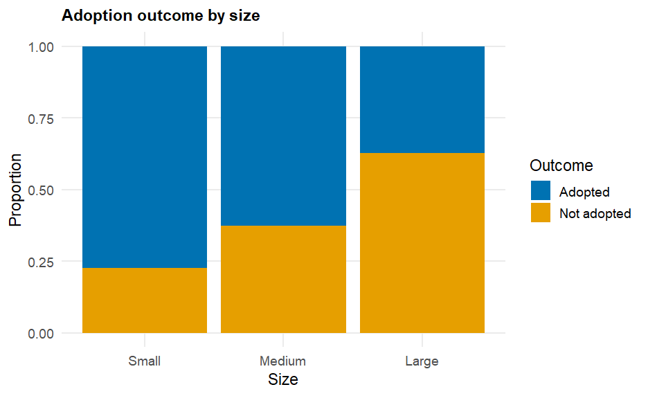
Figure 2. A stacked (segmented) bar chart with one bar per size category, each bar’s height filling 100%. Within each bar, the “Adopted” segment shrinks from about 77.5% of the Small bar, to 62.7% of the Medium bar, to 37.3% of the Large bar — a visibly decreasing share that signals size and adoption outcome are associated, not independent.
3A first look at probability: long-run relative frequency
A sample space is the list of every possible outcome of some process; an event is any subset of the sample space you care about. Probability, , measures how likely event is, always a number between 0 and 1 (0 = never happens, 1 = always happens). The interpretation this course leans on is the long-run relative frequency: if you could repeat the same process over and over, is the proportion of repetitions in which happens, in the long run. The complement of an event , written , is “ does not happen,” and complements always satisfy , since together and use up all the probability there is.
Worked Example 2 — Coffee orders by time of day. A campus coffee shop logs orders
(simulated data, coffee_sim, set.seed(1209)): the time of day (Morning or Afternoon) and the order
type (Drip, Latte, Cold Brew). The sample space for order type is . Treating each recorded order as a repetition of the same “what does the next
customer order?” process, the marginal relative frequencies estimate each order type’s probability:
| Order type | Frequency | Relative frequency |
|---|---|---|
| Drip | 105 | |
| Latte | 94 | |
| Cold Brew | 101 | |
| Total | 300 | 1.000 |
So , and by the complement rule — about 68.7% of customers order something other than a latte. Crossing order with time of day shows the probabilities shift once you condition on when: among the 169 Morning orders, were Drip, while among the 131 Afternoon orders, were Cold Brew — a reasonable pattern (people wake up on drip, cool down on cold brew).
Why “long run”? A single flip of a fair coin is unpredictable, but many flips settle down. Flipping
a simulated fair coin 1000 times (set.seed(1209)), the running proportion of heads was 0.400 after
10 flips, 0.460 after 100 flips, and 0.500 — exactly 500 heads out of 1000 — after all 1000 flips.
Early on, relative frequency bounces around; as grows, it settles toward the true probability
(0.5 for a fair coin). This pattern is the Law of Large Numbers, and it’s exactly why the
shelter and coffee-shop proportions above are useful: with hundreds of observations, their relative
frequencies are a trustworthy estimate of the underlying probabilities.
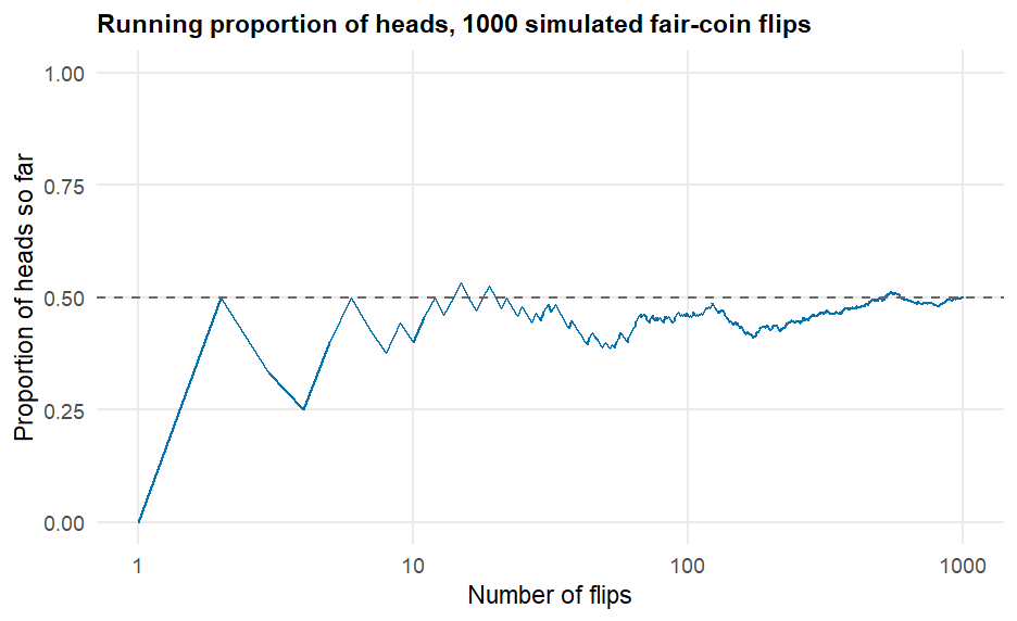
Figure 3. A line graph tracks the running proportion of heads across 1000 simulated fair-coin flips. The line swings widely at first — 40% heads after 10 flips — then the swings shrink as the flip count grows, and the line settles in near the horizontal 0.50 reference line, ending at exactly 0.500 by flip 1000.
See it in R.
library(mosaic)

# colorblind-safe (Okabe-Ito) fills, never rely on hue alone --
# the segment/bar labels below also state each percentage in words
ok_2 <- c("#0072B2", "#E69F00")            # Adopted / Not adopted
ok_3 <- c("#0072B2", "#E69F00", "#009E73") # Drip / Latte / ColdBrew

# frequency & relative-frequency table (Example 1)
tally(~ size, data = shelter_sim)
tally(~ size, data = shelter_sim, format = "percent")

# two-way table and conditional proportions: P(adopted | size)
tally(adopted ~ size, data = shelter_sim, margins = TRUE)
tally(adopted ~ size, data = shelter_sim, format = "proportion")

# segmented bar chart (Figure 2)
gf_props(~ size, data = shelter_sim, fill = ~ adopted, position = "fill") %>%
  gf_refine(scale_fill_manual(values = ok_2))

# empirical probability from a marginal table (Example 2)
tally(~ order, data = coffee_sim, format = "proportion")
gf_bar(~ order, data = coffee_sim, fill = ~ order) %>%
  gf_refine(scale_fill_manual(values = ok_3))

# long-run relative frequency demo (Figure 3)
do(1000) * rflip(1)
Running tally(adopted ~ size, data = shelter_sim, format = "proportion") prints exactly the
column-conditional table above (0.775 / 0.627 / 0.373 in the “Adopted” row); gf_props(...) draws
Figure 2 directly from shelter_sim, and do(1000) * rflip(1) reproduces the coin-flip simulation
behind Figure 3.
4Check your understanding
Using the shelter frequency table (71 Small, 102 Medium, 67 Large; ), what percent of all 240 intakes were Large? Round to one decimal place.
Using the two-way table in Example 1, what percent of all 240 animals were adopted, regardless of size? Is this a marginal, joint, or conditional proportion?
Among the Medium-size animals only, what proportion were adopted? Is this a marginal, joint, or conditional proportion — and what does your answer mean in one plain-language sentence?
Figure 2 shows the “Adopted” segment shrinking from about 77.5% (Small) to 62.7% (Medium) to 37.3% (Large). Does adoption outcome appear associated with size? Explain your reasoning using those numbers.
Using the coffee-shop two-way table (Example 2), state the sample space for order type. Among the 169 Morning orders, what proportion were Drip? What is the complement of “the order was Drip” among Morning orders, and what is its probability?
A campus flyer displays the three coffee order-type percentages (Drip 35.0%, Latte 31.3%, Cold Brew 33.7%) as a bar chart whose y-axis starts at 30% instead of 0%. Explain, using those actual percentages, why this could mislead a reader who glances at the chart.
5Key terms
Frequency — a raw count of observations in a category.
Relative frequency — a category’s count divided by the total ; a proportion or percent.
Bar chart — a graph of categorical frequencies or relative frequencies as bar heights; the y-axis must start at 0 to be read honestly.
Two-way (contingency) table — a table cross-tabulating two categorical variables.
Marginal proportion — a proportion for one variable, read from a table’s row or column total, ignoring the other variable.
Joint proportion — the proportion of all observations in one specific cell (both variables at once).
Conditional proportion — the proportion of one variable’s categories within a single row or column of the other variable.
Association — two categorical variables are associated when the conditional proportions of one change noticeably across categories of the other.
Segmented (stacked) bar chart / mosaic plot — graphs that show conditional proportions within each category, useful for spotting association.
Misleading graph — a graph (e.g., a bar chart with a truncated y-axis, or a busy pie chart) that distorts the visual comparison without changing the underlying numbers.
Sample space () — the complete list of possible outcomes of a process.
Event — a subset of the sample space; something that either happens or doesn’t on a given trial.
Probability, — a number between 0 and 1 measuring how likely event is; interpreted here as long-run relative frequency.
Complement () — the event “ does not happen”; .
Law of Large Numbers — as the number of repetitions grows, the observed relative frequency of an event settles toward its true probability.