This week in one line: you’ll meet the Normal curve, use the 68–95–99.7 rule to estimate proportions without calculus, and learn the z-score, a single number for “how far from typical.”
Look back at last week’s density curves — the smooth outline you sketched over a histogram of adult heights or test scores. Most of those curves shared one particular shape: a single hump, tallest in the middle, tapering off evenly on both sides like a bell. That shape is common enough, and useful enough, that it gets its own name and its own mathematical model — the Normal distribution.
This week you’ll learn to read that curve, use a simple rule to estimate proportions from it without any calculus, and start measuring “how far from typical” a single value really is.
1The Normal (bell) curve
A Normal distribution is a specific bell-shaped density curve: symmetric (the left half is a mirror image of the right half) and unimodal (one hump, no second peak). Unlike the shelter or coffee-shop tables from Week 3, a Normal curve isn’t built by counting categories — it’s a smooth model for a numerical variable, and it’s completely described by just two numbers:
(the Greek letter “mu”) — the mean, which sits exactly at the curve’s center and its peak.
(the Greek letter “sigma”) — the standard deviation, which controls how wide or narrow the bell is. A small makes a tall, narrow bell (values cluster tightly around ); a large makes a short, wide bell (values spread out).
Statisticians write to mean “the variable follows a Normal model with mean and standard deviation .” Every Normal curve — tall and narrow or short and wide — has the same overall shape; only and change where it’s centered and how spread out it is.
Why this particular shape keeps showing up. Heights, birth weights, measurement errors, and standardized test scores all tend to look approximately Normal. The reason is that each of these values is the net result of many small, independent factors adding together (genes, environment, timing, rounding error). It turns out that whenever you add up a lot of small independent effects, the result tends toward this exact bell shape — a fact called the Central Limit Theorem, which you’ll meet properly in Week 9. For now, just trust the pattern: it’s why the Normal model is worth learning well.
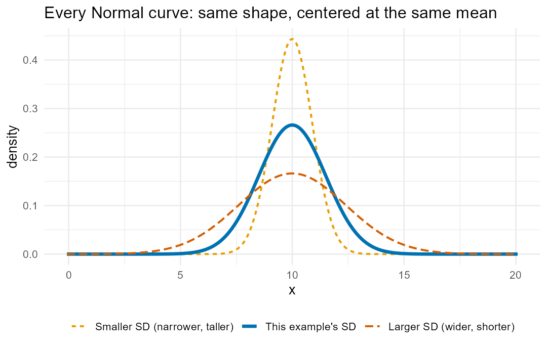
Figure 1. A single bell-shaped curve, tallest and centered at , falling away symmetrically on both sides and never quite touching the horizontal axis. Two reference curves are sketched faintly behind it: one taller and narrower (smaller ) and one shorter and wider (larger ), both centered at the same , showing that controls spread while only shifts the center.
2The empirical rule: 68–95–99.7
Because every Normal curve has the same shape, the proportion of values within a given number of standard deviations of the mean is always the same, no matter what and are. This fact is the empirical rule (also called the 68–95–99.7 rule):
About 68% of values fall within 1 SD of the mean: the interval .
About 95% of values fall within 2 SD of the mean: the interval .
About 99.7% of values fall within 3 SD of the mean: the interval .
Running the exact Normal model in R (see See it in R below) confirms these are rounded numbers: the precise areas are , , and . Because the curve is symmetric, whatever percentage is left over after each interval splits evenly between the two tails — e.g., left over at SD means in each tail (exactly: each, from ).
Worked Example 1 — Cat weights. Suppose, for this example, adult indoor-cat body weight is modeled as Normal with mean lb and standard deviation lb (a stated model for practice, not a fitted real dataset — the exact Normal fit for a real shelter population is a job for later coursework). Using the empirical rule:
| SDs from mean | Interval | Approx. % of cats |
|---|---|---|
| 1 | lb | 68% |
| 2 | lb | 95% |
| 3 | lb | 99.7% |
So about 68% of cats weigh between 8.5 and 11.5 lb, and only about weigh more than 13 lb
(2 SD above the mean) — a genuinely heavy cat by this model. A cat weighing exactly 12 lb is
SDs above the mean — not a round grid line, so the empirical rule alone
can’t give an exact percentage. That’s exactly the gap Week 8’s tools close: R’s xpnorm reports
the precise answer, , meaning about 9 in 100 cats in this model weigh more than
12 lb.
3Standardizing: the z-score
A z-score answers one question in one number: how many standard deviations is a value from the mean, and in which direction?
Subtract the mean, then divide by the standard deviation — one subtraction, one division. A positive
means is above the mean; negative means below; means is the mean exactly. A value
with sits right on one of the empirical-rule grid lines above; any other falls
between grid lines, which is where a tool like xpnorm is most useful. Standardizing a whole
distribution means converting every value to its z-score, which always produces the standard Normal
distribution, — mean 0, SD 1 — the same reference curve no matter what the original
and were. That shared reference curve is exactly what lets you compare values from two
different Normal models on equal footing.
Worked Example 2 — Commute times. Suppose commute times to campus are modeled as Normal with
minutes and minutes. A commute of 40 minutes is exactly 1 SD above the mean
(), so the empirical rule says about of commutes are longer than 40 minutes. A commute
of 45 minutes gives — between the 1-SD and 2-SD grid lines. The empirical rule can
only say “somewhere between 15.87% and 2.28%”; xpnorm gives the exact figure, .
Worked Example 3 — Comparing across two different Normal models. Suppose (again, a stated model for practice) ACT composite scores follow and SAT total scores follow — the ACT and SAT are two US college-entrance exams, each scored on its own scale. Student A scores a 27 on the ACT; Student B scores a 1250 on the SAT. Raw scores aren’t comparable — a 27 and a 1250 live on completely different scales — but their z-scores are:
Student A’s score sits 1.2 SDs above the ACT mean; Student B’s sits 1.0 SD above the SAT mean.
Because , Student A’s score is relatively higher — farther above typical within its own
distribution — even though 1250 is a much bigger raw number than 27. (A related question you’ll
answer precisely starting in Week 8: what raw score marks the cutoff for, say, the top 10% of
test-takers? That needs invNorm/xqnorm, run backwards from a percentage to a value — OpenIntro
Chapter 4.)
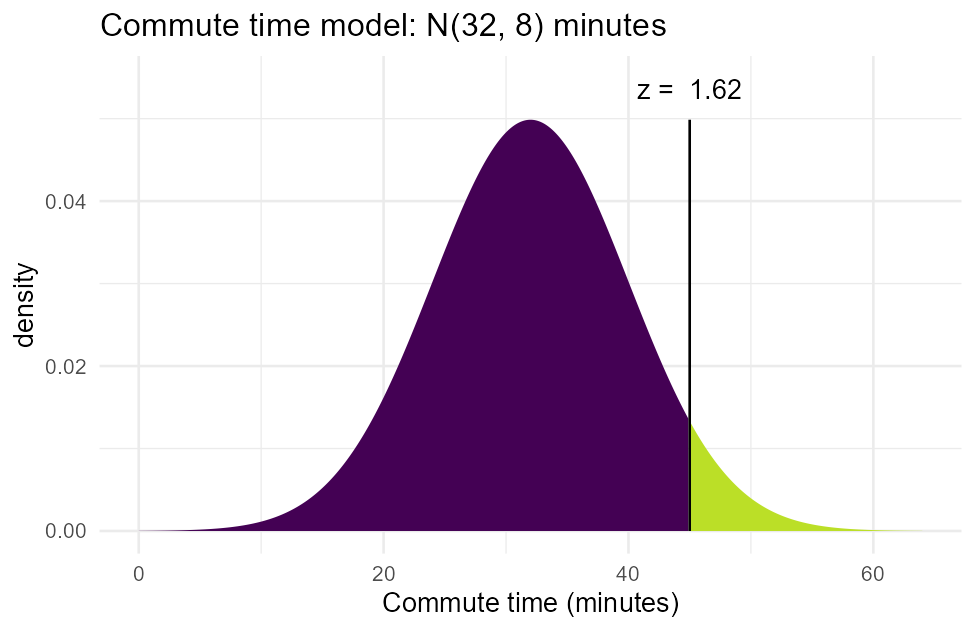
Figure 2. A shaded Normal curve for the commute-time model (, ): the region to the right of minutes is filled in, visually thin compared to the whole area under the curve, matching the computed .
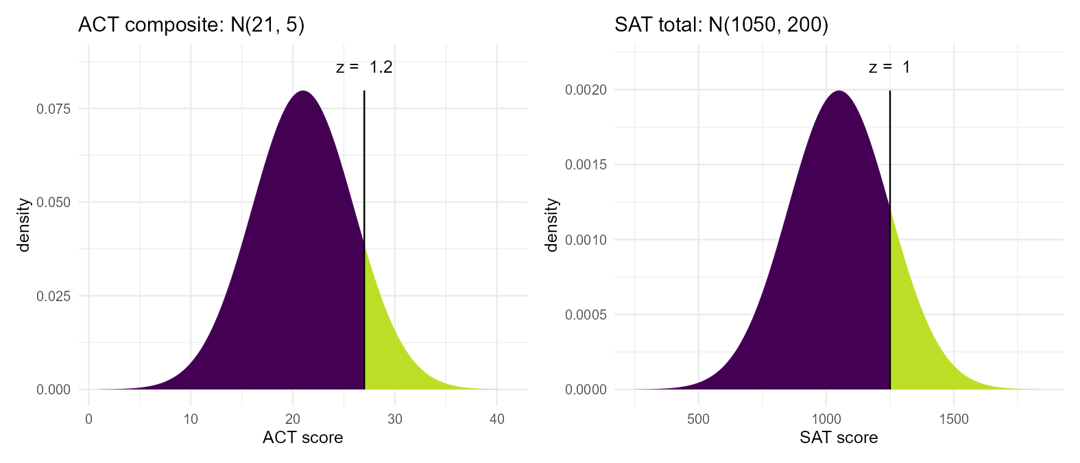
Figure 3. Two Normal curves drawn on separate axes side by side — one for ACT scores centered at 21, one for SAT scores centered at 1050 — each with a vertical mark at the student’s score. Student A’s mark sits slightly farther out into its curve’s right tail (relative to that curve’s own width) than Student B’s mark does in its curve, visually confirming .
See it in R.
library(mosaic)

# confirm the empirical rule from the exact Normal model (no simulation needed --
# this is a deterministic calculation, the same for any mu, sigma)
xpnorm(c(-3,-2,-1,1,2,3), mean = 0, sd = 1)   # standard-normal grid lines

# Worked Example 1: cat weights, mu = 10, sd = 1.5
xpnorm(12, mean = 10, sd = 1.5)     # off-grid cutoff -- prints z, picture, P(X>12)

# Worked Example 2: commute times, mu = 32, sd = 8
xpnorm(45, mean = 32, sd = 8)       # off-grid cutoff -- prints z, picture, P(X>45)
Running xpnorm(12, mean = 10, sd = 1.5) prints the standardized value along with a
shaded picture and the two areas and — matching above.
xpnorm(45, mean = 32, sd = 8) prints and , matching above.
4Check your understanding
Using the cat-weight model from Worked Example 1 ( lb, lb), what weight range holds the middle 68% of cats? What percent of cats weigh less than 8.5 lb?
Using the commute-time model ( min, min), what time range holds the middle 99.7% of commutes? What percent of commutes are longer than 56 minutes?
Two commuting groups have separate Normal models: Group A minutes, Group B minutes. A Group-A commuter takes 44 minutes; a Group-B commuter takes 34 minutes. Compute each commuter’s z-score. Whose commute is more unusual relative to their own group, and why does the raw time (44 vs. 34) not answer that question by itself?
Sketch a Normal curve for the cat-weight model and shade the region representing “cats weighing between 7 and 13 pounds.” What percent does that shaded region represent, and which rule tells you?
Suppose CSUB students’ nightly sleep is modeled as Normal with hours, hour. What percent of students sleep less than 5 hours? Interpret your answer in one plain-language sentence.
In your own words, explain what a z-score of 0 means about a data value, and what a z-score of -3 would tell you.
5Key terms
Normal distribution — a symmetric, unimodal, bell-shaped density curve, fully described by its mean and standard deviation ; written .
Symmetric — the left half of a distribution mirrors the right half.
Unimodal — having exactly one peak (hump).
Empirical rule (68–95–99.7 rule) — for any Normal model, about 68% of values fall within 1 SD of the mean, 95% within 2 SD, and 99.7% within 3 SD.
z-score — ; how many standard deviations is from the mean, and in which direction (positive = above, negative = below).
Standardizing — converting a value (or a whole distribution) to z-scores so it can be compared on the same scale as any other Normal distribution.
Standard Normal distribution, — the Normal model with mean 0 and SD 1; what any Normal distribution becomes once standardized.