1Why study design comes first¶
Drive west out of downtown Bakersfield on a still August afternoon and you can sometimes see the air — a brown haze pressed against the Sierra by the bowl of the San Joaquin Valley. People who live here already know which neighborhoods seem to carry the heaviest load. But “seems” is not evidence. How does anyone know, with numbers, which Kern County communities bear the most environmental burden — and how much trust those numbers deserve?
That question is where statistics begins, and it begins with how the data were collected, long before any average is computed.
California’s environmental-screening tool, CalEnviroScreen 4.0, scores every
census tract in the state for cumulative pollution burden and population
vulnerability. A census tract is just a small, stable neighborhood-sized area
the U.S. Census Bureau draws (usually a few thousand people) so that places can be
compared on equal footing. We have the Kern County slice of this tool on our data
shelf as kern_calenviroscreen: one row for each of 151 census tracts, each
described by 40 variables (a “variable” is one recorded characteristic, like
population or pollution level — defined fully in §1.1). The codebook
data/codebooks/kern_calenviroscreen.md lists them all.
ces <- read.csv("data/processed/kern_calenviroscreen.csv")

# Each tract's CalEnviroScreen percentile ranks it against ALL California
# tracts; higher = more burdened. How many Kern tracts land above the
# statewide 75th percentile (the top quarter of the state)?
n_scored   <- sum(!is.na(ces$ces_percentile))
n_high     <- sum(ces$ces_percentile > 75, na.rm = TRUE)
pct_high   <- 100 * n_high / n_scored

c(tracts_scored = n_scored, in_top_quarter = n_high,
  percent = round(pct_high, 1))
Of the 147 Kern tracts that CalEnviroScreen could score, 73 — nearly half
(49.7%) — sit in the top quarter of the entire state for cumulative
environmental burden (computed above from kern_calenviroscreen; the codebook
lists ces_percentile as the statewide percentile, higher = more burdened). If
Kern were just an average county, you would expect about a quarter of its tracts
in the statewide top quarter. Half is a striking number — and the only reason we
can state it at all is that someone defined a tract, chose which pollutants to
measure, decided how to combine them into a score, and recorded which value
belonged to which place.
This chapter is about those decisions. Before you can summarize data (Chapter 2), visualize it (Chapter 3), or run a single test (Chapters 8–13), you need to know what the data are, how they were gathered, and what questions they can honestly answer. Get the design wrong and every later calculation, however elegant, is built on sand.
2Learning objectives¶
By the end of this chapter you will be able to:
Define population, sample, observation, variable, and variable type (numerical vs. categorical; discrete/continuous; ordinal/nominal) and identify each in a real Kern dataset.
Distinguish observational studies from experiments and explain how study design constrains the scope of inference (association vs. causation).
Identify sources of statistical bias (sampling, non-response, confounding) in a described study and explain their effect on conclusions.
Classify sampling strategies (simple random, stratified, cluster, convenience) and select an appropriate one for a stated question.
Load a dataset into R and inspect its structure (
glimpse, variable types, dimensions, missingness).
31.1 Data, observations, and variables¶
3.1Intuition¶
A dataset is just an organized table. Picture a spreadsheet: each row is
one thing you measured, and each column is one characteristic you
recorded about it. In kern_calenviroscreen, each row is a census tract and each
column is something measured about that tract — its population, its PM2.5 level,
its poverty rate.
The vocabulary is worth getting right once, because the whole course uses it:
An observation (or case, or unit) is a single entity you have data on — here, one census tract. It is a row.
A variable is a single characteristic recorded for every observation — here, PM2.5 concentration or total population. It is a column.
The population is the entire collection of units you want to learn about (every census tract in Kern County).
A sample is the subset you actually have data on. When you have the whole population — as we nearly do here — there is no sampling, and the numbers describe the county directly.
3.2Variable types¶
Variables come in two big families, and almost every choice you make later — which graph, which summary, which test — depends on which family a variable is in.
A numerical variable records a number you can do arithmetic on (averaging it means something). PM2.5 concentration (µg/m³) is numerical. Numerical variables are continuous if they can take any value in a range (a measurement like concentration) or discrete if they come in countable jumps (a count like “number of monitors”).
A categorical variable records which group an observation falls into. Crop type (“ALMONDS”, “GRAPES”) is categorical. A categorical variable is ordinal if its categories have a natural order (class standing: Freshman < Sophomore < Junior < Senior) and nominal if they do not (major, county region).
A useful test: if averaging the values would be nonsense, the variable is categorical. The “average major” is meaningless; the average PM2.5 is not.
3.3R¶
Loading a dataset and reading off its structure is the first real R skill in this
course. Every curated dataset lives as a .csv file in data/processed/, and
you read one into a data frame with read.csv() — the book, the Shiny app, and
the labs all reach the data the same way.
# Load the dataset by pointing read.csv() at its file in data/processed/:
ces <- read.csv("data/processed/kern_calenviroscreen.csv")

# How big is it? rows = observations, columns = variables:
dim(ces)            # -> 151  40

# A compact view of every column, its type, and the first few values:
dplyr::glimpse(ces)

# Base-R alternative if you have not loaded dplyr:
str(ces)
dim(ces) returns 151 40: 151 observations (tracts) and 40 variables
(confirmed against kern_calenviroscreen). glimpse() prints one line per
column showing its name, its type (<dbl> for a number, <chr> for text), and a
preview — your fastest way to see what kind of variable each column is before
you do anything with it.
41.2 Observational studies vs. experiments¶
4.1Intuition¶
Here is the single most important distinction in this chapter, because it decides what your data are allowed to claim.
In an observational study, you watch and record what is already happening; you do not assign anyone or anything to a condition. CalEnviroScreen is observational: nobody decided which tracts would have high PM2.5. We simply recorded the pollution where it fell.
In an experiment, the researcher assigns the treatment — ideally at random. If you randomly gave half of a group a new tutoring method and half the old one, you ran an experiment.
Why does the distinction matter so much? Because of one word: confounding. A confounding variable is a third variable linked to both of the things you are comparing, offering an alternative explanation for any pattern you see. Tracts with high pollution also tend to have high poverty, less green space, older housing — any of which could be the real driver of, say, an asthma difference. In an observational study you usually cannot untangle them.
This leads to the rule that governs honest data analysis:
Observational data can establish association. Only a well-run experiment can establish causation. Random assignment is what breaks the link between the treatment and every confounder, so that a difference in outcomes can be credited to the treatment itself.
4.2Scope of inference¶
Two design choices set the limits — the scope of inference — of any study:
Were units assigned at random to groups? If yes causal conclusions are on the table. If no (observational) association only.
Were units sampled at random from a population? If yes you can generalize to that population. If no conclusions stay limited to the units you observed.
So a study can be any combination: a randomized experiment on a convenience sample (causal, but hard to generalize), or an observational study on a random sample (generalizable association, no causation). Name both axes before you trust any headline.
4.3R¶
R does not decide scope of inference for you — you do, from how the data were
collected. But R helps you see the structure that hints at the design. Here we
peek at the simulated first-day class survey (firstday_survey_sim, a
simulated classroom dataset, not real students — note the _sim):
survey <- read.csv("data/processed/firstday_survey_sim.csv")
dim(survey)                       # 150 students x 8 variables
dplyr::glimpse(survey)

# A categorical variable's categories, with counts:
tally(~ major, data = survey)     # mosaic: a labelled count of each category
This is an observational dataset: students reported their major, work hours, and commute; nobody assigned them. So it can reveal that, say, students who work more tend to study less — an association — but it cannot prove that working causes less studying, because a confounder (a demanding family situation, for instance) could drive both.
51.3 Sampling and bias¶
5.1Intuition¶
Most of the time you cannot measure the whole population, so you take a sample and hope it mirrors the population. The danger is bias: a systematic tendency to miss the truth in a particular direction. Bias is not bad luck — random samples bounce around the truth harmlessly. Bias is a tilt that no amount of extra data will fix, because it is baked into how the data were collected. Three classic sources:
Sampling bias — the method systematically over- or under-represents part of the population. An online poll only reaches people with internet and the patience to click.
Non-response bias — the people who decline to participate differ systematically from those who answer. If unhappy customers are likeliest to return a survey, satisfaction looks worse than it is.
Confounding — (as above) a lurking third variable distorts an observed association.
A bigger biased sample is still biased; it is just confidently wrong. The fix is in the design, not the sample size.
5.2Sampling strategies¶
When you can choose how to sample, four strategies appear constantly:
| Strategy | How it works | When it shines |
|---|---|---|
| Simple random | Every unit has an equal chance; draw at random. | The gold-standard default; needs a list of the whole population. |
| Stratified | Split the population into groups (strata), then randomly sample within each. | When you want to guarantee representation of each group (e.g. each county region). |
| Cluster | Split into groups (clusters), randomly choose whole clusters, measure everyone in them. | When reaching scattered units is costly (e.g. sample whole schools, then survey all students). |
| Convenience | Take whoever is easy to reach. | Fast and cheap — and the most bias-prone; avoid for real conclusions. |
The difference between stratified and cluster sampling trips people up: in stratified sampling you sample some units from every group; in cluster sampling you take all units from some groups.
Going deeper (optional): why the sampling method changes the math later
This is optional and not needed to pass the chapter. Here is the connection to the rest of the course: the clean formulas you will meet for standard errors and confidence intervals (Chapters 6–10) all assume a simple random sample of independent observations. Stratified sampling usually makes an estimate more precise than that baseline (you have removed between-group variation on purpose), while cluster sampling usually makes it less precise (units in the same cluster resemble each other, so each new unit adds less fresh information). The design you choose does not just affect bias — it changes how much a sample-based estimate bounces around, which is the engine of everything in the second half of this book.
5.3R¶
A core habit of trustworthy work is reproducibility: anyone re-running your
code gets your result. In R, random sampling becomes reproducible when you fix the
random seed with set.seed() first.
ces <- read.csv("data/processed/kern_calenviroscreen.csv")

# A reproducible simple random sample of 10 tracts:
set.seed(2200)                       # makes the "random" draw repeatable
idx    <- sample(nrow(ces), size = 10)
ces_10 <- ces[idx, ]
nrow(ces_10)                          # 10

# A stratified idea: sample within levels of a grouping variable.
# (Here we just illustrate the split; real stratified sampling draws
#  a fixed number from each stratum.)
ces$burden_band <- ifelse(ces$ces_percentile > 75, "high", "lower")
table(ces$burden_band, useNA = "ifany")
set.seed(2200) is the small discipline that separates a result you can defend
from one you cannot reproduce. Use it before every simulation in this course.
61.4 Missing data¶
6.1Intuition¶
Real datasets have holes. A tract too small for a reliable estimate, a student who
skipped an “optional” survey item — these become missing values, written NA
(“not available”) in R. Missing data is not just a nuisance; why a value is
missing can itself bias your results. If small, rural tracts are likeliest to be
missing a health indicator, then dropping the missing rows quietly removes rural
places from your conclusion. Always look at how much is missing and where
before you decide what to do about it.
6.2R¶
R has one function that answers “is this missing?” — is.na() — and you build
everything from it. is.na(x) returns TRUE/FALSE for each value, and R
counts a TRUE as 1, so sum(is.na(x)) is just “how many are missing?”
ces <- read.csv("data/processed/kern_calenviroscreen.csv")

# How many tracts are missing the headline CalEnviroScreen percentile?
sum(is.na(ces$ces_percentile))        # 4

# Missing counts for several columns at once: colSums adds up the TRUEs (the
# missing values) down each of the selected columns.
colSums(is.na(ces[c("ces_percentile", "poverty", "ling_isolation")]))
In kern_calenviroscreen, 4 tracts are missing ces_percentile, 4 are
missing poverty, and 9 are missing ling_isolation (linguistic isolation)
— values OEHHA suppresses for tracts too small to estimate reliably (computed
above; see the codebook’s missingness notes). That is missing-not-at-random:
the holes cluster in small tracts, so dropping them is not harmless. Notice that
every summary in this chapter used na.rm = TRUE or na.rm-style handling on
purpose, and reported the count it dropped.
7Worked examples¶
Each example walks the same path you will: intuition formula/definition computation interpretation.
7.1Worked Example 1 — Classifying variables in a real dataset (Kern)¶
Question. In kern_calenviroscreen, classify each of these variables:
tract, total_pop, pm25, ces_percentile. For each, state numerical vs.
categorical and the sub-type.
Intuition. Ask of each column: would averaging it mean something? If yes, numerical; if no, categorical. Then ask whether numbers are measurements (continuous) or counts (discrete), and whether categories are ordered (ordinal) or not (nominal).
Definition recap. Numerical = arithmetic is meaningful; categorical = labels. Continuous = any value in a range; discrete = countable. Ordinal = ordered categories; nominal = unordered.
Computation / reasoning.
str(ces[c("tract", "total_pop", "pm25", "ces_percentile")])tract— a census-tract ID. It is stored as digits, but averaging tract numbers is nonsense, so it is categorical (nominal) — a label.total_pop— a count of people. Numerical, and discrete (you cannot have 5,878.4 people, even though the mean of counts can be a decimal).pm25— a measurement in µg/m³. Numerical, and continuous.ces_percentile— a statewide percentile from 0–100. Numerical and effectively continuous (it can take many in-between values).
Interpretation. Two of these columns are numbers you can summarize with a mean
(Chapter 2); two are labels you summarize with counts and proportions (Chapter 3).
Misclassifying tract as numerical and “averaging” it would be a classic
beginner error — the codebook flags it as an id for exactly this reason.
7.2Worked Example 2 — Counting high-burden tracts (Kern)¶
Question. What fraction of scored Kern tracts rank above the statewide 90th percentile for cumulative environmental burden? Above the 75th?
Intuition. “Above the 90th percentile” means “in the worst-burdened 10% of all California tracts.” We count how many Kern tracts clear that bar, then divide by the number of tracts that actually have a score (excluding the missing ones).
Definition. A proportion is , where (“n”) is the number of non-missing observations. In plain words: count how many cases pass the test, then divide by how many cases you actually had. A percent is just that proportion multiplied by 100 () — the same fact written out of 100 instead of out of 1.
Computation.
n_scored <- sum(!is.na(ces$ces_percentile))   # 147
n_90 <- sum(ces$ces_percentile > 90, na.rm = TRUE)   # 23
n_75 <- sum(ces$ces_percentile > 75, na.rm = TRUE)   # 73
c(p_above_90 = round(100 * n_90 / n_scored, 1),
  p_above_75 = round(100 * n_75 / n_scored, 1))
Working it by hand: scored tracts; 23 exceed the 90th percentile, so
, i.e. 15.6%; and 73 exceed the 75th, so
, i.e. 49.7% (all computed from kern_calenviroscreen).
Interpretation. About 1 in 6 Kern tracts (15.6%) is in the worst-burdened 10% of the entire state, and about half are in the worst-burdened 25%. In a “typical” county you would expect 10% and 25%. Kern is over-represented at the high-burden end — a real finding, and one we can only state because the data were collected the same way for every tract in California, making the percentile comparison fair.
7.3Worked Example 3 — Observational vs. experiment, and scope of inference¶
Question. A researcher notices that, across Kern tracts, higher PM2.5 goes with higher asthma ED-visit rates, and concludes “PM2.5 causes asthma visits in Kern.” Evaluate the claim using study-design vocabulary.
Intuition. Ask the two scope-of-inference questions: was there random assignment ( causation possible) and random sampling ( generalization possible)?
Roadmap. We will check the claim in four short steps: (1) was there random assignment? (2) is there a believable confounder? (3) was there random sampling? (4) put it together into the strongest honest conclusion. Take them one at a time.
Reasoning.
Assignment? No one assigned tracts to “high PM2.5” or “low PM2.5.” This is an observational study, so it can show association, not causation.
Confounding? Yes, plausibly. High-PM2.5 tracts also tend to have higher poverty (the median Kern poverty rate is 51.9% below 2× the federal poverty level, from
kern_calenviroscreen), older housing, and less access to care — any of which could drive asthma visits. PM2.5 and these confounders are tangled.Sampling? The data are every Kern tract (a near-census), so we can describe Kern, but we cannot extend the claim to, say, Fresno.
Interpretation. The honest conclusion is: in Kern County, tracts with higher PM2.5 tend to have higher asthma ED-visit rates (an association). The causal word “causes” overreaches the design. Establishing causation would require either a randomized experiment (impossible/unethical here — you cannot assign people more pollution) or careful methods that adjust for confounders. This is the everyday discipline of scope of inference.
7.4Worked Example 4 — Inspecting structure and missingness (simulated survey)¶
Question. A first-day class survey was collected (firstday_survey_sim, a
simulated dataset — not real students). How many students and variables are
there, what proportion hold a paying job, and which items have missing values?
Intuition. Start every analysis by sizing the dataset and finding the holes, before computing anything fancy.
Computation.
survey <- read.csv("data/processed/firstday_survey_sim.csv")
dim(survey)                                   # 150  8

# Proportion who report any paid work, out of all 150 students.
# A missing work value is treated here as "not known to be working" (counts in
# the denominator but not as > 0), so the denominator is the full 150.
mean(survey$work_hours_week > 0 & !is.na(survey$work_hours_week))

# Missing counts for three optional items at once (colSums adds up the TRUEs):
colSums(is.na(survey[c("commute_minutes", "work_hours_week", "stat_anxiety")]))
Interpretation. The survey has 150 students and 8 variables.
56.0% report paid work (work_hours_week > 0), consistent with a commuter HSI
where many students work — a design fact, not an accident. Missingness is confined
to three “optional” items: 5 missing commute time, 4 missing work hours,
3 missing anxiety (all computed from firstday_survey_sim). Because the file
is simulated, these holes were built in on purpose to let you practice
missing-data handling — and we label it _sim so no one mistakes it for a real
survey of real students.
8Figures¶
ces <- read.csv("data/processed/kern_calenviroscreen.csv")

ggplot(ces, aes(x = ces_percentile)) +
  geom_histogram(binwidth = 5, boundary = 0,
                 fill = okabe_ito["blue"], color = "white") +
  geom_vline(xintercept = 75, linetype = "dashed",
             color = okabe_ito["vermillion"], linewidth = 1) +
  annotate("text", x = 78, y = Inf, vjust = 2, hjust = 0,
           label = "statewide 75th pct", color = okabe_ito["vermillion"]) +
  labs(
    x = "CalEnviroScreen statewide percentile (higher = more burdened)",
    y = "Number of Kern tracts",
    title = "Kern County tracts skew toward high environmental burden"
  )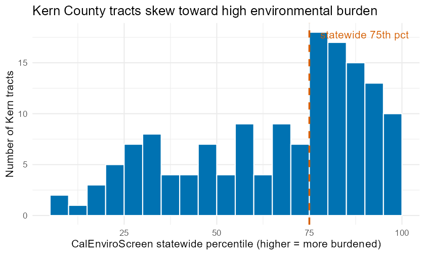
Distribution of CalEnviroScreen statewide percentile across 147 scored Kern County census tracts. The dashed line marks the statewide 75th percentile; bars to its right are Kern tracts in the worst-burdened quarter of California. The bulk of the distribution sits to the right, showing Kern tracts skew toward high cumulative environmental burden.
survey <- read.csv("data/processed/firstday_survey_sim.csv")

ggplot(survey, aes(y = forcats::fct_rev(forcats::fct_infreq(major)))) +
  geom_bar(fill = okabe_ito["orange"]) +
  labs(
    x = "Number of students",
    y = "Declared major",
    title = "Major is categorical (nominal): summarize it with counts"
  )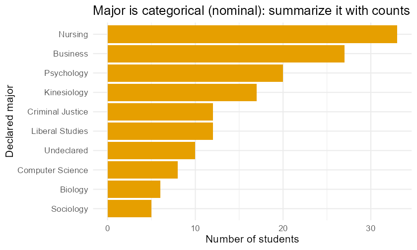
A first look at variable types in the simulated first-day survey (firstday_survey_sim). Counts of students by declared major — a nominal categorical variable best summarized by counts, not an average.
9Try it¶
Practice the skills from this chapter in two interactive places:
Shiny — Statistics Explorer Data Import & Preview module. Load
kern_calenviroscreen(andfirstday_survey_sim), preview the table, and watch the panel display the exactread.csv()/glimpse()R code your clicks generate. Path:shiny-explorer/(run withshiny::runApp("shiny-explorer")), module: Data Import & Preview.Jupyter (R kernel) — Lab 1: RStudio/Quarto & EDA setup. A guided notebook that loads a dataset, inspects its structure, classifies its variables, and documents its missingness. Path:
labs/lab01-data-study-design.ipynb.
Both read the same curated data/processed/ files with the same R you learn
here, so the syntax carries over everywhere.
10Practice problems¶
Work each problem fully before checking. Odd-numbered answers appear in
Appendix: Answers; full worked solutions live in the
instructor materials. Unless a problem says otherwise, use
kern_calenviroscreen (real), firstday_survey_sim (simulated), or
kern_crops_sim (simulated) from data/processed/.
Define, in your own words, the difference between a population and a sample. Give one example of each from the Kern air-pollution context.
For the
firstday_survey_simdataset, what is the observation (the unit in each row)? Name two variables and give the type of each.Classify each variable as numerical (continuous/discrete) or categorical (ordinal/nominal): (a) a student’s
year(Freshman… Senior); (b) a tract’stotal_pop; (c) a tract’spm25; (d) a crop’scommodity.Explain why a census-tract ID stored as the digits
06029001100is a categorical variable even though it looks like a number.A study records the PM2.5 level and asthma rate of every Kern tract and finds they move together. Is this an observational study or an experiment? What is the strongest causal claim it can support?
Define confounding variable and give a plausible confounder for the PM2.5 / asthma association in Kern.
State the two scope-of-inference questions. For a randomized study-methods experiment run only on one professor’s class, answer both.
A campus dining survey is emailed to all students; 12% respond, mostly students who eat on campus daily. Name the two kinds of bias most at risk here and explain each in one sentence.
Using
kern_calenviroscreen, write the R to compute how many tracts are missing thepovertyvalue, and state the number (it is in the codebook / computed in this chapter).Distinguish stratified sampling from cluster sampling in one sentence each, then say which you would use to guarantee every region of Kern County is represented in a 200-tract sample.
You read: “A bigger sample always gives a more accurate estimate.” Explain why this is false when the sampling method is biased.
For
firstday_survey_sim, write the R that returns the number of students and the number of variables. What does each number represent?Give one example each of a variable that is (a) continuous numerical, (b) discrete numerical, (c) ordinal categorical, (d) nominal categorical — drawn from any dataset in this chapter.
Explain why random assignment (not just random sampling) is what allows an experiment to support a causal conclusion.
In
kern_calenviroscreen, the codebook saysces_percentileis missing for 4 tracts because OEHHA suppresses scores for very small tracts. Why is dropping those 4 rows not a harmless choice? Name the missingness concern.A convenience sample of shoppers outside one Bakersfield store is used to estimate the county’s average commute time. Identify the population, the sample, and the most likely direction of bias.
Classify the study and state its scope of inference: researchers randomly assign 60 volunteers to a 6-week walking program or a control group and compare resting heart rate.
Using
kern_crops_sim(simulated), name the observation in each row and give one numerical and one categorical variable from it.Explain the difference between association and causation using the PM2.5/asthma example, and state which one observational Kern data can establish.
Write the R that loads
kern_calenviroscreenand prints its dimensions. How many observations and variables are there?A researcher wants to estimate the average sleep of CSUB students and surveys only students leaving an 8 a.m. class. Name the bias and its likely direction.
For each, state whether random assignment, random sampling, both, or neither is present, and the resulting scope: (a) a poll of 1,000 randomly dialed Kern residents; (b) a randomized clinical trial on volunteers.
Using
firstday_survey_sim, write the R to find the proportion of all 150 students who report any paid work (work_hours_week > 0), treating a missing work value as “not known to be working.” State the value (computed in this chapter).Why must you call
set.seed()beforesample()if you want a reproducible random sample? What goes wrong if you skip it?A news story reports “students who use the campus tutoring center earn higher grades, so tutoring raises grades.” Identify the design (observational vs. experimental) and a confounder that weakens the causal claim.
Define non-response bias and describe a redesign of the dining survey in Problem 8 that would reduce it.
In
kern_calenviroscreen, roughly half of scored tracts exceed the statewide 75th percentile for burden. If Kern were a “statistically average” county, what fraction would you expect above the 75th percentile, and what does the gap suggest?You have data on every Kern tract (a near-census). Can you generalize a finding to all of California? Explain using scope of inference.
Match each scenario to a sampling strategy (simple random, stratified, cluster, convenience): (a) randomly pick 8 schools, survey all students in them; (b) survey the first 50 people you see; (c) draw 100 tracts at random from a full tract list; (d) sample 20 tracts from each of Kern’s regions.
In two or three sentences, explain to a non-statistician why “how the data were collected” matters more than “how much data there is” — using one example from this chapter.
11Chapter summary¶
A dataset is a table: rows are observations (units), columns are variables (characteristics). The population is everything you want to learn about; the sample is what you actually measure.
Variables are numerical (continuous or discrete — arithmetic is meaningful) or categorical (ordinal or nominal — labels). Which family a variable is in drives every later choice of graph, summary, and test.
Observational studies record what is already happening and can show association only; experiments assign treatments (ideally at random) and can show causation, because random assignment breaks the link to confounders.
Scope of inference has two axes: random assignment ( causation) and random sampling ( generalization). Name both before trusting a claim.
Bias is a systematic tilt that more data cannot fix; watch for sampling, non-response, and confounding. Good sampling design (simple random, stratified, cluster — not convenience) is the cure.
Missing data (
NA) must be counted and understood, not silently dropped — why a value is missing can bias the result.In R:
read.csv()loads a dataset,dim()/glimpse()/str()reveal its structure,is.na()/colSums()find and count the holes, andset.seed()makes random work reproducible.
12FAQ¶
Q1. Is “data” singular or plural, and does it matter here? Either is fine in everyday writing. What matters is the concept: a dataset is a structured table of observations and variables. Focus on getting that right.
Q2. If I have data on the whole population, do I still need statistics?
Yes — to summarize and communicate it (Chapters 2–3). You skip the inference
machinery (Chapters 6–13) only when you truly have the entire population, which is
rare. Even kern_calenviroscreen, a near-census of Kern, still benefits from
clear summaries.
Q3. How can I tell numerical from categorical when a category is written as a number (like a 1–7 anxiety rating)? Ask whether averaging is meaningful and whether the gaps are equal. A 1–7 Likert rating is a borderline case often treated as numerical for convenience but is really ordinal. When in doubt, check the codebook and say which choice you made.
Q4. Why can’t a big observational study prove causation? Because no matter how many rows you have, you did not assign the treatment, so a confounding variable can always offer an alternative explanation. Size cannot remove confounding; only random assignment (or careful adjustment) can.
Q5. What’s the practical difference between stratified and cluster sampling? Stratified: you take some units from every group (guarantees each group appears). Cluster: you take all units from some randomly chosen groups (cheaper when groups are scattered). Stratified reduces variability; cluster reduces cost.
Q6. Is convenience sampling ever okay? For a quick classroom demo or a pilot, yes — but never as the basis for a real conclusion about a population, because its bias is unknown and uncorrectable. Say so explicitly whenever you use it.
Q7. What should I do with missing values?
First, count them and ask why they are missing. Only then choose a handling
strategy (drop with na.rm = TRUE, or impute later in the course). Never delete
rows silently — report what you dropped, as every example in this chapter did.
Q8. Why does this course keep using a _sim dataset instead of all real data?
Some real sources (like the USDA crop API) require credentials we cannot obtain
without fabricating, so we generate a plainly labeled simulated stand-in with a
committed, seeded script. We never present simulated data as real — that is why
the name ends in _sim and the codebook says so.
13Resumen en español¶
Resumen del capítulo
La estadística comienza mucho antes de calcular cualquier promedio: comienza con cómo se recopilaron los datos. En este capítulo usted aprendió a leer un conjunto de datos como una tabla organizada, donde cada fila es una observación (observation) y cada columna es una variable (variable), es decir, una característica medida para cada unidad.
Las variables se dividen en dos grandes familias. Una variable numérica (numerical variable) registra un número sobre el que tiene sentido hacer aritmética — como la concentración de PM2.5 en µg/m³ en los tramos censales de Kern County. Una variable categórica (categorical variable) registra a qué grupo pertenece cada observación — como el tipo de cultivo o la carrera universitaria. Dentro de las numéricas, usted distingue entre continuas (continuous) y discretas (discrete); dentro de las categóricas, entre ordinales (ordinal) y nominales (nominal).
La distinción más importante del capítulo es la diferencia entre un estudio observacional (observational study) y un experimento (experiment). En un estudio observacional usted solo registra lo que ya ocurre y puede identificar asociación (association), pero no causalidad. El ejemplo de Kern County es revelador: de los 147 tramos censales con datos de CalEnviroScreen 4.0, casi la mitad — el 49.7% — se ubica en el cuarto superior de toda California en cuanto a carga ambiental acumulada. Que los tramos con mayor PM2.5 también tengan tasas más altas de urgencias por asma describe una asociación, no causalidad, porque una variable de confusión (confounding variable) — como la pobreza — puede explicar ambas cosas a la vez. Solo un experimento con asignación aleatoria (random assignment) puede establecer causación.
El alcance de la inferencia (scope of inference) depende de dos preguntas clave: ¿hubo asignación aleatoria? (esto abre la puerta a conclusiones causales) y ¿hubo muestreo aleatorio (random sampling)? (esto permite generalizar a la población). El sesgo (bias) es una distorsión sistemática que los datos adicionales no pueden corregir; puede surgir del diseño de muestreo, de la no respuesta (non-response), o de la confusión entre variables.
En R, las funciones clave de este capítulo son read.csv() para cargar datos desde data/processed/, glimpse() y str() para inspeccionar la estructura, is.na() y colSums() para detectar y contar valores perdidos (missing values, NA) y set.seed() para garantizar resultados reproducibles (reproducible). Estas herramientas son el primer peldaño del proceso estadístico que continuará a lo largo del curso.