1The question that opens this chapter¶
Every summer, Bakersfield makes a “worst air in the nation” list, and every summer someone pushes back: was the air actually that bad, or did a handful of wildfire-smoke days drag the average up? That argument is really a statistics question, and you can settle it with one dataset and two numbers.
The dataset is kern_airquality — every daily PM2.5 (“fine particle pollution,”
particles smaller than 2.5 micrometers) reading from every EPA monitor in Kern
County in 2023, a genuine U.S. EPA AirData download (see the
codebook). PM2.5 is measured in
micrograms per cubic meter (µg/m³); higher numbers mean dirtier air. The file
holds 1,554 monitor-days — one row for each day at each monitor, so a single
day with several monitors reporting contributes several rows.
Here are the two numbers — computed live from the data, not typed in by hand:
pm_mean   <- mean(~ daily_mean, data = pm)
pm_median <- median(~ daily_mean, data = pm)
c(mean = pm_mean, median = pm_median)
The mean daily PM2.5 is about 9.30 µg/m³, but the median is only
about 7.56 µg/m³ (both dataset-derived from kern_airquality,
daily_mean, n = 1,554). The mean sits noticeably higher than the median.
That gap is the whole story: a small number of very dirty days — the worst day
in the file hit 63.7 µg/m³ — pull the average up, while the typical day is
cleaner than the average suggests. By the end of this chapter you will be able
to say exactly how much “a few bad days” distort the picture, and which number
to trust for which question.
That is what summarizing numerical data is for: turning a long column of numbers into a few honest, well-chosen quantities and pictures that answer a real question.
2Learning objectives¶
By the end of this chapter you will be able to:
Compute and interpret measures of center (mean, median) and spread (standard deviation, IQR, range) for a numerical variable.
Construct histograms, boxplots, and density plots in R and read shape, center, spread, and outliers from them.
Compare distributions across groups and describe skew, modality, and the effect of outliers on each statistic.
Explain when the median and IQR are preferable to the mean and standard deviation, and justify the choice for a given variable.
Write a clear, one-paragraph plain-language description of a distribution using correct statistical vocabulary.
This chapter expands the “examining numerical data” material in Introduction to
Statistics with Randomization and Simulation (ISRS), the OpenIntro text this
course adapts. It assumes
Chapter 1: you should already know what a variable, an
observation, and a numerical variable are, and how to load a dataset with
read.csv() and inspect it with glimpse().
32.1 Measures of center¶
3.1Intuition¶
A measure of center is a single number that answers “what is a typical value?” The two you will use constantly are the mean and the median.
The mean is the balance point: add up all the values and share the total equally among the observations, the way you split a restaurant bill evenly. The median is the middle value: line everyone up from smallest to largest and point at the person in the middle.
When a distribution is roughly symmetric, the mean and median nearly agree. When it is skewed — stretched out by a few unusually large or small values — they part ways, because the mean feels every value (including the extremes) while the median only cares about position. That is exactly what we saw with Bakersfield’s air: a right-skewed distribution pulled the mean above the median.
3.2Formula¶
Let be the observed values of a numerical variable, where is the sample size (the number of observations).
The sample mean, read “x-bar,” is
where (the capital Greek sigma) means “add up the from to .”
The median, written (or ), is the middle value of the sorted data. With the values sorted from smallest to largest:
where denotes the -th value in the sorted list. In words: if there is an odd number of values, the median is the single middle one; if there is an even number, average the two middle ones.
3.3R¶
In mosaic, one function — favstats() — reports center and spread together in
one labelled block. It uses the formula grammar you will see all chapter:
favstats(~ variable, data = D) reads as “the summary statistics of variable
in the data frame D.” If you want center on its own, mean() and median()
take the same ~ variable form:
mean(~ daily_mean, data = pm)
median(~ daily_mean, data = pm)
favstats(~ daily_mean, data = pm)The printout labels each column — min, Q1, median, Q3, max, mean,
sd, n, and missing — so you can read the five-number summary, the mean, and
the SD straight off one line. Notice that mean (9.30) comes out larger than
median (7.56): the signature of right skew.
42.2 Measures of spread¶
4.1Intuition¶
Two cities can have the same average air quality and feel completely different: one steady, one swinging between crystal-clear and choking. Spread measures how far the values reach from the center — how much they vary.
The range is the crudest measure: largest minus smallest. It uses only two numbers and is wrecked by a single outlier.
The standard deviation (SD) is the typical distance of a value from the mean. It uses every observation, which makes it informative but also sensitive to extremes.
The interquartile range (IQR) is the width of the middle half of the data: the distance from the 25th percentile to the 75th. Because it ignores the smallest 25% and largest 25%, it shrugs off outliers.
4.2Formula¶
The range is
The sample variance is the average squared distance from the mean (with the denominator , explained below):
where is the deviation of observation from the mean. In plain words, the recipe is: subtract the mean from each value, square each of those gaps (squaring makes them all positive and punishes big gaps more), add the squares up, and divide by . The squaring is why variance comes out in squared units — which is exactly why we take a square root next. The sample standard deviation is the square root of the variance, which returns the result to the original units:
We divide by rather than . This is called Bessel’s correction. Here is the reason: the deviations are measured from the sample mean , and is itself estimated from the same data. That ties the deviations together — they are forced to add up to zero, so once you know any of them, the last one is fixed. Only are free to vary, so we average over , not . Doing so keeps from systematically under-estimating the true variability. R uses by default, so you rarely have to think about it.
Going deeper (optional): the mean and SD are a matched pair
This is optional enrichment. There is a deeper reason the mean and the standard deviation are always reported together: the mean is the single number that makes the sum of squared deviations as small as possible. Pick any other center and recompute , and you will always get a larger total than you get with . The SD is then literally “how big those minimized squared gaps came out, on average.” (The median, by contrast, minimizes the sum of absolute gaps — which is one reason the median pairs naturally with the IQR instead.) This least-squares idea returns as the engine of regression in Chapter 13.
For the IQR, define the quartiles: is the 25th percentile (a value below which about a quarter of the data fall), is the median, and is the 75th percentile. Then
4.3R¶
sd(~ daily_mean, data = pm)          # standard deviation, denominator n - 1
var(~ daily_mean, data = pm)         # variance
IQR(~ daily_mean, data = pm)         # Q3 - Q1
range(~ daily_mean, data = pm)       # returns c(min, max); width is diff(range(...))
diff(range(~ daily_mean, data = pm)) # the numeric range (max - min)
quantile(~ daily_mean, data = pm)    # min, Q1, median, Q3, max
The SD, and the quartiles and whose difference is the IQR, also
appear — labelled — in the favstats() block from §2.1. For
PM2.5 the SD is about 7.63 µg/m³ and the IQR is about 7.70 µg/m³ (both
dataset-derived from kern_airquality) — the typical day-to-day swing is almost
as large as the average level itself.
52.3 Picturing a distribution¶
5.1Intuition¶
Numbers summarize; pictures reveal. Before trusting any single statistic, look at the distribution — the pattern of which values occur and how often. Three plots do most of the work:
A histogram slices the number line into equal-width bins and draws a bar for how many observations fall in each. It shows the overall shape.
A density plot is a smoothed histogram — a continuous curve that traces the same shape without depending on bin edges.
A boxplot draws a box from to (so the box is the IQR), a line at the median, “whiskers” reaching to the most extreme non-outlier values, and individual points for outliers. It is the five-number summary — the minimum, , median, , and maximum — made visible, and it shines when comparing groups.
When you read a distribution, name four things: shape (symmetric, or skewed left/right; one peak or several), center, spread, and outliers (values that stand far apart from the rest).
5.2Formula¶
A distribution is right-skewed (positively skewed) when its longer tail points toward larger values; then typically . It is left-skewed when the longer tail points toward smaller values; then typically . A handy diagnostic: compare the mean and median.
The boxplot marks a point as a suspected outlier when it falls beyond the 1.5 × IQR fences:
Any value below the lower fence or above the upper fence is flagged. This is a convention, not a law of nature — a flagged point is a value to investigate, not automatically a mistake to delete.
5.3R¶
The ggformula plotting helpers (loaded with mosaic) use the same y ~ x
formula grammar as the summaries. We fill them with the Okabe–Ito
colorblind-safe palette and add a dashed line at the mean by hand, so you can see
it pulled to the right of the bulk of the data:
pm_mean <- mean(~ daily_mean, data = pm)   # the balance point we mark on the plot

gf_histogram(~ daily_mean, data = pm, bins = 30,
             fill = okabe_ito[1], color = "white",
             title = "Daily PM2.5 in Kern County, 2023",
             xlab = "PM2.5 daily mean (µg/m³)",
             ylab = "Number of monitor-days") |>
  gf_vline(xintercept = ~ pm_mean, linetype = "dashed",
           color = okabe_ito[6], linewidth = 1)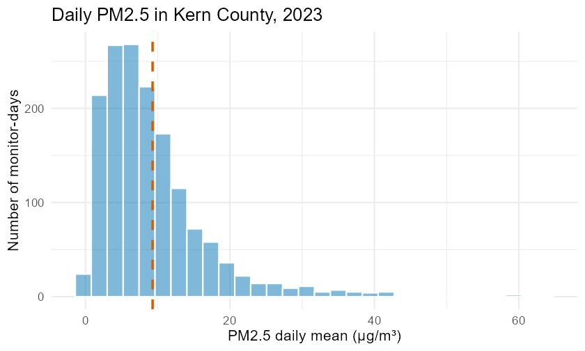
Histogram of daily PM2.5 across all Kern County monitors, 2023. The distribution is strongly right-skewed: a tall cluster of clean days near the low end and a long thin tail of dirty days stretching to the right, with the mean (dashed line) pulled above the bulk of the data.
pm_region <- pm |>
  mutate(region = ifelse(city == "Bakersfield",
                         "Bakersfield",
                         "Desert (Ridgecrest/Mojave)"))
gf_boxplot(daily_mean ~ region, data = pm_region, fill = ~ region,
           title = "PM2.5 by area of Kern County",
           xlab = "Area of Kern County",
           ylab = "PM2.5 daily mean (µg/m³)") |>
  gf_refine(scale_fill_manual(values = okabe_ito), guides(fill = "none"))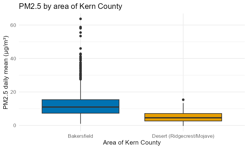
Boxplots of daily PM2.5 for Bakersfield monitors versus the desert monitors (Ridgecrest and Mojave). Bakersfield air is both higher on average and far more variable, with many high-side outliers; the desert sites are lower and tighter.
The two pictures together tell the chapter’s story: the histogram explains why the mean exceeded the median (right skew), and the grouped boxplot shows that the county average hides two very different realities.
62.4 Comparing groups¶
6.1Intuition¶
Most real questions are comparisons: cleaner here or there? higher this year or last? The tools do not change — you compute the same center and spread — you just compute them within each group and line the results up. The single best picture for comparison is side-by-side boxplots, because they let you compare center, spread, and outliers at a glance.
6.2Formula¶
There is no new formula. You apply the §2.1–2.3 definitions to each group separately. A compact way to describe a difference in centers is the gap between group means or medians, e.g. .
6.3R¶
To summarize a variable within each group, hand favstats() a two-sided
formula: favstats(y ~ group, data = D) reads as “the summary of y broken down
by group.” One line replaces a whole pipeline, and it is the workhorse pattern
you will reuse in every later chapter:
favstats(daily_mean ~ site_name, data = pm)Each row is one monitoring site, with its whole distribution on a single line:
the five-number summary (min, Q1, median, Q3, max — the same five you
would read off a boxplot), plus the mean, the sd, the sample size n, and
any missing values. Read across a row for one site’s typical level and spread;
read down a column to compare the sites.
7Worked examples¶
7.1Example 1 — Center and spread by hand (a small clean sample)¶
Intuition. Before trusting R, compute everything once by hand on five numbers so you know what the functions are doing.
Setup. Suppose five monitor-days gave PM2.5 readings (µg/m³): . Find the mean, median, range, variance, standard deviation, and IQR.
Formula computation.
Mean:
Median: sorted, the values are ; with (odd) the middle value is .
Range: .
Variance: the deviations from the mean are , with squares summing to 138. With ,
IQR: using R’s default quartiles on this small set, and , so .
Check in R.
x <- c(4, 6, 9, 12, 19)
c(mean = mean(x), median = median(x),
  range = diff(range(x)), var = var(x), sd = sd(x), iqr = IQR(x))
Interpretation. A typical reading is about 9–10 µg/m³, and individual days sit roughly 5.9 µg/m³ away from the mean on average. The mean and median nearly agree (10 vs. 9), which is what we expect when no single value dominates.
7.2Example 2 — One outlier, two very different statistics¶
Intuition. Add a single wildfire-smoke day to Example 1’s sample and watch which statistics buckle and which hold.
Setup. The new sample is (one extreme day of 90 µg/m³).
Computation.
y <- c(4, 6, 9, 12, 19, 90)
c(mean = mean(y), median = median(y), sd = sd(y), iqr = IQR(y))
Interpretation. The single extreme value drags the mean from 10 up to about 23.3 and inflates the SD from 5.9 to about 33.1 — both more than tripled by one number. The median barely moves (9 10.5) and the IQR stays modest. This is the precise sense in which the median and IQR are resistant to outliers and the mean and SD are not. For a variable like daily PM2.5, which genuinely has rare extreme days, that resistance is why the median is often the fairer “typical day.”
7.3Example 3 — The Kern hook, finished (mean vs. median on real data)¶
Intuition. Now answer the opening question with the full real dataset: how much do “a few bad days” distort Bakersfield’s air-quality average?
Computation.
pm_mean   <- mean(~ daily_mean, data = pm)
pm_median <- median(~ daily_mean, data = pm)
gap       <- pm_mean - pm_median
above     <- mean(~ (daily_mean > pm_mean), data = pm)  # fraction of days above the mean
worst     <- max(~ daily_mean, data = pm)
c(mean = pm_mean, median = pm_median, gap = gap,
  frac_above_mean = above, worst_day = worst)
Interpretation. The mean (≈ 9.30 µg/m³) exceeds the median (≈ 7.56 µg/m³) by
about 1.73 µg/m³ — the mean is roughly 23% higher than the typical day.
Only about 38% of days are above the mean, confirming that most days are
cleaner than the average implies, with the worst day (63.7 µg/m³) and its few
companions doing the pulling (all values dataset-derived from kern_airquality,
daily_mean, n = 1,554). So the skeptic is partly right: the average overstates
the typical day. The honest summary reports both numbers and names the skew.
7.4Example 4 — Comparing two monitors¶
Intuition. “Kern County air” is an average over very different places. Compare a busy Bakersfield monitor with a high-desert one.
Computation.
two_sites <- filter(pm, site_name %in% c("Bakersfield-California", "Ridgecrest-Ward"))
favstats(daily_mean ~ site_name, data = two_sites)
Interpretation. Bakersfield-California averages about 11.93 µg/m³ with an
SD near 8.33, while Ridgecrest-Ward averages about 4.55 µg/m³ with an SD
near 2.99 (dataset-derived from kern_airquality). The Bakersfield site is
both dirtier on average and far more variable — its spread alone (SD 8.33) is
larger than the desert site’s entire mean. Reporting only a county-wide average
would hide this gap. This is the comparison habit you will formalize with
inference in Chapter 10.
8Try it — the interactive tools¶
Reading is not doing. Practice this chapter’s skills two ways:
Statistics Explorer — Descriptive Statistics & Visualization modules. Load
kern_airquality, pickdaily_mean, and click to get the mean, median, SD, IQR, histogram, and boxplot. Every click shows the exact R code it ran, so you can copy it into your own script. (App:shiny-explorer/; modules Descriptive Statistics and Visualization, per the blueprint Phase 5 module list.)Jupyter lab —
labs/lab02-summarizing-numerical-data.ipynb. A guided, step-by-step walkthrough offavstats(), thegf_*plots, and grouped summaries withfavstats(y ~ group), with short exercises and a reflection prompt. Your instructor will share the CSUB JupyterHub link.
9Chapter summary¶
A measure of center answers “what is typical?” The mean is the balance point; the median is the middle of the sorted data. For skewed data they differ, and the gap is informative.
A measure of spread answers “how much do values vary?” The range is max − min; the standard deviation is the typical distance from the mean (using denominator ); the IQR is the width of the middle half, .
Mean and SD suit symmetric data; median and IQR are resistant and suit skewed data or data with outliers. When in doubt, report both and explain.
Always plot first: a histogram (or density plot) shows shape, a boxplot shows the five-number summary and outliers (flagged beyond the fences) and is ideal for comparing groups.
Read every distribution for shape, center, spread, and outliers, and describe it in one plain-language sentence.
In R (all one formula grammar):
mean(~x, data=),median(),sd(),var(),IQR(),quantile(), andfavstats(~x, data=)for center and spread;gf_histogram(~x, data=)andgf_boxplot(y ~ g, data=)for pictures; andfavstats(y ~ group, data=)for per-group summaries.
10FAQ¶
Q1. When should I report the median instead of the mean? When the distribution is skewed or has outliers (incomes, house prices, daily PM2.5). The median answers “typical value” without being dragged by extremes. For roughly symmetric data, the mean is fine and uses all the information.
Q2. Why does R divide by for the standard deviation?
Because the deviations are measured from the sample mean, which is itself
estimated from the data. Dividing by (Bessel’s correction) corrects a
slight under-estimation, giving an unbiased sample variance. R’s sd() and
var() do this by default.
Q3. The range and the IQR sound similar — what is the difference? The range (max − min) uses only the two most extreme values, so one outlier can blow it up. The IQR () is the spread of the middle 50% and ignores the extreme quarters, so it is resistant. They answer different questions: total reach vs. typical spread.
Q4. How many bins should a histogram have? There is no single right answer; the bin count is a choice that changes the story. Too few bins hide structure; too many turn the histogram into noise. Try a few (e.g. 15, 30, 50) and pick one that shows the shape clearly. A density plot sidesteps the choice by smoothing.
Q5. A boxplot flagged some points as outliers. Should I delete them? No — not automatically. The rule flags points to investigate, not to discard. A flagged PM2.5 day might be a real wildfire day, which is exactly the data you care about. Delete a value only when you have a documented reason to believe it is an error.
Q6. Can the mean be larger than most of the data?
Yes. In a right-skewed distribution the mean sits above the majority of values —
in kern_airquality, only about 38% of days exceed the mean. The mean is the
balance point, not “where most days are.”
Q7. What is the difference between variance and standard deviation? The variance is the average squared deviation; the standard deviation is its square root. The SD is usually reported because it is in the same units as the data (µg/m³, not µg²/m⁶), so it is directly interpretable as a typical distance from the mean.
11Practice problems¶
Problems are numbered in order. Odd-numbered answers are in the
Answers appendix; full worked solutions are in the
instructor key. Unless a problem says otherwise, round final answers to 2
decimal places and keep full precision until the last step. Several problems use
real data — load it with library(mosaic); aq <- read.csv("data/processed/kern_airquality.csv"); pm <- filter(aq, pollutant == "PM2.5") (the filter() keeps only the rows whose pollutant equals "PM2.5" — == tests equality).
By-hand center and spread.
For the sample , compute the mean and the median by hand.
For the sample , compute the mean and the median.
For the sample , compute the range, the sample variance, and the sample standard deviation by hand (denominator ).
For the sample , compute the standard deviation.
A dataset has and . What is the mean?
Find , , and the IQR for using R’s default quantiles (
quantile()).
Reasoning about center, spread, and shape.
A variable has mean 50 and median 38. Is it more likely right-skewed or left-skewed? Explain in one sentence.
Two classes have the same mean exam score, but class A has SD 4 and class B has SD 12. Describe how the two distributions differ.
You add one value of 1,000 to a sample of ten values near 20. State what happens (rises a lot / barely changes) to each of: mean, median, SD, IQR.
Explain in your own words why dividing by instead of matters for the sample variance.
A boxplot’s box runs from 12 to 28 with the median line at 15. Is the middle half of the data skewed? In which direction, and how can you tell?
Give a real-world numerical variable you would summarize with the median rather than the mean, and explain why.
Reading and choosing plots.
You want to compare the distribution of monthly rent across four Bakersfield neighborhoods in one figure. Which plot is best, and why?
A histogram of commute times has one tall bar near 10 minutes and a long thin tail out to 90 minutes. Name the shape and predict whether the mean or median is larger.
Using the rule, find the outlier fences for a variable with and , and state whether a value of 75 is flagged.
Explain why a density plot can be preferable to a histogram when comparing the shapes of two distributions on the same axes.
Real data — kern_airquality (PM2.5 daily_mean).
Load the PM2.5 data and report the mean and median of
daily_mean. Based on those two numbers alone, is the distribution skewed, and in which direction?Report the standard deviation and the IQR of PM2.5
daily_mean. Which is the larger measure of spread here, and why might they differ?Compute the upper fence for PM2.5
daily_meanand report how many monitor-days are flagged as high-side outliers.Using
favstats(daily_mean ~ site_name), find which monitoring site has the highest mean PM2.5 and which has the lowest. Report both means.Make a histogram of PM2.5
daily_meanwithgf_histogram(). In one sentence, describe its shape, center, and spread.Make side-by-side boxplots of PM2.5
daily_meanforcity == "Bakersfield"versus the other cities. Which group is more variable?
Synthesis and communication.
The worst single PM2.5 day in the file is 63.7 µg/m³. If that one day were removed, would the median change much? Would the mean? Explain your reasoning without recomputing.
Write a two-sentence, plain-language summary of the PM2.5
daily_meandistribution suitable for a Bakersfield city-council briefing. Use center, spread, and shape, and avoid jargon.An analyst reports “average Kern PM2.5 was 9.3 µg/m³” with no other detail. Name one thing this summary hides and how you would fix the report in one added sentence.
For Ridgecrest-Ward, the SD of PM2.5 is about 2.99 and for Bakersfield-California about 8.33. Interpret the practical meaning of that difference for someone living near each monitor.
The coefficient of variation is (often as a percent), a unitless measure of relative spread. Compute it for PM2.5
daily_meanand explain what “relative spread” adds beyond the SD alone.Suppose a variable is measured in inches and you convert it to centimeters (multiply every value by 2.54). What happens to the mean, the SD, and the CV? Explain.
You have two summaries of the same variable: one reports mean 9.30 and SD 7.63; the other reports median 7.56 and IQR 7.70. Which pair would you put in a headline, and which in a technical appendix? Justify your choice.
In two or three sentences, explain to a classmate who missed this chapter the difference between a measure of center and a measure of spread, with one example of each.
12Glossary¶
New terms introduced in this chapter are added to the book Glossary: mean, median, range, variance, standard deviation, deviation, quartile, interquartile range (IQR), percentile, distribution, histogram, density plot, boxplot, five-number summary, skew, outlier, resistant statistic, coefficient of variation.
13Resumen en español¶
Resumen del capítulo
En este capítulo aprendiste a resumir datos numéricos usando dos tipos de medidas: las medidas de tendencia central (measures of center) y las medidas de dispersión (measures of spread).
Para describir el valor típico de un conjunto de datos, usamos la media (the mean), que es el promedio aritmético, y la mediana (the median), que es el valor del centro cuando los datos están ordenados de menor a mayor. La fórmula de la media muestral es , es decir, se suman todos los valores y se divide entre el número de observaciones . Cuando los datos tienen una distribución simétrica, la media y la mediana son casi iguales. Cuando la distribución es asimétrica (skewed) — con una cola larga hacia los valores altos o bajos — la media se aleja de la mediana, y esa diferencia te dice algo importante sobre los datos.
Para medir cuánto varían los datos alrededor del centro, usamos tres herramientas: el rango (range), que es el valor máximo menos el mínimo; la desviación estándar (standard deviation) , que representa la distancia típica de cada valor a la media; y el rango intercuartílico (interquartile range, IQR) = , que describe la amplitud de la mitad central de los datos. La media y la desviación estándar son sensibles a los valores atípicos (outliers); en cambio, la mediana y el IQR son estadísticos resistentes (resistant statistics) porque casi no cambian ante valores extremos.
El capítulo comenzó con una pregunta real: ¿la calidad del aire en Bakersfield es tan mala como dicen, o unos pocos días de humo de incendio elevan el promedio? Con los datos de PM2.5 del condado de Kern (2023), encontramos que la media fue de aproximadamente 9.30 µg/m³ y la mediana de 7.56 µg/m³. Esa diferencia confirma que la distribución es asimétrica hacia la derecha: la mayoría de los días son más limpios de lo que la media sugiere.
En R, la función principal de este capítulo es favstats() del paquete
mosaic, que muestra la media, la mediana, la desviación estándar, los
cuartiles y más en un solo bloque etiquetado, usando la gramática de fórmulas
favstats(~ variable, data = D). Para visualizar la distribución, usamos
gf_histogram() (histograma) y gf_boxplot() (diagrama de caja). Cuando
compares grupos, favstats(y ~ grupo, data = D) te da un resumen por grupo en
una sola línea de código.