A note on this chapter’s data. Every number you see below is computed by the R code on the page from
kern_crops_sim— a simulated Kern County crop dataset (8 commodities × 9 years, 2015–2023; 72 rows). It is labeled*_simbecause the real source (USDA NASS Quick Stats) needs a registered API key the automated build could not obtain. The magnitudes are realistic for a top U.S. agricultural county, but they are not measured values and carry no claim about actual Kern production (see the codebook,data/codebooks/kern_crops_sim.md). The methods you learn here are exactly the ones you would apply to the real data.
1The Kern hook: has the crop mix shifted toward nuts?
Drive any highway out of Bakersfield and you will pass mile after mile of almond and pistachio orchards. Older residents will tell you it did not always look like that — there used to be more cotton, more open field. Is that just a story, or did the mix of crops Kern County grows really change?
That question is about a categorical variable: each block of farmland is classified into a category (nuts, fruit, citrus, vegetable, field crop), and we want to know how the shares of those categories compare across time. We cannot answer it with a mean — “the average crop” is meaningless. We answer it by counting and turning counts into proportions.
Here is the hook, computed from the data, no hand-waving:
# Share of harvested acreage in each crop category, for 2015 and for 2023.
share_by_year <- function(yr) {
  d <- subset(crops, year == yr)                       # keep only that year's rows
  totals <- tapply(d$harvested_acres, d$category, sum) # acres summed within each category
  round(100 * totals / sum(totals), 2)                 # each category's percent of the year
}
share_2015 <- share_by_year(2015)
share_2023 <- share_by_year(2023)

share_2015["NUTS"]   # nuts' share of acreage in 2015 (percent)
share_2023["NUTS"] # nuts' share of acreage in 2023 (percent)In this dataset, nuts went from Unexecuted inline expression for: round(share_2015["NUTS"],2)% of harvested
acreage in 2015 to Unexecuted inline expression for: round(share_2023["NUTS"],2)% in 2023 — an Unexecuted inline expression for: round(share_2023["NUTS"] - share_2015["NUTS"],2)
percentage-point jump (every figure here is computed from kern_crops_sim; the
total harvested acreage in 2023 works out to 567,407 simulated acres). The story checks out
in the simulated data. By the end of this chapter you will be able to build
that comparison yourself, display it honestly, and judge whether a difference in
shares is large enough to call an association — meaning the two things tend to
go together (we define this carefully in Section 4) — all without ever implying
that growing nuts causes anything.
2Learning objectives
By the end of this chapter you will be able to:
(Apply) Build frequency and relative-frequency tables for one categorical variable and interpret the proportions.
(Apply) Construct two-way contingency tables and compute joint, marginal, and conditional proportions.
(Apply) Create bar charts, segmented (stacked) bar charts, and mosaic plots, and read association from them.
(Analyze) Judge whether two categorical variables appear associated from a two-way table and describe the direction of that association.
(Communicate) Report a categorical comparison clearly without implying causation from observational data.
This chapter assumes you have worked through Chapter 1 (variables and study design) and Chapter 2 (summaries and plots for numerical data). Here we do for categorical data what Chapter 2 did for numbers.
31. Frequency tables for one categorical variable
3.1Intuition
A categorical variable records which group an observation belongs to, not
how much of something it has. “Crop category” is categorical: a row is NUTS
or CITRUS, never 3.7 of them. You cannot average categories, so the first
summary is simply how often each category occurs — a tally.
A raw tally (a count) answers “how many?” But counts are hard to compare when totals differ. If one county reports 18 nut operations and another reports 180, the second is not necessarily “more nutty” — it might just be bigger. So we convert each count to a proportion: its share of the whole. Proportions put every category on the same 0-to-1 scale and let us compare fairly.
3.2Formula
Suppose a categorical variable has categories. Let be the count in category — the number of observations falling in that group. The total number of (non-missing) observations is
Here (capital sigma) means “add up over all categories,” is the category index running from 1 to , and is the grand total. The proportion (relative frequency) of category is
a number between 0 and 1. The percent is just . Because every observation lands in exactly one category, the proportions must add to one: (and the percents add to ). That “adds to one” fact is your built-in error check.
3.3R
mosaic’s tally() counts how many rows fall in each category. Read ~ category
as “just the category variable.” Add format = "proportion" (or
format = "percent") and tally() divides by the total for you, turning the
counts into shares.
# Tally the crop CATEGORY across all 72 rows (every commodity in every year).
tally(~ category, data = crops)                          # counts
tally(~ category, data = crops, format = "proportion")   # proportions
Each commodity appears once per year for nine years, so a category with two commodities (NUTS = almonds + pistachios) shows up twice as often as a category with one (VEGETABLE = carrots). That is why NUTS, FRUIT, and CITRUS each take 25% of the rows while VEGETABLE and FIELD CROP each take 12.5% — the proportions add to 100%, exactly as the formula promises.
42. Two-way tables: joint, marginal, and conditional proportions
4.1Intuition
One categorical variable tells you how the groups split. The interesting questions almost always involve two categorical variables at once: Does the crop category go together with whether the crop is high-value? To answer “do these two go together,” we cross-tabulate — count how many observations fall in each combination of categories. The result is a two-way table (also called a contingency table).
From one two-way table you can read three different kinds of proportion, and keeping them straight is the whole skill:
A joint proportion: the share of everything that falls in one specific cell — e.g., “what fraction of all crop-years are nuts and high-value?”
A marginal proportion: the share in one category of a single variable, ignoring the other — e.g., “what fraction of all crop-years are high-value?” (read off the row or column totals, the “margins”).
A conditional proportion: the share within one given group — e.g., “of the nut crop-years, what fraction are high-value?” This is the one that reveals association.
4.2Formula
Write for the observed count in row , column of the table. Let the row total be (add across a row), the column total be (add down a column), and the grand total be (every cell). Then:
Each symbol: is a single cell’s count; and are the totals in the margins; is the overall total; the dot in means “summed over the column index.” The plain-language version of the three formulas is just three different denominators: joint divides one cell by everybody (), marginal divides a row/column total by everybody (), and conditional divides one cell by its own row (). The conditional proportion uses the row total as its denominator, not — because you are asking a question within row only. Read aloud as “the proportion in column given that we are in row ” — the vertical bar “” means “given,” not division. Choosing the right denominator is the entire game.
4.3R
We will cross crop category with a value tier. First we build the value
tier — a crop-year is “High value” if its value_usd is at or above the dataset
median, otherwise “Lower value.” This makes a clean second categorical variable.
# Median total dollar value across all 72 crop-years.
med_value <- median(~ value_usd, data = crops)

# A second categorical variable: is this crop-year at/above the median value?
# ifelse(condition, A, B) labels a row "A" when the condition is true, "B" if not.
crops$value_tier <- ifelse(crops$value_usd >= med_value,
                           "High value", "Lower value")

# Two-way contingency table: category (rows) x value tier (columns).
# Read "~ category + value_tier" as "count every combination of the two."
tab <- tally(~ category + value_tier, data = crops)
tab
Now read the three kinds of proportion off that table, one tally() call each.
The joint proportions divide every cell by the grand total (all 72 crop-years):
# JOINT proportions: every cell divided by the grand total (each cell / 72).
round(tally(~ category + value_tier, data = crops, format = "proportion"), 2)
The nine cells add to 1. The NUTS / High value cell is 0.25 — a quarter of
all crop-years are both nut and high-value. The marginal proportion of the
value tier ignores category entirely:
# MARGINAL proportion of each value tier (ignore category).
round(tally(~ value_tier, data = crops, format = "proportion"), 2)
Overall the crop-years split 0.50 / 0.50 between the tiers — the median split forces each tier to be exactly half, a handy sanity check. Finally the conditional proportions divide within each category:
# CONDITIONAL proportions: value tier WITHIN each category.
# tally(A ~ B) reads "A given B" -- each B column sums to 1.
round(tally(value_tier ~ category, data = crops, format = "proportion"), 2)
Read this last table down each column (each category’s column sums to 1). Among the nut crop-years, 100% are high-value; among citrus, about 56%; among field crops, 0%. The conditional shares are wildly different from column to column — that difference is exactly what we mean by association, the subject of Section 4.
53. Visualizing categorical data
5.1Intuition
A table is exact; a picture is fast. Three plots cover almost every categorical display you will ever need:
A bar chart shows the counts (or proportions) of one categorical variable — one bar per category, height = frequency. It is the picture of a frequency table.
A segmented (stacked) bar chart stacks a second variable inside each bar. When you make each bar the same height (100%), it shows the conditional distribution of the second variable within each group — perfect for spotting association.
A mosaic plot shows both variables at once with rectangle areas proportional to cell counts; bar widths show one margin, heights show the conditional split. It is a two-way table drawn to scale.
Unlike a histogram, bars for categories have gaps between them and can be reordered — there is no number line underneath, so order is a choice you make to help the reader (usually largest-to-smallest).
5.2Formula
There is no new formula here — the bars are the counts and the segment heights are the conditional proportions from Section 2. The only new idea is a design rule: encode the quantity in a position or length the eye can compare (bar height), and use the colorblind-safe Okabe–Ito palette so color never becomes the only signal (a WCAG-AA accessibility requirement; CLAUDE.md Part 1).
5.3R
# Acreage by category in 2023: sum the acres in each category, then draw bars.
d23 <- subset(crops, year == 2023)
acres_by_cat <- aggregate(harvested_acres ~ category, data = d23, FUN = sum)

# Order categories tallest-to-shortest so the eye reads the biggest group first.
acres_by_cat <- acres_by_cat[order(-acres_by_cat$harvested_acres), ]
acres_by_cat$category <- factor(acres_by_cat$category,
                                levels = acres_by_cat$category)

gf_col(harvested_acres ~ category, data = acres_by_cat, fill = ~ category) %>%
  gf_refine(scale_fill_manual(values = okabe_ito), guides(fill = "none")) %>%
  gf_labs(title = "2023 harvested acreage by crop category (simulated)",
          x = "Crop category", y = "Harvested acres") %>%
  gf_theme(theme_minimal(base_size = 12))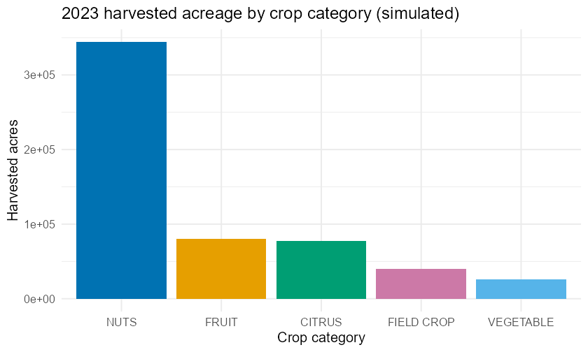
Harvested acreage by crop category, Kern County crop-years 2023 (simulated). Nuts dominate.
# Segmented (stacked-to-100%) bar chart: value tier WITHIN each category.
# This is the picture of the conditional proportions from Section 2.
# position = "fill" makes every bar the same height (1.0), so we compare the
# *splits*, not the totals.
seg_df <- as.data.frame(tally(~ category + value_tier, data = crops))

gf_col(Freq ~ category, fill = ~ value_tier, data = seg_df,
       position = "fill", color = "white", linewidth = 0.2) %>%
  gf_refine(scale_fill_manual(values = okabe_ito[1:2], name = "Value tier")) %>%
  gf_labs(title = "Value tier within each crop category (simulated)",
          x = "Crop category", y = "Proportion of crop-years") %>%
  gf_theme(theme_minimal(base_size = 12))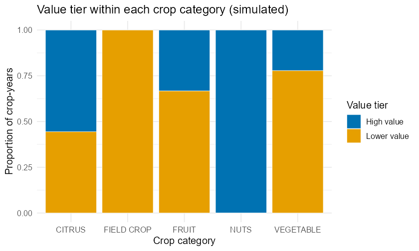
Conditional distribution of value tier within each crop category (100% segmented bars). Every nut crop-year is high-value; no field-crop year is.
The segmented bars make the association jump out: the height of the blue segment is the conditional proportion high-value, and it ranges from 100% (nuts) down to 0% (field crops). If category and value tier were unassociated, every bar would split at the same height.
64. Reading association (without claiming causation)
6.1Intuition
Two categorical variables are associated when knowing one changes the
proportions you expect for the other. Operationally: compare conditional
distributions. If P(High value | NUTS) differs from P(High value | CITRUS),
the value tier depends on the category — they are associated. If all the
conditional distributions are identical, the variables are independent (no
association).
Association is not causation. In an observational dataset like this one, nobody randomly assigned crops to be nuts. A category that tends to be high-value might differ in a dozen other ways (water needs, market, acreage). Association tells you the variables travel together; it does not tell you that one makes the other happen. Saying “growing nuts causes high value” from a table like this is the single most common — and most damaging — mistake in reading categorical data.
6.2Formula
A quick numeric handle on association compares two conditional proportions. For rows and and a target column , the difference in conditional proportions is
If this difference is 0 for every pair of rows, the variables are independent. The further it is from 0, the stronger the association. (Chapter 11 turns this informal reading into a formal chi-square test; here we read it by eye and by proportion.)
Going deeper (optional): what “no association” would look like in counts
Optional, for the curious. “Independent” has a precise arithmetic meaning you can preview now. If two categorical variables were perfectly unassociated, then every conditional distribution would equal the marginal one, and the count you’d expect in a cell would just be its row total times its column total, divided by the grand total: . In other words, each cell gets its “fair share” implied by the two margins alone. Chapter 11 builds the chi-square test by measuring exactly how far the observed counts stray from these expected counts — so the eyeball comparison you are doing here is the same comparison, just not yet turned into a single number.
6.3R
# Conditional proportion of "High value" within each category
# (each category column of this table sums to 1).
cond <- tally(value_tier ~ category, data = crops, format = "proportion")
round(cond["High value", ], 4)
The conditional proportion of high-value runs from 0.00 (field crops) to 1.00
(nuts). Those are not equal, so category and value tier are associated in this
dataset. Direction: nut and citrus crop-years skew high-value; field-crop and
vegetable crop-years skew lower-value. We will describe that — and stop short of
saying one causes the other.
7Worked examples
Each example runs intuition formula computation interpretation, the same order the chapter teaches in. At least one uses the Kern crop data.
7.1Worked Example 1 — A frequency table you can defend (Kern data)
Question. In 2023, which crop commodity took the largest share of harvested acreage in this dataset, and what share was it?
Intuition. This is a one-variable frequency question, but the “frequency” we care about is acres, not rows. So we weight each commodity by its acreage, then convert to proportions.
Formula. With now the harvested acres of commodity and the total acres, the share is .
Computation.
d23 <- subset(crops, year == 2023)
acres <- tapply(d23$harvested_acres, d23$commodity, sum)  # acres per commodity
shares <- round(100 * acres / sum(acres), 2)
sort(shares, decreasing = TRUE)
Interpretation. Almonds led at 37.49% of 2023 harvested acreage, with
pistachios second at 23.14%; together the two nut crops are 60.63% of acreage
(value from kern_crops_sim). Notice this is a different table from
tally(~ category) in Section 1 — there each commodity-year counted as one
row (almonds were just 1/8 of the rows). Here almonds dominate because we counted
acres, not rows. Same data, different unit of count, very different story —
which is exactly why you always state your unit.
7.2Worked Example 2 — Joint, marginal, conditional from one table (Kern data)
Question. Using the category × value-tier table, find (a) the joint proportion of crop-years that are nuts and high-value, (b) the marginal proportion that are high-value, and (c) the conditional proportion of high-value among citrus crop-years.
Intuition. Three questions, three denominators: the whole table, a column margin, and one row.
Formula. (a) ; (b) ; (c) .
Computation.
joint_nuts_high <- tally(~ category + value_tier, data = crops,
                         format = "proportion")["NUTS", "High value"]   # (a)
marg_high       <- tally(~ value_tier, data = crops,
                         format = "proportion")["High value"]           # (b)
cond_citrus     <- tally(value_tier ~ category, data = crops,
                         format = "proportion")["High value", "CITRUS"] # (c)

round(c(joint = joint_nuts_high,
        marginal = marg_high,
        conditional_citrus = cond_citrus), 4)
Interpretation. (a) 25% of all crop-years are nuts and high-value. (b) 50% of all crop-years are high-value (the median split makes this exactly half — a useful sanity check). (c) About 55.6% of citrus crop-years are high-value. The conditional value (c) exceeds the marginal value (b), so citrus skews high-value relative to the overall rate — a hint of association.
7.3Worked Example 3 — Is the crop type associated with high value? (Kern data)
Question. Collapse category into Nuts vs. Not nuts and cross it with the value tier. Are the two variables associated? Describe the direction.
Intuition. Association means the conditional distributions differ. Compare
P(High value | Nuts) with P(High value | Not nuts).
Formula. Difference in conditional proportions: .
Computation.
crops$is_nuts <- ifelse(crops$category == "NUTS", "Nuts", "Not nuts")
tab2 <- tally(~ is_nuts + value_tier, data = crops)
tab2

# Conditional proportion of High value within each group (each group column sums to 1).
cond2 <- tally(value_tier ~ is_nuts, data = crops, format = "proportion")["High value", ]
round(cond2, 4)
round(cond2["Nuts"] - cond2["Not nuts"], 4)
Interpretation. Among nut crop-years, 100% are high-value; among non-nut crop-years, only 33.3% are — a difference of 0.667 in conditional proportions. That is a large, clear association: in this dataset, nut crop-years are far more likely to be high-value. We describe the pattern and stop there. This is observational, simulated data — nothing here says that being a nut crop causes high value (orchard land, water, and market all differ too).
7.4Worked Example 4 — A textbook table by hand, then in R
Question. A small campus survey of 80 students asked their primary commute mode. The counts were: Car 36, Bus 20, Bike 14, Walk 10. Build the relative-frequency table and state the two most common modes’ combined share.
Intuition. Pure one-variable frequency table: divide each count by 80.
Formula. with .
Computation.
modes  <- c("Car", "Bus", "Bike", "Walk")
counts <- c(36, 20, 14, 10)
# The data are already counted, so we divide directly -- this is exactly the
# arithmetic a proportion table does, shown here so you can also do it by hand:
props  <- counts / sum(counts)
data.frame(mode = modes, count = counts,
           proportion = round(props, 4),
           percent = round(100 * props, 2))

# Combined share of the two most common modes:
round(sum(sort(props, decreasing = TRUE)[1:2]) * 100, 2)
Interpretation. Car (45%) and Bus (25%) are the two most common modes, a combined 70% of students. The proportions add to 1.00, confirming no student was double-counted or dropped. (This worked example uses given textbook counts, not the Kern dataset — it shows the same method on a tiny, hand-checkable table.)
8Try it — interactive practice
9Practice problems
Work each problem fully before checking the back of the book. Odd-numbered
answers appear in the Answers appendix; full worked
solutions are in the instructor materials. Unless a problem says otherwise, use
kern_crops_sim (load it with
crops <- read.csv("data/processed/kern_crops_sim.csv")).
Round proportions to 4 decimal places and percents to 2 decimal places unless told otherwise.
Build a
tally(~ commodity, data = crops)over all 72 rows (addformat = "proportion"for shares). How many distinct commodities are there, and what proportion of rows is each? Why are all the proportions equal?Build a
tally(~ category, data = crops, format = "proportion"). Which category has the largest share of rows, and what is that share?In 2023, compute each crop category’s share of harvested acreage. Which category has the largest share, and what is it (to 2 dp)?
Repeat problem 3 for 2015. By how many percentage points did the NUTS share of acreage change from 2015 to 2023?
Make a bar chart of 2023 harvested acreage by commodity, sorted tallest to shortest. Which two commodities top the chart?
Explain in one sentence why a bar chart of categories has gaps between bars but a histogram of a numerical variable does not.
Build the two-way table of
category(rows) byvalue_tier(columns). What is the grand total, and why does it equal 72?From the table in problem 7, compute the marginal proportion of crop-years in each category. Which categories have a marginal proportion of 0.25?
From the same table, compute the joint proportion of crop-years that are
FRUITandLower value.Compute the conditional proportion of high-value crop-years within the FRUIT category. Compare it to the marginal proportion of high-value crop-years (which is 0.50). Is fruit above or below the overall rate?
Using
tally(value_tier ~ category, data = crops, format = "proportion"), report the conditional proportion of high-value crop-years for every category. Order the categories from most to least likely to be high-value.Compute
tally(category ~ value_tier, data = crops, format = "proportion")and read off the proportion of high-value crop-years that are nuts. Explain, in words, what denominator this used and why it answers a different question than problem 11.Make a 100%-segmented bar chart of
value_tierwithincategory. Which single category’s bar is entirely one color, and what does that tell you about its conditional distribution?Define association for two categorical variables in your own words, then state whether
categoryandvalue_tierare associated in this dataset and how you can tell from the conditional proportions.Collapse
categoryintoNutsvs.Not nutsand cross it withvalue_tier. ReportP(High value | Nuts)andP(High value | Not nuts)and their difference.Write one sentence reporting the result of problem 15 for a county agricultural newsletter — describing the association without implying that growing nuts causes high value.
A survey of 200 CSUB students records class standing: Freshman 70, Sophomore 54, Junior 44, Senior 32. Build the relative-frequency table (proportion and percent). What share are upper-division (Junior + Senior)?
For the survey in problem 17, draw the bar chart you would make and state why sorting the bars by class standing (Freshman Senior) might be preferable to sorting by frequency here.
A two-way table of 150 patients cross-classifies
Treatment(Drug, Placebo) withOutcome(Improved, Not improved): Drug 48 improved, 27 not; Placebo 30 improved, 45 not. ComputeP(Improved | Drug)andP(Improved | Placebo). Are treatment and outcome associated?For problem 19, this was a randomized experiment. Explain why a causal conclusion (“the drug improved outcomes”) is more defensible here than for the Kern crop association in problem 15 — connecting back to Chapter 1’s distinction between observational studies and experiments.
In the Kern data, build the two-way table of
commodity(rows) byvalue_tierand find which commodity is high-value in all 9 of its crop-years.Compute the conditional distribution of
categorywithin each year-era (Early = 2015–2019, Recent = 2020–2023), counting rows. Do the category shares of rows differ across eras? (Think about why, given how the panel is built.)Sort the category proportions from problem 2 from largest to smallest and form a running (cumulative) total as you go down the list. That running total reaches 1.00 (100%) at the last category. Explain what the running total at the second category represents.
A classmate claims “since NUTS is 25% of the rows and 60.63% of 2023 acres, the table in Section 1 is wrong.” Resolve the apparent contradiction in two sentences.
Communication. In one short paragraph, describe the 2023 crop-category acreage picture (from problem 3) to a Bakersfield city-council member who has not taken statistics. Use at least one proportion, name your unit of count, and avoid any causal language.
10Chapter summary
Categorical variables are summarized by counting, then converting counts to proportions that add to 1. A frequency table lists count, proportion, and percent per category.
Always know your unit of count. Counting rows and counting acres gave very different pictures of the same crops — both correct, answering different questions.
A two-way (contingency) table cross-classifies two categorical variables. From it you read joint (), marginal ( or ), and conditional () proportions. The denominator is everything: ask “100% of what?”
Bar charts picture one variable; segmented (100%) bar charts and mosaic plots picture the conditional distributions of two — the fastest way to see association. Use the colorblind-safe Okabe–Ito palette.
Two variables are associated when their conditional distributions differ. Association is not causation, especially for observational data — report the pattern, name alternative explanations, and leave cause to a designed experiment (Chapter 1) or a formal test (Chapter 11).
11FAQ
Q1. When is a variable “categorical” rather than numerical? If its values are labels of groups you cannot meaningfully average, it is categorical (crop category, commute mode, class standing). If its values are amounts you can add and average, it is numerical (acres, dollars). Numbers used as labels — like ZIP codes — are categorical despite looking numeric.
Q2. Proportion, percent, or count — which should I report? Report counts so readers know the sample size, and proportions/percents so they can compare. A percent with no count behind it (“70% preferred it!” — out of how many, 10 people?) is a red flag. Best practice shows both.
Q3. What’s the difference between a joint and a conditional proportion again? Joint divides by the grand total (share of everything). Conditional divides by a row or column total (share within a given group). “25% of crop-years are nuts-and-high-value” is joint; “100% of nut crop-years are high-value” is conditional. Different denominators, different meanings.
Q4. My segmented bars are all the same height — did I do something wrong?
That depends on the kind. If you used position = "fill", every bar is
height 1.0 (100%) by design — you are comparing the splits, not the totals.
If you want to compare totals too, use position = "stack" (raw counts) or show a
plain bar chart of the margins alongside.
Q5. Can a two-way table ever prove causation? Not on its own. A table shows association. Causation needs either a randomized experiment (where treatment is assigned, ruling out confounders — Chapter 1) or strong additional assumptions. From observational data, the honest verb is “is associated with,” never “causes.”
Q6. Why does this chapter use simulated data?
The real Kern crop figures live behind a USDA NASS API key the automated build
could not register (a human credential). Rather than invent numbers — which this
project forbids — we generated a clearly labeled *_sim dataset with realistic
magnitudes and a committed generator. Every method transfers unchanged to the
real data once the key is in hand.
Q7. How do I decide the order of categories in a table or bar chart? For unordered (nominal) categories like crop type, sort by frequency (largest first) so the eye reads the most important group first. For ordered (ordinal) categories like class standing or a Likert scale, keep the natural order (Freshman Senior) so the progression is visible — even if it isn’t the frequency order.
Glossary terms introduced in this chapter are collected in
book/ch03/_glossary.md and merged into the book-wide
Glossary by the appendix finalizer. Odd-numbered
answers are in book/ch03/_answers.md ( Answers).
12Resumen en español
Resumen del capítulo
En este capítulo aprendiste a resumir variables categóricas (categorical variables), es decir, variables cuyos valores son etiquetas de grupo —como el tipo de cultivo o el modo de transporte— y no cantidades que se puedan promediar.
El primer paso siempre es contar. Organiza esos conteos en una tabla de frecuencias (frequency table): cuántas observaciones caen en cada categoría. Luego convierte cada conteo en una proporción (proportion) , donde es el total. Las proporciones siempre suman 1 y te permiten comparar grupos de diferente tamaño. Recuerda siempre indicar cuál es tu unidad de conteo (unit of count): contar filas del conjunto de datos y contar acres de cultivo producen resultados muy distintos con los mismos datos —ambos correctos, pero respondiendo preguntas diferentes.
Cuando tienes dos variables categóricas, las cruzas en una tabla de doble entrada (two-way table o contingency table). De ella puedes leer tres tipos de proporción, y distinguirlos es la habilidad central del capítulo:
Proporción conjunta (joint proportion): un solo valor dividido entre el total general — “¿qué fracción de todo corresponde a esta combinación?”
Proporción marginal (marginal proportion): el total de una fila o columna dividido entre — “¿qué fracción del total pertenece a esta categoría, ignorando la otra variable?”
Proporción condicional (conditional proportion): un valor dividido entre el total de su fila — “dentro de este grupo, ¿qué fracción cumple la condición?”
La pregunta clave siempre es: “¿el 100% de qué?”
Dos variables están asociadas (associated) cuando sus distribuciones condicionales difieren de un grupo a otro. En los datos simulados del Condado de Kern, el 100 % de los años-cultivo de nueces (NUTS) son de alto valor, frente al 33 % de las demás categorías —una diferencia grande que indica asociación. Sin embargo, asociación no es causalidad (association is not causation): estos son datos observacionales, y factores como el acceso al agua, el mercado y la superficie pueden explicar el patrón. Describe la asociación honestamente y no afirmes que una cosa causa la otra.
Las funciones principales de R que usaste en este capítulo son tally() y gf_col() del paquete mosaic. Para convertir conteos en proporciones se agrega format = "proportion"; para proporciones condicionales se coloca la variable de interés a la izquierda de la tilde: tally(value_tier ~ category, format = "proportion") divide dentro de cada columna de categoría, de modo que cada columna suma 1.