1Why one sample is never the whole story
Here is a question that sounds simple and isn’t. In 2023, air-quality monitors
across Kern County recorded 1,554 days of fine-particle pollution (PM2.5).
The average daily PM2.5 across all of those monitor-days was
9.30 micrograms per cubic meter (µg/m³), with a standard deviation of
7.63 µg/m³ — a right-skewed record with calm clear days and a handful of
nasty winter-inversion spikes (data/processed/kern_airquality.csv; see the
codebook at data/codebooks/kern_airquality.md).
air <- read.csv("data/processed/kern_airquality.csv")
pm  <- subset(air, pollutant == "PM2.5")

c(n        = nrow(pm),
  mean_pm  = round(mean(pm$daily_mean), 4),
  sd_pm    = round(sd(pm$daily_mean),   4))
#>        n  mean_pm    sd_pm
#> 1554.0000   9.2956   7.6298
Now imagine you are a public-health analyst who can only afford to sample 10 days this year. You compute the average PM2.5 of your 10 days and report it. A second analyst samples a different 10 days and reports a different average. Neither of you is wrong, and neither of you got 9.30 exactly. So how far off is a 10-day average likely to be? Could one analyst report 6 and another report 13 from the same air?
That spread — how much a statistic like the sample mean bounces around from sample to sample — is the single most important idea in this whole book. Every confidence interval and every hypothesis test in the chapters ahead is built on it. This chapter teaches you to see that bounce by simulation first, then to predict it with a formula: the Central Limit Theorem (CLT).
2Learning objectives
By the end of this chapter you will be able to:
Distinguish a population distribution, a sample distribution, and a sampling distribution of a statistic — three different things students constantly confuse.
Build a sampling distribution by simulation in R and describe its center, spread, and shape.
State the Central Limit Theorem and the standard-error formula for a mean and for a proportion, defining every symbol.
Explain how sample size changes the spread of a sampling distribution (the relationship).
Judge whether the CLT conditions are met for a given statistic and sample size.
31. Three distributions, not one
3.1Intuition
The word “distribution” gets overloaded. Pull these three apart and most of the confusion in inference disappears.
Population distribution. The values of a variable for every member of the population. For our air data, treat the 1,554 PM2.5 monitor-days as the population: its distribution is right-skewed, centered near 7.6 µg/m³ (the median) with a long upper tail.
Sample distribution. The values in one sample you actually collected — say 30 days you measured. It’s a small, noisy snapshot of the population. Draw a histogram of it and it roughly resembles the population, but jagged.
Sampling distribution. This is the subtle one. Take a statistic — for example the sample mean — and imagine computing it on many different samples of the same size . Collect all those means. Their distribution is the sampling distribution of . It describes how the statistic itself varies from sample to sample.
The first two describe data values. The third describes a statistic. That is the whole trick.
3.2Formula (notation we’ll use all chapter)
Let the population have mean (the Greek letter “mu,” the population average) and standard deviation (“sigma,” the population spread). We draw a sample of size (the number of observations in one sample) and compute the sample mean
where is the -th observation in the sample and means “add up.” A statistic is any number computed from a sample (here ); a parameter is the corresponding number for the whole population (here ). The sampling distribution is the probability distribution of the statistic across all possible samples of size .
3.3R
We never observe the full sampling distribution in real life — we get one
sample. But we can simulate it with mosaic: repeatedly draw a sample, compute
the statistic, and watch it bounce. Two mosaic verbs do the whole job —
resample() and do().
air <- read.csv("data/processed/kern_airquality.csv")
pm  <- subset(air, pollutant == "PM2.5")

# Treat the 1,554 PM2.5 days as the population; draw 5,000 samples of n = 10.
set.seed(2200)                                     # so your draws match the book
sd10 <- do(5000) * mean(~ daily_mean, data = resample(pm, 10))
Read that last line from the inside out: resample(pm, 10) draws 10 rows at
random from the 1,554-day population, mean(~ daily_mean, data = ...) averages
their PM2.5, and do(5000) * repeats the whole thing 5,000 times, stacking
the results into a data frame with one column named mean. So sd10$mean is
just “the mean column” — the same $-means-a-column idea from earlier chapters
— holding the 5,000 simulated averages. set.seed(2200) fixes the random draws
so your numbers match the book’s. We plot and summarize sd10 in the next
section; for now, note that those 5,000 means center near the population mean
9.30, and their spread — the standard error — is the subject of Section 3.
42. Building a sampling distribution by simulation
4.1Intuition
A sampling distribution is a thought experiment — “what if I could sample over and over?” — that a computer can carry out for real. The recipe is always the same:
Draw a sample of size from the population.
Compute the statistic (here, the mean).
Write it down.
Repeat thousands of times.
Make a histogram of all the written-down statistics.
That histogram is the (simulated) sampling distribution. The more repetitions, the smoother and more trustworthy the picture.
4.2Formula
If we run repetitions (we’ll use ) and the mean from repetition is , the simulated standard error is just the standard deviation of those simulated means:
where (“x double-bar”) is the average of all the simulated means and is the number of repetitions. In words: the standard error is the standard deviation of the statistic across samples.
4.3R
Let’s build and plot the sampling distribution of the mean for and read its shape.
set.seed(2200)
sd10 <- do(5000) * mean(~ daily_mean, data = resample(pm, 10))

# sd10$mean is the length-5000 vector of simulated means.
ggplot(data.frame(xbar = sd10$mean), aes(x = xbar)) +
  geom_histogram(bins = 40, fill = ok[1], colour = "white") +
  geom_vline(xintercept = mean(pm$daily_mean),
             colour = ok[4], linewidth = 1) +
  labs(x = "Sample mean PM2.5 (µg/m³), n = 10",
       y = "Number of simulated samples",
       title = "Sampling distribution of the mean (simulated, n = 10)") +
  theme_minimal(base_size = 12)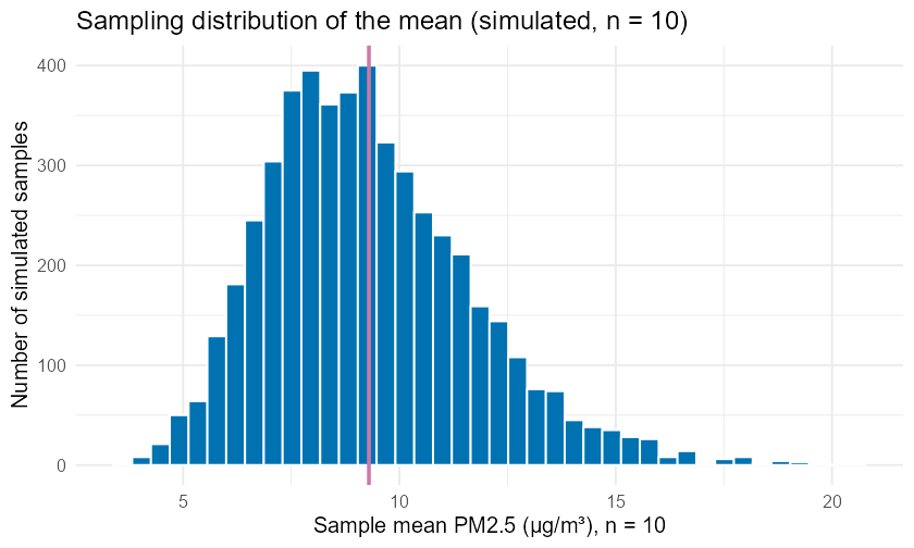
Simulated sampling distribution of the mean daily PM2.5 (µg/m³) for samples of n = 10 Kern County monitor-days, 5,000 repetitions. The distribution of the sample mean is roughly bell-shaped and centered near the population mean of 9.30 µg/m³, even though the underlying daily values are right-skewed.
Notice three things you should always check on a sampling distribution:
Center: the pile sits over the population mean (~9.30). The sample mean is unbiased — on average it hits .
Spread: the means range only from roughly 4 to 16, far tighter than the raw daily values (which run from near 0 past 60). Averaging tames variability.
Shape: it is close to bell-shaped, even though the raw PM2.5 days are right-skewed. That is the CLT, coming next.
53. The Central Limit Theorem and the standard error
5.1Intuition
You don’t actually need a computer every time. There’s a remarkable fact: the spread of the sampling distribution of the mean is predictable from just the population spread and the sample size. Bigger samples give tighter sampling distributions, and they tighten in a specific way — proportional to , not . Quadruple the sample size and you only halve the spread. That “diminishing returns” pattern is worth internalizing: precision is expensive.
The Central Limit Theorem adds a second gift: for a large enough , the sampling distribution of the mean is approximately normal, whatever the shape of the population. Skewed air data, lumpy survey data — average enough of it and the average behaves normally.
5.2Formula
The standard error of the mean (the standard deviation of the sampling distribution of ) is
where is the population standard deviation and is the sample size.
Why the square root, and not just ? Because variances add, not standard deviations. When you average independent observations, the mean’s variance is the population variance divided by :
The standard error is the standard deviation of , which is the square root of that variance:
That lone is the whole reason precision improves slowly: to halve the spread you must quadruple . The Central Limit Theorem states that as grows,
read “ is approximately normally distributed with mean and standard deviation .” The symbol means “is distributed as.” Three claims are bundled here: the sampling distribution is centered at , has spread , and is approximately normal for large .
For a proportion (a yes/no variable, like “did this day exceed a pollution threshold?”), the same logic gives
where is the population proportion of “successes” and (“p-hat”) is the sample proportion. In plain words: this is the same idea as the mean’s standard error — it measures how much the sample proportion would bounce around from one sample of size to the next. Larger makes it smaller, just as before.
5.3R
The simulated standard error from Section 2 should match the CLT formula. Treat
the 1,554 PM2.5 days as the population, so = sd(pm$daily_mean) =
7.63 µg/m³. For :
sigma <- sd(pm$daily_mean)        # 7.6298 (dataset-derived)
n     <- 10

se_theory <- sigma / sqrt(n)
round(se_theory, 4)
#> [1] 2.4127

# The simulated SE is just the SD of the 5,000 simulated means in sd10$mean:
se_sim <- sd(~ mean, data = sd10)
round(c(simulated = se_sim, theoretical = se_theory), 4)
#>   simulated theoretical
#>      2.3862      2.4127   (agree within Monte Carlo noise)
The simulated standard error and the formula value agree to within simulation noise — the formula is just a shortcut for the picture.
Going deeper (optional): why the CLT needs a finite variance
The Central Limit Theorem comes with one piece of fine print that almost never bites in practice but is worth knowing: the population must have a finite standard deviation . Look back at the formula — if were infinite, that expression would be meaningless, and there would be no fixed normal curve for the sample mean to settle into. A few exotic distributions (the Cauchy distribution, used to model certain extreme physical and financial phenomena, is the classic example) have tails so heavy that their variance is infinite, and for those the sample mean does not become normal no matter how large gets — averaging never tames them.
Why mention it? Because it sharpens what the CLT is really claiming. The theorem is not magic that fixes any data; it is a precise statement that, as long as the population has a finite spread, the averaging process pulls the sample mean toward a normal shape. Every real dataset in this course — air quality, heights, yields — has a finite spread, so the CLT applies. This is purely for curiosity; you will never be asked to check for infinite variance in MATH 2200.
64. How sample size sharpens the picture
6.1Intuition
Because , the sampling distribution narrows as grows — but slowly. We can watch it happen: simulate sample means at several sample sizes from the same population and see the spread shrink. Here we deliberately pick a badly non-normal population — a right-skewed Exponential — to show that the CLT still pulls the mean toward a bell.
6.2R
# Draw from a right-skewed Exponential(1) population (sigma = 1) at four sample
# sizes, 2,000 sample means each. do() * mean(rexp(n)) is the same recipe as before.
set.seed(2200)
sim_at_n <- function(nn) data.frame(n = nn, xbar = (do(2000) * mean(rexp(nn)))$mean)
demo_draws <- rbind(sim_at_n(2), sim_at_n(5), sim_at_n(10), sim_at_n(50))

ggplot(demo_draws, aes(x = xbar)) +
  geom_histogram(bins = 35, fill = ok[1], colour = "white") +
  facet_wrap(~ n, labeller = label_both, scales = "free_y") +
  labs(x = "Sample mean (x-bar)", y = "Count of simulated samples",
       title = "CLT: the sampling distribution narrows and normalizes as n grows") +
  theme_minimal(base_size = 12)

# Per-n center (mean, near 1) and simulated standard error (the sd column):
favstats(xbar ~ n, data = demo_draws)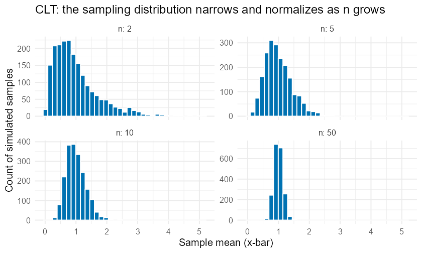
Central Limit Theorem in action: the simulated sampling distribution of the mean for a right-skewed (exponential) population at four sample sizes. As n increases from 2 to 50, the distribution of the mean narrows and becomes more symmetric and bell-shaped.
The four panels above are fixed snapshots. Below is the same idea you can drive yourself: an interactive simulator with a sample-size slider. Drag it and watch the standard error shrink the distribution in real time.
Figure 1:Interactive Central Limit Theorem simulator — drag the sample size slider from to . The histogram of 5,000 simulated sample means narrows toward the population mean (orange dashed line) as the standard error (shown in the title) shrinks. The data are simulated with a fixed seed; the full kernel-free Plotly source lives on the CLT simulator page.
In the favstats() output the mean column stays near 1 (the exponential’s true
mean) while the sd column — the simulated standard error — shrinks toward the
theoretical (here , so ): about
as runs . The same law holds
for any population. Concretely, for our PM2.5 population ():
| 5 | 3.41 µg/m³ |
| 10 | 2.41 µg/m³ |
| 30 | 1.39 µg/m³ |
| 50 | 1.08 µg/m³ |
| 100 | 0.76 µg/m³ |
(All values computed from kern_airquality.csv.) Going from to
cuts the standard error exactly in half (), because
.
75. When does the CLT apply? Conditions
7.1Intuition
The CLT is an approximation, and approximations have fine print. Two conditions matter:
Independence. Observations are independent — typically met by random sampling, or by sampling less than 10% of a finite population without replacement.
Sample size / shape. For a mean, the more skewed the population, the larger the you need before looks normal. A common rule of thumb is ; for very skewed data you may need more. For a proportion, the standard check is success–failure: and .
7.2Formula
For a proportion with population (or planning) proportion and sample size , require
These ensure the count of successes and the count of failures are both large enough for the normal approximation of to hold.
7.3R
Suppose “success” means a day’s PM2.5 exceeds 12 µg/m³ (the EPA Good/Moderate
AQI boundary for daily PM2.5). In our population that happens on
23.81% of days (370 of 1,554 days, from kern_airquality.csv).
p <- mean(pm$daily_mean > 12)     # 0.2381 (dataset-derived)
round(p, 4)
#> [1] 0.2381

check_sf <- function(n, p) c(n = n, np = n * p, n1mp = n * (1 - p),
                             ok = (n * p >= 10) & (n * (1 - p) >= 10))
round(rbind(check_sf(30, p), check_sf(50, p)), 2)
#>  n   np  n1mp ok
#> 30 7.14 22.86  0   <- fails: np = 7.1 < 10
#> 50 11.9 38.10  1   <- passes
At the success–failure check fails (): with a fairly rare event you need a bigger sample before is trustworthy as normal. At it passes.
8Worked examples
8.1Example 1 — Reading a sampling distribution (Kern PM2.5)
Intuition. A colleague will sample 10 Kern monitor-days and average their PM2.5. Before they do, predict how far that average is likely to land from the true mean of 9.30 µg/m³.
Formula. With population and , .
Computation.
sigma <- sd(pm$daily_mean)   # 7.6298
se10  <- sigma / sqrt(10)
round(se10, 4)
#> [1] 2.4127
Interpretation. The standard error is 2.41 µg/m³. By the CLT, a 10-day average is approximately Normal(9.30, 2.41). So a typical 10-day average lands within about of 9.30 (roughly 6.9 to 11.7), and it is genuinely plausible for one analyst to report 7 and another 12 from the same air — that is sampling variability, not a mistake.
8.2Example 2 — The law (Kern PM2.5)
Intuition. Your colleague wants the standard error half as big. How many days must they sample?
Formula. Halving requires quadrupling , because .
Computation.
se10 <- sigma / sqrt(10)
se40 <- sigma / sqrt(40)
round(c(n10 = se10, n40 = se40, ratio = se10 / se40), 4)
#> n10 = 2.4127 ; n40 = 1.2063 ; ratio = 2
Interpretation. Going from 10 to 40 days (4×) cuts the standard error from 2.41 to 1.21 µg/m³ — exactly half. Precision is expensive: each additional digit of accuracy costs a 100-fold increase in sample size.
8.3Example 3 — A proportion and the success–failure check (Kern PM2.5)
Intuition. Define a “high-particle day” as PM2.5 > 12 µg/m³. In the population, 23.81% of days qualify. If we sample days, how much will the sample proportion bounce, and is the normal approximation safe?
Formula. ; check and .
Computation.
p  <- mean(pm$daily_mean > 12)   # 0.2381
n  <- 50
se <- sqrt(p * (1 - p) / n)
round(c(p = p, np = n * p, n1mp = n * (1 - p), SE = se), 4)
#> p = 0.2381 ; np = 11.905 ; n1mp = 38.095 ; SE = 0.0602
Interpretation. Both and exceed 10, so the normal approximation is reasonable. The standard error of is 0.0602, about 6 percentage points: a 50-day sample’s “share of high-particle days” typically lands within about points of the true 23.8%.
8.4Example 4 — Simulating a proportion’s sampling distribution (Kern PM2.5)
Intuition. Don’t trust the formula on faith — simulate it and compare.
Formula. Simulated = SD of the simulated values; compare to .
Computation.
high_day <- factor(ifelse(pm$daily_mean > 12, "high", "ok"))
p <- mean(pm$daily_mean > 12)          # 0.2381 (dataset-derived)

set.seed(2200)
# Each rep: resample 50 days, then take the proportion that are "high".
sp <- do(5000) * mean(resample(high_day, 50) == "high")

se_sim    <- sd(~ mean, data = sp)
se_theory <- sqrt(p * (1 - p) / 50)
round(c(simulated = se_sim, theoretical = se_theory), 4)
#>  simulated theoretical
#>     0.0605      0.0602   (within Monte Carlo noise)
Interpretation. The theoretical matches the simulated spread closely, confirming the formula. The two methods are two views of the same truth: the formula is fast; the simulation is convincing.
8.5Example 5 — The CLT rescues a skewed population (NHANES)
Intuition. Adult-and-child height data are not bell-shaped — the
nhanes_subset heights are left-skewed, because the sample includes young
children whose heights pull a long lower tail. Does the sample mean of height
still go normal anyway? Use the nhanes_subset teaching sample (a CDC NHANES
teaching set — not survey-weighted, so it teaches the mechanics, not a
population claim; see data/codebooks/nhanes_subset.md).
Formula. CLT: for large , regardless of population shape.
Computation.
nh <- read.csv("data/processed/nhanes_subset.csv")
height <- nh$height_cm[!is.na(nh$height_cm)]

set.seed(2200)
sd25 <- do(5000) * mean(resample(height, 25))

library(ggplot2)
p_pop <- ggplot(data.frame(h = height), aes(h)) +
  geom_histogram(bins = 40, fill = ok[2], colour = "white") +
  labs(x = "Individual height (cm)", y = "People",
       title = "Population: individual heights") +
  theme_minimal(base_size = 11)

p_samp <- ggplot(data.frame(xbar = sd25$mean), aes(xbar)) +
  geom_histogram(bins = 40, fill = ok[1], colour = "white") +
  labs(x = "Sample mean height (cm), n = 25", y = "Samples",
       title = "Sampling distribution of the mean") +
  theme_minimal(base_size = 11)

if (requireNamespace("patchwork", quietly = TRUE)) {
  patchwork::wrap_plots(p_pop, p_samp, ncol = 2)
} else {
  print(p_pop); print(p_samp)
}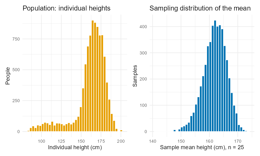
Left: the left-skewed population of NHANES heights (cm), pooled across all ages. Right: the simulated sampling distribution of the mean height for n = 25, which is symmetric and bell-shaped — the Central Limit Theorem at work on a non-normal population.
Interpretation. The individual heights are not normal, but the sampling
distribution of the mean at is a clean bell — exactly what the CLT
promises. (Reference values from nhanes_subset.csv: mean height cm, SD cm, so the theoretical at is
cm.)
9Try it
Shiny — Statistics Explorer, “Sampling Distribution Simulator” module. Drag the sample-size slider and watch the sampling distribution narrow in real time; the panel shows the exact
mosaiccode —do(...) * mean(~ x, data = resample(...))— each move generates. Launch the app (shiny-explorer/) and open the Sampling Distribution module.Jupyter lab —
labs/lab06-sampling-distributions.ipynb(R kernel). Rebuild the PM2.5 sampling distributions by hand withreplicate(), then withdo() * mean(~ daily_mean, data = resample(pm, n)), and confirm the law on the Kern data.
10Chapter summary
A population distribution and a sample distribution describe data values; a sampling distribution describes how a statistic (like ) varies across many samples of size .
You can build a sampling distribution by simulation: sample, compute the statistic, repeat thousands of times, histogram the results.
The standard error is the spread of the sampling distribution. For a mean, ; for a proportion, .
The Central Limit Theorem: for large , is approximately — whatever the population shape.
Spread shrinks like : quadruple the sample to halve the standard error.
Conditions: independence; large-enough (rule of thumb for means, more if very skewed); success–failure and for proportions.
This is the engine of every confidence interval (Chapter 7) and hypothesis test (Chapter 8) ahead.
11FAQ
Q1. Is the standard error the same as the standard deviation? No, but they’re related. The standard deviation describes spread of the raw data. The standard error describes spread of a statistic (the mean) across samples. The SE is always smaller than (for ), because averaging reduces variability.
Q2. Does the Central Limit Theorem make my data normal? No. Your data keep whatever shape they have. The CLT is about the sample mean, which becomes approximately normal as grows even when the data are skewed.
Q3. What sample size is “large enough”? It depends on how skewed the population is. The familiar rule works for mildly skewed data; heavily skewed data may need much more. For proportions, use the success–failure check ( and ) instead of a flat number.
Q4. Why and not in the denominator? Because variances add and standard deviation is the square root of variance. The variance of is , so its standard deviation — the standard error — is . That square root is why precision improves only slowly with sample size.
Q5. In real life I have from where? Usually you don’t know exactly; you estimate it with the sample standard deviation . That substitution is precisely what leads to the -distribution in Chapter 10. In this chapter we treat the curated data as a known population so you can see the sampling distribution clearly.
Q6. Why simulate if there’s a formula? Two reasons. First, simulation builds intuition — you literally watch the bounce. Second, for statistics with no tidy formula (medians, trimmed means, correlations), simulation/bootstrapping is the only route, which you’ll use for confidence intervals in Chapter 7.
Q7. Does a bigger population mean a bigger standard error? No — the standard error depends on the sample size and the population spread , not the population size (as long as you sample a small fraction of it). A well-designed sample of 1,000 is about as precise for the U.S. as for a single city.
12Practice problems
For each problem, assume the curated datasets are loaded with
read.csv(). Odd-numbered answers appear in the appendix; full worked
solutions are in the instructor key.
Define, in your own words, the difference between a sample distribution and a sampling distribution. Give an example of each using daily PM2.5.
A population has . Compute for .
True or false: the Central Limit Theorem says that data from any population become normally distributed as sample size grows. Explain.
For the PM2.5 population (, ), give the approximate sampling distribution of for (name the model, its center, and its spread).
You quadruple your sample size from 25 to 100. By what factor does the standard error of the mean change?
A sample proportion has and . Compute .
Check the success–failure condition for a proportion with and . Is the normal approximation appropriate? Why or why not?
Explain why the sampling distribution of is narrower than the population distribution of the raw data.
Using the air-quality population, the standard error of a 10-day mean is 2.41. Roughly what range will contain most () of 10-day sample means? (Use the 68–95–99.7 rule from Chapter 5.)
A friend says, “My sample of 8 days gave a mean of 9.1, so the true mean is 9.1.” What is wrong with this statement?
The NHANES height population has cm. Compute for .
For a proportion, which is larger when versus (same ): the standard error? Explain why is the “worst case.”
Write the R code (using
do() *withresample()) to simulate the sampling distribution of the mean PM2.5 for samples of size 25 with 4,000 repetitions and seed 2200.The CLT requires independence. Name one way a sample of consecutive daily PM2.5 readings might violate independence.
A sampling distribution of the mean is centered at 9.30 with SE 1.08. What sample size produced it, given ? (Solve for .)
Interpret the standard error 0.06 for a sample proportion of high-particle days in plain language for a city council member.
Sketch (describe in words) how the histogram of changes as goes from 2 to 50 for a right-skewed population.
Compute the theoretical standard error of for the PM2.5 population at , and state how it compares to the value.
Explain the difference between a parameter and a statistic, using and .
A proportion’s success–failure check passes at when but fails at . Show the arithmetic and explain the practical lesson.
Why do we set a seed (
set.seed/ theseed =argument) when simulating a sampling distribution?The simulated standard error from 5,000 reps was 2.39; the formula gives 2.41. Why don’t they match exactly, and how would you make them closer?
For and , compute and then state how many times smaller it is than the SE at .
A pollster reports “37% support, sample of 1,000.” Compute the approximate standard error of that proportion and give a rough ± range for the true value (use ).
Explain why averaging “tames variability” using the air-quality example (raw days range near 0 to 60; means of 10 days range only ~4 to 16).
The success–failure rule uses 10. Conceptually, what goes wrong with the normal approximation of when is very small (say 2)?
Given , derive the sample size needed to achieve a target standard error . Write the formula.
Using the derivation in #27, find the needed for µg/m³ with .
Distinguish the shape, center, and spread claims bundled inside the Central Limit Theorem.
A classmate plots a histogram with “µg/m³” on the x-axis and calls it a sampling distribution. How can you tell from the axis label that they have likely mislabeled it?
13Resumen en español
Resumen del capítulo
En este capítulo aprendiste una de las ideas más importantes de toda la estadística: cómo se comporta un estadístico (statistic) — por ejemplo, la media muestral (sample mean) — cuando se toman muchas muestras diferentes de la misma población (population).
Para entender esto, primero distinguimos tres distribuciones (distributions) que suelen confundirse. La distribución poblacional (population distribution) describe los valores de todos los miembros de la población; la distribución muestral (sample distribution) describe los valores de una sola muestra que recolectaste; y la distribución de muestreo (sampling distribution) describe cómo varía un estadístico de muestra en muestra. Esta última es la clave de toda la inferencia.
Usamos datos reales de calidad del aire en el Condado de Kern: los 1,554 días de registro de PM2.5 con una media poblacional de 9.30 µg/m³ y una desviación estándar (standard deviation) de 7.63 µg/m³. Con do(5000) * mean(~ daily_mean, data = resample(pm, 10)) de mosaic, simulamos miles de muestras de tamaño 10 y observamos cómo la media muestral varía alrededor del verdadero valor poblacional, formando una campana, aunque los datos originales son sesgados hacia la derecha.
La fórmula central del capítulo es el error estándar (standard error) de la media:
donde es la desviación estándar poblacional y es el tamaño de muestra. Esta fórmula te dice cuánto “rebota” la media de muestra en muestra. Para una proporción (proportion) , el error estándar es .
El Teorema del Límite Central (Central Limit Theorem, CLT) garantiza que, para muestras suficientemente grandes, la distribución de muestreo de la media es aproximadamente normal (normal distribution), sin importar la forma de la población original. Cuadruplicar el tamaño de muestra reduce el error estándar a la mitad — la precisión mejora lentamente.
Antes de aplicar estas fórmulas, debes verificar las condiciones (conditions): independencia entre observaciones y tamaño de muestra adecuado ( para medias; para proporciones, la prueba de éxito-fracaso: y ).
Las funciones do() * y resample() de mosaic te permiten ver todo esto en R. Este capítulo es el motor que impulsa los intervalos de confianza (confidence intervals) del Capítulo 7 y las pruebas de hipótesis (hypothesis tests) del Capítulo 8.