1Objectives
By the end of this lesson you will be able to:
Compute a correlation coefficient with
cor(y ~ x, data=).Fit a simple linear regression model with
lm(y ~ x, data=).Read the coefficient table from
msummary(model)and interpret the slope, the intercept, and in the context of the data.Predict a new value with
makeFun()and withpredict().Build and read a residual plot to check whether a straight line was a reasonable model in the first place.
2From “is there a relationship” to “what is the relationship”
L07 plotted exam_score against study_min and computed
cor(exam_score ~ study_min, data = survey), getting about 0.56 — a real,
positive, moderate relationship, more study time going with a higher score.
Correlation answers whether (and how strongly) two numerical variables
move together. Regression goes one step further and answers how: it
fits a straight line that turns any study time into a predicted exam
score. This lesson picks up exactly where L07 left off, same variables, same
dataset:
suppressMessages({library(mosaic); library(BSDA)})
set.seed(2200)
survey <- read.csv("data/survey_sim.csv")31. Correlation, again — and what it does not tell you
cor(exam_score ~ study_min, data = survey)[1] 0.5594575cor(y ~ x, data=) is mosaic’s formula version of the correlation
coefficient — one number, always between -1 and 1, summarizing the
strength and direction of a linear relationship. : as weekly
study time goes up, exam score tends to go up too, moderately consistently.
What alone can’t do is turn “more study time” into a specific predicted
score — for that you need an equation, which is exactly what lm()
builds.
42. Fitting the line: lm()
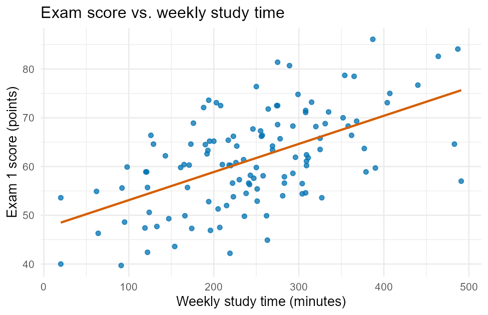
Figure 1:Exam score vs. weekly study time (from L07) — the line lm() fits below is exactly this one.
That trend line is a least-squares regression line: the one straight
line that makes the total squared vertical distance from every point to the
line as small as possible. lm() (“linear model”) fits it and hands back an
object holding everything about the fit:
model <- lm(exam_score ~ study_min, data = survey)
model
Call:
lm(formula = exam_score ~ study_min, data = survey)

Coefficients:
(Intercept)    study_min
   47.34733      0.05765
Same y ~ x, data= formula shape as every other function in this book — “model
exam score as a function of study time, using survey.” Printed on its own,
model gives just the two numbers that define the line:
, the intercept: the model’s predicted exam score for a student with
study_min = 0. It’s a mathematical anchor point for the line, not necessarily a realistic prediction — no student in this dataset actually studied zero minutes., the slope: for every additional minute of weekly study time, predicted exam score rises by about 0.0577 points, holding nothing else constant (there’s nothing else in this model to hold constant — that matters more once a model has several predictors). Scaled up, that’s about 5.8 points per extra 100 minutes of weekly study time.
53. The full picture: msummary()
model alone shows the line; msummary() — mosaic’s cleaner version of
base R’s summary() for a fitted model — adds the coefficient table, the
significance tests on each coefficient, and :
msummary(model) Estimate Std. Error t value Pr(>|t|)
(Intercept) 47.347331 2.075349 22.814 < 2e-16 ***
study_min 0.057650 0.007863 7.332 3.09e-11 ***
Residual standard error: 8.157 on 118 degrees of freedom
Multiple R-squared: 0.313, Adjusted R-squared: 0.3072
F-statistic: 53.76 on 1 and 118 DF, p-value: 3.093e-11Each row of the coefficient table is its own hypothesis test — same logic as
every test in L10/L11 — testing
(“this term adds nothing to the model”) against . The
study_min row’s Pr(>|t|) of 3.09e-11 is far below :
reject — study time is a statistically significant predictor of exam
score in this sample. Std. Error is the standard error of that coefficient
estimate (how much the slope would jitter across repeated samples); t value is Estimate / Std. Error.
, the Multiple R-squared line (0.313), is the proportion of the
variation in exam score that this model explains using study time alone —
about 31.3%. You can also pull it directly:
rsquared(model)[1] 0.3129927 means study time accounts for a bit under a third of why exam
scores vary from student to student in this sample — a real, meaningful
relationship (matching the moderate from the correlation above,
since ), but far from the whole story. The other
69% comes from everything else study_min alone can’t capture: how
well-rested a student was, prior background, how the questions happened to
fall for them, and plain chance.
64. Predicting a new value: makeFun() and predict()
Once a model is fit, turning a new study time into a predicted score takes
one line — two equivalent ways to do it. makeFun() (a mosaic function)
turns the whole model into an ordinary R function you can call by name:
predict_exam <- makeFun(model)
predict_exam(study_min = 300)
1
64.64231 A student who studies 300 minutes a week is predicted to score about 64.6.
Base R’s predict() does the same job, taking a small data frame of new
x values instead of named arguments — handy for predicting several values
at once:
predict(model, newdata = data.frame(study_min = c(100, 300, 500))) 1 2 3
53.11232 64.64231 76.17230 Both agree exactly at study_min = 300 (64.64) — makeFun() is simply a
friendlier wrapper around the same predict() machinery underneath.
75. Checking the line: a residual plot
A residual is the gap between what actually happened and what the model
predicted: . resid()
and fitted() pull both off a fitted model:
favstats(~resid(model)) min Q1 median Q3 max mean sd n
-18.65345 -6.406816 0.5248858 5.656097 18.19894 4.706269e-16 8.122442 120
missing
0The mean residual is (up to rounding) exactly 0 — least squares guarantees that, so it’s not informative on its own. What is informative is the pattern in the residuals, best seen as a plot of residuals against the model’s fitted (predicted) values:
gf_point(resid(model) ~ fitted(model), color = "#0072B2", alpha = 0.75) %>%
  gf_hline(yintercept = 0, color = "#D55E00", linetype = "dashed") %>%
  gf_labs(title = "Residual plot: exam_score ~ study_min",
          x = "Fitted (predicted) exam score", y = "Residual (actual - predicted)")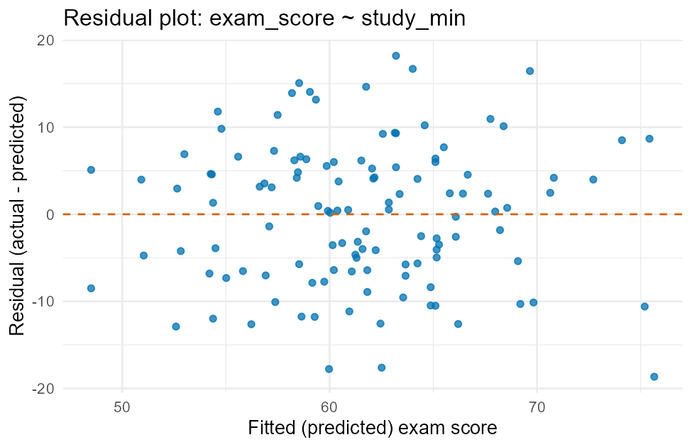
Figure 2:Residual plot for the exam_score ~ study_min model.
This is what a healthy residual plot looks like: points scattered randomly above and below the dashed zero line, no curve, and no funnel shape (spread staying roughly constant as the fitted values increase). That supports two of simple linear regression’s key conditions — linearity (a straight line was a reasonable choice, no missed curve) and constant variance (the model isn’t systematically worse for high or low predictions). If you instead saw a clear U-shape, a straight line would be the wrong model; if you saw the spread fanning out at one end, the constant-variance condition would be in question. Reading a residual plot is exactly this: look for any leftover pattern, because a pattern means the model missed something the straight line should have captured.
8Summary
cor(y ~ x, data=)measures the strength and direction of a linear relationship;lm(y ~ x, data=)fits the actual line, andmodelprinted alone shows its intercept and slope.msummary(model)is the full picture: a coefficient table (each row its own test), the residual standard error, and —rsquared(model)pulls that last number directly.Interpret the slope as “for each one-unit increase in , predicted changes by this much”; interpret as “this fraction of the variation in is explained by .”
makeFun(model)turns a fitted model into a callable R function;predict(model, newdata = data.frame(x = ...))does the same job for one or many new values — never trust either one far outside the range of the model was fit on.A residual plot (
resid(model)vs.fitted(model)) is how you check whether a straight line was the right model at all: look for random scatter around zero, not a curve or a funnel.The full script that generated the new figure and every number in this lesson is committed at
data/make_L12_figures.R— run it yourself to reproduce all of it exactly. The recap scatterplot above is the same filedata/make_L07_figures.Rproduced in L07.