1Objectives
By the end of this lesson you will be able to:
Fit a one-way ANOVA model with
aov(y ~ g, data=)and read its table withanova(model).Interpret an -statistic and its p-value to decide whether group means differ.
Define the core experimental-design vocabulary: factor, levels, randomization, replication.
Connect a small designed experiment to the ANOVA table it produces.
2From two groups to several
L11 compared exactly two group means with a t-test. ANOVA
(“Analysis of Variance”) answers the same kind of question — do group means
differ? — for three or more groups at once, with a single test instead
of running t-tests on every pair. survey’s five declared majors are a
ready-made example: does mean Exam 1 score differ across Business,
Kinesiology, Nursing, Other, and STEM?
suppressMessages({library(mosaic); library(BSDA)})
set.seed(2200)
survey <- read.csv("data/survey_sim.csv")
survey$major_area <- factor(survey$major_area)31. EDA first, as always
favstats(exam_score ~ major_area, data = survey) major_area min Q1 median Q3 max mean sd n missing
1 Business 42.2 56.150 60.30 66.40 76.7 60.88065 8.811145 31 0
2 Kinesiology 40.0 60.250 63.40 69.25 86.1 64.42500 10.353166 24 0
3 Nursing 49.3 59.200 62.20 68.55 78.5 63.37895 7.844430 19 0
4 Other 43.6 51.475 55.85 65.95 82.6 58.84091 10.820160 22 0
5 STEM 39.7 54.375 58.00 67.85 80.7 60.57917 10.646819 24 0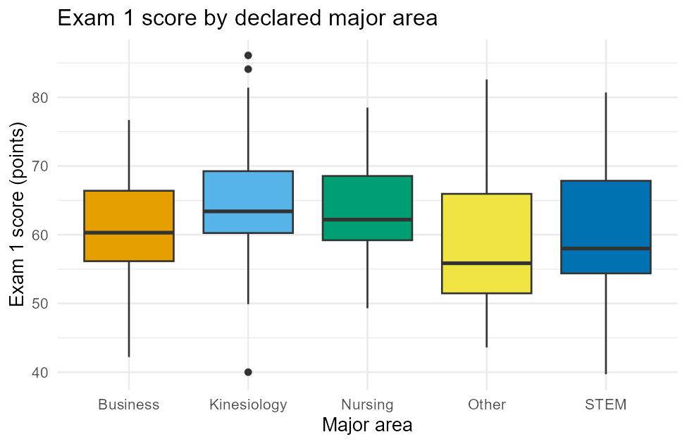
Figure 1:Exam 1 score by declared major area — EDA before the ANOVA test.
Five means, all sitting within about six points of each other (58.8 to 64.4), with heavily overlapping boxes — EDA alone doesn’t show an obvious winner or loser. That’s exactly the situation a formal test is for: is that six-point spread more than you’d expect from sampling variability alone, or is it a real difference?
42. Fitting and reading the ANOVA table
fit <- aov(exam_score ~ major_area, data = survey)
anova(fit)
Analysis of Variance Table
Response: exam_score
Df Sum Sq Mean Sq F value Pr(>F)
major_area 4 459.9 114.976 1.2055 0.3123
Residuals 115 10967.8 95.372 aov(y ~ g, data=) — same y ~ g, data= shape as t.test() in
L11, just with a grouping variable that now has more than two
levels — fits the model; anova() (note: no x in the name, unlike
xchisq.test()) prints its table. Read each column:
Df(degrees of freedom):major_area’s row gets (five groups);Residuals’ row gets (120 students minus 5 groups).Sum Sq(sum of squares):major_area’s 459.9 is variation between the five group means;Residuals’ 10967.8 is variation within groups (students scoring differently even inside the same major). ANOVA is literally comparing these two sources of variation.Mean Sq: eachSum Sqdivided by its ownDf— an average squared variation per degree of freedom.F value:Mean Sq(major_area) / Mean Sq(Residuals)= . An near 1 means the between-group variation is about the same size as the natural within-group noise — no real evidence of a group effect. A large (well above 1) means the groups differ by more than noise alone would explain.Pr(>F): the p-value,0.3123here.
: all five major means are equal (); : at least one differs. With : fail to reject . This sample gives no evidence that mean Exam 1 score differs across declared major — the six-point spread in the means is small enough to be ordinary sampling variability, exactly what the near-1 -statistic already signaled.
53. Experimental-design vocabulary
ANOVA’s own name comes from designed experiments, not just observational
survey data like survey. Four terms describe how such an experiment is
built:
| Term | Meaning |
|---|---|
| Factor | The variable a researcher deliberately manipulates (e.g., which fertilizer a plant receives). |
| Levels | The specific values/categories the factor takes (e.g., Control, Treatment A, Treatment B). |
| Randomization | Assigning experimental units to levels by chance, so no hidden variable systematically favors one level (e.g., shuffling which tree gets which fertilizer, instead of choosing by hand). |
| Replication | Measuring more than one unit per level, so you can tell a real effect from one unusually high or low measurement. |
survey$major_area is not a designed-experiment factor in this sense —
students chose their major, nobody randomly assigned it, so “major” is an
observational grouping variable. That distinction matters for what you
can claim: Section 2’s result (no evidence of a difference) describes an
association question, and even a significant result there could never, by
itself, support a claim that changing your major causes a score change.
A true experiment, with random assignment to levels, is what lets you make
that stronger causal claim.
64. A small worked experiment
Here’s what a genuine designed experiment looks like end to end, worked
through with simulated data — 24 young almond trees, randomly
assigned 8 each to three fertilizer levels (Control, Treatment A,
Treatment B), yield in pounds measured once per tree at harvest (one
replication per tree, 8 replications per level). This is clearly
labeled classroom-simulation data, not a real Kern County yield record — the
generating code is right here, reproducible with set.seed(2200):
set.seed(2200)
fert_yield <- data.frame(
  fertilizer = factor(rep(c("Control", "Treatment A", "Treatment B"), each = 8),
                       levels = c("Control", "Treatment A", "Treatment B")),
  yield_lb   = round(c(rnorm(8, mean = 28, sd = 3),
                        rnorm(8, mean = 33, sd = 3),
                        rnorm(8, mean = 31, sd = 3)), 1)
)
favstats(yield_lb ~ fertilizer, data = fert_yield)
fertilizer min Q1 median Q3 max mean sd n missing
1 Control 25.3 26.875 28.45 30.350 32.0 28.6375 2.485350 8 0
2 Treatment A 25.5 29.700 32.65 34.250 37.8 31.8000 4.314428 8 0
3 Treatment B 30.8 30.875 32.35 33.425 34.9 32.4250 1.603345 8 0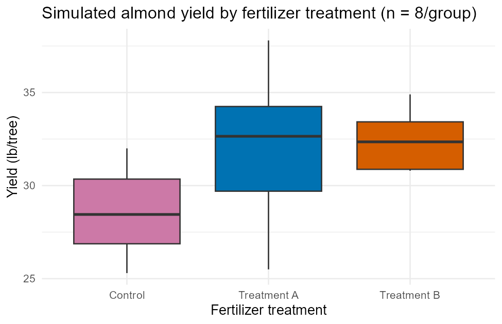
Figure 2:Simulated almond yield by fertilizer treatment — a small designed experiment.
Control’s mean (28.6 lb) looks visibly lower than either treatment’s (31.8 and 32.4 lb). Fit and read the ANOVA table exactly as in Section 2:
fert_fit <- aov(yield_lb ~ fertilizer, data = fert_yield)
anova(fert_fit)
Analysis of Variance Table
Response: yield_lb
Df Sum Sq Mean Sq F value Pr(>F)
fertilizer 2 65.966 32.983 3.6163 0.04471 *
Residuals 21 191.534 9.121
---
Signif. codes: 0 '***' 0.001 '**' 0.01 '*' 0.05 '.' 0.1 ' ' 1 (3 fertilizer levels ) and 21 (24 trees levels), , . This time : reject —
this simulated experiment shows evidence that mean yield differs across the
three fertilizer levels. R even flags it with a * under Signif. codes.
Unlike Section 2’s major_area result, this conclusion — because
fertilizer was randomly assigned — can support a genuinely causal
claim: in this simulated trial, changing the fertilizer treatment plausibly
changed the yield, not just correlated with it.
7Summary
aov(y ~ g, data=)fits a one-way ANOVA;anova(fit)prints the table —Df,Sum Sq,Mean Sq,F value,Pr(>F)— comparing variation between groups to variation within groups.An -statistic near 1 signals no real group effect; a large with a small
Pr(>F)signals the group means likely differ. : all group means equal; : at least one differs.Factor = the manipulated variable; levels = its specific values; randomization = chance assignment of units to levels; replication = more than one measurement per level. All four appear together only in a true designed experiment, not in an observational grouping variable like
major_area.A significant ANOVA from a randomized experiment can support a causal claim; the same significant-or-not result from observational data (students choosing their own major) only ever describes an association.
The full script that generated every figure and every number in this lesson, including the simulated fertilizer-trial generator, is committed at
data/make_L13_figures.R— run it yourself to reproduce all of it exactly.