This week in one line: you’ll learn why two honest random samples give two different numbers (sampling variability), and how to put a number on the typical size of that wobble (the standard error).
Two campus newspapers, on the same afternoon, each poll 50 different students at random about a proposed increase to the student recreation fee. Reporter A’s sample finds 52% in favor. Reporter B’s sample finds 50% in favor. Both reporters did everything right — a genuine random sample, the same question, the same day. So why don’t their numbers match, and which one (if either) is “correct”?
This week starts Chapter 5, the conceptual heart of the semester. Any number you compute from a sample — a percentage, an average — behaves a little like rolling a dice: draw a different sample and you get a different number, purely from the luck of who happened to get picked. Once you can say precisely how much that number typically wobbles from sample to sample, you have everything you need for the confidence intervals and hypothesis tests that fill the rest of this course.
1From guess to typical guess: parameter vs. point estimate
A parameter is a number that describes an entire population — every student at CSUB, every part a factory makes, every possible flip of a coin. Parameters are usually unknown, often unknowable directly. Two you’ll use constantly: the population proportion (the fraction of the population with some trait) and the population mean (the average of some numerical variable across the population).
A statistic is the matching number computed from a sample — the smaller group you actually got to observe. The point estimate is a statistic used as your single best guess at the parameter: the sample proportion (“p-hat”) estimates , and the sample mean (“x-bar”) estimates .
Worked Example 1 — A campus fee referendum. To make the population visible for teaching (something
you never get in real research), suppose a population of CSUB students has a true
proportion supporting the fee measure — 11,000 support it, 9,000 oppose it (fee_poll_sim, a
simulated population built with set.seed(1209)). Reporter A’s random sample of students finds
(26 of 50 in favor). Here is the parameter — fixed, and in real life unknown —
while is the point estimate: Reporter A’s one honest guess at , built entirely from
the 50 students she happened to draw.
2Same recipe, different sample: the sampling distribution
Reporter B follows the exact same recipe — random sample, , same population — and gets (25 of 50). Neither reporter made a mistake. This is sampling variability: a statistic computed from a random sample naturally differs from one sample to the next, purely because a different set of people was drawn. If you could repeat Reporter A’s poll thousands of times, each repetition’s would land somewhere slightly different, and the full collection of those values is called the sampling distribution of — the distribution of a statistic’s value across every possible sample of a given size.
You can’t poll a real population a thousand times, but because we built the whole population for this example, R can simulate it: draw 1,000 separate random samples of and record each one’s .
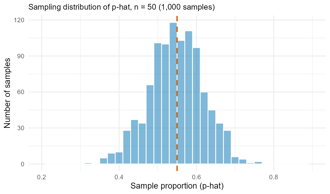
Figure 1. A histogram of 1,000 simulated values (samples of ) is roughly bell-shaped and symmetric, centered close to 0.55, and ranges from about 0.32 to 0.80. The average of all 1,000 estimates is 0.549 — almost exactly the true — showing that doesn’t systematically run high or low. A statistic with that property is called unbiased.
3Standard error: putting a number on the wobble
The standard error (SE) is the standard deviation of a sampling distribution — the typical distance a statistic lands from its parameter, measured in the statistic’s own units. For a sample proportion:
where is the population proportion and is the sample size (in practice substitutes for the unknown ). For a sample mean:
where is the population standard deviation (in practice the sample SD substitutes for the unknown ). For the fee poll, — almost exactly the standard deviation of the 1,000 simulated ’s from Figure 1, which was 0.0707.
Worked Example 2 — Coffee price on campus. Build a second hypothetical population:
purchase amounts (coffee_price_sim) generated from a Normal model targeting ,
(the realized population lands at mean , SD — indistinguishable from
the target for teaching purposes). One sample of purchases gives ; a second
sample of gives — again, two honest estimates, two different numbers.
Simulating 1,000 samples of gives a sampling distribution of centered at with
SD , matching the formula: .
Now quadruple the fee-poll sample to : — exactly half of the value. Because sits under a square root, multiplying the sample size by 4 divides the SE by . The same shrinking pattern holds for the mean: bumping the coffee-price sample from to shrinks the simulated spread from to , matching . Bigger samples give more precise — not more accurate, more precise — point estimates, because a larger shrinks the typical wobble around whatever value the sample happens to be centered on.
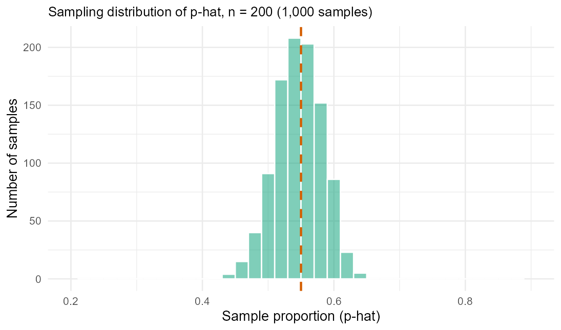
Figure 2. A second histogram of 1,000 simulated ’s, now from samples of , is visibly narrower than Figure 1’s — spread (SD) about 0.035 versus 0.071 — while still centered near 0.55.
4Same shape every time: the Central Limit Theorem
Look back at Figure 1: the variable behind it is about as far from bell-shaped as a variable can be — each student either supports the measure or doesn’t; a coin flip has no “shape.” Yet the sampling distribution of came out bell-shaped anyway. That’s the Central Limit Theorem (CLT): for a large enough sample size, the sampling distribution of a sample proportion or sample mean is approximately Normal, centered at the true parameter, regardless of the shape of the underlying population. “Large enough” is the condition the rest of this course is built on — Chapter 6 checks it with a success–failure count for proportions, Chapter 7 with a sample-size/skew check for means — but this week’s main idea is simpler: once is reasonably large, you can trust the bell shape and the SE formula to describe how a point estimate behaves, which is exactly what makes a confidence interval (next week) possible.
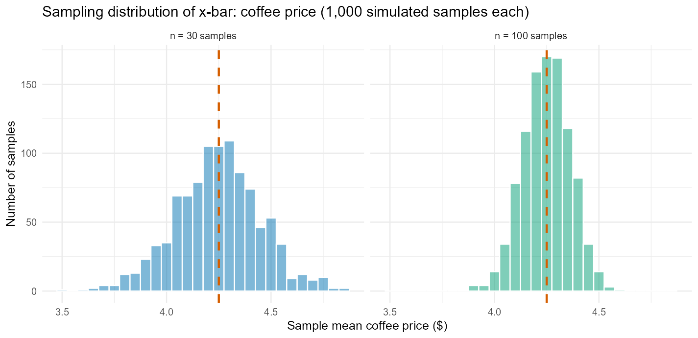
Figure 3. Two histograms of simulated ’s for the coffee-price example, and , drawn on the same horizontal scale: both are bell-shaped and centered near , and the histogram is visibly the narrower of the two — the same square-root shrinkage seen in Figures 1–2, now for a mean instead of a proportion.
See it in R.
library(mosaic)
set.seed(1209)

# Worked Example 1: sampling distribution of p-hat, n = 50, true p = 0.55
sim_phat_50 <- do(1000) * mean(~support, data = resample(fee_poll_sim, size = 50))
favstats(~mean, data = sim_phat_50)
gf_histogram(~mean, data = sim_phat_50)

# same population, n = 200 (Figure 2)
sim_phat_200 <- do(1000) * mean(~support, data = resample(fee_poll_sim, size = 200))
favstats(~mean, data = sim_phat_200)

# Worked Example 2: sampling distribution of x-bar, n = 30 and n = 100
sim_xbar_30  <- do(1000) * mean(~price, data = resample(coffee_price_sim, size = 30))
sim_xbar_100 <- do(1000) * mean(~price, data = resample(coffee_price_sim, size = 100))
favstats(~mean, data = sim_xbar_30)
favstats(~mean, data = sim_xbar_100)
Running this exact code (set.seed(1209), mosaic 1.9.2) reproduces every number in this week’s
reading: sim_phat_50 comes back with mean 0.549 and SD 0.0707; sim_phat_200 with mean 0.551
and SD 0.0349; sim_xbar_30 with mean 4.243 and SD 0.204; sim_xbar_100 with mean 4.248 and
SD 0.109.
5Check your understanding
In Worked Example 1, and Reporter A’s sample gave . Which of these two numbers is the parameter and which is the point estimate? Explain the difference between them in your own words.
Reporter B’s sample (same population, same ) gave — different from Reporter A’s 0.52, even though both sampled the exact same population the exact same way. Is this difference a sign that one reporter made a sampling mistake? Explain, using the term sampling variability.
Compute for the fee-poll population () at and again at . By what factor did increase, and by what factor did the SE decrease? Compare each answer to the simulated spreads reported in this week’s reading (0.0707 and 0.0349).
Compute for the coffee-price population () at and again at . Compare each answer to the simulated spreads reported in this week’s reading ( and ).
The variable behind Figure 1 — whether a student supports the fee measure — is binary, nothing like a bell curve. Yet the histogram of 1,000 simulated ’s came out roughly bell-shaped and centered near . Name the principle that explains this pattern, and state it in your own words.
A classmate says: “Since the SE for coffee-price samples () is smaller than the SE for samples (), every single sample of 100 will land closer to the true mean () than every single sample of 30.” Explain what’s wrong with this claim, using the idea that a standard error describes typical variability, not a guarantee.
6Key terms
Parameter — a number that describes an entire population (e.g., , ); usually unknown.
Statistic — the matching number computed from a sample (e.g., , ).
Point estimate — a statistic used as a single best guess at a parameter.
Sample proportion, (“p-hat”) — the point estimate of a population proportion .
Sample mean, (“x-bar”) — the point estimate of a population mean .
Sampling variability — the natural tendency of a statistic to differ from sample to sample.
Sampling distribution — the distribution of a statistic’s value across every possible sample of a given size.
Standard error (SE) — the standard deviation of a sampling distribution; the typical distance a statistic lands from its parameter. ; .
Unbiased — a statistic whose sampling distribution is centered at the true parameter (it doesn’t systematically run high or low, even though any single estimate can miss).
Central Limit Theorem (CLT) — for a large enough sample size, the sampling distribution of a sample proportion or mean is approximately Normal, centered at the true parameter, regardless of the underlying population’s shape.