1A Bakersfield neighborhood puzzle
Drive across Kern County and the air, the traffic, and the health of one neighborhood can look nothing like the next. California’s CalEnviroScreen tool tries to capture that by scoring every census tract — a small, neighborhood-sized Census area — on its combined pollution burden, then ranking each tract against every other tract in the state with a percentile from 0 (least burdened) to 100 (most burdened).
Here is a fact you can check yourself from the data shipped with this book. Of
the 147 Kern County tracts that have a CalEnviroScreen score, 73 — very
nearly half (49.7%) — fall in the statewide top quartile of burden (the
worst 25% of tracts in all of California). If Kern were just an average slice of
the state, we would expect only about 25% of its tracts up there, roughly 37
of them, not 73. (Source: kern_calenviroscreen codebook,
data/processed/kern_calenviroscreen.csv; this chapter recomputes the count
below.)
That gap — about 36 more high-burden tracts than “average” would predict — is the kind of thing this chapter teaches you to test. Is it a real departure from the “Kern is typical” story, or could a county just happen to land that way by chance? When your data are counts of categories rather than measured numbers like height or income, the tool for that question is the chi-square test. By the end of the chapter you will run exactly this test, get a chi-square statistic, and reach a defensible conclusion.
2Learning objectives
By the end of this chapter you will be able to:
(Apply) Conduct a chi-square goodness-of-fit test and interpret the result in context.
(Apply) Conduct a chi-square test of independence on a two-way (contingency) table.
(Apply) Compute expected counts and verify the expected-count condition before trusting a chi-square result.
(Analyze) Interpret which cells drive a significant result using standardized (Pearson) residuals.
(Communicate) State a categorical-association conclusion with appropriate causal caution for a non-technical audience.
This chapter expands ISRS sections 3.3–3.4 (goodness of fit; independence in two-way tables). It assumes you have met frequency and contingency tables (Section 1 builds on Chapter 3) and the logic of hypothesis testing — null and alternative hypotheses, conditions, p-values, and the reject / fail-to-reject decision — from Chapter 8.
3Why a new test? The idea behind chi-square
You already know how to test a claim about a single proportion (Chapter 9) and about means (Chapter 10). But many real questions are about a whole table of counts at once:
Goodness of fit: Do the counts in several categories match a claimed set of proportions? (Are Kern’s tracts spread evenly across the four statewide burden quartiles, or do they pile up at the top?)
Independence: In a two-way table, are the row and column categories associated, or unrelated? (Are predominantly Hispanic neighborhoods more likely to be high-burden than other neighborhoods?)
Both questions have the same shape. You have a table of counts you actually observed. You can write down the table of counts you would expect if the boring “nothing special is going on” story (the null hypothesis) were true. The chi-square test measures, with a single number, how far the observed table is from the expected table — and then asks whether that distance is bigger than sampling noise could comfortably produce.
The mental picture: lay the observed table on top of the expected table. If they match cell-for-cell, there is nothing to report. The more the two tables disagree, the larger the chi-square statistic, and the more the data argue against the null story.
Going deeper (optional) — chi-square as a measure of goodness
Enrichment; skip it freely. It is worth seeing why is the right yardstick. Each term is, near the null, approximately the square of a standardized normal deviation: the cell’s count behaves roughly like a normal variable with mean and variance close to , so is roughly a standard-normal . Squaring and summing such (nearly independent) -like pieces is exactly the recipe that defines a chi-square distribution — a sum of squared standard normals. That is the deep reason the statistic measures “goodness” of fit: it is the total squared, scaled distance of your table from the table the null predicts, in units the normal model makes comparable. It also explains the expected-count rule of thumb — the normal approximation to each count only holds when is not tiny.
4Goodness-of-fit: do the counts match a claimed distribution?
4.1Intuition
You have one categorical variable with categories and a count in each. Some theory or claim says the categories should occur in certain proportions. The goodness-of-fit test asks: do the observed counts fit that claim well, or are some categories surprisingly over- or under-represented?
Think of the burden-quartile question. There are four categories (Q1–Q4). The “Kern is a typical slice of California” claim says each statewide quartile should catch about a quarter of Kern’s tracts. The test compares the four counts we see against the four counts that claim predicts.
4.2Formula
Let
= the number of categories,
= the observed count in category (what the data show),
= the total number of observations,
= the hypothesized proportion for category under (the claim), with ,
= the expected count in category if is true.
The hypotheses are:
The chi-square statistic is
where the sum runs over all categories. Each term measures how far one category’s observed count strayed from its expected count, scaled by how big the expected count is (a miss of 10 matters more when you only expected 5 than when you expected 500). Squaring makes every term positive and punishes big misses hard. The statistic is compared against a chi-square distribution with
degrees of freedom (), where is the number of categories. A large (far out in the right tail) gives a small p-value and argues against .
4.3R
In mosaic the workflow is two steps you already know the shape of: build the
count table with tally(), then hand it to xchisq.test(). The “x” in
xchisq.test() stands for extra output — on top of the chi-square statistic
and p-value, it prints each cell’s observed count, its (expected) count
in parentheses, the [contribution to the chi-square statistic] in square
brackets, and the ⟨Pearson residual⟩ in angle brackets. That grid is the
“lay the observed table on the expected table” picture, made concrete. For
goodness-of-fit you pass the one-way table of counts plus a vector p of
hypothesized proportions.
# Load the real Kern environmental-justice data (one row per census tract).
ces <- read.csv("data/processed/kern_calenviroscreen.csv")

# Keep tracts that actually have a statewide burden percentile, then bin each
# tract into the statewide quartile its percentile falls in. cut() slices a
# numeric variable into labeled bins at the breakpoints you give.
scored <- subset(ces, !is.na(ces_percentile))
scored$quartile <- cut(
  scored$ces_percentile,
  breaks = c(0, 25, 50, 75, 100),
  labels = c("Q1 (0-25)", "Q2 (25-50)", "Q3 (50-75)", "Q4 (75-100)"),
  include.lowest = TRUE
)
observed <- tally(~ quartile, data = scored)
observed
The four observed counts are 11, 30, 33, and 73. Now run the test. Under “Kern
is typical,” each statewide quartile should hold one-quarter of Kern’s tracts, so
we hand xchisq.test() the null proportions p = rep(1/4, 4) (four equal
quarters):
xchisq.test(observed, p = rep(1/4, 4))Read the printout top to bottom. Each quartile shows its observed count on top,
its expected count (36.75) in parentheses (147 tracts ÷ 4 quartiles), the
[contribution to X-squared] it adds, and its ⟨Pearson residual⟩; Q1 lands far
below expectation and Q4 far above. The headline line reports the totals,
computed live from the data: X-squared = 55.422, df = 3, p-value = 5.581e-12 —
that is on with a p-value of about
, far below 0.0001. Because the p-value is far below our
significance level (the cutoff for “small enough to reject,”
written with the Greek letter alpha, , and carried over from
Chapter 8), we reject : Kern’s tracts are not
spread evenly across the statewide burden quartiles.
gof_df <- data.frame(
  quartile = names(observed),
  observed = as.numeric(observed)
)
expected_each <- sum(observed) / length(observed)   # 147 / 4 = 36.75

ggplot(gof_df, aes(x = quartile, y = observed)) +
  geom_col(fill = ok_blue) +
  geom_hline(yintercept = expected_each, linetype = "dashed",
             color = ok_vermil, linewidth = 1) +
  annotate("text", x = 1, y = expected_each + 4,
           label = "expected if Kern were typical (36.75)",
           hjust = 0, color = ok_vermil, size = 3.6) +
  labs(x = "Statewide CalEnviroScreen burden quartile",
       y = "Number of Kern tracts") +
  theme(panel.grid.major.x = element_blank())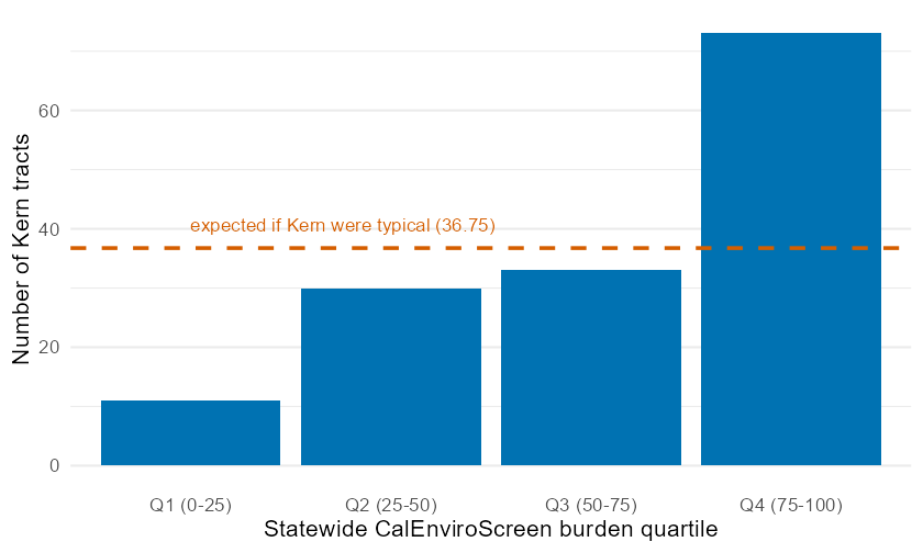
Observed vs. expected counts of Kern County census tracts in each statewide CalEnviroScreen burden quartile. Bars are observed counts; the dashed line marks the count expected (36.75) if Kern matched the statewide one-quarter-per-quartile pattern. Q4 towers far above the line and Q1 sits far below it, which is what makes the chi-square statistic large.
5Independence: are two categorical variables associated?
5.1Intuition
Now suppose each observation is cross-classified by two categorical variables, giving a two-way table (also called a contingency table). The test of independence asks: does knowing an observation’s row category tell you anything about its column category? If the two variables are independent, the column breakdown looks the same in every row. If they are associated, the breakdown shifts from row to row.
For the environmental-justice question, the rows might be a tract’s demographic makeup (Hispanic-majority or not) and the columns its burden level (top-quartile or not). Independence would mean high-burden tracts are just as common among Hispanic-majority neighborhoods as anywhere else. Association would mean the burden is not shared evenly.
5.2Formula
Lay out the data as a table with rows and columns. Let
= the observed count in row , column ,
= the total of row (the row total),
= the total of column (the column total),
= the grand total of all counts.
If the row and column variables were independent, the expected count in a cell would be its row’s share times its column’s share times the total:
That formula is the independence assumption written as arithmetic: the fraction of the whole table in row is , the fraction in column is , and under independence the fraction in their intersection is the product , so its expected count is .
The hypotheses are:
The statistic is the same sum as before, now over every cell of the table:
compared against a chi-square distribution with
degrees of freedom, where is the number of rows and the number of columns. The same expected-count condition applies: every should be at least 5.
Going deeper (optional) — where (r-1)(c-1) comes from
Enrichment, safe to skip. Degrees of freedom count how many cell values are free to vary once the test fixes what it must. When you build the expected table from the data’s own row totals and column totals , those totals are held fixed. In an table with all margins pinned down, you can fill in the top-left block of cells freely, but every cell in the last row and last column is then forced by subtraction (each must make its row or column add back to the fixed total). That is exactly free cells — the degrees of freedom. The goodness-of-fit case is the same idea with a single row of categories whose total is fixed: are free, the last is forced.
5.3R
Build the two-way table with tally(y ~ x, data = D) and pass it to
xchisq.test():
# Classify each scored tract two ways: by demographic makeup and by burden.
# ifelse(condition, A, B) labels a row "A" when the condition is true, else "B".
scored$demographic <- ifelse(scored$hispanic_pct >= 50,
                             "Hispanic-majority", "Not Hispanic-majority")
scored$burden      <- ifelse(scored$ces_percentile >= 75,
                             "High burden", "Lower burden")

# tally(y ~ x) builds the two-way count table -- burden broken down by demographic.
burden_table <- tally(burden ~ demographic, data = scored)
burden_table
# correct = FALSE turns off R's automatic Yates continuity correction for 2x2
# tables, giving the textbook Pearson chi-square -- the version for which
# chi-square = z-squared against Chapter 9's two-proportion z-test.
xchisq.test(burden_table, correct = FALSE)Live from the data, this gives on , with a
p-value of about — far below 0.05. We reject
independence: in these Kern tracts, demographic makeup and pollution burden are
associated. The xchisq.test() grid already lays the observed counts over
their expected counts and prints the residuals; section Section 6 reads
those residuals to show how the two variables are associated.
6Reading the table after a significant result: standardized residuals
A significant chi-square tells you the table departs from the null — but not which cells are responsible. Standardized (Pearson) residuals pinpoint them. For each cell,
the gap between observed and expected, scaled by the square root of the expected count. A residual is just a signed, standardized version of the per-cell contribution to . As a rule of thumb, a residual larger than about +2 flags a cell with more observations than independence predicts, and a residual below about -2 flags a cell with fewer. Cells near 0 behave as the null expected.
# The test already displayed the residuals; you can also pull the expected
# table and the standardized residuals straight out of the saved test object.
ind <- xchisq.test(burden_table, correct = FALSE)
round(ind$expected, 2)     # expected counts E = (row total)(column total)/n
round(ind$residuals, 2)    # standardized (Pearson) residuals (O - E)/sqrt(E)
The residuals are about +2.88 for Hispanic-majority/High-burden, -2.86 for Hispanic-majority/Lower-burden, -2.83 for Not-Hispanic-majority/ High-burden, and +2.81 for Not-Hispanic-majority/Lower-burden. Read in plain language: Hispanic-majority tracts are high-burden far more often than independence would predict, and other tracts are high-burden far less often. The residuals tell you the direction of the association the chi-square test detected.
7Worked examples
Each example runs the full arc: intuition formula computation interpretation. At least one uses the chapter’s Kern dataset.
7.1Worked Example 1 — Goodness-of-fit on Kern’s burden quartiles (Kern dataset)
Question. Are Kern County’s census tracts spread evenly across the four statewide CalEnviroScreen burden quartiles, or do they concentrate at one end?
Intuition. “Spread evenly” is the boring null: a quarter of Kern’s tracts in each statewide quartile. We compare what we see against that even split.
Formula. Goodness-of-fit with categories, null proportions , expected counts , statistic , and .
Computation. Among scored tracts the observed counts are for Q1–Q4. Each expected count is . The per-category terms are
which sum to on , giving . (Every expected count is 36.75, comfortably above 5, so the condition holds.)
ces <- read.csv("data/processed/kern_calenviroscreen.csv")
scored <- subset(ces, !is.na(ces_percentile))
scored$q <- cut(scored$ces_percentile, breaks = c(0, 25, 50, 75, 100),
                labels = c("Q1", "Q2", "Q3", "Q4"), include.lowest = TRUE)
xchisq.test(tally(~ q, data = scored), p = rep(1/4, 4))
Interpretation. We reject the even-split null. Kern’s tracts pile up in the highest statewide burden quartile (73 observed where 37 were expected) and are scarce in the lowest (11 where 37 were expected). Kern is not a typical slice of California for pollution burden — it is shifted decisively toward the high-burden end. (This does not, by itself, explain why.)
7.2Worked Example 2 — Independence of demographics and burden (Kern dataset)
Question. In Kern’s tracts, is being a high-burden tract associated with being a Hispanic-majority tract?
Intuition. If burden were shared evenly, the share of high-burden tracts would be the same among Hispanic-majority and other neighborhoods. We test whether the two classifications move together.
Formula. Independence on a table: , , .
Computation. The observed table (rows = demographic, columns = burden) is
| High burden | Lower burden | Row total | |
|---|---|---|---|
| Hispanic-majority | 53 | 19 | 72 |
| Not Hispanic-majority | 20 | 55 | 75 |
| Column total | 73 | 74 | 147 |
The expected count for the top-left cell is ; the others are 36.24, 37.24, 37.76 — all above 5. Summing over the four cells gives , , .
scored$demographic <- ifelse(scored$hispanic_pct >= 50,
                             "Hispanic-majority", "Not Hispanic-majority")
scored$burden <- ifelse(scored$ces_percentile >= 75,
                        "High burden", "Lower burden")
xchisq.test(tally(burden ~ demographic, data = scored), correct = FALSE)
xchisq.test() reports the strength of the association only indirectly (through
the statistic), so compute the Cramér’s V effect size straight from the
formula in Section 9:
tab   <- tally(burden ~ demographic, data = scored)
chi2  <- chisq.test(tab, correct = FALSE)$statistic   # the bare statistic, no printout
# V = sqrt( chi^2 / (n * min(rows-1, cols-1)) )
sqrt(as.numeric(chi2) / (sum(tab) * min(dim(tab) - 1)))
Interpretation. We reject independence: demographic makeup and pollution burden are associated in these Kern tracts. To describe how strong that association is, we use Cramér’s V — an effect size that rescales the chi-square statistic onto a 0-to-1 scale, where 0 means no association and 1 means a perfect one (its formula is in Section 9 and Problem 28). Here Cramér’s V is about 0.47, which signals a moderately strong association — not a faint one. The residuals in Section 6 show the association runs in the direction of Hispanic-majority tracts carrying more burden. Because these are observational data, we report the association, not a cause.
7.3Worked Example 3 — A three-row independence test: PM2.5 and poverty (Kern dataset)
Question. Across Kern’s tracts, is a tract’s PM2.5 air-pollution level (low / medium / high) associated with whether it has high poverty?
Intuition. Splitting PM2.5 into three levels and poverty into two gives a table. If pollution and poverty were unrelated, the high-poverty share would be roughly constant across the three pollution levels.
Formula. Same independence machinery, now , , so .
Computation. Cutting PM2.5 at its tertiles and poverty at its median gives:
| High poverty | Low poverty | Row total | |
|---|---|---|---|
| Low PM2.5 | 25 | 24 | 49 |
| Med PM2.5 | 14 | 35 | 49 |
| High PM2.5 | 35 | 14 | 49 |
| Column total | 74 | 73 | 147 |
Every expected count is about 24.3–24.7 (all above 5). The statistic is on , .
keep <- subset(ces, !is.na(pm25) & !is.na(poverty))
keep$pm_level <- cut(keep$pm25,
                     breaks = quantile(keep$pm25, c(0, 1/3, 2/3, 1)),
                     labels = c("Low", "Med", "High"), include.lowest = TRUE)
keep$pov_level <- ifelse(keep$poverty >= median(keep$poverty),
                         "High poverty", "Low poverty")
xchisq.test(tally(pov_level ~ pm_level, data = keep))
Interpretation. We reject independence: PM2.5 level and poverty are associated. But notice the pattern is not a tidy “more pollution more poverty” ladder — the highest poverty share sits in the high PM2.5 row, yet the lowest poverty share sits in the medium PM2.5 row, not the low one. A chi-square test detects association but says nothing about its shape; you must read the table (and residuals) to describe it, and resist inventing a trend the test never claimed.
7.4Worked Example 4 — A non-significant table: crop type and year-over-year growth (Kern context)
Question. Using the simulated Kern crop panel, is a commodity’s type (perennial tree/vine crops vs. annual field/vegetable crops) associated with whether its production grew from one year to the next?
Intuition. Each (commodity, year) record either grew over the prior year or did not. We cross “perennial vs. annual” with “grew vs. did not grow.” If type and growth were unrelated, perennials and annuals would grow in the same proportion of years.
Formula. Independence on a table, .
Computation. Across the 64 year-over-year records the table is:
| Grew | Did not grow | Row total | |
|---|---|---|---|
| Annual | 8 | 8 | 16 |
| Perennial | 26 | 22 | 48 |
| Column total | 34 | 30 | 64 |
The smallest expected count is 7.5 (still above 5). The statistic is only on , .
crops <- read.csv("data/processed/kern_crops_sim.csv")
crops <- crops[order(crops$commodity, crops$year), ]   # sort by crop, then year

# For each commodity, "prev" = that crop's production the PREVIOUS year. ave()
# runs the little function separately within each commodity; c(NA, head(x, -1))
# shifts each crop's values down one row (the first year has no prior year, so
# it becomes NA).
crops$prev <- ave(crops$production, crops$commodity,
                  FUN = function(x) c(NA, head(x, -1)))

g <- subset(crops, !is.na(prev))                       # drop each crop's first year
g$grew <- ifelse(g$production > g$prev, "Grew", "Did not grow")
g$type <- ifelse(g$category %in% c("NUTS", "FRUIT", "CITRUS"),
                 "Perennial", "Annual")
xchisq.test(tally(grew ~ type, data = g), correct = FALSE)
Interpretation. We fail to reject independence (): in this simulated panel there is no evidence that crop type is associated with whether production grew. This is the honest, common outcome — most tables you test will not show a significant association, and “no evidence of association” is a real, reportable finding, not a failure. Notice too that failing to reject is not proof the variables are independent; it only means the data did not give us enough reason to doubt it.
8Try it yourself
9Chapter summary
Chi-square tests are for counts of categories. When your data are a table of frequencies (not measured numbers), chi-square compares the observed table to the table you would expect under a null story.
One statistic, two tests. Both add across a table’s cells.
Goodness-of-fit: one categorical variable vs. a claimed distribution; ; .
Independence: a two-way table; ; .
Always check the expected-count condition first. Every expected count should be at least 5; otherwise the chi-square p-value is untrustworthy.
A small p-value rejects the null, signaling a poor fit (goodness-of-fit) or an association (independence). Standardized residuals show which cells drive the result (roughly is notable).
Cramér’s V reports the strength of an association on a 0–1 scale, (with the grand total and , the numbers of rows and columns), so a result can be statistically significant yet practically small (or, as in Section 7.2, moderately strong).
Association is not causation. With observational data, report the association and the cells driving it; do not claim a cause.
10Frequently asked questions
1. When do I use goodness-of-fit versus a test of independence? Count your categorical variables. One variable compared to a claimed set of proportions goodness-of-fit. Two variables cross-classified in a table, asking whether they are associated test of independence.
2. The condition is about expected counts, but my table has a cell with 0 observed. Is that a problem? Not necessarily. The rule is about expected counts, not observed ones. A cell can show 0 observed and still satisfy the condition if its expected count is 5 or more. Only small expected counts break the test.
3. What do I do if some expected counts are below 5? Combine sparse categories into a larger, meaningful category, collect more data, or switch to an exact method (Fisher’s exact test for a table). Do not report the chi-square p-value as-is when the condition fails.
4. Why is the chi-square test almost always one-sided (right tail)? The statistic measures distance between observed and expected; any departure from the null — in any direction — makes it bigger. So evidence against always lives in the right tail, and the p-value is the area to the right of your statistic. You never split this into two tails.
5. Does a significant chi-square tell me which group is higher? No. By itself it only says “the table departs from the null.” To say where and in which direction, inspect the standardized residuals (Section 6) or compare conditional proportions across rows.
6. My p-value is tiny — does that mean a strong, important effect? Not on its own. A tiny p-value with a huge sample can accompany a weak association. Always report an effect size such as Cramér’s V alongside the p-value to describe the strength, not just the presence, of the effect.
7. Can I run chi-square on percentages or averages instead of counts? No. Chi-square needs raw counts of observations in each cell. Percentages and means have lost the sample-size information the test depends on. Convert back to counts first.
8. How is this different from the two-proportion test in Chapter 9? For a table comparing two proportions, the chi-square test of independence and the two-proportion z-test give the same p-value (). Chi-square is the natural generalization once you have more than two categories in either direction.
11Glossary
The glossary terms introduced in this chapter (chi-square statistic, expected count, goodness-of-fit test, test of independence, contingency table, observed count, standardized residual, Cramér’s V, degrees of freedom for chi-square) are collected in the book’s Glossary.
12Practice problems
Work these by hand where a formula is asked, and confirm with
xchisq.test() (build the count table with tally() first). Odd-numbered
problems have short answers in the
answer appendix; full worked solutions are in the
instructor key. Use unless told otherwise. Several problems use
the kern_calenviroscreen and kern_crops_sim datasets shipped with this book.
A goodness-of-fit test has categories. How many degrees of freedom does it use?
A test of independence is run on a table with 4 rows and 3 columns. State the degrees of freedom.
In a goodness-of-fit test, one category has observed count and expected count . Compute that category’s contribution to the chi-square statistic. Round to two decimals.
A two-way table has row total , column total , and grand total . Compute the expected count for that cell.
A four-category goodness-of-fit test on observations uses the null proportions . List the four expected counts and confirm they sum to 200.
Explain in one or two sentences why the chi-square test puts all of its “evidence against ” in the right tail of the distribution.
A chi-square test of independence gives on . Without R, is the result significant at ? (The critical value for is about 9.49.) State your decision.
A cell in an independence test has observed count and expected count . Compute its standardized residual and say whether the cell has more or fewer observations than independence predicts.
A goodness-of-fit test on categories with has all null proportions equal. One expected count works out to 10. Does the table satisfy the expected-count condition? Explain.
State, in your own words, the null and alternative hypotheses for a chi-square test of independence between a tract’s demographic majority and its burden level.
Using
kern_calenviroscreen, bin tracts into the four statewide burden quartiles (as in Section 7.1) and report the four observed counts. Then run the goodness-of-fit test against equal proportions and state , , and your decision.Two researchers test the same table. One runs a two-proportion z-test and gets . What chi-square statistic should the other get from the test of independence, and why?
In Section 7.2 the largest standardized residual is about +2.88 for the Hispanic-majority / high-burden cell. Interpret what that residual means in one plain-language sentence.
A goodness-of-fit test produces on (). Write a one-sentence conclusion in context for a claim that “the four categories occur equally often.”
Using
kern_crops_sim, build the two-way table of crop category (the five-level variable) by year-era (year <= 2019vs.year >= 2020). Before running anything, explain why the expected-count condition is worth checking for this particular table.A chi-square test of independence is significant with a large sample, but Cramér’s V is only 0.06. Explain to a non-statistician what this combination means.
Using
kern_calenviroscreen, reproduce the demographics-by-burden independence test from Section 7.2 and report , , the p-value, and Cramér’s V. State your decision at .A student writes: “The chi-square test proved that Hispanic-majority neighborhoods cause higher pollution.” Identify the error and rewrite the sentence so it is defensible.
A goodness-of-fit test of a fair six-sided die uses 60 rolls. State the expected count per face and the degrees of freedom. If the observed counts were , do you expect a large or small ? Why?
For a table of independence, you compute all six expected counts and the smallest is 3.2. State what you should do before reporting a chi-square p-value, and name one alternative method.
Using
kern_calenviroscreen, split tracts into “high PM2.5” vs. “low PM2.5” at the medianpm25, and “high education-gap” vs. “low” at the medianeducation(% adults without a high-school diploma). Run the test of independence and report , , and your decision.Explain the difference between an observed count and an expected count in a chi-square test, and which one you compute from the null hypothesis.
A goodness-of-fit test on four categories has observed counts and null proportions all equal. Compute the expected counts, the chi-square statistic, and state .
You reject in a test of independence. Describe the next step you would take to explain which cells drive the result, and what cutoff you would use to flag a cell.
A colleague reports a chi-square test run on column percentages that each row sums to 100%. Explain why the resulting p-value cannot be trusted and what they must supply instead.
Using
kern_crops_sim, reproduce the crop-type-by-growth independence test from Section 7.4. Report , , and the p-value, and write a one-sentence conclusion. Why is “fail to reject” not the same as “the variables are independent”?The chi-square distribution has only positive values and a long right tail. Explain why it cannot be negative, referring to the formula for .
A two-way table has , , with 3 rows and 4 columns. Compute Cramér’s V using and comment on the strength of the association.
Write null and alternative hypotheses, in context, for a goodness-of-fit test of whether Kern’s tracts are evenly split across the four statewide burden quartiles.
A report claims “there was no association (p = 0.42), proving the two variables are independent.” Rewrite the conclusion so it correctly reflects what a non-significant chi-square test does and does not establish.
13Resumen en español
Resumen del capítulo
En este capítulo aprendiste a usar la prueba ji-cuadrada (chi-square test) para analizar datos que se presentan como conteos de categorías (counts of categories) en lugar de medidas numéricas continuas.
La idea central es siempre la misma: compara la tabla de conteos observados (observed counts) — lo que realmente viste en los datos — con la tabla de conteos esperados (expected counts) — lo que habrías visto si la hipótesis nula fuera cierta. Mientras más se alejen esas dos tablas, mayor es el estadístico ji-cuadrada (chi-square statistic), y más fuerte es la evidencia en contra de la hipótesis nula.
El capítulo cubre dos pruebas que usan la misma aritmética:
Bondad de ajuste (goodness-of-fit test): tienes una variable categórica y una afirmación sobre las proporciones esperadas en cada categoría. Los conteos esperados se calculan como , y los grados de libertad (degrees of freedom) son , donde es el número de categorías.
Prueba de independencia (test of independence): tienes dos variables categóricas en una tabla de contingencia (contingency table). Los conteos esperados se calculan como , y los grados de libertad son .
Antes de confiar en cualquier resultado, siempre verifica la condición de conteos esperados: todo conteo esperado debe ser al menos 5.
Cuando rechaces la hipótesis nula, los residuos estandarizados (standardized residuals) — calculados como — te dicen exactamente qué celdas provocan la diferencia. Un residuo mayor que +2 indica más observaciones de las esperadas; uno menor que -2 indica menos.
El ejemplo central del capítulo es Kern County: en los 147 tramos censales con puntuación de CalEnviroScreen, 73 caen en el cuartil de mayor carga ambiental estatal, cuando sólo se esperarían 37 bajo la hipótesis de que Kern es un condado típico. La prueba de bondad de ajuste produce con un valor p (p-value) de aproximadamente — evidencia abrumadora de que Kern no es un condado típico en cuanto a carga ambiental.
En R, este capítulo usa tally() para construir la tabla de conteos y xchisq.test() del paquete mosaic, que muestra los conteos observados, los esperados entre paréntesis y los residuos estandarizados. Recuerda siempre: asociación no es causalidad. Un valor p pequeño dice que dos variables están relacionadas; no dice por qué.