In 1947 and again in the 1960s, survey teams read Americans a list of occupations and asked
them to rate each one as excellent, good, average, somewhat below average, or poor. Otis Dudley
Duncan collected the ratings for 45 jobs, from professor and banker to coal miner and soda
clerk. He set them beside two hard economic facts about each job from the 1950 Census: the
share of workers earning at least $3,500 a year (his income measure) and the share who had
finished high school (his education measure). His question was old and stubborn. Why do people
grant some jobs more respect than others?
Two answers suggest themselves, and they point in different directions. Maybe a job earns prestige because it pays well, and schooling matters only because schooling leads to the paycheck. Or maybe education carries its own dignity, so that a well-schooled but modestly paid job, like the ministry, still commands respect. In Duncan’s data the minister is a real data point: 84 percent high-school-educated, rated good or better by 87 percent of respondents, yet only 21 percent of ministers cleared the income line. If prestige followed income alone, the minister would rank far lower than it does.
Figure 1 shows the raw material. Prestige climbs with education, and prestige climbs with income, and the two predictors are themselves tangled together: better-schooled jobs tend to pay more. A plain correlation cannot separate the strands. This final chapter introduces path analysis. It is a way of drawing a causal story as a diagram, then using ordinary regression, the same tool you have used all semester, to put a number on each arrow. It also, honestly, marks the limits of what those numbers can prove. We end by walking the whole semester’s workflow one last time and pointing at the roads that lead onward.
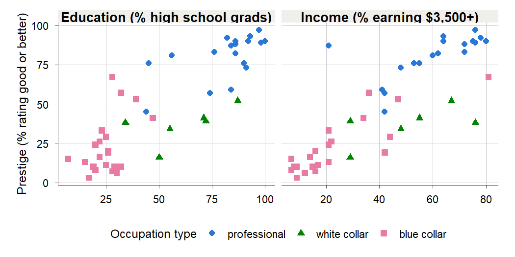
Figure 1:Prestige rises with both education and income across Duncan’s 45 occupations. Because education and income also rise together, a single scatterplot cannot say how much of prestige each one earns on its own. That is the question path analysis takes apart.
16.1 Drawing a causal story: path diagrams
Intuition
You cannot test a causal story you have not yet stated. Path analysis (Definition 16.1) begins by making the story explicit as a picture. A path diagram (Definition 16.2) is a small graph: each measured variable is a box, and each arrow is a claim that one variable directly affects another. The picture is a hypothesis, not a discovery. You bring the arrows; the data only tell you how strong each one is once you have committed to a direction.
Three pieces of notation carry the whole grammar, shown in Figure 2. A single-headed arrow from to says “ is a direct cause of ” in this model. A curved double-headed arrow between two variables says “these two move together for reasons the model does not explain.” And every variable that has an arrow pointing into it also gets a short stub arrow from a disturbance (Definition 16.3), written , standing for every other influence on that variable that we did not measure. The disturbance is the path-diagram cousin of the error term you have used since 2.1 The simple linear regression model.
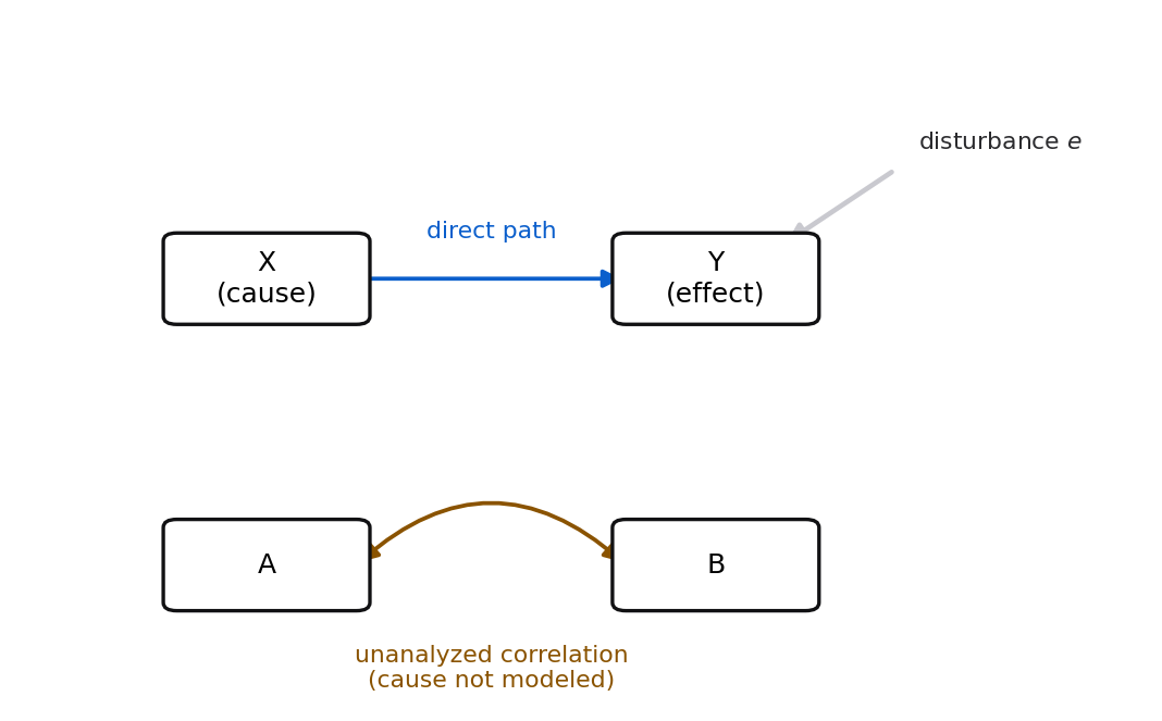
Figure 2:The three marks of a path diagram: a straight arrow for a hypothesized direct cause, a stub arrow for the disturbance (everything unmeasured), and a curved double-headed arrow for a correlation the model leaves unexplained.
A variable with no arrows pointing into it is exogenous (Definition 16.4): the model takes it as given and does not try to explain it. A variable with at least one arrow pointing in is endogenous (Definition 16.4): the model claims to account for part of it. We restrict attention to recursive (Definition 16.5) models, meaning the arrows never form a loop. You can list the variables in an order where every arrow points from earlier to later, so nothing causes itself through a chain. Recursive models are exactly the ones ordinary regression can fit one equation at a time.
For Duncan’s data we adopt the causal ordering that most sociologists of the era would defend. Education comes first, fixed by the time a person enters the workforce. Income comes next, shaped in part by education. Prestige comes last, shaped by both. Figure 3 draws this story with the numbers we will compute in the next section already filled in.
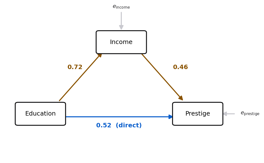
Figure 3:The fitted Duncan path model. Education reaches prestige two ways: straight across (the direct path, 0.52) and through income (0.72 then 0.46). Income and prestige each carry a disturbance for everything the three variables leave out.
Formula
A recursive path model is a set of linear equations, one per endogenous variable, each writing that variable as a linear function of the variables with arrows pointing into it, plus a disturbance. For the Duncan model, using standardized variables (each centered and divided by its standard deviation, marked with a star),
are the three variables in standardized units: each has mean 0 and standard deviation 1.
is the path coefficient (Definition 16.6) from education to income: the standard-deviation change in income per one-standard-deviation rise in education.
is the direct path from education to prestige, and the path from income to prestige.
and are the disturbances of income and prestige, the standardized stand-ins for everything the model omits.
In words: each equation is just a regression, and the path coefficients are its slopes, read in standardized units so that every arrow in the whole diagram is on the same scale.
16.2 Estimating the paths with regression
Intuition
Here is the move that makes path analysis practical. In a recursive model, each endogenous variable’s equation can be fit on its own by ordinary least squares, ignoring the other equations. Regress income on education to get the arrow into income. Regress prestige on both education and income to get the two arrows into prestige. You already know how to do both; this is multiple regression from Chapter 8, run twice. Figure 4 shows how the two regressions hand you the three arrows.
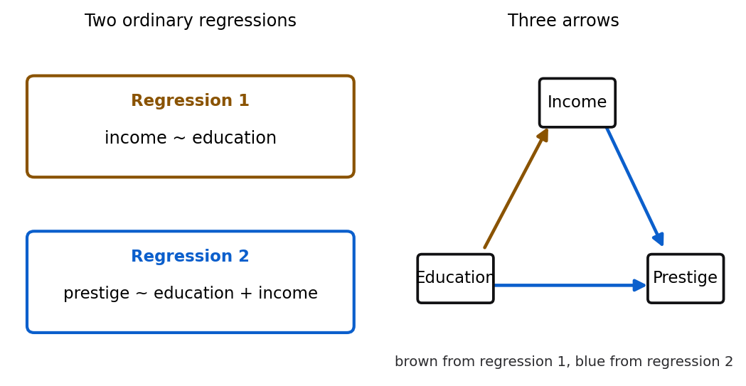
Figure 4:Three arrows, two regressions. Regression 1 (income on education) gives the arrow into income; regression 2 (prestige on education and income) gives the two arrows into prestige. Because the model is recursive, each equation is fit on its own.
Why is fitting one equation at a time legitimate? Because the model is recursive and we assume each disturbance is uncorrelated with the variables that feed into its own equation. Under that assumption the least-squares slopes in each separate regression are unbiased for that equation’s path coefficients. The assumption is doing real work, and we return to it, with less cheer, in 16.4 What path analysis cannot claim about causation.
One decision remains: raw units or standardized units? The raw slope from regressing income on education is measured in “income points per education point,” and the slope from regressing prestige on income is in “prestige points per income point.” These live on different scales, so you cannot compare arrows or multiply them along a route. Standardizing every variable first, so each has standard deviation 1, puts all arrows in the common currency of standard deviations. The standardized slope is the path coefficient, and standardized coefficients are what make a path diagram’s numbers comparable. You met them in Chapter 8; here they become the main event.
Formula
The standardized coefficient for predictor in a regression of is the raw coefficient rescaled by the ratio of standard deviations,
is the ordinary least-squares slope for , in raw units.
is the standard deviation of and the standard deviation of .
is the standardized (path) coefficient: the change in , in standard deviations of , per one-standard-deviation rise in , holding the other predictors fixed.
In words: to convert a slope into a path coefficient, multiply by how many -units make one -standard-deviation and divide by the same for . A short derivation shows where the formula comes from.
Proof. Start from the fitted multiple regression in raw units, . Subtract the fitted mean, using , so the intercept drops out:
Divide both sides by , and inside the sum multiply and divide each term by :
The left side is the standardized response , and the factor multiplying the standardized predictor is exactly . So regressing on the standardized predictors gives slopes , and they equal the raw slopes times .
For a single predictor this collapses to a fact from 4.2 Correlation and the regression slope: the standardized simple slope equals the correlation . That link is the hinge of the whole decomposition to come.
R
Read the data, look at it, and inspect the three correlations that path analysis will take apart.
duncan <- read.csv("data/duncan.csv")
dim(duncan)
head(duncan, 4)
round(cor(duncan[, c("education", "income", "prestige")]), 3)
[1] 45 5
occupation type income education prestige
1 accountant prof 62 86 82
2 pilot prof 72 76 83
3 architect prof 75 92 90
4 author prof 55 90 76
education income prestige
education 1.000 0.725 0.852
income 0.725 1.000 0.838
prestige 0.852 0.838 1.000Every pair correlates strongly and positively, and education correlates with income at 0.725. That last number is why we cannot read the education-prestige and income-prestige correlations at face value: the two predictors overlap.
Standardizing sounds like bookkeeping until you watch a raw slope and a path coefficient walk off in opposite directions under your own finger.
What to notice. The path coefficient and the correlation stay locked to each other no matter how you move the points, which is Theorem 16.7 for a single predictor. Try this. Drag the banker (education 82) straight up to an income near 120: the raw slope climbs about a fifth while falls, because you stretched at the same time you steepened the line. That ratio is the whole content of 16.2 Estimating the paths with regression.
16.3 Direct, indirect, and total effects
Intuition
We now have all three path coefficients, so we can finally answer the question that opened the chapter: how much of prestige does education really earn on its own, and how much only through the paycheck it brings? Path analysis answers it by tracing routes. Education reaches prestige by two routes, drawn in Figure 6. It goes straight across, the direct effect (Definition 16.8), and it goes the long way through income, the indirect effect. The direct effect is just the direct path coefficient, 0.52. The indirect effect is what education does to income multiplied by what income then does to prestige: you lose a little at each step, so strengths multiply. Along the education-income-prestige route that is . The total effect of education on prestige is the two routes added together.
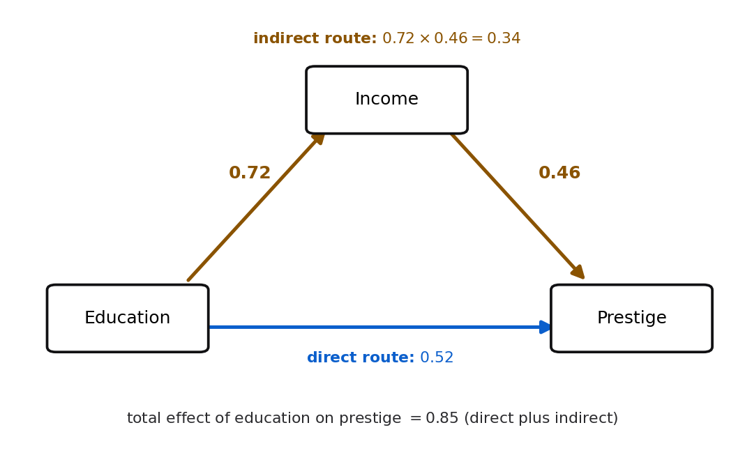
Figure 6:Education’s total effect on prestige is the sum of its two routes: the direct path (0.52) plus the indirect path through income (0.72 times 0.46, which is 0.34), giving 0.85.
Why do strengths multiply along a route and add across routes? Multiplying is the chain rule in standardized units. Push education up by one standard deviation, and income rises by standard deviations. Each of those standard deviations of income then pushes prestige up by . So the through-income effect is the two pushes multiplied together. Adding across routes is because the routes deliver their pushes independently and least squares is linear, so the total is their sum. The next derivation makes this exact and delivers a bonus: the total effect of the exogenous variable equals the plain correlation.
Formula
For the Duncan model, the effects of education on prestige are
is the direct path, education straight to prestige.
is the indirect path, the product of the two legs through income.
their sum is the total effect: the full standardized change in prestige that follows a one-standard-deviation rise in education, letting income respond as the model says it will.
In words: total effect equals direct effect plus the product of the coefficients along each indirect route.
Proof. Substitute the income equation into the prestige equation. From 16.1 Drawing a causal story: path diagrams, , so
The coefficient on is the total effect, , direct plus indirect. Now take the correlation of both sides with . Because education is exogenous, it is uncorrelated with the disturbances and , so the whole disturbance term drops out, and since has variance 1,
The total effect of the exogenous variable is exactly the correlation you started with. Path analysis has not changed that number; it has split it into a piece that travels directly and a piece that travels through income.
R and Python
Figure 7 shows the same accounting as a bar. The direct and indirect pieces stack up to the total.
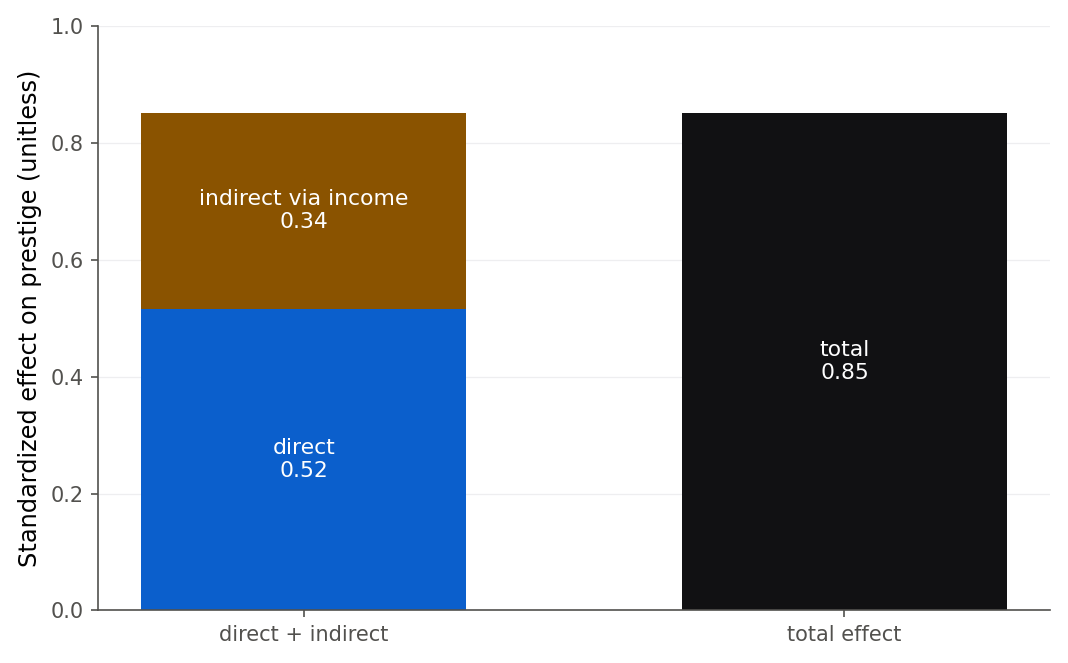
Figure 7:Education’s total effect on prestige (0.85) as the sum of a direct piece (0.52) and an indirect piece through income (0.34). The stacked bar on the left reaches the same height as the total on the right.
Now turn the same tools on income. Income’s arrow to prestige has path coefficient 0.46, but its plain correlation with prestige is 0.838, much larger. Where does the gap go? Income and prestige share a common cause, education, which lifts both. Part of their correlation is therefore spurious (Definition 16.10): it reflects education pulling the strings, not income acting on prestige. The spurious part is the product of the paths along the shared route, education to income (0.72) and education to prestige (0.52), giving . Add that to the real direct path 0.46 and you recover the full correlation 0.838. Figure 8 draws the split.
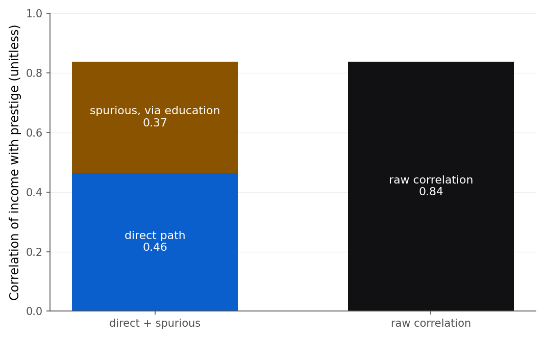
Figure 8:The income-prestige correlation (0.84) is not all real influence. A direct path of 0.46 is genuine; the remaining 0.37 is spurious, manufactured by education, which raises both income and prestige.
Indirect effects and spurious components look like twins on paper: both are a product of two path coefficients. But they mean opposite things, and the difference is the shape of the route. Figure 9 puts them side by side. An indirect effect runs forward through a mediator, so it is part of a real total effect. A spurious link runs up to a shared cause and back down, so it is no one’s doing at all. When you see a product of two paths, ask which shape it is.
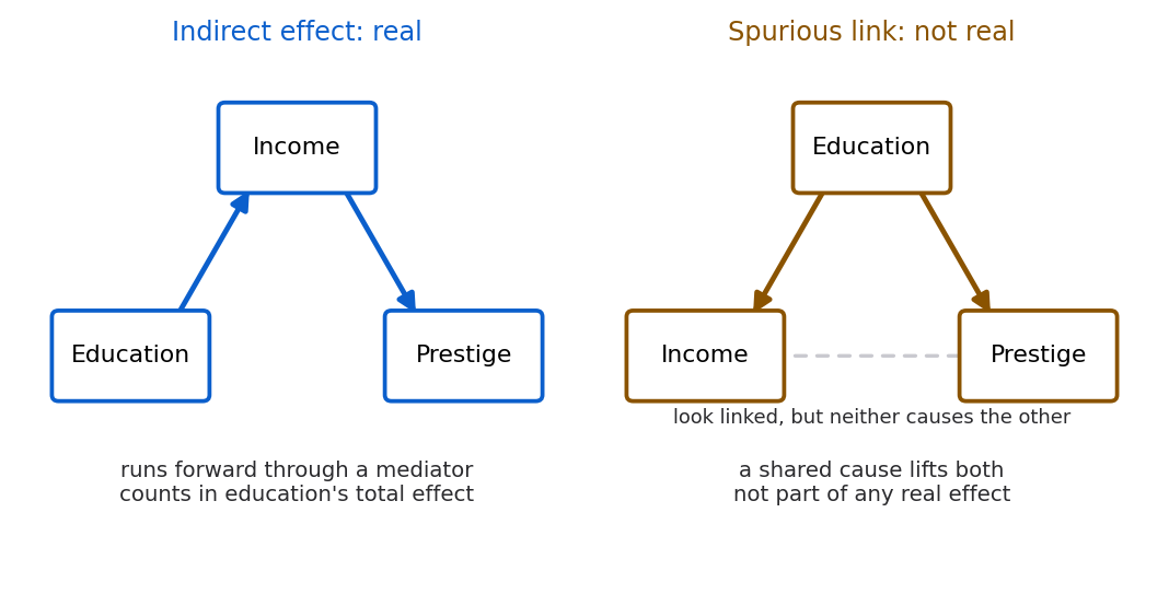
Figure 9:Same arithmetic, opposite meaning. An indirect effect (left) runs forward through a mediator and counts in a real total effect; a spurious link (right) is manufactured by a shared cause and reflects no direct effect at all.
Multiply along and add across is a rule you will trust faster once you have watched the two routes separate and rejoin on a real cloud of occupations.
What to notice. The vertical gap between the amber direct line and the blue total line, read at , is exactly the indirect effect . Try this. Drag down to 0, the claim that education reaches prestige only through the paycheck, and watch the blue line fall well below the dots; then bring it back until the last readout reads 0.000. The arithmetic is Theorem 16.9 in 16.3 Direct, indirect, and total effects.
16.4 What path analysis cannot claim about causation
Intuition
Everything above rests on a story you supplied: education causes income, both cause prestige, and nothing outside the diagram matters. The arithmetic is exact, but the arithmetic is only as good as that story. Path analysis is a bookkeeping system for a causal hypothesis. It cannot certify the hypothesis. Three limits deserve blunt statement.
Direction is your assumption, not the data’s verdict. The data gave us three correlations, and correlations are symmetric: the correlation of education with income is the same number read either way. Reverse the arrow between education and income and you get a model that fits the three correlations exactly as well, shown in Figure 11. Such models are called equivalent models (Definition 16.11): different causal stories, identical fit. No amount of this data can choose between them. Only knowledge from outside the numbers, that schooling is mostly finished before a career’s earnings are set, justifies pointing the arrow from education to income rather than back.
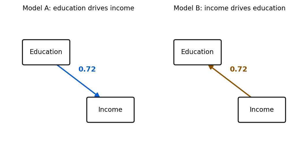
Figure 11:Two equivalent models. Education driving income and income driving education reproduce the same correlation equally well. The data are silent about the arrow’s direction; only outside knowledge points it.
An omitted common cause poisons every number. Our decomposition assumed each disturbance is uncorrelated with its equation’s predictors. Suppose some unmeasured variable, say family background, raises a person’s education and independently raises the prestige of the jobs they can enter. Then the disturbance of prestige is correlated with education, and the direct path absorbs part of that background’s effect. The path coefficient is then biased, and no diagnostic run on these three variables can reveal it, because the culprit was never measured. Figure 12 is the picture path analysis quietly assumes away.
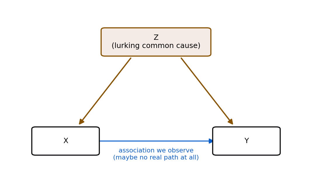
Figure 12:The assumption path analysis cannot check: no unmeasured common cause Z. If some Z drives both X and Y, the association we measure between them can be entirely manufactured, and a path coefficient will report a causal effect that is not there.
Good fit is not proof. A path model can reproduce the correlations beautifully and still be the wrong story, because a rival model with different arrows fits just as well. Fit tells you the model is not contradicted by these data. It never tells you the model is right. This is the same humility 4.2 Correlation and the regression slope urged for a single correlation, now scaled up to a diagram full of them.
Formula
There is no new formula here, and that is the point. What changes across models is not the algebra but the assumptions you feed it. It helps to state the standing assumptions of a recursive path analysis as a checklist, because they are what your conclusions actually depend on:
Correct direction. Every arrow points the causal way, justified from outside the data.
No omitted common causes. Each disturbance is uncorrelated with the predictors in its own equation. Equivalently, every common cause of two modeled variables is itself in the model.
Correct functional form. The relationships are linear and additive, with no important interactions or curves left out (the modeling lessons of Chapters 8, 10, and 11 still apply).
No important feedback. The model is recursive; no variable causes itself through a loop.
In words: the numbers are trustworthy only to the extent these four claims are true, and the data can check only the last two, never the first two.
A wrong reading, corrected
Students often say “the path coefficient 0.52 is the effect of education on prestige, so if we raised everyone’s schooling by one standard deviation, prestige would rise by 0.52 standard deviations.” Read the verb carefully. The coefficient is the effect in this model, under its assumptions. It describes how prestige and education move together across these 45 occupations, adjusting for income. It becomes a claim about the result of an intervention (actually raising schooling) only if the four assumptions above hold, and observational data cannot confirm the two that matter most. The honest reading is conditional: “if the causal story is correct, a one-standard-deviation rise in education is associated with a 0.52-standard-deviation direct rise in prestige, plus 0.34 more through income.” Keep the “if.”
The second assumption, no omitted common cause, is the one worth feeling rather than reading, so here it is with a slider on the hidden variable.
What to notice. The wedge between the true direct path and the reported one is bias, not noise, so collecting more occupations would not close it by a hair. Try this. Leave the true direct path at 0, so education causes nothing, and push the hidden cause to 0.60: a path analysis would confidently report 0.360 for an arrow that does not exist. That is the picture 16.4 What path analysis cannot claim about causation calls the assumption path analysis cannot check.
16.5 The semester in review: the workflow, one last time
You began this course fitting a single line to 25 production runs and end it drawing causal diagrams across 45 occupations. The tools grew, but the way of working did not. Every chapter, this one included, walked the same five-step spine: ASK a real question with real data, EXPLORE it with plots and summaries, FIT a model, CHECK its assumptions, and USE the result to interpret, predict, or decide. The modeling workflow named that spine; Figure 14 draws it whole, with the loop that matters most: checking usually sends you back to fitting.
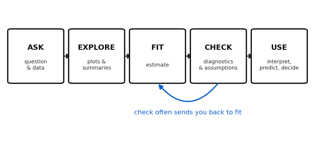
Figure 14:The modeling workflow that ran through the whole course. It is mostly a straight march from question to use, with one insistent loop: what you learn in CHECK usually sends you back to refit.
This very chapter is the spine in miniature. We asked why some occupations are respected more than others. We explored with Figure 1 and the correlation matrix. We fit two regressions to estimate the paths. We would check them exactly as Chapter 9 taught. Duncan’s data famously hides two high-influence occupations, the minister and the railroad conductor. Their Cook’s distances (see 9.3 Influence: which points actually change the fit) are large enough to shift the coefficients, so a real analysis would refit without them and report whether the story holds. And we used the fitted paths to decompose an effect and, just as importantly, to say out loud what the decomposition cannot prove.
Where this fits in the workflow. Path analysis lives mostly in USE: it is a way to interpret and communicate a fitted set of models as a causal story, with the honesty to mark the story’s limits. It also loops back to ASK, because deciding on the arrows is really deciding what question you are asking. It reuses the multiple-regression estimation and standardized coefficients of Chapter 8, the correlation cautions of 4.2 Correlation and the regression slope, and the influence diagnostics of 9.3 Influence: which points actually change the fit.
The roads onward
This course taught the linear model and its close relatives thoroughly, which is the right foundation. It is not the end of the map. Three directions lead naturally from here, and you are now equipped to start each.
Causal inference. Path analysis is the ancestor of a large modern field that takes causation seriously with observational data. Directed acyclic graphs formalize the diagrams of this chapter; methods like instrumental variables, propensity-score matching, difference-in-differences, and regression discontinuity squeeze causal claims from non-experimental data by leaning on carefully argued assumptions, always stated in the open. The one honest lesson to carry forward: causal conclusions come from causal assumptions, and the work is defending the assumptions, not running the regression.
Mixed and hierarchical models. For most of the course we assumed independent errors, and Chapter 15 already showed one way that assumption breaks, when time links each error to the one before it. Grouping breaks it another way. Real data often come in groups: students within schools, measurements within patients, occupations within industries. Mixed-effects models add random effects that let each group have its own intercept or slope drawn from a distribution, so the model borrows strength across groups while respecting their differences. They are the right tool the moment your rows are not independent.
Statistical learning. Regression is the doorway to machine learning. Regularized regression (ridge and lasso, previewed in Chapter 12), trees and random forests, gradient boosting, and neural networks all trade some of the interpretability you have prized here for predictive power on hard, high-dimensional problems. A neural network is, at bottom, layers of regressions with nonlinear joints. Everything you learned about overfitting, validation, and the difference between explaining and predicting transfers directly, and it is what keeps those powerful methods honest.
The scarce skill, now that software and AI assistants can fit any of these models in seconds, is not fitting. It is judging: choosing the question, checking the assumptions, reading the diagnostics, and saying plainly what the numbers do and do not support. That judgment is what this book set out to teach, and it is what will still be yours when the tools change again.
16.6 Chapter summary
You can now turn a causal hypothesis about several variables into a path diagram, estimate its arrows by fitting a sequence of ordinary regressions, and read the arrows as standardized path coefficients on a common scale. You can decompose the effect of one variable on another into a direct effect and indirect effects that travel through mediators, verify that they sum to the total effect, and show that for an exogenous variable the total effect is just the correlation you started with. You can separate the genuine direct part of a correlation from the spurious part that a common cause manufactures. Most of all, you can state exactly what a path analysis assumes and refuse to oversell what it proves: direction and the absence of hidden common causes are assumptions the data cannot check.
Key results at a glance.
| Result | Statement or formula | Valid when |
|---|---|---|
| Standardized (path) coefficient (Theorem 16.7) | ; single predictor gives | any fitted least-squares regression |
| Effect decomposition (Theorem 16.9) | total (direct plus indirect) | recursive model, disturbances uncorrelated with own predictors |
| Total effect of an exogenous cause (Theorem 16.9) | cause is exogenous | |
| Correlation decomposition | (direct plus spurious) | recursive model as above |
| Duncan path coefficients | standardized Duncan fit |
Key terms. Path analysis, path diagram, disturbance, exogenous variable, endogenous variable, recursive model, path coefficient, standardized coefficient, direct effect, indirect effect, total effect, spurious correlation, equivalent models.
You should now be able to:
Draw and read a path diagram, naming exogenous variables, endogenous variables, and disturbances.
Estimate the path coefficients of a recursive model by fitting a sequence of ordinary regressions.
Compute standardized (path) coefficients and explain what putting every variable on a common scale buys you.
Decompose a total effect into a direct effect and one or more indirect effects, and verify the decomposition numerically.
Separate the genuine direct part of a correlation from the spurious part that rides on a common cause.
State precisely what path analysis assumes and what it cannot prove about causation.
Summarize the ASK-EXPLORE-FIT-CHECK-USE workflow of the course and name honest next steps beyond it.
Where this fits. This chapter closes the course in the USE stage of the The modeling workflow spine: it is about interpreting and communicating fitted models as a causal story, with the honesty to mark the story’s edges. It gathers threads from across the semester, the correlation cautions of 4.2 Correlation and the regression slope, the multiple regression and standardized coefficients of Chapter 8, and the influence diagnostics of 9.3 Influence: which points actually change the fit, and turns them toward the oldest question in statistics: not just how two things move together, but why. The look ahead pointed past the linear model to causal inference, mixed models, and statistical learning, each a natural continuation of what you built here.
16.7 Frequently asked questions
Q1. Is path analysis just running several regressions? Mechanically, for a recursive model, yes: each endogenous variable’s equation is fit by ordinary least squares on its own. What path analysis adds is the diagram that ties the equations into one causal story and the rules for combining coefficients into direct, indirect, and total effects. The value is in the framing and the decomposition, not in any new estimation machinery.
Q2. Why standardize the variables? Can I keep raw units? You can, and for a single equation raw units are often more meaningful (dollars per year of schooling). But to compare arrows measured in different units, or to multiply coefficients along a route, you need a common scale, and standardized units (standard deviations) provide one. Report whichever answers your question; path diagrams conventionally show standardized coefficients so every arrow is comparable.
Q3. What is the difference between an indirect effect and a spurious correlation? Both are products of two path coefficients, so they look alike, but the routes differ. An indirect effect runs forward through a mediator: education raises income, which raises prestige. A spurious component runs back and then forward through a common cause: income and prestige both rise because education, upstream of both, lifts them. Indirect effects are part of a variable’s real total effect; spurious components are not. Figure 9 draws the two routes side by side.
Q4. Why does the total effect of education equal the plain correlation? Because education is exogenous, uncorrelated with the model’s disturbances. Substituting the income equation into the prestige equation and correlating with education makes the disturbance terms drop out, leaving the correlation equal to direct plus indirect. For an endogenous predictor like income, the plain correlation does not equal the total effect, because part of it is spurious.
Q5. Can path analysis prove that education causes prestige? No. It can show that the education-causes-prestige story is consistent with the data and can quantify the arrows within that story, but a rival story with reversed or added arrows may fit equally well, and an unmeasured common cause could bias every number. Proof of causation needs either a randomized experiment or causal assumptions defended from outside the data.
Q6. My two path models fit equally well. How do I choose? You cannot choose on fit alone; that is what equivalent models means. Choose on knowledge from outside the data: temporal order (which variable was determined first), subject-matter theory, and prior experiments. If nothing outside the data distinguishes them, the honest report is that both are consistent and the data cannot decide.
Q7. Where do the disturbances go in the decomposition? They carry everything the model omits, and by assumption they are uncorrelated with the predictors in their own equation, so they contribute nothing to the direct, indirect, or spurious pieces we compute. That convenience is exactly the assumption that fails when there is an omitted common cause, which is why the whole method rests on it.
16.8 Practice problems
(A) Define, in one sentence each, exogenous variable, endogenous variable, and disturbance, and say which of the three Duncan variables is exogenous.
(A) In your own words, explain the three marks of a path diagram: the single-headed arrow, the curved double-headed arrow, and the disturbance stub.
(A) State the difference between a direct effect and an indirect effect, using education and prestige as your example.
(A) A path coefficient of 0.46 connects income to prestige. Write the one-sentence interpretation in standardized units, being careful about what is held fixed.
(A) Explain what “recursive” means for a path model, and why it lets you fit one equation at a time.
(A) The income-prestige correlation is 0.84 but the income-to-prestige path is only 0.46. In plain words, where did the rest go?
(A) List the four standing assumptions of a recursive path analysis, and mark which two the data can check and which two it cannot.
(A) A classmate says a well-fitting path model “proves” its causal story. Give the two distinct reasons this is wrong.
(A) Name the five stages of the course workflow spine and, in a phrase each, say what path analysis contributes to the USE stage and why it loops back to ASK.
(A) Give one honest example, from any field you know, where an observed correlation is mostly a spurious common-cause effect rather than a direct one.
(B) Derive the standardized-coefficient formula (Theorem 16.7) starting from the raw fitted regression .
(B) For a single predictor, show that the standardized simple-regression slope equals the correlation (Theorem 16.7), and connect this to the fact from 4.2 Correlation and the regression slope.
(B) Substitute the income equation into the prestige equation to show that education’s total effect on prestige is (Theorem 16.9).
(B) Continuing problem 13, take the correlation of both sides with standardized education and show that, because education is exogenous, the total effect equals (Theorem 16.9). State precisely where exogeneity is used.
(B) Show that the income-prestige correlation decomposes as , and identify which term is the real effect and which is spurious.
(B) Suppose an unmeasured variable raises both education and prestige, so the prestige disturbance is positively correlated with education. Argue that the estimated direct path is then biased upward, and explain why no diagnostic on the three measured variables can reveal it.
(B) Explain, with a two-variable example, why two path models that reverse a single arrow can reproduce the same correlations. What outside information is needed to choose between them?
(B) In a chain model with no direct arrow, the paths are and . Show that the total effect of on equals and that this equals when is exogenous (Theorem 16.9).
(B) A researcher standardizes only the response, not the predictors, and calls the resulting slopes “path coefficients.” Explain why these are not comparable across predictors measured in different units, using the formula .
(C) Read
duncan.csvin R or Python, fit the two path regressions, and reproduce the raw coefficients and the three standardized path coefficients 0.72, 0.52, 0.46.(C) Compute education’s direct, indirect, and total effects on prestige in software, and confirm the total matches the education-prestige correlation to four decimals.
(C) Compute the spurious part of the income-prestige correlation as , add it to the direct path, and confirm you recover the correlation 0.838.
(C) Standardize the three variables and verify, in code, that the standardized simple-regression slope of prestige on education equals both the correlation and the total effect from problem 21.
(C) Fit the reversed model, regressing education on income in standardized units, and show that its slope equals the education-to-income slope from the original model. Explain what this says about the data’s ability to pick a direction.
(C) Duncan’s data hide two high-influence occupations, the minister and the railroad conductor. Refit
prestige ~ education + incomewith those two rows removed and report how much the two coefficients change. Reference the influence tools of 9.3 Influence: which points actually change the fit.(C) Add the occupation
typefactor (professional, white collar, blue collar) as a predictor in the prestige equation using dummy coding. Report how the education and income coefficients change, and say in words what including type adjusts for.(C) Build the full standardized correlation matrix of education, income, and prestige in code, then reconstruct the model-implied correlation between income and prestige from the path coefficients () and compare it to the observed value.
(C) Using the fitted paths, predict the standardized prestige of a hypothetical occupation whose education is one standard deviation above the mean and whose income is exactly at the mean. Then predict it again letting income respond to education as the model says, and explain why the two predictions differ.
(A) The chapter points past the linear model to three research directions. Name all three, give one sentence each on what each one adds beyond ordinary regression, and state the one honest lesson the chapter says to carry into causal inference.
16.9 Exam practice
EP 16.1 (interpret the output in context). A standardized fit of the Duncan path model prints the three path coefficients below.
duncan <- read.csv("data/duncan.csv")
z <- as.data.frame(scale(duncan[, c("education", "income", "prestige")]))
coef(lm(income ~ education, data = z))["education"]
coef(lm(prestige ~ education + income, data = z))[c("education", "income")]
education
0.7245
education income
0.5155 0.4643 Interpret each of the three path coefficients in one full sentence, naming its units and what is held fixed. Then explain what the standardized education-to-income coefficient 0.7245 tells you that the raw slope from the same regression, 0.5949 income points per education point, does not.
Model answer
The coefficient 0.7245 on the education-to-income arrow says that, across these 45 occupations, an occupation one standard deviation higher in education is predicted to be about 0.72 standard deviations higher in income. The direct education-to-prestige coefficient 0.5155 says that, holding income fixed, an occupation one standard deviation higher in education is predicted to be about 0.52 standard deviations higher in prestige. The income-to-prestige coefficient 0.4643 says that, holding education fixed, an occupation one standard deviation higher in income is predicted to be about 0.46 standard deviations higher in prestige. The two prestige coefficients are partial slopes, each read with the other predictor held constant; the education-to-income coefficient is a simple slope because income has only one arrow into it. The standardized value 0.7245 adds something the raw slope 0.5949 cannot: because education and income are now on a common standard-deviation scale, 0.7245 can be compared directly with the other two arrows and multiplied along a route (as in ), whereas the raw slope of 0.5949 is stuck in the mixed units of “income points per education point” and cannot be set beside the income-to-prestige slope, which lives in “prestige points per income point.”
A weak answer reports the three numbers without saying what is held fixed for each, or claims the raw and standardized slopes carry the same information, missing that standardizing is exactly what makes the arrows comparable and multipliable.
EP 16.2 (explain why). For an exogenous cause in a recursive path model, the total effect on the outcome equals the plain correlation between them. In the Duncan fit, education’s total effect on prestige is , and the raw correlation is also 0.8519. Explain why these two numbers must agree, and state precisely the one assumption about education that the argument relies on.
Model answer
Substitute the income equation into the prestige equation. Writing everything in standardized units, , so . Now correlate both sides with . Because education is exogenous, it is assumed uncorrelated with the two disturbances and , so the entire disturbance term contributes nothing to the correlation and drops out. Since a standardized variable has variance one, the correlation of the leading term with education is exactly its coefficient, leaving , which is the total effect. In words, path analysis has not created a new number here; it has taken the correlation you already had and split it into a piece that travels straight across and a piece that travels through income. The whole argument rests on education being exogenous, that is, uncorrelated with every disturbance in the model; if some unmeasured common cause made education correlate with the prestige disturbance, the disturbance term would not drop out and the equality would fail.
A weak answer just checks that the arithmetic matches the correlation without explaining that the match is guaranteed by exogeneity, and in particular never names the uncorrelated-disturbance assumption that makes the disturbance term vanish.
EP 16.3 (a student claims X, evaluate). A student looks at the standardized paths and writes: “The direct path from education to prestige is 0.52 and the path from income to prestige is 0.46. Since , education has a larger effect on prestige than income does.” Evaluate this claim. State what part of the reasoning is legitimate and what it overlooks, and give the comparison you would actually make.
Model answer
The claim is defensible as far as it goes but it compares the wrong quantities. Comparing 0.52 with 0.46 is a fair comparison of two direct effects, because both are path coefficients on the same standardized scale, so the student is right that education’s direct pull on prestige is a little larger than income’s. What the claim overlooks is that education also reaches prestige a second way, indirectly through income, contributing more, so education’s total effect on prestige is . Income, by contrast, has no route to prestige except its single direct arrow, so its total effect on prestige is just 0.46. The honest comparison is therefore total effect against total effect, 0.85 for education versus 0.46 for income, and on that comparison education’s advantage is far larger than the bare direct-path comparison suggests: education matters both on its own and by lifting the income that in turn lifts prestige. So the student’s conclusion happens to point the right way but badly understates the gap and compares direct effects when the substantive question is about total effects.
A weak answer either endorses the claim outright (missing education’s indirect route entirely) or rejects it as simply wrong without recognizing that comparing two direct path coefficients on a common scale is itself legitimate.
EP 16.4 (what would change if). The chapter warns that Duncan’s data hide two high-influence
occupations, the minister and the railroad conductor. The output below refits
prestige ~ education + income in raw units on all 45 occupations and then on the 43 that remain
after those two rows are dropped.
sub <- duncan[!(duncan$occupation %in% c("minister", "conductor")), ]
coef(lm(prestige ~ education + income, data = duncan))[c("education", "income")]
coef(lm(prestige ~ education + income, data = sub))[c("education", "income")]
education income
0.5458 0.5987
education income
0.3322 0.8674 Explain what changes when the two occupations are removed, why just two of 45 cases can move the coefficients this far, and what this tells you about which stage of the workflow you are in and what an honest report of the path model should say.
Model answer
Removing the minister and the railroad conductor shifts the education coefficient down sharply, from 0.55 to 0.33, and pushes the income coefficient up, from 0.60 to 0.87. The two occupations can move the fit this much because each is both unusual in its predictors and contrary to the general pattern: the minister has high education but low income yet very high prestige, which props up the education coefficient, while the railroad conductor has high income but low education and low prestige, which holds the income coefficient down. Their large Cook’s distances (the minister’s is about 0.57) flag exactly this high-leverage, contrary-residual influence from 9.3 Influence: which points actually change the fit. You are in the CHECK stage of the workflow: fitting the paths was FIT, but before trusting them you examine influence, and here the check sends you back toward FIT because the standardized story changes with them gone (the direct education path falls and the income path rises, so more of prestige’s link to education would run through income). An honest report does not silently pick one fit; it states that two of the 45 occupations are highly influential, reports the coefficients both with and without them, and tells the reader that the conclusion about how much of prestige education earns directly is sensitive to a pair of cases, so it should be read with that caution rather than as a settled number.
A weak answer just says “the coefficients changed” without explaining that a high-influence point combines unusual predictors with a contrary residual, and without drawing the workflow lesson that influential cases must be disclosed rather than quietly kept or dropped.
EP 16.5 (a student claims X, evaluate). After seeing that education’s total effect on prestige is 0.85 and matches the correlation almost exactly, a student concludes: “This proves that if we raised every occupation’s schooling by one standard deviation, its prestige would rise by about 0.85 standard deviations.” Evaluate the claim. Give the two distinct reasons it overreaches, and write the honest, correctly hedged version of the sentence.
Model answer
The claim reads an intervention (“if we raised schooling”) off numbers that describe only how prestige and education move together across existing occupations, and it overreaches for two separate reasons. First, direction is an assumption, not a finding: the correlations are symmetric, so an equivalent model with one or more arrows reversed reproduces the same three correlations exactly as well, and nothing in this data can single out the education-causes-prestige story over its rivals. Second, the total effect is unbiased only if there is no omitted common cause; if something unmeasured, such as family background, raises both a person’s schooling and the prestige of the jobs open to them, then education is correlated with the prestige disturbance, the paths absorb part of that background, and the 0.85 is biased as an intervention effect, with no diagnostic on these three variables able to reveal it. Good fit rules out neither problem, because fit only says the data do not contradict the story, never that the story is right. The honest version keeps the “if” and the word “associated”: “if the causal diagram is correct and no common cause is omitted, an occupation one standard deviation higher in schooling is associated with about 0.85 standard deviations more prestige, 0.52 of it directly and 0.34 through income.” That sentence describes an association under stated assumptions, not the guaranteed result of actually changing schooling.
A weak answer objects only that “correlation is not causation” without naming the two concrete mechanisms, equivalent models (direction) and an omitted common cause (bias), that this course teaches, and fails to supply the properly hedged conditional restatement.
Chapter game
Resumen del capítulo (en español)
Este capítulo final presenta el análisis de rutas (path analysis), un método para dibujar una hipótesis causal como diagrama y estimar cada flecha con regresión ordinaria. Usamos los datos de Duncan: 45 ocupaciones de Estados Unidos hacia 1950, con su prestigio, su ingreso y su educación. La pregunta es por qué unas ocupaciones reciben más respeto: por lo que pagan, por la escolaridad que exigen, o por ambas cosas.
Un diagrama de rutas usa cajas para las variables medidas, flechas de una punta para las causas directas, y una flecha corta para la perturbación (disturbance), que representa todo lo que el modelo no mide. Adoptamos un orden causal recursivo: educación primero, luego ingreso, y al final prestigio. Cada variable endógena se estima con su propia regresión por mínimos cuadrados.
Los coeficientes se leen mejor en unidades estandarizadas. El coeficiente de ruta es el coeficiente estandarizado . Para Duncan obtenemos (educación a ingreso), (educación directo a prestigio) y (ingreso a prestigio).
El efecto total de la educación sobre el prestigio se descompone en un efecto directo de 0.52 y un efecto indirecto de , que suman 0.85: como la educación es exógena, ese total coincide con la correlación 0.852. Buena parte de la correlación entre ingreso y prestigio (0.838) es espuria: 0.37 viene de la educación como causa común, y solo 0.46 es efecto directo.
Lo más importante es la honestidad sobre los límites: el análisis de rutas no prueba la causalidad. La dirección de las flechas es una suposición, no un resultado; modelos equivalentes ajustan igual de bien; y una causa común no medida sesga todos los números. Cerramos con el flujo de trabajo del curso, PREGUNTAR, EXPLORAR, AJUSTAR, VERIFICAR y USAR (ver The modeling workflow), y los caminos siguientes: inferencia causal, modelos mixtos y aprendizaje estadístico.