In 1973 two biologists, Michael Johnson and Peter Raven, tallied the number of plant species on 30 islands of the Galapagos archipelago and recorded a handful of geographic facts about each island: its area, its highest elevation, how far it sits from the nearest island, how far from the central island of Santa Cruz, and the area of the closest neighbor. The natural question is whether geography predicts biological richness. Bigger, taller, more isolated islands might hold more species. A multiple regression of species count on those five predictors is the obvious first move, and it looks like a success: it explains about 77 percent of the variation in species counts.
Then you plot the residuals, and the model falls apart. Figure 1 shows the residuals against the fitted counts. Three problems jump out at once. The spread of the residuals grows as the fitted count grows, a funnel that breaks the constant-variance assumption. One island, Isabela, sits far from the crowd. And for several small islands the model predicts a negative number of species, which is impossible. A fit that reports a high can still be wrong in every way that matters.
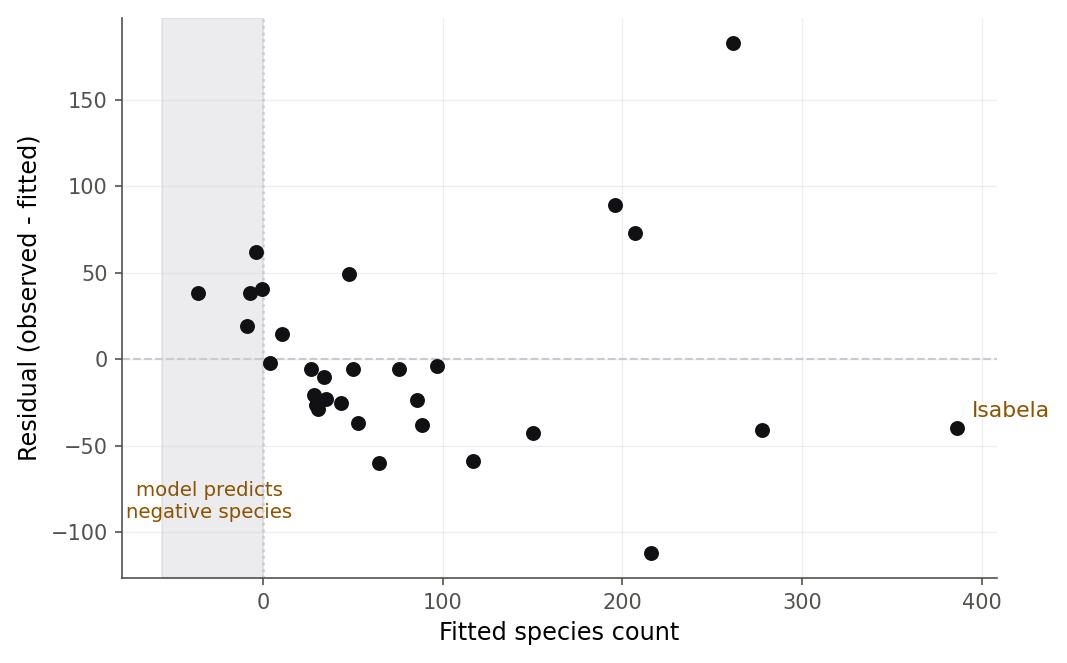
Figure 1:The Galapagos model earns a high R-squared yet fails on sight: the residual spread widens with the fitted count (nonconstant variance), the model predicts negative species counts for small islands (the shaded region), and Isabela is an extreme case.
This chapter is about the fourth stage of the modeling workflow, CHECK. You have learned to ASK a question, EXPLORE the data, and FIT a model in matrix form (7.1 The model and least squares in matrix form) with all its inference machinery (8.4 The general linear test). Fitting is now the easy part; any computer will do it, and so will any student. The scarce skill is judgment: deciding whether a fitted model can be trusted, finding the observations that are quietly running the show, and naming exactly which assumption a model breaks. That is what diagnostics do. By the end of the chapter you will have a toolkit that turns “the fit looks fine” into a checklist you can defend.
We work two real datasets side by side. The Galapagos species data (gala) is
the model that fails every test. The cross-country savings data (savings),
which you first met in the correlation chapter, is the model whose assumptions
mostly hold but whose fit is steered by a single country. Along the way the
Toluca production data returns one last time to answer a question we could not
settle before: is a straight line really the right shape?
Everything in this chapter answers one of two plain questions. Are any single data points trouble, either sitting in a strange spot or quietly steering the fit? Or does the model break a promise it made about the errors taken as a whole? Figure 2 is the map. The left branch chases troublesome cases (Sections 9.1 to 9.3); the right branch checks the assumptions (Sections 9.4 to 9.6); every box names the tool and the section that answers it. Come back to this picture whenever you lose the thread.
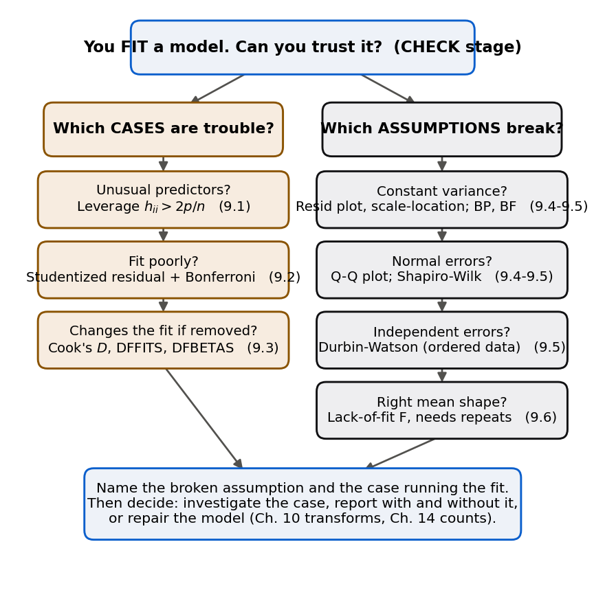
Figure 2:The whole CHECK stage on one page. Diagnostics split into two families: finding the individual cases that are trouble (left) and testing the assumptions the model made about the errors (right). Each box points to the tool and the section that does the job.
9.1 Leverage values and the hat matrix
Intuition
Before we can judge a residual we have to know how much freedom the model gave each point. Picture the fitted line as a see-saw. A point sitting near the middle of the predictor values can move up or down quite a bit without shifting the line much; the crowd around it holds the line in place. A point way out at the edge of the predictor range is different: because it is the only observation out there, the line has to follow it, so the fitted line at that point is pulled toward the point’s own response. That pull is measured by the leverage value (Definition 9.1). A high-leverage point is one whose predictor values are unusual, so the fit is forced to pay it special attention regardless of its response.
The leverage value is a statement about the predictors only. It says nothing yet about whether a point is fit well or badly. It measures potential, the capacity to influence the line, and we will spend the next two sections turning potential into a verdict.
Formula
Recall the hat matrix from 7.3 The hat matrix. Stacking the observations into the design matrix (an matrix whose first column is ones, with the number of parameters including the intercept), the fitted values are where
is the hat matrix, the orthogonal projection onto the column space of ; it “puts the hat on .”
is the transpose of , and is the inverse built in 6.4 The inverse and the normal equations.
Derivation (properties of the leverage values)
Proof. In 7.3 The hat matrix we proved that is symmetric () and idempotent (), with trace equal to . Three facts follow directly.
First, because is symmetric and idempotent, read on the diagonal gives
Rearranging, , so . Since as well, we get
In words: a leverage value is trapped between 0 and 1, and a value near 1 means the fit at that point is determined almost entirely by that point’s own response.
Second, the leverage values add up to the trace of :
Third, dividing by , the average leverage value is . A point is not carrying its fair share of predictor space if its leverage value is well above that average, which motivates the common rule of thumb: examine any case with
The factor of 2 is a convention, not a law; it flags roughly the points worth a second look.
For simple regression the leverage value has a clean closed form that shows plainly what it measures.
Proof. With one predictor, and, as computed in 7.3 The hat matrix,
Multiplying out the quadratic form and simplifying with gives
In words: the leverage value in simple regression is a baseline shared by everyone, plus a penalty that grows with the squared distance of from the mean predictor value. Figure 3 draws this parabola on the Toluca lot sizes.
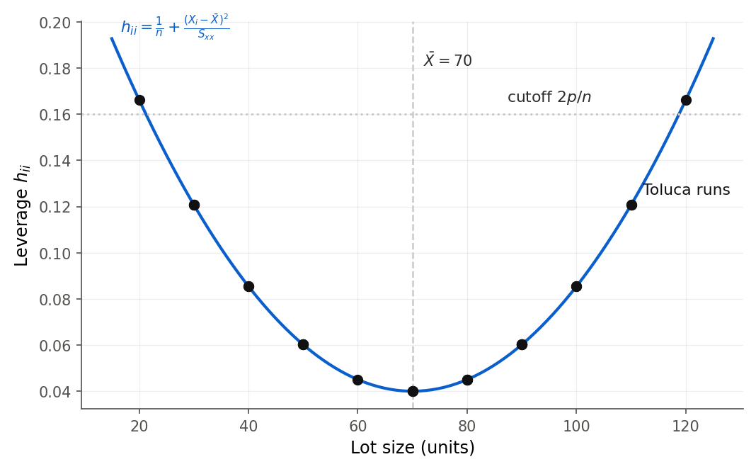
Figure 3:The leverage value in simple regression is a parabola in the predictor: smallest at the mean lot size and largest at the extremes. No Toluca run crosses the 2p/n line, so none has an unusual leverage value.
R and Python
An index plot makes the two standouts obvious. Figure 4 plots each island’s leverage value against its position in the data, with the line drawn in: Isabela and Fernandina tower over the other 28 islands, and everything else sits in a harmless band.
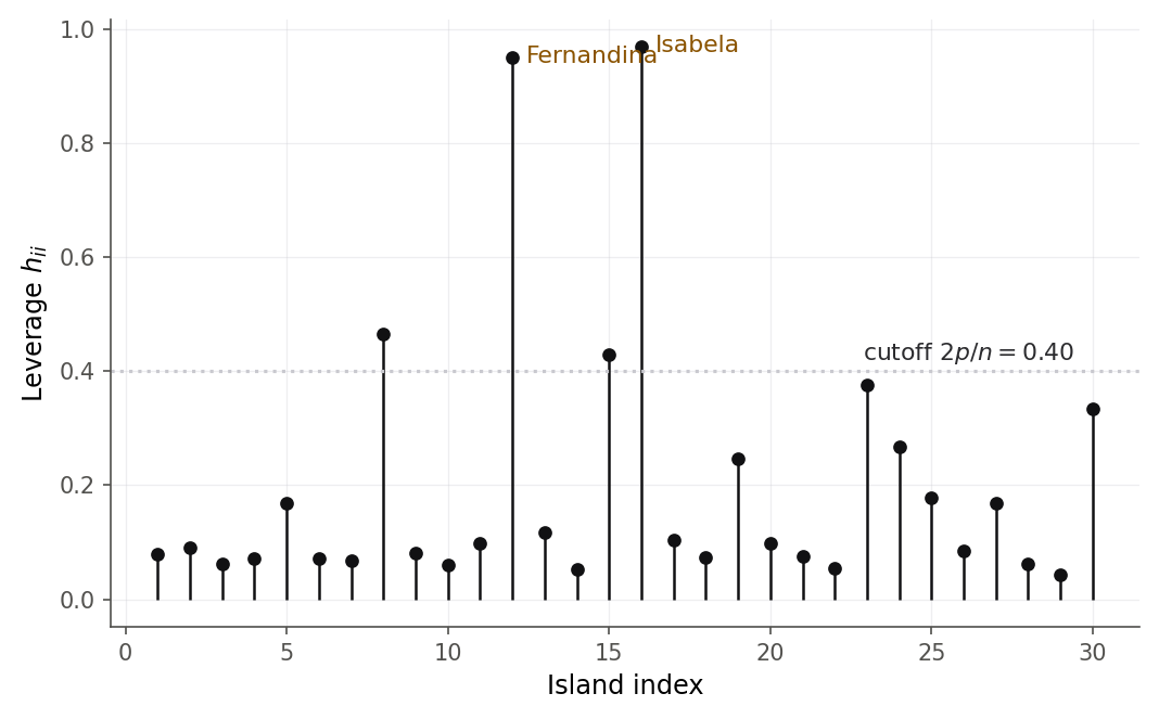
Figure 4:Two islands, Isabela and Fernandina, have leverage values near 0.95, far above the 2p/n cutoff of 0.40; the other 28 islands are unremarkable. These two occupy their own corner of predictor space.
The closed form is worth checking
against the software once, so you trust that hatvalues and the hat matrix agree.
toluca <- read.csv("data/toluca.csv")
tfit <- lm(hours ~ lotsize, data = toluca)
x <- toluca$lotsize
h_closed <- 1 / nrow(toluca) + (x - mean(x))^2 / sum((x - mean(x))^2)
max(abs(hatvalues(tfit) - h_closed))
[1] 2.775558e-17toluca = pd.read_csv("data/toluca.csv")
tfit = smf.ols("hours ~ lotsize", data=toluca).fit()
x = toluca["lotsize"].to_numpy()
h_closed = 1 / len(toluca) + (x - x.mean()) ** 2 / np.sum((x - x.mean()) ** 2)
print(np.max(np.abs(tfit.get_influence().hat_matrix_diag - h_closed)))4.163336342344337e-17The two agree to floating-point dust, confirming the formula.
Theorem 9.2 says the leverage values are a fixed budget that always adds up to , and that claim is far easier to believe once you have watched the budget being spent.
Slide one new run along the lot-size axis and watch the parabola of leverage values for all 26 runs redraw itself.
What to notice. No response value enters this picture anywhere, because is built from the predictors alone. Try this. Push the new run out to a lot size of 200 and confirm that its own leverage value climbs past 0.47 while the leverage value of every original run falls, with the sum pinned at throughout (9.1 Leverage values and the hat matrix).
9.2 Four flavors of residual
Intuition
The leverage value measured which points had the power to distort the fit. The next question is which points the fit actually misses. For that we read the residual , the model’s leftover: the part of the fit did not capture. It is tempting to hunt for outliers by scanning the raw residuals for big values. That is a trap, because raw residuals are not on a level playing field. A high-leverage point drags the line toward itself, which shrinks its own residual. So the very points most able to distort the fit tend to have deceptively small raw residuals. To compare residuals fairly we have to put them on a common scale, and that means dividing by the right standard deviation, which depends on the leverage value.
Formula
The scale factor is not decoration. It comes from an exact variance formula for the residuals.
Derivation (the variance of a residual)
Proof. Write the residual vector as a linear map of the responses. Since ,
Under the model (the errors are uncorrelated with common variance, from 6.7 Random vectors, expectation, and covariance matrices). The matrix is symmetric and idempotent, just like . Applying the covariance rule for a linear transform,
Reading the -th diagonal entry,
In words: the residual at a high-leverage point has smaller variance, because the fit bends to meet it. That is exactly why a raw residual understates trouble at high-leverage points, and why dividing by restores a common scale. Figure 6 shows the shrinkage and its correction.
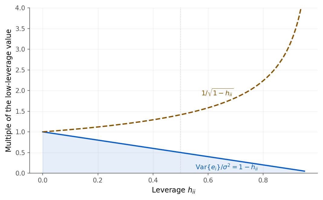
Figure 6:As the leverage value grows, a raw residual keeps less of the error variance (solid curve), so it looks artificially small. Standardizing multiplies by the rising dashed factor to undo the shrinkage and put every residual on one scale.
Derivation (the studentized deleted residual and the outlier test)
The standardized residual has a subtle flaw: if case really is an outlier, it inflates , the very quantity in its own denominator, masking itself. The fix is to estimate the error standard deviation from the other cases. Let be the root mean square error of the fit with case deleted. A useful algebraic identity, which avoids refitting times, is
In words: this builds the leave-one-out error variance from quantities the full fit already gives you, by subtracting case ’s own squared-error contribution, so you never actually refit.
Proof. Consider the deleted residual , the gap between and the prediction at from a model that never saw case . Because that prediction does not use , the two are independent. An identity we prove from the leave-one-out update in 9.3 Influence: which points actually change the fit gives , with variance
Estimating by the independent and dividing by its estimated standard error yields
under the model, when case is not an outlier. Because numerator and denominator are independent, this is an exact ratio.
To test whether the most extreme case is a genuine outlier you look at . Since you are implicitly running tests, use a Bonferroni cutoff: flag case when . The correction keeps the chance of a single false alarm across all cases below .
9.3 Influence: which points actually change the fit
Intuition
A high leverage value is potential and a large residual is a symptom; influence is the thing we actually care about, the amount the fit would change if a point were gone (Definition 9.7). A point can be high-leverage yet have little influence, if it happens to fall right on the trend the other points set. And a point with a large residual but an ordinary leverage value may tug the line only a little. Influence is the product of the two ingredients: an unusual predictor row and a response the model fits poorly.
Figure 7 makes the point with four small pictures. In each one we drop a single red point into the same cloud and refit. Push the point far out in but keep it on the trend, and the line does not budge: a high leverage value, no influence. Give it a big vertical miss but an ordinary , and the line barely tilts: a plain outlier. Only when the point is both far out in and off the trend does the line swing to chase it. That last panel is influence, and it takes both ingredients at once.
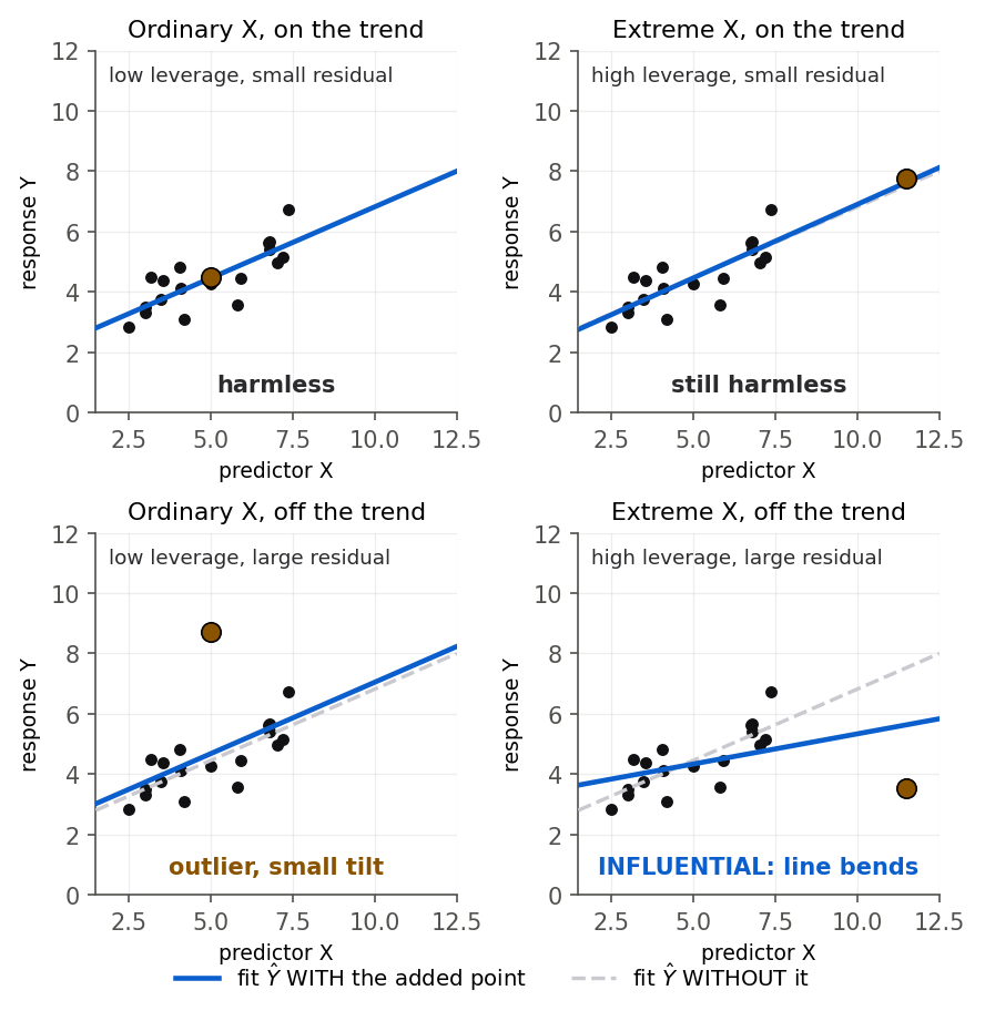
Figure 7:Influence needs both ingredients. A point moves the fit (solid versus dashed line) only in the bottom-right panel, where the red point is both far out in the predictor and off the trend. An unusual X alone (top right) or a big miss alone (bottom left) leaves the line almost where it was.
Formula
The second form makes the recipe explicit: influence equals a residual part () times a factor that grows with the leverage value. Both must be sizable for to be large. A rough guide treats near or above 1 as worth serious attention, and any case far above the rest as worth naming.
Derivation (the leave-one-out update and Cook’s distance)
Every influence measure rests on one algebraic fact: you can compute the fit without case from the full fit, no refitting required.
Proof. Deleting case removes the row from and the value from , so
The Sherman-Morrison formula gives the inverse of a rank-one downdate: for an invertible and vector with ,
which you can verify by multiplying the right side by and collecting terms to get . Set and , so that . Multiplying the updated inverse by and simplifying (using and ) collapses to the compact result
In words: dropping case shifts the coefficient vector by a multiple of , scaled by the case’s residual and inflated by when the leverage value is high. Setting the shift’s effect at itself gives , so the deleted residual is , the identity promised in 9.2 Four flavors of residual.
Proof. The numerator of is a quadratic form in that shift, because :
Substitute the deletion formula. The middle cancels one inverse on each side, leaving :
Divide by and recognize :
This is the promised split of into a squared standardized residual and a term in the leverage value .
R and Python
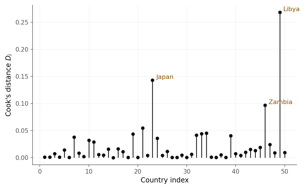
Figure 8:Cook’s distance flags Libya as the single most influential country in the savings fit, standing clearly above Japan and Zambia while the other 47 countries barely register.
The influence plot in Figure 9 combines the whole story: the leverage value on one axis, studentized deleted residual on the other, and Cook’s distance as bubble size. It separates the roles that a one-number summary blends together.
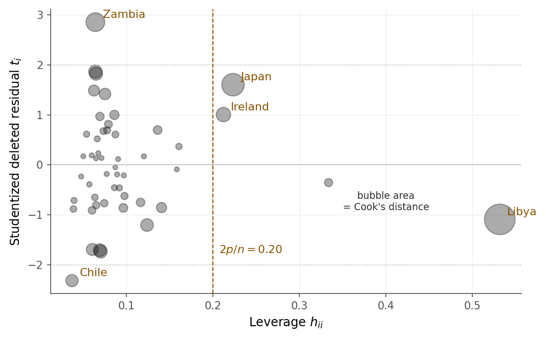
Figure 9:The influence plot pulls apart the two ingredients. Zambia is a large residual at an ordinary leverage value; Libya is a moderate residual at an extreme leverage value; their product, the bubble area, makes Libya the most influential case.
Naming an influential point is not the same as deleting it. The honest workflow is to refit without the case and report how much the answer moves, so a reader can judge. Figure 10 and the numbers behind it do exactly that.
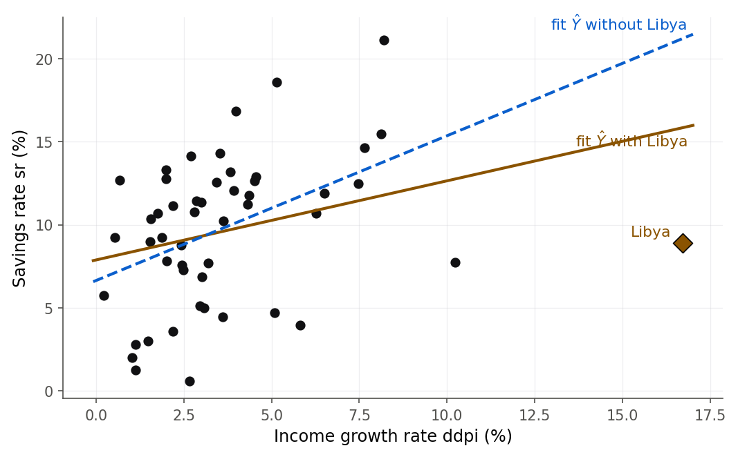
Figure 10:Deleting one country visibly tilts the growth relationship. Libya (the diamond) sits at an extreme growth rate, and the fit including it (solid) is pulled toward a shallower slope than the fit without it (dashed).
The four panels of Figure 7 are fixed pictures of that argument. In the widget below you move the lone case yourself and watch answer.
Drag the lone case at and watch its leverage value, raw residual, studentized deleted residual and Cook’s distance respond together.
What to notice. The lone case starts with the largest leverage value in the data and a Cook’s distance of essentially zero, which is the top-right panel of Figure 7. Try this. Drag it down to about 6.5, then reset and drag the case at down the same distance: the same vertical miss, and almost none of the influence (9.3 Influence: which points actually change the fit).
9.4 Reading the diagnostic plots
Intuition
Formal numbers are sharp, but the fastest way to catch a broken model is to look at it. Three plots do most of the work, and each targets one assumption. The residual-versus-fitted plot checks the shape of the mean function and the constancy of variance. The normal quantile-quantile plot checks the shape of the error distribution. The scale-location plot checks constant variance again, more sensitively. You learned to draw the first of these back in 2.3 Fitted values and the properties of residuals; now you can read all three as a set.
Figure 12 is a field guide to the residual-versus-fitted plot. Four shapes recur: a formless horizontal band (healthy), a funnel (variance grows with the mean), a bend (the mean function is the wrong shape), and a lone stray point (an outlier). Train your eye on these and most diagnostics become pattern recognition.
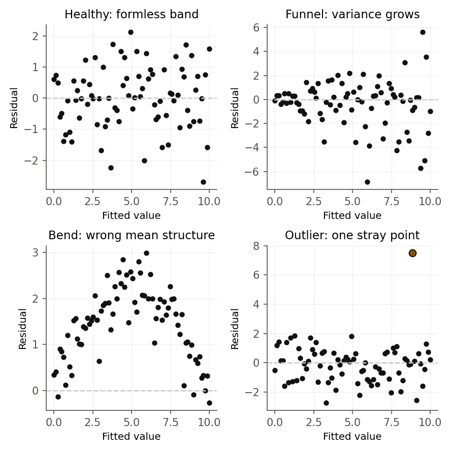
Figure 12:The four residual patterns worth memorizing: a healthy formless band, a funnel of growing variance, a bend that signals the wrong mean structure, and a single outlier. Reading the plot is mostly matching it to one of these.
R and Python
You have already seen the Galapagos residual-versus-fitted plot in
Figure 1: a textbook funnel. The normal quantile-quantile plot in
Figure 13 tells the normality half of the story. In R it is one line,
qqnorm(residuals(gfit)); qqline(residuals(gfit)), and Python’s statsmodels
offers sm.qqplot(gfit.resid, line="s"). If the errors were normal the points
would hug the reference line; here the upper tail bends away and Isabela plunges
far below, the visual echo of its -5.33 studentized residual.
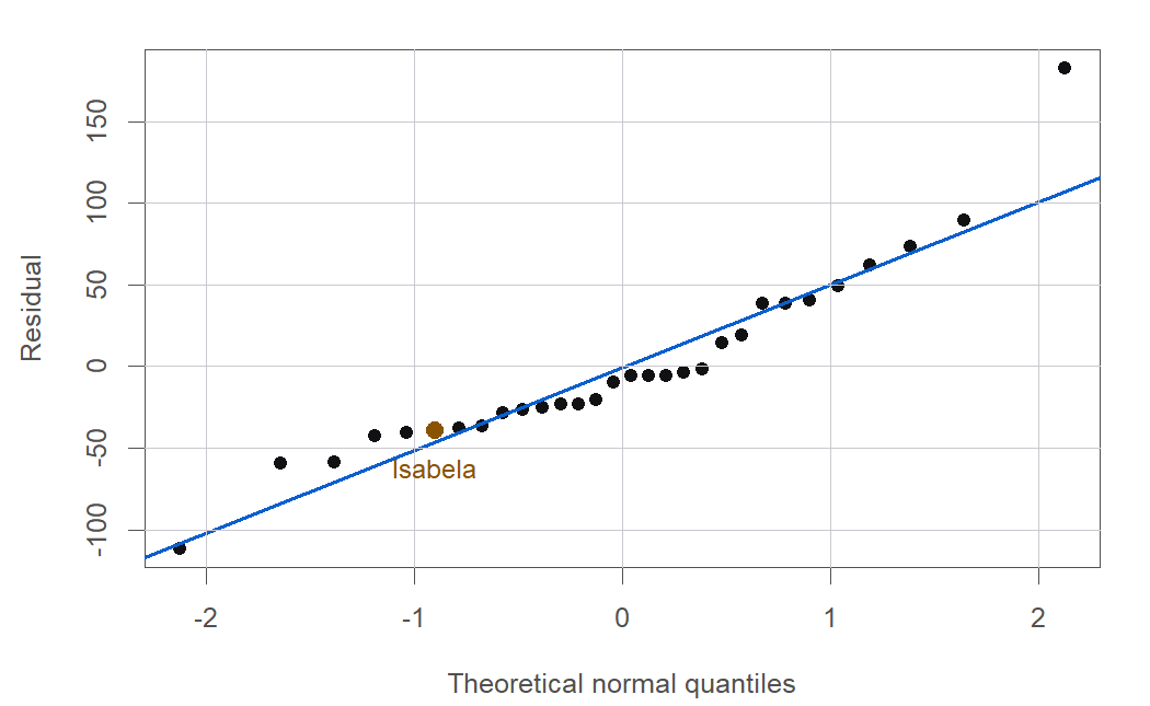
Figure 13:The Galapagos residuals depart from the normal reference line at both ends, and Isabela sits dramatically below it. The pattern says the normal-errors assumption is not credible for this model.
The scale-location plot in Figure 14 plots against the fitted value. A flat cloud means constant variance; a rising trend means the spread grows with the mean. The Galapagos cloud climbs steadily, confirming the funnel from a second angle.
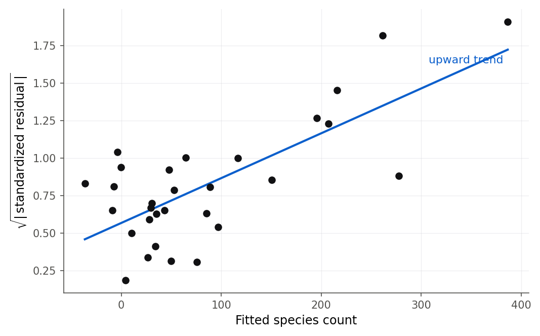
Figure 14:The scale-location plot rises from left to right, a clear signal that the error variance is not constant but grows with the fitted species count.
9.5 Formal tests for the assumptions
Intuition
Plots persuade; tests put a number on the suspicion. Use them together, and lean on the plots when the two disagree, because a test can miss a pattern a plot makes obvious, and a test can flag a wrinkle too small to matter. There is one test for each assumption: constant variance, normal errors, and independence.
For constant variance, two tests are standard. The Breusch-Pagan test regresses the squared residuals on the predictors and asks whether that regression explains anything; if the spread depends on the predictors, it does. The Brown-Forsythe test splits the data into groups, compares the spread of residuals across groups using medians (so it resists outliers), and is a good choice when you suspect variance changes with one particular predictor.
For normality, the Shapiro-Wilk test compares the ordered residuals to what normal data would produce; a small p-value says the residuals are not normal. A close relative is the correlation test for normality, which computes the correlation between the ordered residuals and their normal scores (the points in the quantile-quantile plot) and rejects normality when that correlation is too far below 1.
For independence in time-ordered data, the Durbin-Watson test checks whether consecutive errors are correlated.
Formula
The Durbin-Watson statistic is
where is the estimated lag-1 autocorrelation of the residuals, the correlation between each residual and the one before it in time order.
ranges from 0 to 4. means no autocorrelation ().
signals positive autocorrelation (errors drift in runs, ).
signals negative autocorrelation (errors alternate in sign).
In words: Durbin-Watson compares how much neighboring residuals differ to how big the residuals are overall; when neighbors are alike, the numerator is small and drops below 2. The exact null distribution depends on the design matrix, so classic tables give two bounds and ; modern software returns an exact p-value instead. This diagnostic is the entry point for 15.2 Why time breaks ordinary least squares, where time-ordered errors are the whole subject and where models are built that fix the problem rather than just detect it.
R and Python
When normality fails, as it does for gala, one honest response is to stop relying on the normal-theory t and F machinery and switch to the resampling inference of 5.4 The bootstrap for regression, which does not assume a normal error shape. The deeper fix, changing the model so its errors behave, is the subject of Chapter 10 and, for count data like species totals, Chapter 14.
The Durbin-Watson test needs data in a meaningful order, so it does not really apply to the savings countries, which have no natural sequence. To see it work we simulate two time-ordered series: one with independent errors, one with errors that carry over from step to step.
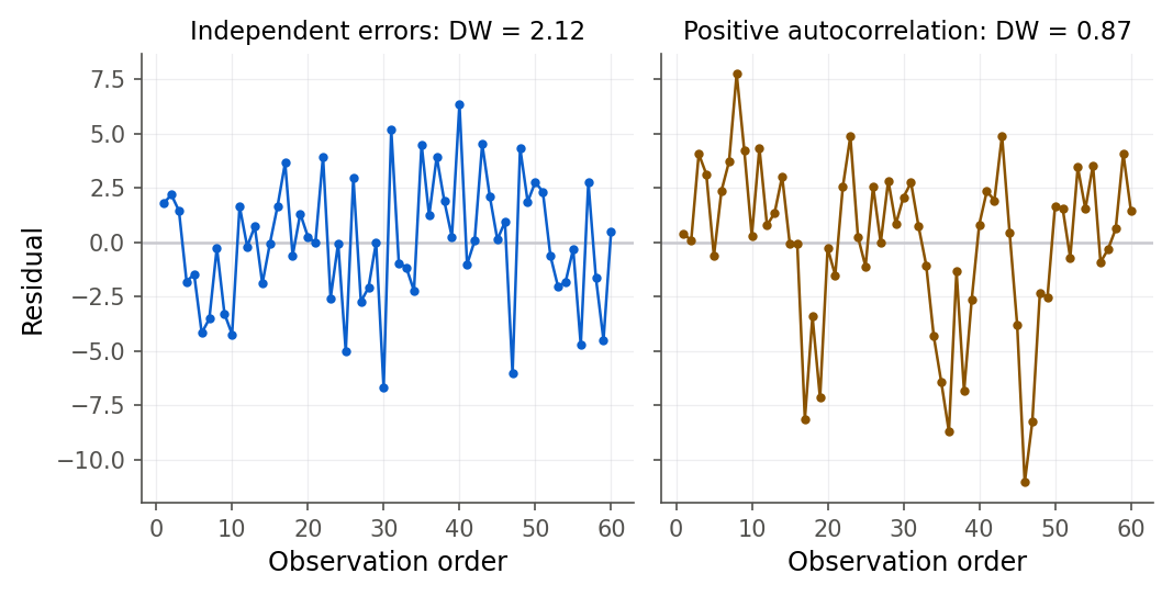
Figure 15:Independent residuals (left) flip sign freely and give a Durbin-Watson statistic near 2; positively autocorrelated residuals (right) drift in long runs, and the statistic falls toward 0.
9.6 The lack-of-fit F test
Intuition
Every diagnostic so far asks whether the errors misbehave. The lack-of-fit test asks a different question: is the shape of the regression function right at all? Suppose the true mean of bends, but you fit a straight line. Then even with perfect data the line will miss the true means. The trouble is that ordinary SSE cannot tell “the model is wrong” from “the data are noisy,” because both inflate it. The way out is replication. If you have several observations at the same predictor value, the spread among them measures pure noise, with no help from any model. That gives a yardstick of irreducible error to compare the model’s misses against.
The Toluca data are built for this. The 25 runs used only 11 distinct lot sizes, so most lot sizes were repeated. Figure 16 shows the idea: at each lot size the runs scatter around their own group mean (pure error), and the group means scatter around the fitted line (lack of fit).
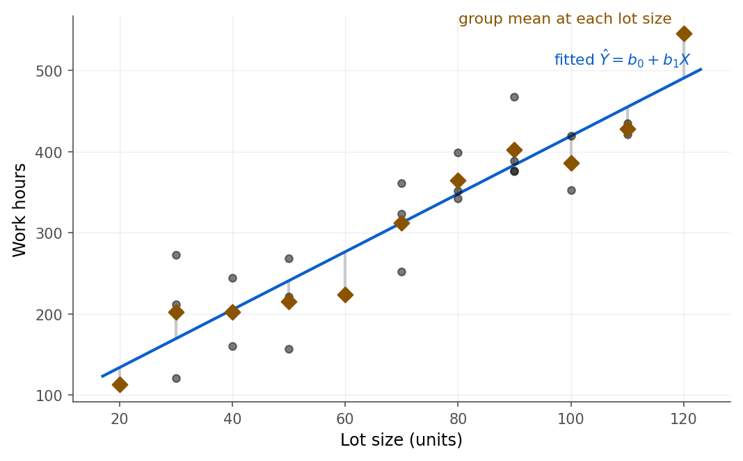
Figure 16:Lack of fit compares two spreads: the runs around their group means (pure error) and the group means around the line (lack of fit). The Toluca group means hug the line, so lack of fit is small.
Formula
Derivation (lack of fit as a general linear test)
Proof. This is the general linear test of 8.4 The general linear test with a specific pair of models. The full model puts a free mean at each of the distinct predictor levels: . Its least-squares fitted value at level is the group mean , so its error sum of squares is exactly , with degrees of freedom because it estimates means. The reduced model is the straight line , whose error sum of squares is the ordinary with degrees of freedom.
The general linear test statistic is
That the difference equals follows from expanding , squaring, and summing: the cross term vanishes because within each group. Under the reduced model the two mean squares both estimate , so is near 1; when the true means depart from a line, only inflates, since always.
R and Python
The split in Figure 16 is worth taking apart with your own hands, because the two sums of squares respond to completely different moves.
Five lot sizes with three runs each: drag the runs up and down and watch SSPE, SSLF and the lack-of-fit F test respond.
What to notice. Moving a whole group of repeats together leaves the pure error untouched and charges the entire move to lack of fit. Try this. Lift the three runs at by about 6 and watch the p-value fall from 1.0000 to 0.017, then lift only one of them and watch the test go quiet again (Figure 16).
9.7 Chapter summary
Diagnostics turn “the fit looks fine” into a defensible checklist. You can now derive the leverage values from the hat matrix, bound them between 0 and 1, show they sum to , and compute them by hand in simple regression; place a residual on four scales and explain why the raw residual misleads at high-leverage points; test a case for outlyingness with the studentized deleted residual and a Bonferroni cutoff; derive Cook’s distance from the leave-one-out coefficient change and read it, with DFFITS and DFBETAS, to find the points that actually move the fit; read the residual, quantile-quantile, and scale-location plots and run the Breusch-Pagan, Brown-Forsythe, Shapiro-Wilk, and Durbin-Watson tests; and derive and apply the lack-of-fit F test with pure error. The Galapagos fit failed on every count while the savings fit was steered by one country, and the Toluca line was vindicated at last.
Key results at a glance
| Result | Statement or formula | Valid when |
|---|---|---|
| Leverage value (Def 9.1) | any least-squares fit | |
| Leverage values: bounds, sum (Thm 9.2) | any least-squares fit | |
| Leverage value, simple regression (Thm 9.3) | one predictor | |
| Residual variance (Thm 9.5) | linear model, | |
| Studentized deleted residual (Thm 9.6) | case not an outlier | |
| Leave-one-out update (Thm 9.10) | ||
| Cook’s distance (Thm 9.11) | any least-squares fit | |
| DFFITS, DFBETAS (Def 9.9) | ; | per-case influence |
| Durbin-Watson | time-ordered errors | |
| Lack-of-fit F (Thm 9.13) | replicated , linear mean |
Key terms. leverage value, high-leverage point, raw residual, semistudentized residual, standardized residual, studentized deleted residual, deleted residual, outlier, influential observation, Cook’s distance, DFFITS, DFBETAS, Breusch-Pagan test, Brown-Forsythe test, Shapiro-Wilk test, correlation test for normality, Durbin-Watson test, autocorrelation, pure error, lack of fit.
You should now be able to
Derive the properties of the leverage values from the hat matrix and compute them by hand in simple regression.
Distinguish the raw, semistudentized, standardized, and studentized deleted residuals, and explain why the raw residual is a misleading scale.
Test a single case for outlyingness with the studentized deleted residual and a Bonferroni cutoff.
Derive Cook’s distance from the leave-one-out coefficient change, and compute DFFITS and DFBETAS.
Separate a high-leverage point from an influential one, and diagnose the savings and gala fits by name.
Read residual, quantile-quantile, and scale-location plots, and run the Breusch-Pagan, Brown-Forsythe, Shapiro-Wilk, and Durbin-Watson tests.
Derive and apply the lack-of-fit F test with pure error from replicated predictor values.
Where this fits. This chapter is the CHECK stage of the workflow spine from The modeling workflow: after you FIT a model you must find out whether it can be trusted before you USE it to predict or decide. Diagnostics look backward to the matrix machinery of 7.3 The hat matrix, which built the hat matrix whose diagonal holds the leverage values and whose properties power every influence measure, and to the general linear test of 8.4 The general linear test, which is the lack-of-fit test in disguise. They look forward to Chapter 10, which takes the two broken fits of this chapter, the Galapagos funnel and its non-normal errors, and tries to repair them with transformations and weighted least squares, continuing the savings and gala case studies by name. The gala thread runs further still: Chapter 14 gives the honest resolution with Poisson regression, the right tool for a count response that can never go negative. One diagnostic here is only introduced, not fully used: the Durbin-Watson statistic becomes the whole subject of 15.2 Why time breaks ordinary least squares, where time-ordered errors are modeled and corrected rather than merely detected.
9.8 Frequently asked questions
Q1. Is a high-leverage point a bad thing? Not by itself. A high leverage value means an unusual predictor row, which is potential to influence the fit, not proof of harm. A high-leverage point that sits right on the trend set by the others barely moves the line. A high leverage value becomes a problem only when it pairs with a large residual, and that combination is what Cook’s distance measures.
Q2. Should I delete an influential point? Almost never automatically. An influential point is a signal to investigate, not garbage to discard. Check it for a data-entry error first. If it is real, the honest report shows the fit with and without it and explains the difference, as we did with Libya. Deleting real data to get a cleaner answer is how analyses go wrong.
Q3. What is the difference between an outlier and an influential point? An outlier has a large residual: the model fits it poorly. An influential point changes the fit when removed. They can occur separately. Zambia is close to an outlier at an ordinary leverage value, so it is fit poorly but does not run the model. Libya is influential without an extreme residual, because its leverage value is so high.
Q4. My residual plot looks fine but Shapiro-Wilk rejects normality. Who wins? Read the sample size. In large samples formal tests reject tiny, harmless departures from normality; in small samples they miss real ones (the Galapagos Breusch-Pagan p-value of 0.08 is an example of the miss). Use the plot to judge whether the departure is big enough to matter, and remember that the t and F tests are fairly forgiving of mild non-normality.
Q5. Why divide by instead of for the outlier test? If case is truly an outlier, including it inflates the ordinary , which sits in the denominator of and hides the very case you are testing. Estimating the error standard deviation from the other cases, , removes that self-masking and gives an exact distribution for .
Q6. Does Durbin-Watson apply to any regression? No. It tests correlation between consecutive errors, so it only means something when the rows have a real order, usually time. Running it on cross-sectional data like the savings countries is meaningless, because “consecutive” is just alphabetical order. Chapter 15 uses it where it belongs.
Q7. Cook’s distance has no p-value. How large is too large? Cook’s distance is a descriptive scale, not a formal test. Common guidance flags near or above 1, but the most useful reading is relative: look for cases that stand far above the rest in an index plot. Libya at 0.27 is below 1 yet clearly separated from the pack, which is enough to warrant a closer look.
Q8. If a model fails a diagnostic, is it useless? No. A diagnostic tells you which assumption broke and therefore which conclusions to distrust. The Galapagos fit still describes a real association between geography and species richness; what it cannot support is a normal-theory prediction interval or a claim about a small island’s exact count. Knowing the limits of a model is what lets you use the part that holds.
9.9 Practice problems
(A) In one sentence each, define the leverage value, outlier, and influential point, and say which two combine to make the third.
(A) A leverage value comes out as in someone’s homework. Explain how you know it is wrong without seeing the data.
(A) Why does a high-leverage point tend to have a small raw residual? Refer to the variance formula for .
(A) State the rule and compute the cutoff for the savings model. Which single fact about the hat matrix makes the average leverage value?
(A) Explain in plain words why the studentized deleted residual uses rather than .
(A) Give the residual-versus-fitted pattern you would expect for (i) nonconstant variance, (ii) a missing quadratic term, (iii) a single gross outlier.
(A) A colleague deletes every point with and reports the cleaned fit. Give two reasons this is bad practice.
(A) The savings Durbin-Watson statistic is 1.93. Explain why this is not evidence that the savings errors are independent.
(A) Interpret Libya’s DFBETAS of -1.02 for the
ddpicoefficient for a reader who has never seen the statistic.(B) Using the symmetry and idempotence of , prove that and that (Theorem 9.2).
(B) Derive the simple-regression leverage value formula from (Theorem 9.3).
(B) Prove , and deduce both and (Theorem 9.5).
(B) Verify the Sherman-Morrison formula for by multiplying it by and simplifying to .
(B) Starting from the deletion formula (Theorem 9.10), derive the closed form (Theorem 9.11).
(B) Show that the deleted residual satisfies and that .
(B) Derive the lack-of-fit decomposition by expanding and showing the cross term vanishes (Theorem 9.13).
(B) Explain why whether or not the linear model is correct, but when it is not. Identify the full and reduced models behind the lack-of-fit F test.
(B) Show algebraically that starting from the change in the single fitted value and the deletion formula.
(B) Using , find the value of implied by a Durbin-Watson statistic of 0.67, and explain what that autocorrelation means for the errors.
(C) Fit the gala model. Report the leverage values above , and confirm that the leverage values sum to .
(C) For the savings model, compute all four residual scales for the United States and Japan, and comment on how the studentizing changes the picture for each.
(C) Run the Bonferroni outlier test on the savings model. Report the most extreme studentized deleted residual, the cutoff, and your decision.
(C) Compute Cook’s distance for the gala model, make an index plot, and confirm Isabela’s value with the formula.
(C) Refit the gala model without Isabela and report how the
ElevationandAreacoefficients change. Comment on whether the conclusions are fragile.(C) Make the residual-versus-fitted, normal quantile-quantile, and scale-location plots for the savings model, and argue from them that its assumptions are acceptable.
(C) Run the Breusch-Pagan and Shapiro-Wilk tests on the gala model, then on a model that uses as the response. Does the log help? (This previews Chapter 10.) Also run the Brown-Forsythe (modified Levene) test for constant variance on the raw gala model by splitting the cases at the median fitted value and running a two-sample test on the absolute deviations of the residuals from their group medians; does it agree with Breusch-Pagan?
(C) Using
toluca.csv, run the lack-of-fit F test by hand: build the group means, compute SSPE and SSLF, form , and matchanova.(C) Simulate a regression with positively autocorrelated errors (seed
4210, , ) and one with independent errors, and compare their Durbin-Watson statistics and p-values.(B) A point has and lies exactly on the fitted line (). Compute its Cook’s distance and DFFITS, and explain why a high-leverage point can have zero influence.
(C) For the gala model, produce the influence plot (leverage value versus studentized deleted residual, bubble size Cook’s distance) and identify every island that is unusual on at least one axis.
9.10 Exam practice
These five questions are written in the style of the course exams. Each asks you
to explain your reasoning in full sentences, not just to report a number. Where a
question shows software output, it was produced on the course machine from the
same data/ files you used all term; you read the numbers off the printout and
interpret them. Work each one before opening the model answer.
EP 9.1. The savings model sr ~ pop15 + pop75 + dpi + ddpi (,
) is fit, and the residual scales for Chile and Zambia, the two countries
with the largest raw residuals, are printed below along with the Bonferroni
outlier cutoff.
savings <- read.csv("data/savings.csv")
sfit <- lm(sr ~ pop15 + pop75 + dpi + ddpi, data = savings)
n <- nrow(savings); p <- length(coef(sfit))
i <- which(savings$country %in% c("Chile", "Zambia"))
data.frame(country = savings$country[i],
hii = round(hatvalues(sfit)[i], 3),
raw_e = round(residuals(sfit)[i], 3),
standardized = round(rstandard(sfit)[i], 3),
stud_deleted = round(rstudent(sfit)[i], 3))
qt(1 - 0.05 / (2 * n), n - p - 1) country hii raw_e standardized stud_deleted
Chile 0.037 -8.242 -2.209 -2.313
Zambia 0.064 9.751 2.651 2.854
[1] 3.5258Explain why Zambia’s residual grows from 2.564 on the semistudentized scale (its raw residual 9.751 divided by ) to 2.854 once it is studentized and deleted, and say which feature of Zambia in the table drives that increase. Then state whether the outlier test flags Zambia as a genuine outlier, name the number you compare it against, and explain in one sentence what the Bonferroni correction protects you from.
Model answer
The four scales climb because each divides by a smaller, more honest yardstick. The semistudentized residual divides only by , treating every residual as if it had the same variance. But Theorem 9.5 says , so Zambia’s residual, sitting at leverage value , actually has slightly less than the full error variance; dividing by instead of raises the value to the standardized 2.651. The studentized deleted residual goes one step further and estimates the error standard deviation from the other 49 countries as , which removes Zambia’s own inflation of and pushes the value to 2.854. The leverage value and the self-masking of are the two features driving the climb.
For the outlier test you compare the largest studentized deleted residual against the Bonferroni cutoff . Zambia’s 2.854 is well below 3.53, so it is not a significant outlier: it is fit poorly but not beyond what 50 draws from a clean model can produce. The Bonferroni correction divides by because you are implicitly running one test per case; without it, scanning 50 residuals for the largest would flag a clean point roughly one time in every two datasets, and the correction holds the family-wide false-alarm rate below .
A weak answer just reports “2.854 < 3.53, not an outlier” without explaining that the studentizing climb comes from dividing by a smaller variance, and without saying that the Bonferroni cutoff exists precisely because you selected the most extreme of many cases.
EP 9.2. The same savings fit gives the influence summary below for its three most talked-about countries.
country hii rstudent cooksD dffits
Japan 0.223 1.603 0.143 0.860
Zambia 0.064 2.854 0.097 0.748
Libya 0.531 -1.089 0.268 -1.160
( 2p/n = 0.200, DFFITS cutoff 2*sqrt(p/n) = 0.632 )A student writes: “Zambia has the largest studentized residual of any country, so Zambia is the single point most distorting the savings fit, and I would refit without it.” Evaluate this claim. State whether it is right, correct the reasoning using the numbers in the table, and name the country that actually most influences the fit, with the measure that settles it.
Model answer
The claim is wrong because it confuses a large residual with influence. A residual measures how badly a point is fit; influence measures how much the fit would move if the point left, and Definition 9.7 says influence needs two ingredients at once, an unusual predictor row (a high leverage value) and a poorly fit response (a large residual). Zambia has the largest studentized residual, 2.854, but its leverage value is only , close to the average and far below the cutoff. A point sitting in an ordinary part of predictor space can miss its own response badly and still barely tilt the line, because the crowd around it holds the line in place. That is why Zambia’s Cook’s distance is a modest 0.097.
Libya is the influential country. Its leverage value is the highest in the data, and although its residual is unremarkable (), the product of the two ingredients is what matters: Cook’s distance combines them, and Libya’s 0.268 is the largest in the data, nearly triple Zambia’s. Its DFFITS of -1.160 also clears the 0.632 cutoff while Zambia’s does not. Cook’s distance is the measure that settles it. The honest next step is not to delete anyone but to refit without Libya and report how much the answer moves, as Example 9.4 does with the growth coefficient.
A weak answer simply swaps “Zambia” for “Libya” without explaining that influence is the product of the leverage value and the residual, and so misses why the biggest residual is not the biggest problem.
EP 9.3. For the Galapagos model
Species ~ Area + Elevation + Nearest + Scruz + Adjacent (, ), a
grader runs the Breusch-Pagan and Shapiro-Wilk tests and inspects the fitted
values.
gala <- read.csv("data/gala.csv")
gfit <- lm(Species ~ Area + Elevation + Nearest + Scruz + Adjacent, data = gala)
library(lmtest)
bptest(gfit)
shapiro.test(residuals(gfit))
range(fitted(gfit)); sum(fitted(gfit) < 0) studentized Breusch-Pagan test
data: gfit
BP = 9.7959, df = 5, p-value = 0.08123
Shapiro-Wilk normality test
data: residuals(gfit)
W = 0.91351, p-value = 0.01826
[1] -36.38392 386.40356
[1] 5A student concludes: “The Breusch-Pagan p-value is 0.081, which is above 0.05, so the constant-variance assumption holds and the Galapagos model is fine.” Evaluate this conclusion. Explain what the test does and does not show here, bring in the other evidence on the printout, and state the general rule about tests versus plots that this case illustrates.
Model answer
The conclusion is not defensible. The Breusch-Pagan p-value of 0.081 means the test fails to reject constant variance at the level, but failing to reject is not the same as confirming: it can happen because the assumption holds, or because the test lacks the power to detect a real problem. With only islands the test is underpowered, and the residual-versus-fitted plot (Figure 1) shows an obvious funnel, the spread widening as the fitted count grows. When a formal test and a clear plot disagree, you trust the plot and treat the test as too weak to overrule it. So the constant-variance assumption is in fact suspect despite the p-value.
Even setting variance aside, the model is not “fine.” The Shapiro-Wilk p-value of 0.018 rejects normality of the errors, echoing the heavy tails and Isabela’s plunge in the quantile-quantile plot. And the fitted range runs down to -36.4 species, with five islands assigned a negative predicted count, which is impossible for a count response. A high coexists with a model that is wrong in several ways at once.
The general rule: a plot and a test answer the same question with different strengths. On a small sample a test can miss a departure a plot makes obvious; on a large sample it can flag a departure too small to matter. Read the picture, and let the test sharpen rather than replace your judgment.
A weak answer stops at “p > 0.05 so variance is constant” and never notices the funnel plot, the rejected normality test, or the impossible negative predictions.
EP 9.4. Continuing with the Galapagos fit, an analyst is worried that Isabela, the largest island, is running the whole model. The fit is refit with Isabela removed and the coefficients compared.
iso <- which(gala$island == "Isabela")
c(h = hatvalues(gfit)[iso], rstudent = rstudent(gfit)[iso],
cooksD = cooks.distance(gfit)[iso])
gfit2 <- lm(Species ~ Area + Elevation + Nearest + Scruz + Adjacent,
data = gala[-iso, ])
round(rbind(all = coef(gfit), no_Isabela = coef(gfit2)), 4)
c(R2_all = summary(gfit)$r.squared, R2_no_Isabela = summary(gfit2)$r.squared) h.16 rstudent.16 cooksD.16
0.9685 -5.3337 68.0764
(Intercept) Area Elevation Nearest Scruz Adjacent
all 7.0682 -0.0239 0.3195 0.0091 -0.2405 -0.0748
no_Isabela 22.5861 0.2957 0.1404 -0.2552 -0.0901 -0.0650
R2_all R2_no_Isabela
0.766 0.871Interpret this output in context. Say what would change in the reported conclusions
about Area and Elevation if Isabela were dropped, explain why one island can do
this using its three diagnostic numbers, and state what the honest way to report a
result this fragile is.
Model answer
Isabela is both an extreme predictor row and a badly fit response, the combination that produces heavy influence. Its leverage value is , almost the maximum possible value of 1 and far above the cutoff, so the fit is nearly pinned to Isabela’s own species count. Its studentized deleted residual is -5.33, past the Bonferroni cutoff of about 3.56, so it is also a genuine outlier. Cook’s distance multiplies the two ingredients and comes out at 68.1, off any reasonable scale, which is the single-number warning that this one island dominates the fit.
Dropping Isabela changes the story qualitatively, not just by a little. The Area
coefficient flips sign, from -0.0239 to +0.2957: with Isabela in, area appears
to lower species count, and without it, area raises the count, which is the sign you
would expect biologically. The Elevation coefficient falls from 0.3195 to
0.1404, less than half its former size. Meanwhile rises from 0.766 to
0.871, because the single hardest island to fit is gone. Any conclusion about how
area or elevation drives species richness rests on one island.
The honest report does not quietly delete Isabela and present the cleaner fit as if it were the whole story. You first check Isabela for a data error; finding it real, you report the fit both with and without the island and explain that the sign of the area effect depends on it, so the reader can judge. Deleting real data to get a tidier answer is how analyses mislead.
A weak answer notes only that “the coefficients change” and that improves,
without flagging the sign flip on Area, without tying the influence to all three
diagnostics, and without insisting that both fits be reported rather than the case
silently dropped.
EP 9.5. The Toluca data record labor hours against lotsize for 25
production runs that used only 11 distinct lot sizes. The lack-of-fit F test
compares the straight-line fit to a model with a free mean at each lot size.
toluca <- read.csv("data/toluca.csv")
reduced <- lm(hours ~ lotsize, data = toluca)
full <- lm(hours ~ factor(lotsize), data = toluca)
anova(reduced, full)
Analysis of Variance Table
Model 1: hours ~ lotsize
Model 2: hours ~ factor(lotsize)
Res.Df RSS Df Sum of Sq F Pr(>F)
1 23 54825
2 14 37581 9 17245 0.7138 0.6893Interpret this output in context: identify which printed number is the pure-error sum of squares and which is the lack-of-fit sum of squares, state the conclusion of the test in plain language, and explain what the test is comparing to reach it. Then answer: what would change about your ability to run this test if every one of the 25 runs had used a different lot size?
Model answer
The pure-error sum of squares is the residual sum of squares of the full group-means model, on 14 degrees of freedom, because the free-mean-per-lot-size model fits each group at its own mean and its leftover is pure noise among repeats. The lack-of-fit sum of squares is the “Sum of Sq” column, on 9 degrees of freedom, the extra error the straight line carries beyond that noise floor, that is the gap between the group means and the line. Together they split the line’s into pure error plus lack of fit.
The test compares two yardsticks of spread: the runs around their own group means (pure error, which no model can remove) against the group means around the fitted line (lack of fit, which a wrong shape would inflate). Here with a p-value of 0.69, so there is no evidence of lack of fit. In plain language, the group means hug the straight line no more loosely than pure noise alone would explain, so the straight-line shape the Toluca engineers relied on is vindicated.
If all 25 runs had used distinct lot sizes there would be no replication, so every group would contain a single observation, its group mean would equal that observation, and would be zero on degrees of freedom. With no pure-error estimate of the denominator is undefined and the test cannot be run at all. Replication is exactly what buys you a model-free measurement of the noise, and without repeats there is no way to separate a wrong shape from ordinary scatter.
A weak answer reads off “p = 0.69, no lack of fit” but cannot say which number is SSPE and which is SSLF, cannot explain the two spreads being compared, and does not see that the test collapses entirely without replicated predictor values.
Chapter game
Resumen del capítulo (en español)
Este capítulo trata la etapa CHECK (verificar) del flujo de trabajo: una vez
ajustado un modelo, hay que comprobar si merece confianza antes de usarlo. Se
apoya en dos casos reales. El modelo de especies de las islas Galápagos (gala)
tiene un alto pero falla casi toda prueba: la varianza crece con el valor
ajustado y predice conteos negativos, con la isla Isabela como caso extremo.
El modelo de ahorro entre países (savings) cumple los supuestos, pero su
ajuste depende de un solo país, Libia.
La influencia de un punto combina dos ingredientes: un apalancamiento alto, que mide lo inusual de sus predictores, y un residuo grande. Derivamos las propiedades de a partir de la matriz sombrero: está entre 0 y 1 y suma . Como la varianza del residuo crudo depende de , ese residuo engaña en puntos de alto apalancamiento, así que lo estandarizamos. El residuo eliminado studentizado prueba si un caso es un valor atípico con una corrección de Bonferroni; Isabela resulta un atípico claro.
La distancia de Cook resume la influencia combinando el residuo y el
apalancamiento; se deriva del cambio en los coeficientes al eliminar un caso.
En savings, Libia desplaza notablemente el coeficiente de crecimiento ddpi
al quitarla; en gala, Isabela domina por completo. DFFITS y DFBETAS
afinan el diagnóstico caso por caso.
Los gráficos de residuos, el cuantil-cuantil normal y el escala-ubicación revelan de un vistazo problemas de forma, normalidad y varianza. Las pruebas formales (Breusch-Pagan, Brown-Forsythe, Shapiro-Wilk) los confirman, y Durbin-Watson detecta autocorrelación en datos ordenados en el tiempo, tema que retoma el Capítulo 15. Finalmente, la prueba F de falta de ajuste usa el error puro de observaciones repetidas para juzgar si la forma lineal es correcta; para Toluca, la recta resulta adecuada.