In 1949 an international airline started keeping a simple monthly tally: how many passengers flew that month, counted in thousands. Twelve years of those counts, from January 1949 through December 1960, became one of the most studied datasets in statistics. The airline’s problem was concrete. To decide how many aircraft to buy, how many crews to hire, and how to schedule maintenance, the planners needed to forecast demand a year or two ahead. A good forecast saved money; a bad one grounded planes or stranded passengers.
Figure 1 plots the 144 monthly counts in order. Three features jump out. The series climbs steadily: air travel roughly tripled over the twelve years. It also cycles every year, with a tall summer peak (people fly on vacation) and a winter dip. And the swings get wider as the series rises: the gap between the summer peak and the winter trough was small in 1949 and large in 1960. A single straight line will not describe this, but a regression with a trend term and a set of monthly indicators just might.
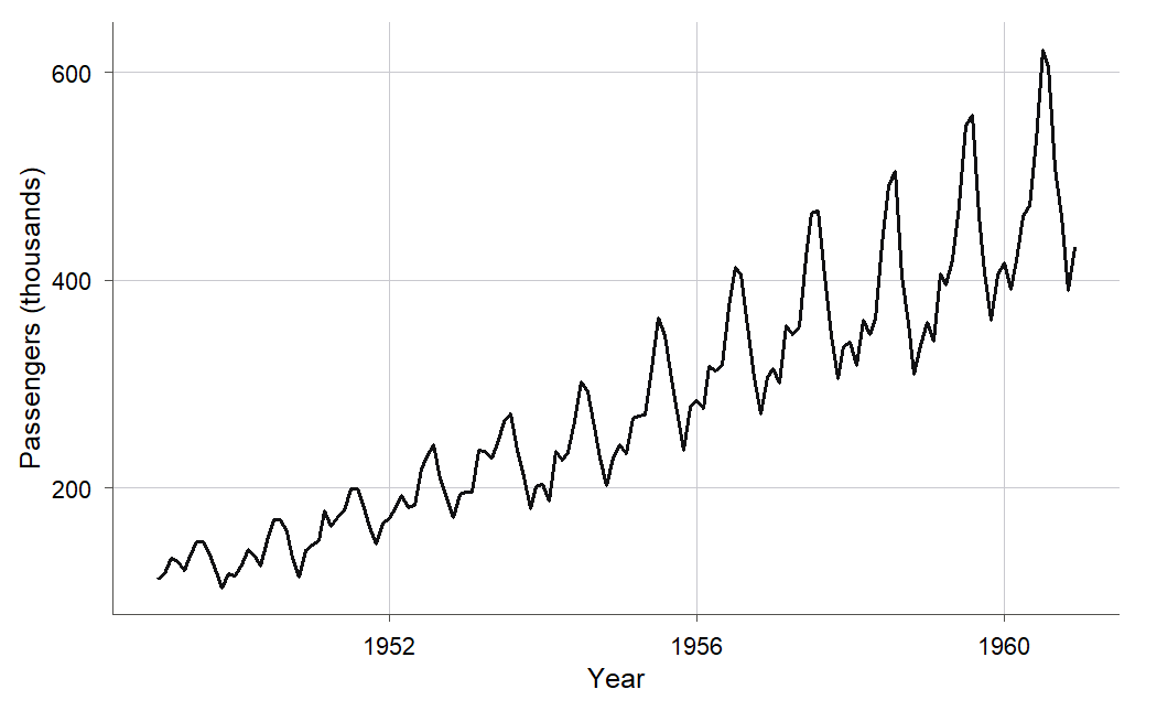
Figure 1:The monthly airline series: a rising trend, a repeating yearly cycle with summer peaks, and seasonal swings that grow wider as the overall level climbs.
Time-ordered data like this break a promise the earlier chapters relied on. Every inference you have done so far assumed the errors were uncorrelated: one observation’s luck told you nothing about the next. When observations come in time order, that assumption usually fails. A month that runs above the trend tends to be followed by another above the trend, because whatever pushed demand up (a booming economy, a new route) does not vanish overnight. This chapter shows what that correlation does to your standard errors, how to detect it, one classic way to remove it, and how to judge a forecast honestly by testing it on the future instead of the past.
15.1 A model for trend and seasonality
Intuition
We start where the workflow always starts: with the picture and the question. Figure 1 shows three ingredients, and a regression can carry one term for each. The steady climb is a trend, which we model with a straight line in the time index . The yearly cycle is seasonality, which we model with eleven indicator (dummy) variables for the months February through December, each measuring how that month sits relative to a January baseline. The growing swings are the reason we do not model the raw counts directly.
Look again at the raw series: in 1949 the summer peak stands maybe 30 above the winter trough, but by 1960 that same seasonal gap is over 150. The seasonal effect is not a fixed number of passengers; it is a fixed percentage of the current level. When an effect is multiplicative like that, taking logarithms turns it additive and, as a bonus, evens out the variance. Figure 2 shows the payoff: on the log scale the seasonal swings are about the same width every year. Working on the log scale is the transformation idea from 10.2 The log transformation and reading its coefficients, and it is what lets a single set of month effects fit the whole twelve years.
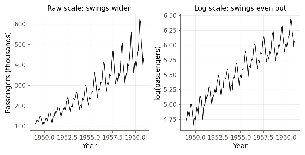
Figure 2:On the raw scale (left) the yearly swings widen as the level rises; on the log scale (right) they hold a nearly constant width. Logs turn a multiplicative seasonal pattern into an additive one and stabilize the variance.
Formula
Let be the passenger count in month and work with . The model carries one term for each feature of Figure 1: a linear trend, a fixed offset for each month, and an error.
The pieces, term by term:
is the time index, 1 for January 1949 up to for December 1960.
is the intercept: the log level of a January at time (a baseline anchor).
is the trend slope: the change in per month. Because is logged, is an approximate proportional growth rate per month (from 10.2 The log transformation and reading its coefficients).
is the month- indicator: it equals 1 when month is calendar month , and 0 otherwise. There are eleven of them, for February () through December ().
is the seasonal coefficient for month : how far month sits above or below January on the log scale, holding the trend fixed. January is the reference month, coded by all eleven indicators being zero, exactly the dummy-coding scheme of 11.1 From categories to numbers: indicator coding.
is the error in month .
In words: the log passenger count is a straight-line trend plus a fixed offset for each month of the year plus a disturbance. For now we fit this by ordinary least squares, treating the as if they satisfied the usual assumptions. Section 15.2 checks whether they do.
R
We read the tidy monthly file, build a time index and a log response, and make month a
factor so lm expands it into indicator variables automatically.
air <- read.csv("data/airpassengers.csv")
air$t <- seq_len(nrow(air))
air$logpass <- log(air$passengers)
air$month <- factor(air$month)
dim(air)
head(air, 3)
[1] 144 5
year month passengers t logpass
1 1949 1 112 1 4.718499
2 1949 2 118 2 4.770685
3 1949 3 132 3 4.882802Eleven coefficients are hard to picture from a table, so Figure 3 draws them as bars. Each bar is one month’s offset from January, and the shape tells the whole seasonal story at a glance: a summer hump peaking in July and August, a soft dip in late fall.
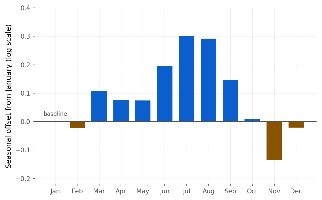
Figure 3:The seasonal coefficients as bars, each measured against a January baseline. The summer peak and the November low that the numbers rank are far easier to see as a shape than as a column of decimals.
The trend slope deserves its own reading, because logs make it a growth rate.
Figure 4 lays the fitted values over the observed log series. The straight trend plus twelve monthly offsets reproduces the sawtooth shape closely, which is why is so high.
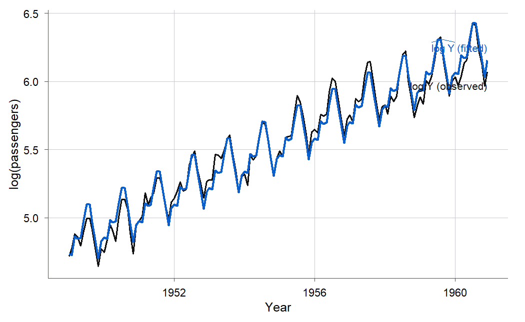
Figure 4:The trend-plus-month model on the log scale. A single straight trend and eleven seasonal offsets follow the observed sawtooth closely, which is why the model explains 98 percent of the variation.
15.2 Why time breaks ordinary least squares
Intuition
We can now fit the line; the obvious next question is whether we should trust its standard errors. Recall the residual plot habit from Chapter 2: after any fit, look at the residuals. For time data, plot them in time order. Figure 5 does exactly that for the trend-plus-season model, and the picture is not the random band you want. The residuals move in long runs: a stretch of months above zero, then a stretch below, then above again. A month that overshoots the model is usually followed by another that overshoots. That is autocorrelation (Definition 15.2): the errors are correlated with their own recent past.
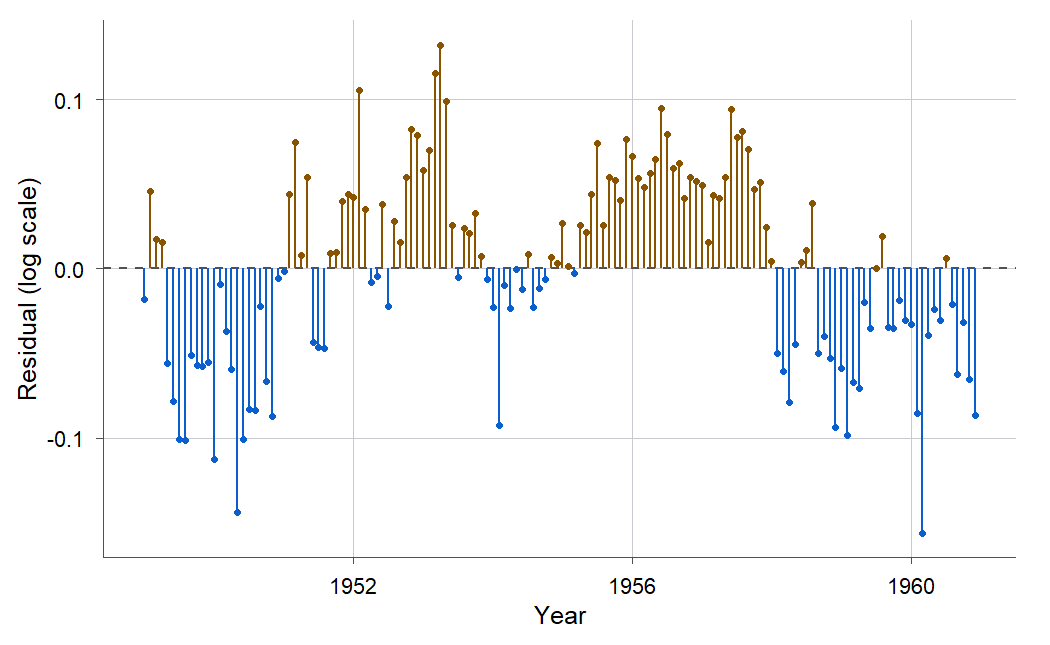
Figure 5:The model residuals in time order form long runs of the same sign instead of scattering randomly around zero. That clustering is the visual signature of positive autocorrelation.
Autocorrelation matters because it breaks the “uncorrelated errors” assumption that every standard error formula in this book was built on. Under the Gauss-Markov conditions of 2.5 Sampling behavior and the Gauss-Markov theorem, distinct errors were uncorrelated. When they are not, least squares still lands on an unbiased estimate of the slope, but its reported standard error is wrong. For the positive autocorrelation you almost always see in time series, it is wrong in the dangerous direction: too small. The software prints a tight confidence interval and a tiny p-value, and you believe the trend is pinned down far more precisely than the data support.
Formula
The simplest and most common model for correlated errors is the first-order autoregressive model, written AR(1).
Reading the pieces:
is the regression error in month , the thing we assumed was uncorrelated but is not.
is the autocorrelation parameter: the correlation between an error and the one just before it. Positive means consecutive errors tend to share sign.
is the innovation: the genuinely new, unpredictable shock in month , and these are independent with constant variance.
keeps the process stable so the errors do not blow up.
In words: this month’s error is a fraction of last month’s error plus a fresh independent shock. Figure 6 contrasts independent errors with AR(1) errors of the same variance. The independent series has no memory; the AR(1) series wanders in runs, exactly like the residuals in Figure 5.
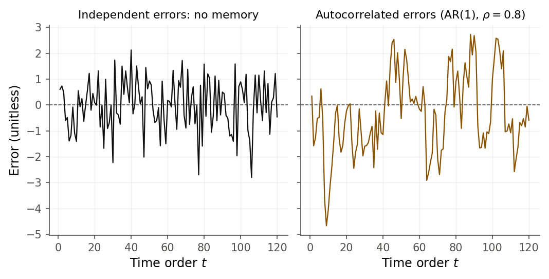
Figure 6:Independent errors (left) and positively autocorrelated AR(1) errors (right) with the same variance. The AR(1) series drifts in long runs, which is why autocorrelated residuals cluster by sign.
Derivation
Why does positive autocorrelation make the reported standard error too small? The cleanest place to see the mechanism is the simplest estimator, the sample mean, where the algebra is short and the lesson transfers directly to the regression slope.
Proof. Suppose for , where each error has mean zero and variance , and neighboring errors have correlation , the AR(1) pattern. The estimator of is . Its true variance is
The first sum is . Every covariance is , so collecting terms by their lag gives
In words: the true variance of the mean is the familiar multiplied by a bracket that depends on the autocorrelation. When the errors are uncorrelated () the bracket is 1 and we recover . When every term in the sum is positive, so the bracket exceeds 1 and the true variance is larger than . But is exactly what the ordinary formula estimates, because it ignores the covariances. So ordinary least squares divides by too little and reports a variance, and a standard error, that are too small. The same cancellation of covariances inflates the true variance of the regression slope ; only the bookkeeping is longer.
How badly does this bite in practice? A simulation makes it concrete, and it is worth running yourself, in the spirit of the “check a formula by simulating it” habit.
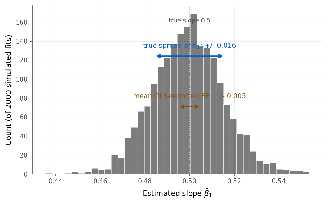
Figure 7:Two thousand slope estimates under AR(1) errors. Their actual spread (wide arrow) is about three times the standard error ordinary least squares reports (short arrow), so the usual confidence interval is far too narrow.
The simulation below puts that whole argument under your finger: it holds the data and the shocks fixed and lets you turn the autocorrelation up, so you can watch the reported standard error stay put while the true one runs away from it.
Slide the autocorrelation rho and watch the residuals fall into long runs, the Durbin-Watson statistic drop from 2 toward 0, and the standard error that least squares reports drift further and further below the true spread of the slope.
15.3 Detecting autocorrelation: the Durbin-Watson test
Intuition
The residual plot warns you; a test quantifies the warning. Two pictures point the same way. A lag plot (Definition 15.5) graphs each residual against the previous residual ; positive autocorrelation shows up as an upward tilt, because a positive residual tends to sit next to another positive one. Figure 9 is that plot for the airline model, and the tilt is unmistakable.
The Durbin-Watson test turns that tilt into a single number and a p-value. You met this test as one item in the diagnostic toolkit of 9. Model diagnostics, where it flagged ordering in savings residuals; here is the time-ordered data it was built for, and this is where we finally derive why its scale runs the way it does.
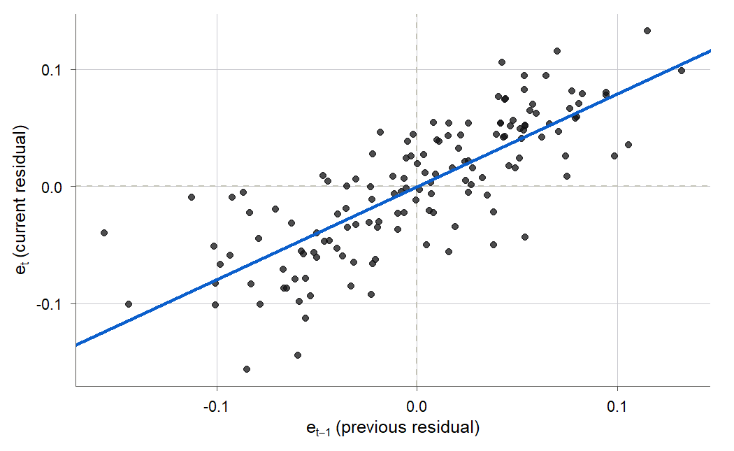
Figure 9:Each residual against the one before it. The clear upward tilt (slope near 0.79) means a residual is usually followed by another of the same sign, the definition of positive autocorrelation.
Formula
The Durbin-Watson statistic measures how much consecutive residuals differ.
is the residual in month from the fitted regression.
The numerator adds up squared changes between neighboring residuals; the denominator is the usual residual sum of squares.
The statistic runs from 0 to 4. When neighboring residuals are nearly equal (strong positive autocorrelation) the numerator is small and is near 0. When residuals alternate sign (negative autocorrelation) the changes are large and is near 4. When residuals are uncorrelated, sits near 2. Figure 10 is the number line to keep in mind.
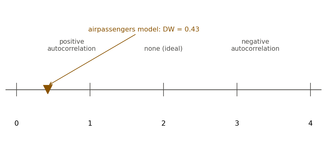
Figure 10:The Durbin-Watson statistic runs from 0 to 4: near 0 is strong positive autocorrelation, near 2 is none, near 4 is negative. The airline model lands at 0.43, deep in the positive zone.
Derivation
The scale is not arbitrary. Chapter 9 stated the shortcut in its summary and used it to read the savings statistic; now that autocorrelation is the whole story, it is worth seeing where that identity comes from. The Durbin-Watson statistic is, up to a small-sample correction, just a rescaling of the lag-one residual autocorrelation, which explains why 2 is the neutral value.
Proof. Expand the square in the numerator:
For a reasonably long series the first two sums are each very close to the full residual sum of squares , because they each drop only one term (the last or the first). Write for the lag-one residual autocorrelation. Dividing the expansion by ,
In words: the Durbin-Watson statistic is about 2 minus twice the lag-one autocorrelation. If then ; if then ; if then . This is why a value near 2 signals no autocorrelation.
Deciding whether an observed is far enough from 2 to be surprising is slightly awkward. The null distribution of depends on the predictor values, so Durbin and Watson published a pair of bounds, and , that bracket the true critical value. Software sidesteps the tables by computing the p-value directly. Both appear below.
R and Python
A p-value below is easy to read past. The simulation below makes it concrete by building the comparison the test is making: hundreds of series whose errors really are uncorrelated, so you can see for yourself how far 0.43 sits from anything chance produces.
Simulate the Durbin-Watson statistic under honestly uncorrelated errors and watch the pile gather around 2. The airline model’s 0.43, marked in amber, never gets company.
15.4 A remedy: the Cochrane-Orcutt procedure
Intuition
If the errors follow an AR(1) pattern, we can transform them away. The trick is quasi-differencing: instead of the raw series, regress each observation minus times the previous observation. That combination cancels the correlated part of the error and leaves the fresh, independent innovations behind. Because the transformed model has uncorrelated errors, ordinary least squares on it is valid again. The one snag is that is unknown, so we estimate it from the residuals and iterate. That loop is the Cochrane-Orcutt procedure.
Formula
Start from the regression with AR(1) errors, written compactly with for the row of predictors (the 1, the trend , and the month indicators) in month :
Lag the whole regression one step, multiply by , and subtract:
is the quasi-differenced response.
is the quasi-differenced predictor row.
is the innovation, and by the AR(1) definition it is independent across with constant variance.
The transformed model has exactly the same coefficients as the original, but now satisfies the ordinary least-squares assumptions, so fitting it gives trustworthy standard errors.
Derivation
Proof. The AR(1) definition says the error is its own lag scaled by plus an independent shock, , which rearranges to . Take the original regression and the same relation one step back, . Multiply the lagged equation by and subtract it from the current one. On the left, ; on the right, plus , and that last piece is exactly . So the quasi-differenced series obeys a regression with the same and with the independent, constant-variance errors . Ordinary least squares is back on solid ground, which is the whole point of the transform.
The obstacle is that is unknown. The Cochrane-Orcutt procedure estimates it and the coefficients together, by iterating:
Fit the original model by ordinary least squares and keep the residuals .
Estimate by regressing on through the origin: .
Quasi-difference and every predictor using , and refit by least squares to get new .
Recompute residuals from the original-scale fit, re-estimate , and repeat until stops changing.
Each pass reduces the leftover autocorrelation; in practice a couple of iterations suffice.
Figure 12 lays the four steps out as a loop. Read it top to bottom, then follow the orange arrow back up whenever the estimated is still moving: fit, estimate, transform, refit, check, and stop once settles.
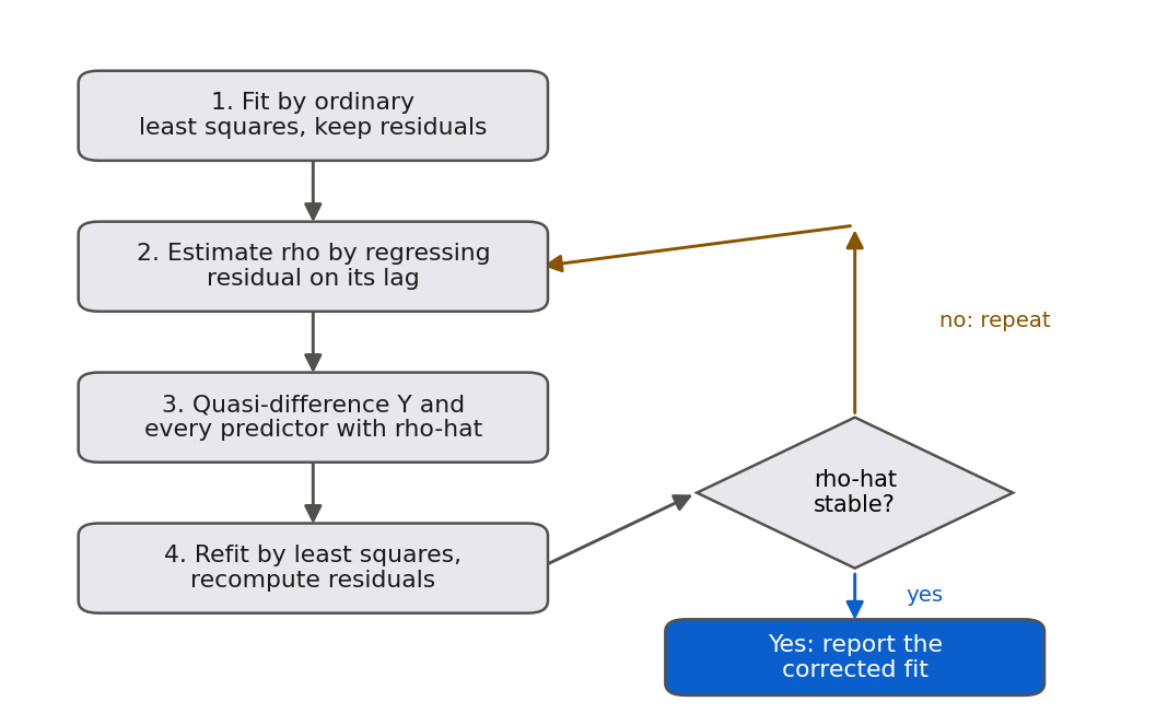
Figure 12:The Cochrane-Orcutt procedure as a loop. Each pass estimates the autocorrelation, quasi-differences with it, and refits; the loop repeats until the estimated rho stops changing, then reports the corrected standard errors.
R and Python
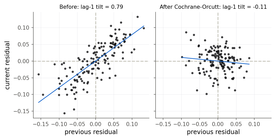
Figure 13:Residual lag plots before (left) and after (right) one Cochrane-Orcutt step. Quasi-differencing flattens the upward tilt to a round cloud, so the transformed errors look uncorrelated.
Try it 15.4 asks you to argue that is too much. The simulation below lets you check the argument on the real airline model by choosing the yourself and reading off the autocorrelation that survives.
Quasi-difference the airline model with a rho of your choosing. Near 0.71 the residual runs break up and the Durbin-Watson statistic settles beside 2; push toward 1 and the residuals begin to zigzag instead.
15.5 Forecasting honestly: test on the future
Intuition
A model that fits the past beautifully can still forecast the future badly. The only honest way to judge a forecast is to hide part of the future from the model, forecast it, and compare. For time data that means an out-of-time split (Definition 15.11): train on the earlier years, test on the later ones. This is the validation mindset of Chapter 12 with one strict rule added by the clock. You may never train on data that came after your test period, because at forecast time that data did not exist. Splitting at random, the way you would for cross-sectional data, would let the model peek at the future and flatter itself.
We train the trend-plus-season model on 1949 through 1957 and forecast 1958 through 1960, three years it has never seen. Figure 15 shows the result, and it is a useful humbling.
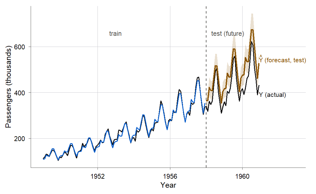
Figure 15:The model trained on 1949 to 1957 and forecasting 1958 to 1960. In the test years the forecast drifts above what actually happened, and the shaded naive prediction band misses most of the real months.
Formula
Two honest scorecards summarize test-set performance. The root mean squared error and the mean absolute percentage error on the held-out months are
is the actual passenger count in a test month; is the model’s forecast, back-transformed from the log scale by exponentiating.
RMSE is in passengers (thousands); MAPE is a unit-free percentage that is easy to explain.
In words: RMSE is the typical size of a forecast miss in passengers, and MAPE is the average miss as a percent of the actual count.
Because the model is fitted on the log scale, we exponentiate the log forecast to get a count forecast before scoring. We also carry the ordinary regression prediction interval from 3.5 Prediction interval for a new observation, back-transformed the same way, and check how often it actually covers the truth.
R and Python
Why does the prediction interval fail so badly? The interval from 3.5 Prediction interval for a new observation was derived under independent, constant-variance, normal errors, and it accounts for only two sources of uncertainty: the spread of a single new error and the uncertainty in the fitted mean. For a forecast several years out, neither piece is the real story. The errors are strongly autocorrelated, so a run of bad months compounds instead of averaging out. The trend is extrapolated far beyond the data, so any error in the estimated slope grows with the horizon. And genuine forecast uncertainty should widen the further ahead you look, while the ordinary regression interval barely widens at all. An interval that ignores all of this is bound to be too narrow, which is exactly what the coverage shows.
The 1957 split is one choice among many, and the simulation below lets you move it. Watching the same model score well on the months it saw and badly on the months it did not, over and over at different splits, is the fastest way to make the lesson stick.
Move the training cutoff and compare the two error tiles: the model scores about 9 on the months it trained on and about 63 on the months it forecast. The 95 percent prediction band covers 19 percent of them.
15.6 Chapter summary
You can now handle regression on time-ordered data from end to end. You fit a trend-plus-season model on the log scale (Definition 15.1), reading the trend as a growth rate and each month coefficient as a seasonal offset, reusing the log transform of 10.2 The log transformation and reading its coefficients and the dummy coding of 11.1 From categories to numbers: indicator coding. You can explain why time order usually correlates the errors, and you proved, for the sample mean, that positive autocorrelation makes the ordinary variance formula too small (Theorem 15.4), so least squares reports standard errors you cannot trust. You diagnose autocorrelation three ways, the residual-versus-time plot, the lag plot, and the Durbin-Watson test, and you derived why makes 2 the neutral value (Theorem 15.7). You apply the Cochrane-Orcutt procedure and know why quasi-differencing restores independent errors (Theorem 15.10). And you evaluate a forecast honestly with an out-of-time split, computing test error and prediction-interval coverage, and you can say plainly why calibrated forecast intervals need time-series methods this course does not cover.
Key results at a glance.
| Result | Statement or formula | Valid when |
|---|---|---|
| Trend-plus-season model (Def 15.1) | trend and seasonality are multiplicative; logs make them additive and stabilize variance | |
| Growth from the log slope | monthly ; annual | response modeled on the log scale |
| AR(1) error model (Def 15.3) | , $ | \rho |
| Variance of the mean under AR(1) (Thm 15.4) | AR(1) errors; exceeds when , so OLS SEs are too small | |
| Durbin-Watson statistic (Def 15.6) | any fitted regression; 0 positive, 2 none, 4 negative | |
| Durbin-Watson identity (Thm 15.7) | reasonably long series of residuals | |
| Quasi-differencing removes AR(1) (Thm 15.10) | AR(1) errors, with known or estimated | |
| Out-of-time forecast score | RMSE and MAPE on held-out later months | train/test split respects time order |
| Prediction-interval coverage | fraction of test months inside the interval | interval is honest only if coverage |
Airline figures: , , moves from 0.43 to 2.19 after one Cochrane-Orcutt step, test RMSE 63 / MAPE , and prediction-interval coverage 0.19 (7 of 36).
Key terms. time-ordered data, trend, seasonality, trend-plus-season model, autocorrelation, first-order autoregressive (AR(1)) error model, autocorrelation parameter, innovation, Durbin-Watson statistic, Durbin-Watson test, lag plot, Cochrane-Orcutt procedure, quasi-differencing, out-of-time split, mean absolute percentage error (MAPE), prediction-interval coverage.
You should now be able to.
Fit and interpret a trend-plus-season model on the log scale, reading the trend as a growth rate and each month coefficient as a seasonal offset.
Explain why time order correlates the errors, and show that positive autocorrelation makes ordinary least-squares standard errors too small.
Diagnose autocorrelation with a residual-versus-time plot, a lag plot, and the Durbin-Watson test.
Derive and use it to read the Durbin-Watson scale.
Apply the Cochrane-Orcutt procedure and explain why quasi-differencing restores independent errors.
Evaluate a forecast with an out-of-time split, computing test RMSE, MAPE, and prediction-interval coverage.
Explain why calibrated forecast intervals need time-series methods beyond ordinary regression.
Where this fits. This chapter serves the CHECK and USE stages of the modeling workflow introduced in The modeling workflow. We ASK a forecasting question and EXPLORE the series, FIT a trend and seasonal model, then spend most of the chapter on CHECK: the uncorrelated-errors assumption that every earlier inference relied on fails on time data, so we diagnose the failure with the Durbin-Watson test and repair the inference with Cochrane-Orcutt. The USE stage, forecasting, comes with a warning the earlier chapters could make cleanly but this one cannot: the prediction interval of 3.5 Prediction interval for a new observation, honest under independent errors, is badly miscalibrated here. That is the seam where an applied regression course hands off to a time-series course: the out-of-time split and the honest-forecast discipline you built here are the entry habits any such course assumes. Chapter 16 (16. Path analysis and a look ahead) closes the book by stepping back from any single model to ask what a chain of regressions can and cannot say about cause, and by walking the whole workflow one last time.
15.7 Frequently asked questions
Q1. Why log the passengers instead of modeling the counts directly? Because the seasonal swings and the error spread both grow with the level of the series, which is a multiplicative pattern. Taking logs turns the multiplicative seasonal effect into an additive one, so a single set of month coefficients fits all twelve years, and it stabilizes the variance so the constant-variance assumption is closer to true. This is the same reasoning as 10.2 The log transformation and reading its coefficients, applied to a series that grows over time.
Q2. If least squares is still unbiased under autocorrelation, why care? Unbiased means the estimate is right on average, but a single analysis gives you one estimate, and you need to know how far it might be off. That is the standard error’s job, and autocorrelation makes the reported standard error wrong, usually far too small. You end up with a point estimate that is fine and a confidence interval that lies about its own reliability.
Q3. My Durbin-Watson statistic is 2.6. Is that a problem? It is on the negative- autocorrelation side, since means . From , a of 2.6 implies . Mild negative autocorrelation is less common than positive but does occur, often from over-differencing or from a variable measured as a change. Whether it is “a problem” depends on the p-value and on how much you rely on the standard errors.
Q4. Does Cochrane-Orcutt change the trend estimate or just the standard errors? Both, a little. The quasi-differenced fit is a generalized least-squares estimate, which weights the data differently from ordinary least squares, so the coefficients shift somewhat. The larger and more important change is to the standard errors, which now account for the correlation and are the ones you should report.
Q5. Why not just use the ordinary prediction interval and admit it is approximate? Because it is not approximately right, it is badly wrong: on the airline test set it covered of months instead of . An interval that far off does not communicate uncertainty, it misstates it. If you cannot produce a calibrated interval, report the out-of-time test error instead, which is honest about how the forecast actually performs.
Q6. Could I add more predictors instead of modeling the error correlation? Sometimes. Autocorrelated residuals can be a symptom of a missing predictor, an omitted trend curvature or a skipped seasonal term, and adding the right predictor can remove the pattern at its source. That is usually the better fix when you can find the missing structure. Cochrane-Orcutt is for the residual correlation that remains after you have modeled the structure you can.
Q7. Is a high like 0.983 evidence the forecast will be good? No. That measures fit to the past, and this chapter’s whole point is that in-sample fit and out-of-time forecast accuracy are different things. The same model with missed the future by and its interval covered one test month in five. Judge a forecast on held-out data, never on .
15.8 Practice problems
(A) In one sentence each, name the three features of the airline series in Figure 1 and say which term in the trend-plus-season model captures each.
(A) Explain why the errors in a regression on monthly data are likely to be correlated, and give a concrete reason two neighboring months would share the sign of their error.
(A) The trend slope estimate is on the log scale. Interpret it as a monthly percentage growth rate, and explain why exponentiating is needed.
(A) A Durbin-Watson statistic equals 0.43. Without a table, state what it implies about the lag-one autocorrelation and about the reliability of the ordinary standard errors.
(A) Explain, to someone who has not taken this course, why splitting time-series data at random for a train/test evaluation is cheating, and what the correct split is.
(A) The naive prediction interval covered of the test months. State plainly what “95% coverage” is supposed to mean and why is a failure, not just a small miss.
(A) Give a wrong reading of the July coefficient that a careless student might state, then correct it. (Hint: the coefficient is on the log scale, relative to January.)
(A) Why does positive autocorrelation, rather than negative, make ordinary least squares overconfident? Point to the sign of the covariance terms in the variance of the mean.
(B) Starting from , derive the approximation (Theorem 15.7), stating the step where the two truncated sums are replaced by the full residual sum of squares and why it is reasonable for large .
(B) For with and , derive (Theorem 15.4), and conclude it exceeds when .
(B) Using the AR(1) error model , derive the quasi-differencing transform (Theorem 15.10) and show that the transformed error equals the independent innovation .
(B) Show that for a stationary AR(1) process, starting from and using .
(B) In the AR(1) model, show that the correlation between errors steps apart is , so the autocorrelation decays geometrically with the lag. (Use .)
(B) The Cochrane-Orcutt transform loses the first observation, since has no predecessor. Explain why, and describe how the Prais-Winsten variant recovers it by rescaling the first row by (a one-paragraph argument, no full derivation needed).
(B) A student claims that because is unbiased under autocorrelation, the confidence interval is still valid. Identify the error in the claim and state precisely which quantity in the interval is wrong.
(B) Show that if the true errors are uncorrelated (), the Cochrane-Orcutt first step estimates and the quasi-differenced fit reduces to ordinary least squares, so the procedure does no harm when there is no autocorrelation.
(C) Read
airpassengers.csv, buildtandlogpass, fit the trend-plus-season model, and reproduce the trend slope, , and residual standard error reported in Example 15.1.(C) Compute the Durbin-Watson statistic from the residuals by hand (via ) and confirm it against
lmtest::dwtestin R ordurbin_watsonin Python. Report both.(C) Make the residual-versus-time plot and the lag plot for the fitted model. Describe what each shows and how they agree about the sign of the autocorrelation.
(C) Estimate from the residuals, quasi-difference the response and design matrix, refit, and report the Durbin-Watson statistic before and after. Confirm it moves from about 0.43 toward 2.
(C) Fit the model without logs (
passengers ~ t + month) and compare its residual-versus-time plot and Durbin-Watson statistic to the log model’s. Does dropping the log make the autocorrelation better or worse, and does the residual spread look constant?(C) Split the data by time (train on 1949 to 1957, test on 1958 to 1960), fit on the training years, forecast the test years, back-transform, and reproduce the test RMSE and MAPE from Example 15.6.
(C) For the same split, compute the naive prediction-interval coverage on the test set and confirm it is far below 0.95. Then compute the in-sample coverage on the training set and comment on the difference.
(C) Refit the trend-plus-season model dropping the seasonal dummies (trend only,
logpass ~ t). Report the drop in and the new Durbin-Watson statistic, and explain how the unmodeled seasonal pattern shows up in the residuals of the trend-only fit.(C) Add a squared trend term (
logpass ~ t + I(t^2) + month) and report whether the curvature term is needed and whether it reduces the residual autocorrelation. Interpret what a negative coefficient on would mean for the growth rate.(C) Using the training fit, forecast December 1958, 1959, and 1960 (months 120, 132, 144), back-transform, and compare each to the actual value. Describe how the forecast error grows with the horizon.
(C) Repeat the out-of-time evaluation with an earlier split (train 1949 to 1955, test 1956 to 1960). Report the test MAPE and compare it to the 1958 split’s . Explain why a shorter training window can change the forecast error.
(C) Run the simulation of Example 15.3 for , , and , and report the ratio of the mean reported SE to the true standard deviation of for each. Describe how the ratio changes as grows and what that means for confidence intervals.
(A) The ordinary regression prediction interval from 3.5 Prediction interval for a new observation covered only of the airline test months. Give the three reasons this interval is structurally too narrow for a forecast several years ahead, and name one family of methods that builds the error correlation into the model so its forecast interval widens with the horizon.
15.9 Exam practice
These five questions are written in the style of the course exams: each one hands you output or a claim and asks you to explain, in full sentences with units, what it means. A correct number with no reasoning earns little credit here. Work each one before opening the model answer.
EP 15.1 (interpret this output in context). The trend-plus-season model was fitted to all
144 months of airpassengers.csv, and the software reported the following.
Coefficients (partial):
            Estimate  Std. Error  t value  Pr(>|t|)
t          0.0100688   0.0001193   84.40    < 2e-16 ***

Durbin-Watson test:  DW = 0.4252,  p-value < 2.2e-16
alternative hypothesis: true autocorrelation is greater than 0
Interpret the trend coefficient as a yearly growth rate (use ), and then explain, given the Durbin-Watson result, whether you would report the printed standard error of 0.00012 and the tiny p-value on the trend at face value. State the direction in which those numbers are wrong and why.
Model answer
On the log scale the trend of 0.0101 per month compounds over twelve months to , so passenger traffic grew about per year across 1949 to 1960. The Durbin-Watson statistic of 0.43 sits far below the neutral value of 2, with a p-value below , so the residuals are strongly positively autocorrelated: a month above the fitted line is typically followed by another above it. That matters because every standard-error formula in the model assumes uncorrelated errors, and positive autocorrelation violates it. Under positive autocorrelation ordinary least squares treats correlated months as if each carried independent information, so it divides by too much and reports a standard error that is too small, which in turn makes the t statistic too large and the p-value too tiny. The point estimate of the trend, 0.0101, is still unbiased and worth reporting, but the printed 0.00012 standard error and the microscopic p-value overstate the precision and should not be taken at face value; honest inference needs a correction such as Cochrane-Orcutt first.
A weak answer converts the growth rate but then trusts the small p-value, or says the standard error is “too large,” missing that positive autocorrelation shrinks the reported standard error rather than inflating it.
EP 15.2 (a student claims X, evaluate). A student writes: “This model has , so it explains almost all the variation in the series. That means it will forecast next year’s monthly passenger counts to within about .” Using the out-of-time evaluation from this chapter, evaluate the student’s reasoning and state what the correct expectation is.
Model answer
The student has confused in-sample fit with out-of-time forecast accuracy, which is the central error this chapter warns against. The measures only how well the fitted line describes the 1949 to 1960 months the model was trained on; it says nothing directly about months the model has never seen. When the model is trained on 1949 to 1957 and asked to forecast the held-out 1958 to 1960 months, its test mean absolute percentage error is about , not , and its test RMSE of 63 thousand passengers dwarfs the training RMSE of about 9. The forecast degrades out of sample because the model extrapolates the early growth rate into years when growth slowed, and because the autocorrelated errors all drift the same way at once instead of cancelling. So the correct expectation is that the model describes the past very well but forecasts the near future to only about accuracy, and the only honest way to know that is to test it on held-out later months, never to read it off .
A weak answer simply says “high is good” or disputes the 0.983 figure, without naming the in-sample versus out-of-time distinction or citing the roughly test error as the honest number.
EP 15.3 (interpret this output in context). One Cochrane-Orcutt step was run on the airline model, producing the output below.
rho_hat (lag-one autocorrelation of residuals):  0.7918
Durbin-Watson before quasi-differencing:  0.4252
Durbin-Watson after  quasi-differencing:  2.1891
Explain what this procedure did to the model, what problem the “after” statistic shows it fixed, and name one thing this step does not fix. Write in full sentences.
Model answer
The procedure estimated the first-order autocorrelation of the residuals as , then quasi-differenced the response and every predictor by replacing each value with itself minus 0.79 times its predecessor, and refitted. Quasi-differencing with the correct cancels the correlated part of an AR(1) error and leaves the independent innovations behind, so the transformed model satisfies the uncorrelated-errors assumption that the original violated. The Durbin-Watson statistic confirms this worked: it moved from 0.43, deep in the positive-autocorrelation zone, to 2.19, essentially the neutral value of 2, so the first-order autocorrelation is gone and the standard errors from the transformed fit are now trustworthy. What Cochrane-Orcutt does not fix is the forecasting problem: it repairs the inference about the trend and seasonal coefficients, but it does not make the model extrapolate the future any better, so the out-of-time test error and the miscalibrated prediction interval remain exactly as poor as before. Correcting the standard errors and forecasting well are separate goals.
A weak answer reads “2.19 is close to 2” without explaining that quasi-differencing removed the AR(1) correlation, or claims the step also improves the forecast, which it does not.
EP 15.4 (what would change if). Suppose you had fitted the model to the raw passenger counts
instead of their logs, passengers ~ t + month. The two fits compare as follows.
                    R^2     residual SE        DW      corr(|residual|, fitted)
raw counts        0.9559     26.33 pass       0.4502            +0.137
log counts        0.9835      0.0593 (log)    0.4252            -0.041
Explain what would change, and what would not, if you used the raw-count fit. Address both the behavior of the residual spread and whether the autocorrelation problem is cured, and say why the log scale is preferred here.
Model answer
Two things change and one thing does not. First, the residual spread stops being constant: on the raw scale the size of the residuals grows with the fitted level, shown by the positive correlation of +0.137 between the absolute residuals and the fitted values, so the errors fan out as passenger traffic climbs and the constant-variance assumption fails. The log fit removes that fanning, with a near-zero correlation of -0.04, because logging turns the multiplicative seasonal swings into additive ones and stabilizes the variance. Second, a single set of month coefficients no longer describes every year equally well on the raw scale, since the seasonal gap in passengers is small early and large late; that is the same multiplicative pattern the log handles. What does not change is the autocorrelation: the raw-count Durbin-Watson statistic is 0.45, essentially as bad as the log model’s 0.43, so switching off the log does nothing to cure the positive autocorrelation, which comes from time order rather than from the scale. The log scale is preferred because it fixes the nonconstant variance and lets one seasonal pattern fit all twelve years, while the autocorrelation must still be handled separately by Cochrane-Orcutt or a time-series model.
A weak answer claims the log “fixes the autocorrelation” (it does not, both statistics are near 0.45) or ignores the growing residual spread that the log is actually there to cure.
EP 15.5 (explain why). On the 1958 to 1960 test set, the model’s nominal prediction interval covered only 7 of the 36 test months, an actual coverage of .
nominal coverage:  0.95
actual coverage:   0.194   (7 of 36 test months inside the 95% interval)
State what “ coverage” is supposed to mean, explain why is a structural failure rather than a small miss, give the three reasons the ordinary regression interval is too narrow for a forecast several years ahead, and name one family of methods built to fix it.
Model answer
A prediction interval is a promise that, over many forecasts, about 95 of every 100 future observations will fall inside their intervals, so it should be wrong roughly one time in twenty. Covering only of the test months means the interval was wrong about four times in five, so it is not a slightly optimistic interval but one that misstates the uncertainty by a wide margin; the promised one-in-twenty failure rate became a four-in-five failure rate. The ordinary regression interval is structurally too narrow here for three reasons. First, the errors are strongly positively autocorrelated, so a run of bad months compounds in the same direction instead of averaging out, and the interval, derived under independent errors, never accounts for that. Second, the trend is extrapolated years beyond the training data, so any error in the estimated slope grows with the forecast horizon, yet the ordinary interval barely widens as it reaches further ahead. Third, genuine forecast uncertainty should widen the further out you look, while the regression prediction interval stays almost the same width across the whole test period. Methods built to fix this are the time-series family, such as autoregressive integrated moving-average (ARIMA) models, exponential smoothing, and state-space or structural models, which build the error correlation into the model so their forecast intervals widen with the horizon.
A weak answer treats as merely “a bit low,” or lists only one reason (usually the autocorrelation) without the extrapolated-slope and horizon-widening reasons, or names no proper time-series remedy.
Chapter game
Resumen del capítulo (en español)
Este capítulo trata la regresión con datos ordenados en el tiempo (time-ordered data), usando la serie clásica de pasajeros aéreos mensuales de 1949 a 1960. La serie muestra tres rasgos: una tendencia (trend) creciente, una estacionalidad (seasonality) anual con pico en verano, y oscilaciones que crecen con el nivel. Modelamos : una tendencia lineal en el tiempo más once variables indicadoras de mes, en escala logarítmica para volver aditiva la estacionalidad y estabilizar la varianza. El modelo explica el de la variación; la pendiente estimada implica un crecimiento de mensual, cerca de anual.
El problema central es la autocorrelación (autocorrelation): en datos temporales los errores están correlacionados con su pasado reciente, lo que viola el supuesto de errores no correlacionados. Con el modelo autorregresivo de primer orden (AR(1)) , demostramos que la autocorrelación positiva hace que la varianza verdadera del estimador supere a la fórmula ordinaria, de modo que mínimos cuadrados reporta errores estándar demasiado pequeños. Una simulación muestra que el error estándar reportado es apenas un tercio del real.
Para detectar la autocorrelación usamos el gráfico de residuos contra el tiempo, el gráfico de rezago, y la prueba de Durbin-Watson (Durbin-Watson test), con estadístico . Derivamos que , así que 2 indica ausencia de autocorrelación. Para la serie aérea (autocorrelación positiva fuerte, ). El procedimiento de Cochrane-Orcutt (Cochrane-Orcutt procedure) transforma el modelo por cuasi-diferenciación , dejando errores independientes; tras una iteración sube de 0.43 a 2.19.
Finalmente evaluamos el pronóstico de forma honesta con una división temporal (out-of-time split): entrenar en 1949 a 1957, probar en 1958 a 1960. El RMSE en prueba (63) supera con creces al de entrenamiento (9), con un MAPE de , y el intervalo de predicción del solo cubre el de los meses. Por eso los intervalos de pronóstico calibrados requieren métodos de series de tiempo más allá de este curso.