In 2008 a US college pulled together a table of its faculty: for each of 397 professors, the table recorded rank, academic discipline, years since the PhD, years of service, sex, and the nine-month academic salary. The table was assembled for a specific reason, to monitor whether men and women were paid differently. That is a question with real stakes, and it is also a question that a single number cannot answer well. The average male salary in this dataset is about $115,090 and the average female salary is about $101,002, a raw gap of roughly $14,088. Is that gap the whole story?
Almost certainly not, because salary depends on more than one thing. It depends heavily on rank: full professors out-earn assistant professors by a wide margin, as Figure 1 shows. It depends on discipline and on years of service. If the mix of ranks, disciplines, and experience differs between the two groups, then a raw average difference blends the effect of sex with the effects of everything else. To say anything careful, we need a model that can hold those other variables fixed. But rank, discipline, and sex are not numbers. They are categories, and so far every predictor in this book has been a measured quantity like lot size or years. This chapter is about putting categories into a regression.
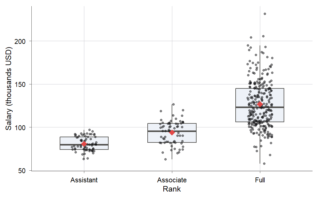
Figure 1:Nine-month academic salary rises steeply with rank, from a mean near 81k for assistant professors to about 127k for full professors. A predictor with three named categories like this one cannot go into a regression as a single number; this chapter shows how to encode it.
By the end you will be able to turn a categorical predictor into indicator variables and read
each coefficient. You will combine a category with a continuous predictor to fit parallel or
separate lines, test which fit the data supports, and model curvature with polynomials the right
way. And you will see that the one-way analysis of variance you may remember from intro stats is
just a regression on indicators. The salary data carries us through the categorical part; the
classic cars stopping-distance data carries us through the polynomial part.
11.1 From categories to numbers: indicator coding
Intuition
A regression equation multiplies each predictor by a number, so a predictor has to be a number. “Rank” is not: its values are the words Assistant, Associate, and Full. You might be tempted to code them 1, 2, 3 and feed that in. Resist. Coding rank as 1, 2, 3 forces a specific and probably false claim on the data. It says the salary step from Assistant to Associate equals the step from Associate to Full, because both are a move of one unit on your invented scale. The categories have an order, but nothing says the gaps are equal, and a nominal predictor like discipline or sex has no order at all.
The honest way to carry a category into a regression is with indicator variables (Definition 11.1), also called dummy variables: 0-or-1 columns, each answering a yes-or-no question (“is this professor a full professor?”). Indicators let each category have its own level, free of any assumption about spacing. The only subtlety is that you do not use one indicator per category. You use one fewer, and let the left-out category set the baseline. Figure 2 shows the idea for the three ranks: one group becomes the baseline, and the coefficients measure how far each other group sits above it.
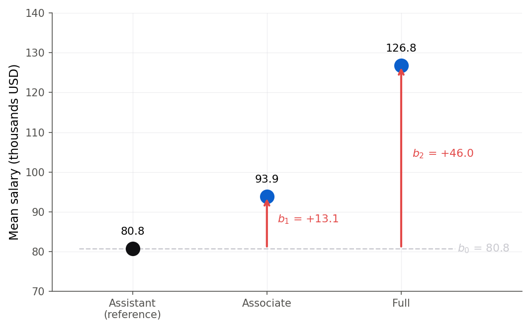
Figure 2:Reference-cell coding for rank. The intercept is the reference group’s mean (Assistant, 80.8k), and each coefficient is the vertical gap from that baseline up to another group’s mean: +13.1k to Associate, +46.0k to Full.
Formula
Suppose a categorical predictor (a factor, Definition 11.2) has levels. Pick one level as the reference (or baseline). For each of the other levels, define an indicator variable that is 1 when a case is in that level and 0 otherwise. For the three ranks, taking Assistant as the reference, define
is the Associate indicator: 1 for associate professors, 0 for everyone else.
is the Full indicator: 1 for full professors, 0 for everyone else.
There is no indicator for Assistant. An assistant professor has ; the two zeros are the code for the reference level.
Figure 3 shows this coding at work on the first few professors in the data: the single column of rank words becomes two 0-or-1 columns, and the assistant professor’s row is just a pair of zeros.
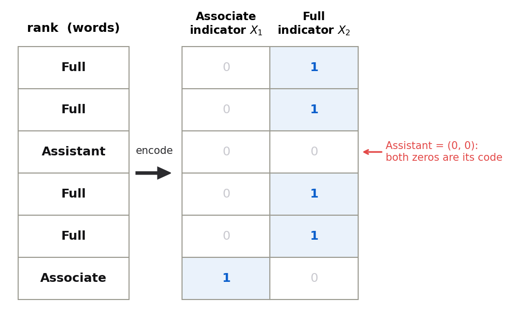
Figure 3:Reference-cell coding in action. One column of category words becomes indicator columns of zeros and ones. A full professor is coded (0, 1) and an associate (1, 0); the assistant professor gets no column of its own, and its pair of zeros is the code for the reference level.
The model with these two indicators is
In words: the mean salary is a baseline , plus an extra if the professor is an associate, plus an extra if the professor is full. Read the mean response one level at a time by plugging in the indicators:
So is the mean of the reference group, is the Associate-minus-Assistant difference in means, and is the Full-minus-Assistant difference. The coefficients are contrasts against the baseline, nothing more.
This is reference-cell coding (Definition 11.3; R and Python call it treatment coding). It is the default in both languages, and the one this book uses throughout. Chapter 13 will code the predictors of a logistic regression exactly the same way (11.1 From categories to numbers: indicator coding is the pattern it reuses).
Derivation (why indicators, not )
The reason is easier to see than to say. Figure 4 lays out the design matrix with the intercept column and all three rank indicators. In every row exactly one indicator is a 1, so adding the three indicator columns together rebuilds the intercept column of ones. One column is then a copy of the others combined, which is the linear dependence that sinks the fit.
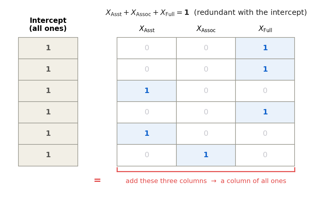
Figure 4:Keeping all indicators alongside the intercept is redundant. Because every professor holds exactly one rank, the three indicator columns add up row by row to the intercept column of ones. That linear dependence makes singular, so we drop one indicator and let its level become the baseline.
Proof. Suppose you stubbornly include all indicators, , one per level, alongside the intercept column of ones. Every case belongs to exactly one level, so exactly one of its indicators is 1 and the rest are 0. Adding the indicator columns across all levels therefore reconstructs the all-ones column:
That is a linear dependence among the columns of the design matrix . From 7.1 The model and least squares in matrix form, the least-squares estimate needs to be invertible, which requires the columns of to be linearly independent (full column rank). With the intercept plus all indicators, they are not: the coefficients are not uniquely determined, because you could add any constant to and subtract it from every level’s effect and get the identical fitted values. Drop one indicator (equivalently, drop the intercept) and the dependence is gone. Reference-cell coding drops the reference level’s indicator, keeps the intercept, and gives a full-rank design with indicators.
This “one fewer than the number of levels” fact has a name you will meet again: a factor with levels contributes degrees of freedom to the model.
R
R stores categories as factors and builds the indicators for you. Read the data and look at the categorical columns.
salaries <- read.csv("data/salaries.csv")
dim(salaries)
table(salaries$rank)
table(salaries$discipline)
table(salaries$sex)
[1] 397 6
AssocProf AsstProf Prof
64 67 266
A B
181 216
Female Male
39 358By default R orders factor levels alphabetically and makes the first one the reference. For rank that would make AssocProf the baseline, which is awkward to read. We reorder so that Assistant is the reference, matching Figure 2.
You can see the indicators themselves in the model’s design matrix. The first column is the intercept (all ones), and the next two are the Associate and Full indicators.
head(model.matrix(fit_rank), 4) (Intercept) rankAssocProf rankProf
1 1 0 1
2 1 0 1
3 1 0 0
4 1 0 1print(fit_rank.model.exog[:4])[[1. 0. 1.]
[1. 0. 1.]
[1. 0. 0.]
[1. 0. 1.]]Rows 1, 2, and 4 are full professors (Full indicator 1); row 3 is an assistant professor (both indicators 0). No row ever has both indicators equal to 1, because no professor holds two ranks at once.
Coefficients that are really differences of means are easier to trust once you have moved the means yourself and watched the coefficients answer.
Three sliders set each rank’s mean salary, and the readouts show the intercept and indicator coefficients a regression on rank would report.
11.2 One categorical and one continuous predictor
Intuition
A category by itself just sorts cases into groups. The interesting models mix a category with a measured predictor. Salary, for instance, depends both on discipline (a category, theoretical A or applied B) and on years of service (a number). We now have two knobs, and there are three increasingly flexible ways to turn them, drawn schematically in Figure 6.

Figure 6:The three models for one continuous and one categorical predictor. Common line ignores the group; parallel lines give each group its own intercept but a shared slope; separate slopes give each group its own slope as well, which is what an interaction term does.
The simplest model ignores the category and fits one line to everybody. The next model, the subject of this section, gives each discipline its own intercept but makes them share a single slope: two parallel lines. Reading it is easy: experience is worth the same number of dollars per year in both disciplines, and one discipline simply sits a fixed amount above the other at every experience level. This parallel-lines model has a traditional name, analysis of covariance or ANCOVA (Definition 11.5), from the days when the continuous predictor was called a covariate and the category was the treatment. The third model, separate slopes, is the next section.
Formula
Let be years of service and let be the discipline-B indicator ( for applied, for theoretical). The parallel-lines model is
In words: salary is a baseline, plus a per-year effect of service that both disciplines share, plus a fixed bump for being in discipline B.
is the slope on years of service, shared by both disciplines.
is the vertical gap between the two discipline lines, the same at every .
Split it by discipline to see the two lines:
In words: both lines have slope ; the applied line is shifted up by . The two lines never cross, because they are parallel. The reading of is a genuine “holding years of service fixed” comparison: at any given experience, applied faculty are paid more on average, exactly the kind of adjusted comparison the chapter opened by asking for.
R
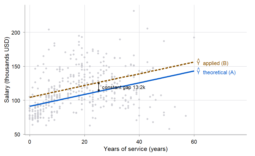
Figure 7:The parallel-lines model. Both disciplines share one slope for years of service, and the applied line sits about 13.2k above the theoretical line at every experience level. Parallel lines are the visual signature of a model with no interaction.
11.3 Interactions: letting the slopes differ
Intuition
The parallel model makes a strong assumption: a year of service is worth the same in both disciplines. Maybe it is not. Maybe applied faculty, whose skills track a hot outside job market, gain more per year than theoretical faculty. If so, the two lines should have different slopes, fanning apart as service grows rather than staying a fixed distance apart. Letting the slopes differ is what an interaction (Definition 11.6) does. An interaction between a category and a continuous predictor says the effect of the continuous predictor depends on the category.
You build it by adding one more column: the product of the continuous predictor and the indicator. That product is zero for the reference group (so its line is unchanged) and equals the continuous predictor for the other group (so that group gets an extra slope term).
Formula
With = years of service and = discipline-B indicator, the interaction model is
In words: take the parallel-lines model and add one product term, which lets discipline B have its own slope instead of sharing the baseline slope.
is the interaction coefficient, the coefficient on the product .
The product term is 0 when and equals when .
Split by discipline again:
In words: the theoretical line has intercept and slope ; the applied line has intercept and slope . So is the gap between the two intercepts (the difference at ), and is the gap between the two slopes (the extra dollars per year that applied faculty gain over theoretical faculty). If the slopes are equal and we are back to parallel lines, which is why testing is the test for “do the slopes differ.”
The wrong reading, first
Here is where careful reading matters, because the interaction model sets a trap. Look at the fitted coefficients (Example 11.3 below computes them): the discipline coefficient comes out to about $857 with a large standard error and a p-value of 0.86, nowhere near significant. A hurried reader concludes: “discipline does not matter for salary.” That reading is wrong, and the mistake is worth dwelling on.
In the interaction model, is not “the effect of discipline.” It is only the gap between the disciplines at , that is, for a professor with zero years of service. At zero service the two lines nearly meet, so of course that particular gap is small and uncertain. But the lines are not parallel; the applied line climbs faster. Out where the actual faculty live, at 20 or 30 years of service, the disciplines are far apart. Figure 8 makes the point: measures the gap at the far-left edge of the plot, which says nothing about the gap in the body of the data.
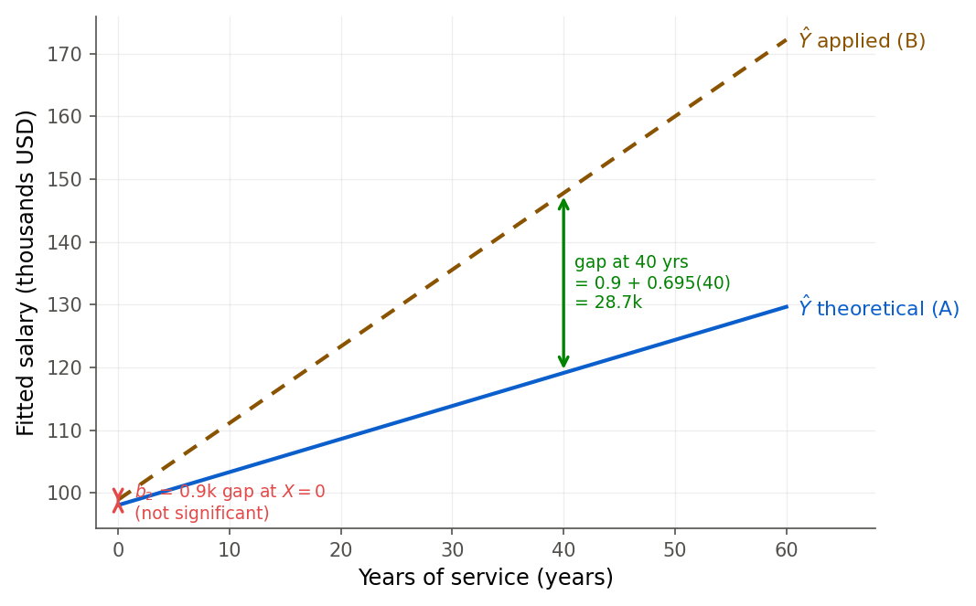
Figure 8:The trap in reading an interaction model. The discipline coefficient b-two is only the vertical gap at X = 0 (red arrow, tiny and not significant). Because the slopes differ, the gap out in the data is large (green arrow, 28.7k at 40 years). A small, non-significant b-two does not mean the groups are alike.
The correct statement is: the interaction coefficient is significant, so the slopes differ, and the discipline gap grows with service. The gap at a specific service level is , not alone. Whenever a model contains an interaction, the coefficient on a main effect is a conditional statement about the point where the other predictor is zero, never a blanket “effect.”
R
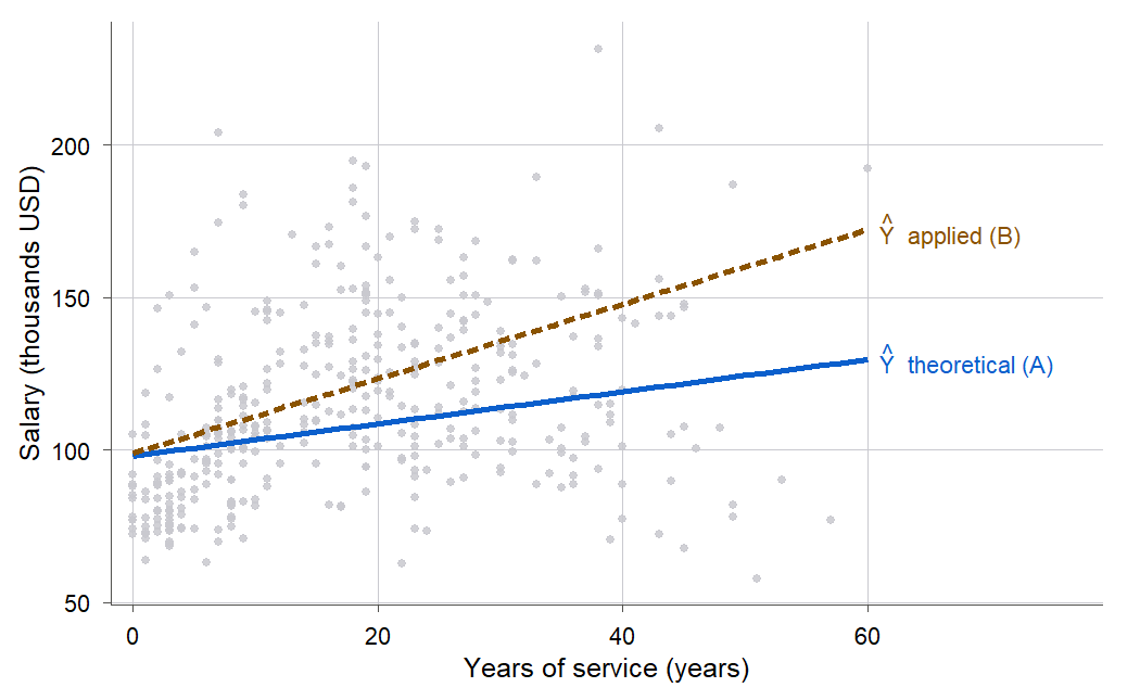
Figure 9:The separate-slopes model. The applied line is steeper, so the two disciplines start close and fan apart with experience. The distance between them at any service level is the interaction coefficient times that service, plus the small intercept gap.
Testing whether the slopes really differ
Eyeballing a fanned pair of lines is not proof. The interaction added exactly one term to the
parallel model, so we can ask whether that one term earns its place with the general linear test
of 8.4 The general linear test: fit the reduced (parallel) model and the full (interaction) model,
and compare their error sums of squares. Here the reduced model is fit_par from Example 11.2
and the full model is fit_int.
anova(fit_par, fit_int)Analysis of Variance Table
Model 1: salary ~ yrs.service + discipline
Model 2: salary ~ yrs.service * discipline
Res.Df RSS Df Sum of Sq F Pr(>F)
1 394 3.0594e+11
2 393 2.9807e+11 1 7864744229 10.369 0.001388 **from statsmodels.stats.anova import anova_lm
print(anova_lm(fit_par, fit_int)) df_resid ssr df_diff ss_diff F Pr(>F)
0 394.0 3.059377e+11 0.0 NaN NaN NaN
1 393.0 2.980729e+11 1.0 7.864744e+09 10.369424 0.001388The statistic is 10.37 on 1 and 393 degrees of freedom, with a p-value of 0.0014. That p-value equals the p-value of the interaction coefficient’s test above, and indeed , the same equivalence between the and tests you saw for a single slope in 3.7 The F test and its equivalence to the t test. Adding the interaction significantly reduces the error sum of squares, so the data support separate slopes over parallel lines.
The trap in reading is much harder to fall for after you have watched the gap grow under your own finger.
Move the interaction coefficient b3 and the year you read the gap at, and compare the gap at zero years with the gap out where the faculty actually are.
Adjustment and the salary-equity question
We opened with a raw male-minus-female gap of about $14,088. Now we can ask what happens to that gap when the model holds rank, discipline, and years of service fixed. This is the statistical heart of an equity analysis: a raw difference can shrink, vanish, or grow once you account for other measured variables, and honest reporting shows the estimate before and after adjustment.
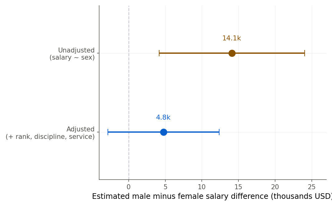
Figure 11:The estimated sex difference before and after adjustment. Controlling for rank, discipline, and years of service moves the estimate from 14.1k (interval above zero) to 4.8k (interval crossing zero). The adjusted estimate is an association among otherwise-similar faculty, not a causal effect.
11.4 Polynomial regression and centering
Intuition
Categories are one way a straight line can fail to fit; curvature is another. Stopping distance
does not grow in a straight line with speed. Physics says braking distance rises with the square
of speed, because kinetic energy does, and the classic cars data (50 cars from the 1920s)
shows exactly the upward bend, drawn in Figure 12. A straight line undershoots at the
high speeds where the curve turns up. These are the same cars data whose residual funnel drove
the square-root transformation in 10.3 Box-Cox: letting the data choose the power; there we reshaped the response, and here we
leave it alone and let the mean function bend instead.
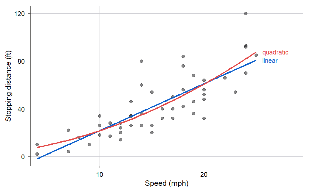
Figure 12:Stopping distance against speed with a straight line (blue) and a quadratic curve (red). The quadratic bends upward to match the physics that distance grows faster than linearly with speed, though for these data the improvement over the line is modest.
We can bend a regression line by adding the square of the predictor as a second term. A polynomial regression (Definition 11.7) keeps the model linear in its coefficients (so all the least-squares machinery still applies) while making the fitted curve a parabola, or a cubic, or higher. The one practical wrinkle is that a predictor and its square are usually strongly related to each other, which makes the raw coefficients unstable and hard to read. The fix is centering (Definition 11.8): subtract the mean of the predictor before squaring.
Formula
The second-order (quadratic) polynomial model in a predictor is
In words: the straight-line model with one extra column, the square of the predictor, which lets the fitted curve bend instead of staying straight.
controls the curvature: positive bends the parabola upward, negative bends it down.
The model is still a linear model, because it is linear in ; the predictor is just another column.
The centered version replaces by :
In words: measure the predictor as a deviation from its average before squaring. Centering does not change the shape of the fitted curve or any fitted value. It only shifts what the linear and intercept terms mean, and it sharply reduces the correlation between the first-order and second-order columns. After centering, is the fitted mean at the average speed and is the slope of the curve at the average speed, both readable numbers.
Why centering helps
The raw predictor speed runs from 4 to 25, so speed and speed^2 both increase together
across that whole range; their correlation in the cars data is 0.98. Two columns that move
almost in lockstep carry nearly the same information, and the regression struggles to divide
credit between them: the individual coefficients get large standard errors and can even flip
sign. Subtracting the mean recenters the predictor on zero, so its square becomes small in the
middle and large at both ends, a U-shape that no longer tracks the linear term.
Figure 13 shows the correlation collapsing from 0.98 to about -0.10 after centering.
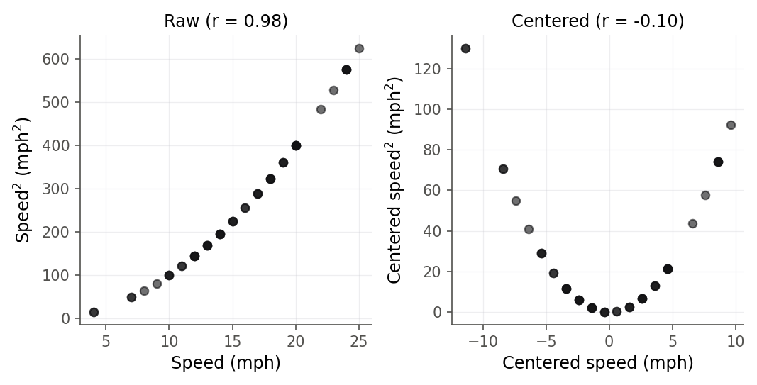
Figure 13:Centering breaks the near-perfect correlation between a predictor and its square. On the raw scale speed and speed-squared move together (r = 0.98); after subtracting the mean, the centered predictor and its square are nearly uncorrelated (r = -0.10), which stabilizes the polynomial’s coefficients.
R
Claiming that centering changes the coefficients but not the curve is one thing; sliding the centering point yourself and seeing the curve hold still is another.
The quadratic is refitted for every centering point c, so you can watch SE(b1) and the correlation between the linear and squared columns move while the curve and its prediction stay put.
The hierarchy principle and choosing the degree
Two rules keep polynomial models sane.
First, the hierarchy principle (Definition 11.9): if a model includes a higher-order term, keep
all the lower-order terms below it, even if they look non-significant. A model with but no
forces the parabola’s vertex to sit at . That is an arbitrary constraint the data never
asked for, and it is not even preserved if you shift the predictor’s origin. Keep whenever
you keep . The same logic says keep both main effects whenever you keep their interaction,
which is why the interaction models in section 11.3 always carried both yrs.service and
discipline.
Second, do not chase degree. Each extra power bends the curve more and will always fit the
sample a little better, but high-degree polynomials wiggle wildly between and beyond the data
points. Figure 15 fits degrees 1, 2, and 5 to the cars data: the quadratic tracks
the gentle bend, while the degree-5 curve starts chasing individual points and swings at the
ends, the classic face of overfitting. Test whether the added curvature is real rather than
reading individual high-order coefficients.
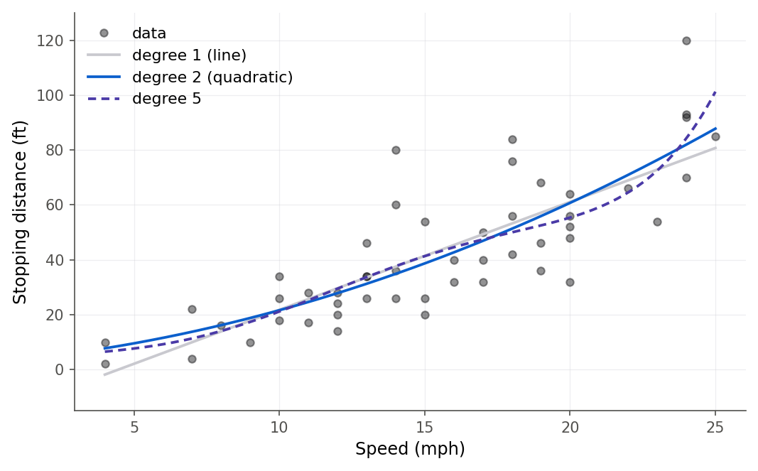
Figure 15:Fitting polynomials of degree 1, 2, and 5 to the same fifty points. The quadratic captures the real upward bend; the degree-5 curve overfits, wiggling between points and swinging at the ends where data is sparse. More flexibility is not more truth.
We test the quadratic the same way we tested the interaction, with the general linear test: is the reduced (linear) model beaten by the full (quadratic) model?
anova(fit_lin, fit_quad)
predict(fit_quad, newdata = data.frame(speed = 20))
predict(fit_quad_c, newdata = data.frame(speed_c = 20 - mean(cars$speed)))
Analysis of Variance Table
Model 1: dist ~ speed
Model 2: dist ~ speed + I(speed^2)
Res.Df RSS Df Sum of Sq F Pr(>F)
1 48 11354
2 47 10825 1 528.81 2.296 0.1364
1
60.71961
1
60.71961print(anova_lm(fit_lin, fit_quad))
print(fit_quad.predict(pd.DataFrame({"speed": [20]})))
xc = 20 - cars["speed"].mean()
print(fit_quad_c.predict(pd.DataFrame({"speed_c": [xc]}))) df_resid ssr df_diff ss_diff F Pr(>F)
0 48.0 11353.521051 0.0 NaN NaN NaN
1 47.0 10824.715908 1.0 528.805143 2.296027 0.136402
0 60.719611
dtype: float64
0 60.719611
dtype: float64Two things to read here. The for the quadratic term is 2.30 with a p-value of 0.14: for these 50 cars the upward bend is suggestive but not decisive, and a straight line is defensible. The honest report is that the curvature is in the expected direction but not established at conventional significance, exactly the kind of judgment call this course asks you to make and state rather than hide. Second, both the raw and centered models predict the identical stopping distance of 60.72 feet at 20 mph, confirming that centering is a change of parametrization, not a change of model.
Overfitting is easier to believe when you make it happen yourself, one degree at a time.
One slider sets the polynomial degree fitted to the fifty cars, and the readouts track SSE, R-squared, the general linear test against the straight line, and the prediction five miles an hour past the data.
A brief look at piecewise regression
Polynomials bend a single smooth curve across the whole range. Sometimes a relationship instead changes slope at a particular point: a dose that helps up to a threshold and hurts after, a tax rate that kicks in at an income level. For these you can fit piecewise linear regression (Definition 11.10), two or more straight segments joined at chosen points called knots. The trick is one extra column: for a knot at , add the “hinge” predictor , which equals when and 0 otherwise. Its coefficient is the change in slope at the knot, and because the hinge is continuous the two segments meet without a jump. Figure 17 shows a two-segment fit with a knot at . This is the simplest member of the spline family; the course does not pursue splines further, but the idea, add hinge columns to let the slope change at knots, is a natural extension of everything in this chapter.
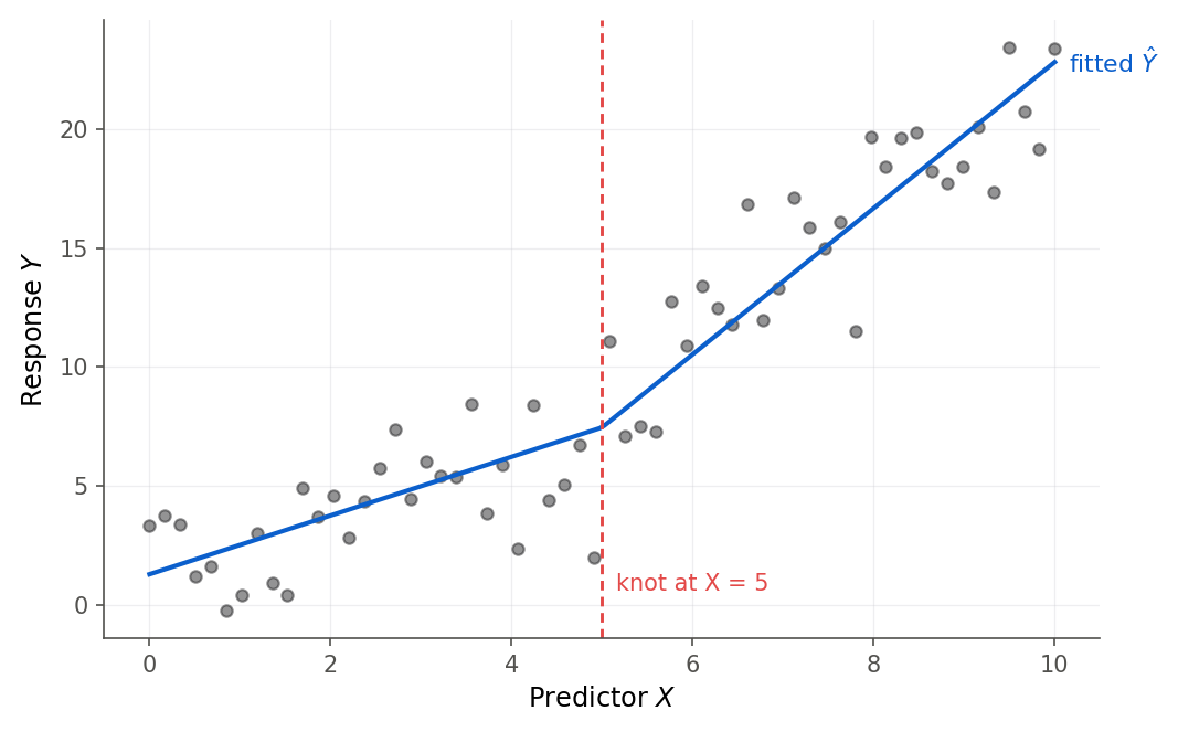
Figure 17:Piecewise linear regression with a knot at X = 5. Adding one hinge column lets the slope change at the knot while the two line segments stay joined. This is the simplest spline, and it uses the same add-a-column idea as indicators and polynomials.
11.5 Analysis of variance as regression
Intuition
If you took intro statistics you likely met one-way analysis of variance (ANOVA, Definition 11.11), the test for whether several group means are equal, and you may have met it as a separate technique with its own formulas. It is not separate. One-way ANOVA is exactly the regression of the response on the group factor, coded with indicators, which is the model of section 11.1. Seeing this collapses two things you learned as one and lets every tool of regression, diagnostics, intervals, the general linear test, work on group-comparison problems.
The key fact is that when the only predictor is a factor, the fitted value for every case is just its own group’s sample mean. So the regression “curve” is a set of flat levels, one per group, as Figure 18 shows for the three ranks. Nothing else could minimize the squared error within each group, because the mean is the least-squares constant.
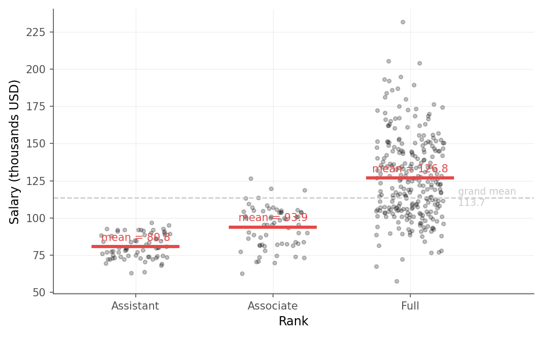
Figure 18:One-way ANOVA is regression on rank indicators. The fitted value for each professor is simply that rank’s group mean (red bars), so the model is a step function across the groups. The regression F test for the rank factor is identical to the one-way ANOVA F test.
Formula
The one-way ANOVA model is usually written
for observation in group , where is a baseline and is group ’s effect. With reference-cell coding this is precisely from section 11.1: is the reference group’s mean , and each is a coefficient , the difference of a group’s mean from the reference. The ANOVA null hypothesis that all group means are equal,
is the regression hypothesis that all the indicator coefficients are zero, : the factor explains nothing. That is tested by the model’s overall statistic.
R
This bridge pays off in both directions. Everything you know about ANOVA (that a significant says the means differ somewhere, not which pair) transfers to reading a factor’s overall test in a regression. And everything regression offers (residual diagnostics, confidence intervals for specific contrasts, adding a continuous covariate to get the ANCOVA of section 11.2) is now available for problems you might have thought needed a separate ANOVA toolkit. Two levels of the factor make it the two-sample test; more levels make it one-way ANOVA; add a covariate and it is ANCOVA. All one model.
11.6 Chapter summary
You can now bring categories and curves into a regression. You encode a -level factor with reference-cell indicators, and you can say why one indicator must be dropped: including all plus the intercept makes the design rank-deficient (Theorem 11.4). You read each indicator coefficient as a difference of group means and the intercept as the reference-group mean. You combine a category with a continuous predictor three ways: a common line, parallel lines (the ANCOVA model), and separate slopes (an interaction), and you test between the parallel and separate models with the general linear test of 8.4 The general linear test. You know the trap that a main-effect coefficient in an interaction model is only the effect at the other predictor’s zero. You fit a polynomial, center it so its coefficients are stable and interpretable, apply the hierarchy principle, and resist over-fitting the degree. And you see one-way ANOVA as nothing but regression on indicators, with the same test (Theorem 11.12).
Key results at a glance.
| Result | Statement or formula | Valid when |
|---|---|---|
| Reference-cell model (Def 11.3) | one -level factor, one level chosen as reference | |
| Indicator coefficient | reference-cell coding | |
| indicators (Theorem 11.4) | forces rank deficiency; drop one | intercept kept in the model |
| Parallel lines / ANCOVA (Def 11.5) | one continuous, one categorical, equal slopes | |
| Separate slopes / interaction (Def 11.6) | slopes allowed to differ by group | |
| Between-group gap (interaction) | equals only at | |
| Test of equal slopes | general linear test, full vs reduced () | nested parallel vs interaction models |
| Quadratic model (Def 11.7) | curvature; still linear in coefficients | |
| Centering (Def 11.8) | ; curvature unchanged | to cut linear-square correlation, stabilize coefficients |
| Hierarchy principle (Def 11.9) | keep with ; keep main effects with interaction | any higher-order term present |
| One-way ANOVA = regression (Theorem 11.12) | equals the ANOVA | a single factor is the only predictor |
Key terms. indicator (dummy) variable, factor, level, reference-cell coding, effects coding, cell-means coding, analysis of covariance (ANCOVA), parallel lines, interaction, main effect, polynomial regression, centering, hierarchy principle, knot, piecewise linear regression, spline, one-way analysis of variance (ANOVA).
You should now be able to.
Encode a categorical predictor with reference-cell coding, and explain why a -level factor needs indicators.
Interpret each indicator coefficient as a difference of group means and the intercept as the reference-group mean.
Fit and interpret an ANCOVA (parallel-lines) model with one categorical and one continuous predictor.
Interpret an interaction coefficient as a difference of slopes, and avoid the wrong reading of the main-effect coefficient that comes with it.
Test whether two or more groups share a slope using the general linear test.
Fit a polynomial regression with a centered predictor, explain why centering helps, and apply the hierarchy principle.
Show that one-way ANOVA is regression on indicator variables, and connect its test to the regression test.
Where this fits. In the workflow spine of The modeling workflow, this chapter is mostly FIT: it widens the kinds of predictors a linear model can hold, from measured quantities to categories, curves, and their combinations, without leaving the least-squares framework of 7.1 The model and least squares in matrix form. It leans on the general linear test of 8.4 The general linear test to decide between nested models, which is the CHECK-inside-FIT loop the course uses whenever a model gains a term. It also serves USE: interpreting an interaction, or an adjusted coefficient, is the communication step where most real mistakes happen, which is why the chapter spent so long on wrong readings. Looking ahead, 11.1 From categories to numbers: indicator coding is the exact machinery Chapter 13 uses to put factors into a logistic regression, and the centering and hierarchy habits carry into Chapter 12, where correlated predictors (including a predictor and its own square) drive the study of multicollinearity.
11.7 Frequently asked questions
Q1. Which category should I make the reference? Any of them; the fit is identical, only the coefficients’ meaning changes. Pick the reference that makes the comparisons you care about easiest to read: a control group, the largest group, or a natural baseline like “assistant professor.” If a coefficient’s sign feels backwards, you may just want to relevel so the other category is the reference.
Q2. Do I ever include an indicator for every level? Only if you drop the intercept. The intercept column plus all indicators are linearly dependent, so software will either drop one automatically or (with the intercept removed) switch to cell-means coding, where each coefficient is a group mean. Never include the intercept and all indicators; the model is not identifiable.
Q3. My interaction is significant but one main effect is not. Do I drop the main effect? No. The hierarchy principle says keep both main effects whenever you keep their interaction. A non-significant main effect in an interaction model usually just means the groups are similar at the point where the other predictor is zero, which is rarely an interesting place and often outside the data. Dropping it distorts the model.
Q4. Why not just fit separate regressions to each group instead of one interaction model? Fitting each group separately gives the same fitted lines as the full interaction model, so for prediction it is fine. But the single interaction model lets you test whether the slopes differ (one coefficient, one p-value) and pools the groups to estimate a common error variance, which separate fits cannot do. When the question is “are these groups different,” one model with an interaction is the cleaner tool.
Q5. Does centering change my predictions or my ? No. Centering is a change of parametrization: it shifts the meaning of the intercept and linear coefficient but leaves every fitted value, residual, , and statistic untouched. Example 11.5 shows the raw and centered quadratics predicting the identical 60.72 feet at 20 mph. Center for interpretation and numerical stability, not to change the fit.
Q6. How high a polynomial degree should I go? Rarely past two or three, and only with a test to back it up. Each degree fits the sample better but generalizes worse, wiggling between points (Figure 15). Use the general linear test to check whether the added term reduces error significantly, prefer the lowest degree that captures the visible shape, and never extrapolate a high-degree polynomial beyond the data, where it can shoot off to absurd values.
Q7. The adjusted sex coefficient is not significant. Does that prove pay is fair? No. It says that in this sample and this model, once rank, discipline, and service are held fixed, the remaining male-minus-female difference is not distinguishable from zero, with a wide interval driven partly by there being only 39 women. It does not establish equity, and it depends on the choice of adjustment variables; if rank itself is affected by sex, adjusting for it can hide part of the difference. Report the numbers and the assumptions, and let readers judge.
11.8 Practice problems
(A) Explain why coding the three ranks as a single numeric column 1, 2, 3 imposes an assumption the data reject, and say what that assumption is in one sentence.
(A) In the model
salary ~ rankwith Assistant as reference, state in words what the intercept and each of the two coefficients mean.(A) A factor has 5 levels. How many indicator variables does reference-cell coding use, and how many degrees of freedom does the factor contribute? Explain.
(A) Describe the difference between the parallel-lines model and the separate-slopes model in terms of what the two fitted lines look like.
(A) In an interaction model
salary ~ yrs.service * discipline, a classmate says “the discipline coefficient is not significant, so discipline does not affect salary.” Correct this statement.(A) Explain the hierarchy principle in one or two sentences, and give an example of a model that violates it.
(A) Why does centering a predictor before squaring leave every fitted value unchanged while changing the linear coefficient’s value and meaning?
(A) State the connection between one-way ANOVA and regression, and say what the ANOVA between-groups and within-groups sums of squares correspond to in the regression.
(B) Prove that including an intercept plus all indicators of a -level factor makes the design matrix rank-deficient (Theorem 11.4), by exhibiting the linear dependence among its columns. Explain why this makes the least-squares coefficients non-unique.
(B) In reference-cell coding, prove that the intercept equals the reference group’s sample mean and each coefficient equals a difference of group sample means, for a one-factor model. Use the fact that the least-squares fitted value in each group is that group’s sample mean.
(B) For the parallel-lines model , write the two fitted lines for and , and prove their vertical distance is at every .
(B) For the interaction model , derive the fitted gap between the two groups as a function of , and show it equals only at .
(B) Show algebraically that the test of the interaction coefficient () and the general linear test of parallel-versus-separate slopes () satisfy , and explain why this must hold for a single added term (cite 3.7 The F test and its equivalence to the t test).
(B) Let . Starting from , substitute and collect terms to express of the centered model in terms of and . Confirm (the curvature is unchanged).
(B) Using the result of problem 14, explain precisely why the raw and centered quadratics give identical fitted values and identical residuals, so is unchanged.
(B) Prove that in a one-factor regression the least-squares fitted value for each group is the group’s sample mean, by minimizing over the group constants .
(B) A model with a three-level factor has coefficients under reference-cell coding. Derive what the intercept would become under cell-means coding (all three indicators, no intercept), and confirm the fitted values are unchanged.
(B) In the ANCOVA model, show that the estimated slope is a pooled within-group slope, and explain in words why pooling assumes the true slopes are equal across groups (the assumption the interaction test checks).
(C) Fit
salary ~ disciplineand confirm from the coefficients that the intercept is the mean salary in discipline A and the slope is the B-minus-A difference. Report both means.(C) Fit
salary ~ rankwith Full professor (Prof) as the reference instead of Assistant. Report the new intercept and coefficients, and verify the fitted group means are identical to the chapter’s.(C) Fit the parallel model
salary ~ yrs.service + sexand the interaction modelsalary ~ yrs.service * sex. Report the interaction coefficient and its p-value, run the general linear test between the two models, and state whether the slopes differ for men and women.(C) Reproduce Example 11.4’s adjustment: fit
salary ~ sexandsalary ~ rank + discipline + yrs.service + sex, report the sex coefficient in each, and write two sentences interpreting the change, being careful not to claim a causal effect.(C) Fit the raw quadratic
dist ~ speed + I(speed^2)and the centered quadratic oncars. Report the correlation between the linear and squared columns in each case, and the standard error of the linear coefficient in each case, and explain the difference.(C) Fit polynomials of degree 1, 2, and 3 to the
carsdata. Use the general linear test to decide whether degree 2 improves on degree 1 and whether degree 3 improves on degree 2. State which degree you would report and why.(C) Using the interaction model
salary ~ yrs.service * discipline, predict the salary of a theoretical (A) and an applied (B) professor at 0, 15, and 30 years of service. Tabulate the six predictions and the A-versus-B gap at each service level, and comment on how the gap changes.(C) Fit
dist ~ speedoncarsand add the hinge predictor to fit a two-segment piecewise model with a knot at 15 mph. Report the two segment slopes (before and after the knot) and say whether the slope increases after the knot.(C) Verify the ANOVA-regression bridge (Theorem 11.12) numerically: fit
salary ~ rank, extract the overall from the model summary and the fromanova()(R) oranova_lm(Python), and confirm they are identical. Report both.(C) Make a residuals-versus-fitted plot for the linear
dist ~ speedfit oncars. Describe any pattern you see (curvature, widening spread) and say which remedy from this chapter or an earlier one each pattern would suggest.
11.9 Exam practice
These five questions match the style of the course exams: each one asks you to explain in full sentences, not just to compute. Read any output given, say which numbers you used, and write your answer the way you would on the exam. Then open the model answer and compare. A correct number with no reasoning earns little credit here, so practice saying why.
EP 11.1 (interpret output in context, then evaluate a claim). A colleague fits salary on years since the PhD, sex, and their interaction, using female as the reference level for sex.
fit <- lm(salary ~ yrs.since.phd * sex, data = salaries)
round(coef(summary(fit)), 4)
Estimate Std. Error t value Pr(>|t|)
(Intercept) 73840.7607 8696.7132 8.4907 0.0000
yrs.since.phd 1644.8825 454.6163 3.6182 0.0003
sexMale 20209.6135 9179.2131 2.2017 0.0283
yrs.since.phd:sexMale -727.9822 468.0468 -1.5554 0.1207The colleague reads the table and concludes: “The sexMale coefficient is about $20,200 and it
is significant, so men are paid about $20,000 more than women.” Evaluate this claim. In your
answer, say what each of the four coefficients means in context, and state what the sex gap
actually is at a realistic level of experience.
Model answer
The claim misreads the main-effect coefficient, the classic interaction trap. Because the model
contains the product yrs.since.phd:sex, the sexMale coefficient is not the overall male-minus-
female gap. It is the gap only where the interacting variable is zero, that is, for a professor
with zero years since the PhD. So the honest reading of each coefficient is: the intercept
$73,841 is the mean salary of a brand-new female PhD; the yrs.since.phd slope $1,645 per year
is how fast female salaries rise with experience; the sexMale coefficient $20,210 is the
male-minus-female gap at zero years since the PhD; and the interaction is how much less
per year the male salary rises, so the male slope is per year.
Because the male slope is smaller, the gap does not stay at $20,210, it shrinks with experience. The gap at years since the PhD is . At a realistic mid-career value of, say, 20 years, the estimated gap is , far below the $20,000 the colleague quoted, and at about 28 years it closes entirely. On top of that, the interaction is not significant (), so the data do not firmly establish that the slopes differ at all; the safest statement is that men start ahead but the estimated gap narrows with seniority. A weak answer reports $20,210 as “the effect of sex” and never notices that the coefficient is conditional on zero years of experience.
EP 11.2 (explain why). In Example 11.5 the raw quadratic dist ~ speed + I(speed^2) gives the
speed coefficient a standard error of about 2.03 (so ), while the centered quadratic
gives the speed_c coefficient a standard error of about 0.41 (so ). The curvature
coefficient, the fitted curve, and are identical in the two fits. Explain why centering
shrinks the standard error of the linear coefficient so dramatically, and explain why this is not
evidence that the centered model “fits better.”
Model answer
The two fits are the same parabola written in two coordinate systems, so they have identical fitted
values, residuals, SSE, and ; centering changes the parametrization, not the model. What
changes is the correlation between the two predictor columns. On the raw scale speed runs from 4
to 25, so speed and speed^2 both climb together and correlate about 0.98. When two columns are
nearly collinear the least-squares fit cannot tell how much credit each one deserves, because many
different coefficient pairs give almost the same fitted values; this near-singularity inflates the
diagonal of , and since
the standard error of the linear coefficient blows up. Subtracting the mean before squaring makes
the linear column and the squared column nearly uncorrelated (their correlation falls to about
-0.10), so each coefficient is pinned down on its own and its standard error collapses.
This is a gain in interpretability and numerical stability, not in fit. The centered speed_c
coefficient is now clearly readable as the slope of the curve at the mean speed, with a small
standard error, but the model predicts exactly the same stopping distances as before. A weak answer
claims centering “improves the fit” or raises ; it does neither, and saying so misses that
collinearity hurts the standard errors while leaving the fitted curve untouched.
EP 11.3 (what would change if). Example 11.1 fit salary ~ rank with Assistant as the reference
level and reported an intercept of $80,776, a rankAssocProf coefficient of $13,100, and a
rankProf coefficient of $45,996. A colleague refits the identical model but sets Full professor
(Prof) as the reference instead. Describe what would change in the coefficient table and what
would stay exactly the same, and explain why. Give the numerical values the new table would show.
Model answer
Changing the reference level only relabels the comparisons; it does not change the model or its fit. The fitted group means, the residuals, , and the overall statistic are all identical, because the three fitted salaries are still each group’s own sample mean (Assistant $80,776, Associate $93,876, Full $126,772) no matter which level is chosen as the baseline. What changes is what the intercept and the two coefficients measure. With Full as the reference, the intercept becomes the full-professor mean, and each coefficient becomes a group’s mean minus the full-professor mean, so both coefficients turn negative. The refit produces
               Estimate Std. Error t value Pr(>|t|)
(Intercept)   126772.11    1449.07   87.48        0
rankAssocProf -32895.67    3290.47  -10.00        0
rankAsstProf  -45996.12    3230.54  -14.24        0
The intercept $126,772 is the full-professor mean; rankAssocProf says associates
earn that much less than full professors, and rankAsstProf says assistants earn
that much less. That last number is exactly the negative of the old rankProf coefficient
($45,996), because the Full-minus-Assistant gap and the Assistant-minus-Full gap are the same
distance with opposite sign. A weak answer says the fit itself changes or that one reference is more
correct than another; the choice of reference is only a choice of which comparison is easiest to
read.
EP 11.4 (interpret output in context, then evaluate a claim). For the cars data a student fits
the linear model and the quadratic model and compares them.
fit_lin  <- lm(dist ~ speed, data = cars)
fit_quad <- lm(dist ~ speed + I(speed^2), data = cars)
round(coef(summary(fit_quad)), 4)
anova(fit_lin, fit_quad)
Estimate Std. Error t value Pr(>|t|)
(Intercept) 2.4701 14.8172 0.1667 0.8683
speed 0.9133 2.0342 0.4490 0.6555
I(speed^2) 0.1000 0.0660 1.5153 0.1364
Analysis of Variance Table
Model 1: dist ~ speed
Model 2: dist ~ speed + I(speed^2)
Res.Df RSS Df Sum of Sq F Pr(>F)
1 48 11354
2 47 10825 1 528.81 2.296 0.1364The student concludes: “The squared-speed coefficient is positive, which matches the physics that braking distance grows faster than linearly, so we should report the quadratic model.” Evaluate this conclusion, using the numbers in the output.
Model answer
The student is right about the direction and wrong to treat it as settled. The squared-speed coefficient is +0.100, and a positive curvature does match the physics that stopping distance rises with the square of speed. But a coefficient having the expected sign is not the same as the curvature being established. The general linear test comparing the quadratic to the straight line gives on 1 and 47 degrees of freedom with , well above 0.05, so the drop in error sum of squares (from 11,354 to 10,825) is within what sampling noise could produce. For these 50 cars the upward bend is suggestive but not significant, and a straight line is defensible.
The honest report is exactly that: the curvature is in the physically expected direction but not
established at conventional significance, so either model is reasonable and the simpler straight line
is a fair default. Note also that the individual value on speed in the raw quadratic (0.45,
) should not be read as “speed does not matter”; that large p-value is an artifact of the
0.98 correlation between speed and speed^2, not evidence against the linear term. A weak answer
either declares the quadratic proven from the coefficient sign alone, ignoring the test,
or misreads the raw speed p-value as a real finding.
EP 11.5 (what would change if). Example 11.4 estimated the male-minus-female salary difference,
adjusting for rank, discipline, and years of service, and found sexMale with
. Suppose you drop rank from the adjustment and refit salary ~ discipline + yrs.service + sex.
fit_norank <- lm(salary ~ discipline + yrs.service + sex, data = salaries)
round(coef(summary(fit_norank)), 2)
Estimate Std. Error t value Pr(>|t|)
(Intercept) 84361.06 4941.37 17.07 0.00
disciplineB 13033.85 2840.35 4.59 0.00
yrs.service 832.15 110.22 7.55 0.00
sexMale 8423.34 4744.54 1.78 0.08Explain why the sex coefficient changed when rank left the model, and explain why deciding whether to include rank is a question about the world rather than a question the regression can settle.
Model answer
Dropping rank nearly doubled the estimated sex gap, from $4,771 to $8,423 (and moved its p-value from 0.22 toward significance at 0.08). The reason is that rank is related to both salary and sex. Rank is the strongest single driver of salary, and the sexes are not evenly spread across ranks: proportionally fewer women hold the full-professor rank. When rank is in the model, it absorbs the part of the raw male-minus-female difference that runs through rank, leaving a small residual sex coefficient. When rank is removed, that rank-carried difference has nowhere else to go, so the sex coefficient swells to pick it up. Neither number is a mistake; they answer different questions, “among faculty of the same rank” versus “ignoring rank.”
Which question is the right one is not something the arithmetic can decide, because it depends on how rank came to be. If promotion practices themselves differ by sex, then rank sits on the causal pathway between sex and salary, and controlling for it would remove part of the very difference an equity analysis is trying to measure. If rank is instead a fair reflection of seniority and merit, adjusting for it is exactly right. The regression will happily produce either coefficient cleanly; choosing which variables belong in the adjustment set is a substantive judgment about promotion and careers, not about the model. A weak answer just reports that the number went up, or treats one of the two coefficients as the single correct estimate of discrimination without engaging the causal-pathway question.
Chapter game
Resumen del capítulo (en español)
Este capítulo enseña a incluir predictores categóricos (categorical predictors) y curvas en
una regresión, usando los salarios de 397 profesores (rango, disciplina, años de servicio, sexo y
salario) y los datos clásicos de frenado (cars).
Una categoría no es un número, así que se codifica con variables indicadoras (indicator variables), columnas de ceros y unos. Un factor con niveles usa indicadores; incluir los más el intercepto deja la matriz de diseño sin rango completo. En la codificación de celda de referencia (reference-cell coding), el intercepto es la media del grupo de referencia y cada coeficiente es la diferencia de medias respecto a ese grupo. Para el rango: la media de profesor asistente es $80,776, y los coeficientes $13,100 y $45,996 son las diferencias hacia asociado y titular.
Con un predictor categórico y uno continuo hay tres modelos: una recta común, rectas paralelas (parallel lines) (modelo ANCOVA, un intercepto por grupo y pendiente compartida), y pendientes separadas (separate slopes) mediante una interacción (interaction). En el modelo con interacción, el coeficiente de la categoría mide solo la diferencia en ; leerlo como “el efecto de la categoría” es un error común. La prueba lineal general (general linear test) decide entre ambos modelos: aquí , , las pendientes difieren.
La regresión polinómica (polynomial regression) añade el cuadrado del predictor para curvar la
recta. Centrar (centering) el predictor no cambia la curvatura ni las predicciones, pero reduce
la correlación entre el término lineal y el cuadrático (de 0.98 a -0.10 en cars) y aclara los
coeficientes. El principio de jerarquía (hierarchy principle) exige conservar los términos de
orden inferior. Finalmente, el análisis de varianza (analysis of variance) de una vía es la
regresión sobre indicadores: su coincide con el global de la regresión. Un solo
modelo contiene la prueba de dos muestras, el ANOVA y el ANCOVA.