Why do some countries save a large share of their income while others save almost nothing? In the 1960s economists studying the life-cycle theory of saving collected a small cross-country table to look for an answer. For 50 countries they recorded the aggregate personal savings rate, averaged over 1960 to 1970. Alongside it they noted a few features of each economy: the fraction of the population under 15, the fraction over 75, per-capita income, and how fast that income was growing. The life-cycle idea predicts that people save during their working years and draw the savings down when young or old, so a country with many dependents, young or old, should save less.
Figure 1 shows the first slice of that table: the savings rate against the share of the population under 15. The cloud slopes downward. Countries with more children do tend to save less, just as the theory says. But how strong is that tendency? “Slopes downward” is a picture, not a number, and a picture cannot go into a report or a comparison. We want a single number that measures how tightly two quantities move together, one that does not depend on whether savings is in percent or income in dollars, and one we can attach a margin of error to.
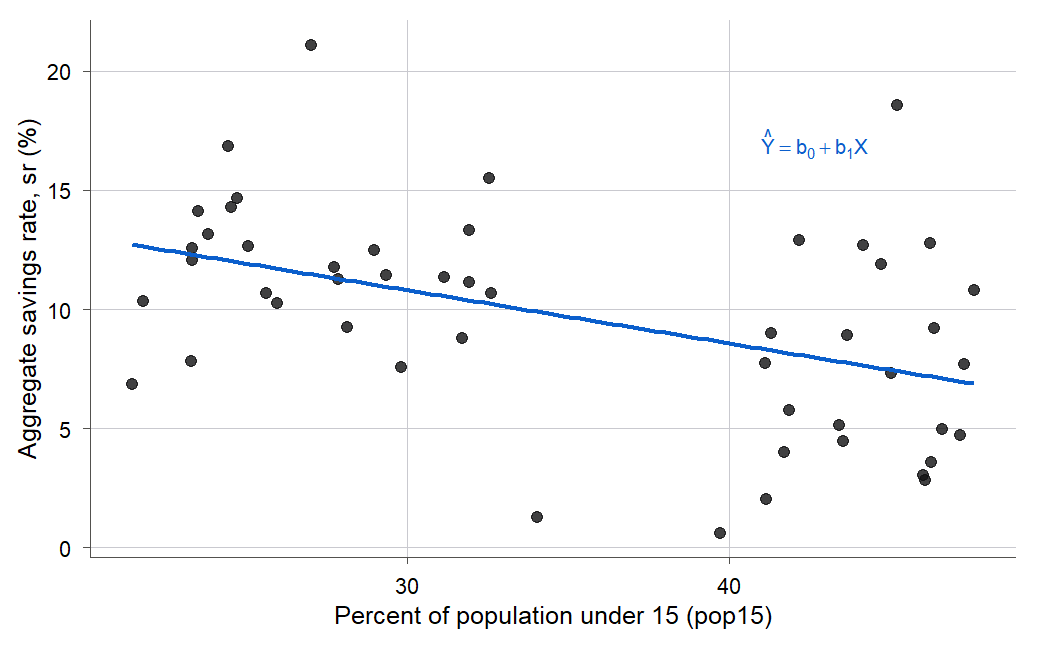
Figure 1:The savings rate falls as the share of young dependents rises, but the scatter is wide: the downward drift is real and the spread around it is large. A correlation of -0.46 puts one number on both facts at once.
That number is the correlation coefficient (defined formally in Definition 4.1), and this chapter is about reading it honestly. In Chapters 2 and 3 we built an entire line and tested every part of it, from the slope to the prediction interval; correlation asks a smaller and more symmetric question, how tightly two quantities move together, and Section 4.2 will show it is that same fit seen through a single number. Correlation is the workhorse summary of a straight-line relationship: it compresses a whole scatterplot into one value between -1 and +1. It is also one of the most abused numbers in all of statistics, blamed for causal claims it never made, inflated by outliers, hidden by curves, and shrunk by a badly chosen sample. By the end you will be able to compute it, test it, interval it, and, just as important, say when it is lying to you.
4.1 The correlation coefficient
Intuition
Here is the goal in one plain sentence: take a whole scatterplot and boil it down to a single number that says how tightly the two things move together, and make that number come out the same no matter what units you measured them in. That number is the correlation, and this section builds it from parts you already have.
The regression slope from Chapter 2 already measures how moves with , but it carries the units of the problem: for the savings data the slope is in percent of savings per percentage point of young population. Change savings to a fraction instead of a percent and the slope changes too. That makes slopes hard to compare across different pairs of variables. Correlation fixes the units problem by measuring association on a pure, dimensionless scale.
The trick is standardizing. Before comparing how two variables move, put both on the same footing: subtract each variable’s mean and divide by its standard deviation, so each becomes a set of z-scores with no units. A country that is one standard deviation above the mean in young population and half a standard deviation below the mean in savings contributes a product of to the tally. Add those products up and average them, and you have measured whether above-average tends to come with above-average (positive), below-average (negative), or neither (near zero). The average of the standardized products always lands between -1 and +1. That average is the correlation.
Figure 2 makes this bookkeeping visible on the savings data. Split the plot at the two means into four quadrants. A country in the upper-right or lower-left sits on the same side of both means, so its product is positive. A country in the other two quadrants sits on opposite sides, so its product is negative. Because more youth tends to come with less saving, most points fall into the two negative quadrants, and the average of all the products comes out negative. That negative average is the correlation.
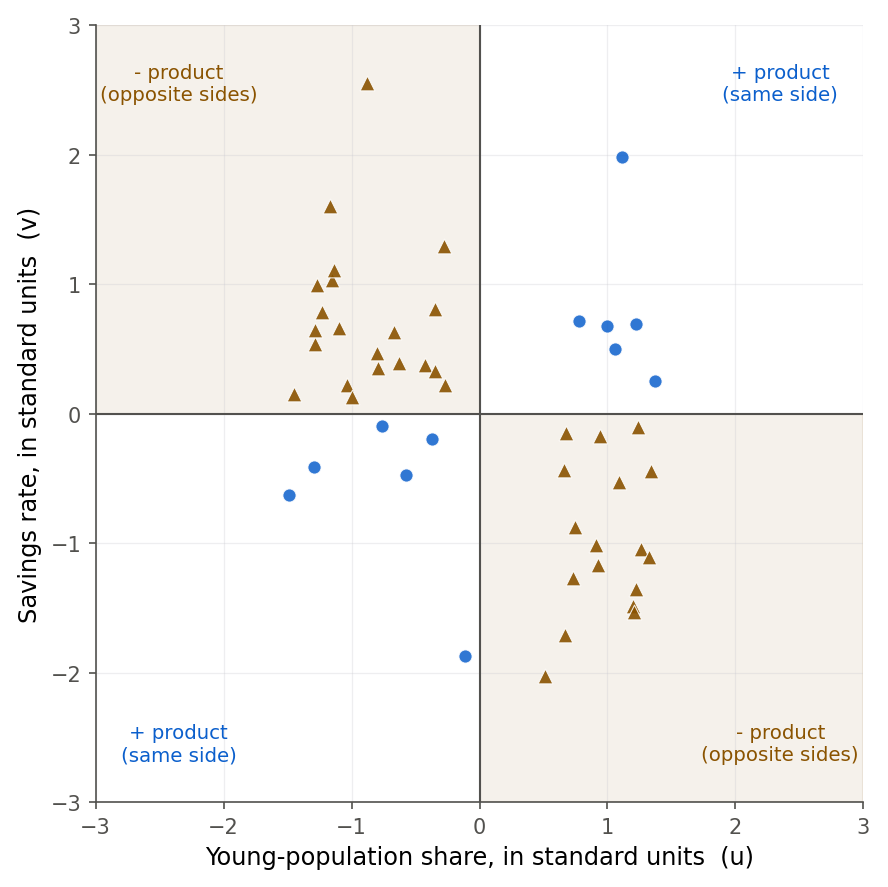
Figure 2:Correlation is just the average of these signed products. On the savings data the points crowd into the two negative quadrants (orange), so the average is negative and r equals minus 0.46.
Formula
Recall the deviation sums from 2.2 Least squares from first principles: , , and the cross-product . Standardizing the covariance by the two standard deviations gives the correlation.
is the covariance: the average product of paired deviations, positive when and tend to sit on the same side of their means.
and are the sample standard deviations of and .
is the covariance rescaled by the two standard deviations, which cancels all units and pins the value into .
In words: is the covariance of and measured in standard-deviation units of each, so it says how many standard deviations moves, on average, per standard deviation of , capped at one. The factors in , , and cancel in the ratio, which is why the second form of uses the raw deviation sums with no divisor at all.
Derivation (why lives in )
Proof. Standardize both variables. Write and . By construction and (the squared deviations of sum to , and dividing each by leaves ; same for ), and the correlation is . Now use the fact that a sum of squares is never negative. For either choice of sign,
Divide by . The plus-sign choice gives , so ; the minus-sign choice gives , so . Therefore . Equality holds only when the squared sum is exactly zero, that is when for every : the standardized points fall on a perfect line, so means an exact straight-line relationship and nothing less.
R
Reading a correlation is easier once you see a whole table of them. The cor function
applied to several columns returns the correlation matrix, every pairwise
correlation at once.
savings <- read.csv("data/savings.csv")
round(cor(savings[, c("sr", "pop15", "pop75", "dpi", "ddpi")]), 3)
sr pop15 pop75 dpi ddpi
sr 1.000 -0.456 0.317 0.220 0.305
pop15 -0.456 1.000 -0.908 -0.756 -0.048
pop75 0.317 -0.908 1.000 0.787 0.025
dpi 0.220 -0.756 0.787 1.000 -0.129
ddpi 0.305 -0.048 0.025 -0.129 1.000The diagonal is all ones (every variable correlates perfectly with itself), and the
matrix is symmetric. The savings rate sr correlates -0.456 with the young-population
share and +0.317 with the old-population share, exactly the two signs the life-cycle
theory predicts. Notice also the -0.908 between pop15 and pop75: countries with
many children have few elderly and the reverse, so those two predictors carry almost the
same information. That near-duplication will matter when the savings data returns for
multiple regression in Chapter 8 and for diagnostics in Chapter 9.
To calibrate your eye, Figure 3 shows six clouds with correlations from strongly negative to nearly perfect. A correlation of still looks like a formless blob to most people; you need to reach 0.7 or so before the linear trend jumps out. The savings correlation of -0.46 sits between the second and third panels.
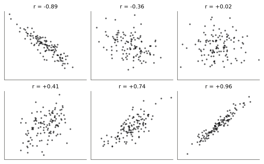
Figure 3:Six correlations for the eye to memorize. Weak correlations near plus or minus 0.3 look almost round; a clear linear band does not appear until the correlation reaches roughly 0.7.
Reading a correlation off a picture is a trained skill, and the six frozen panels above can only take you so far, so sweep the slider below through the whole range and calibrate your eye against a cloud that moves.
A slider sets the population correlation rho and rebuilds the same 120 points at that value: every point keeps its X and only the heights move. The sample r underneath is never quite rho.
4.2 Correlation and the regression slope
Intuition
Correlation and the regression slope from Chapter 2 are measuring the same relationship, so they cannot be independent numbers. The slope answers “how many units of per unit of ,” carrying units; the correlation answers “how many standard deviations of per standard deviation of ,” carrying none. Convert one to the other by putting in or taking out the units, which means multiplying or dividing by the ratio of the two standard deviations. This section makes that exact, because the tie between and explains a fact you will meet again and again: the correlation squared is the fraction of variance the regression explains.
Formula
The slope and the correlation are linked by
is the least-squares slope of on from 2.2 Least squares from first principles.
are the sample standard deviations, so is the unit-conversion factor between the two scales.
is the coefficient of determination from 3.8 R-squared and its interpretation, the share of the total variation in that the fitted line accounts for.
In words: the slope is the correlation scaled up by how much more spread has than , and squaring the correlation gives exactly the proportion of ’s variance that the regression explains.
Derivation (the exact link between , , and )
Proof. Start from the two definitions and factor. Since (the factors cancel),
Solving for gives . Both estimates share the sign of , so a positive slope always comes with a positive correlation and never disagrees in sign.
Now the connection to . From the fitted line of 2.2 Least squares from first principles the regression sum of squares is , and because this is . Divide by :
So the coefficient of determination is nothing more than the correlation squared, in simple linear regression.
One more consequence is worth stating, because it explains a puzzle from Chapter 2. If you regress on instead of on , the slope is . Multiply the two slopes:
The two regression slopes are reciprocals only when , that is only when the fit is perfect. Otherwise regressing on and on give genuinely different lines, and their slopes multiply to . Correlation is the one symmetric summary that does not care which variable you call the response.
4.3 Inference for the correlation
Intuition
The -0.46 is a sample correlation, computed from 50 countries that happened to be in the table. Behind it sits a population correlation (the Greek letter rho), the value we would get from every country that could exist under the same conditions. We have the same two questions as always: could the true be zero, with our -0.46 just sampling noise, and what range of values is consistent with the data? The first is a hypothesis test, the second a confidence interval. The test turns out to be one you already know in disguise, and the interval needs one clever change of variable.
Formula
To test against , use
For a confidence interval we first change scale, using Fisher’s transformation.
Figure 5 shows what the transform does. Near the middle of the scale it barely changes at all: a step from 0.45 to 0.50 moves by only 0.06. But as nears the walls at the curve turns almost vertical, so the same 0.05 step from 0.90 to 0.95 moves by 0.36, more than five times as far. The transform gives the crowded values near the ceiling room to spread out, which is exactly what turns their lopsided pile into a symmetric bell.
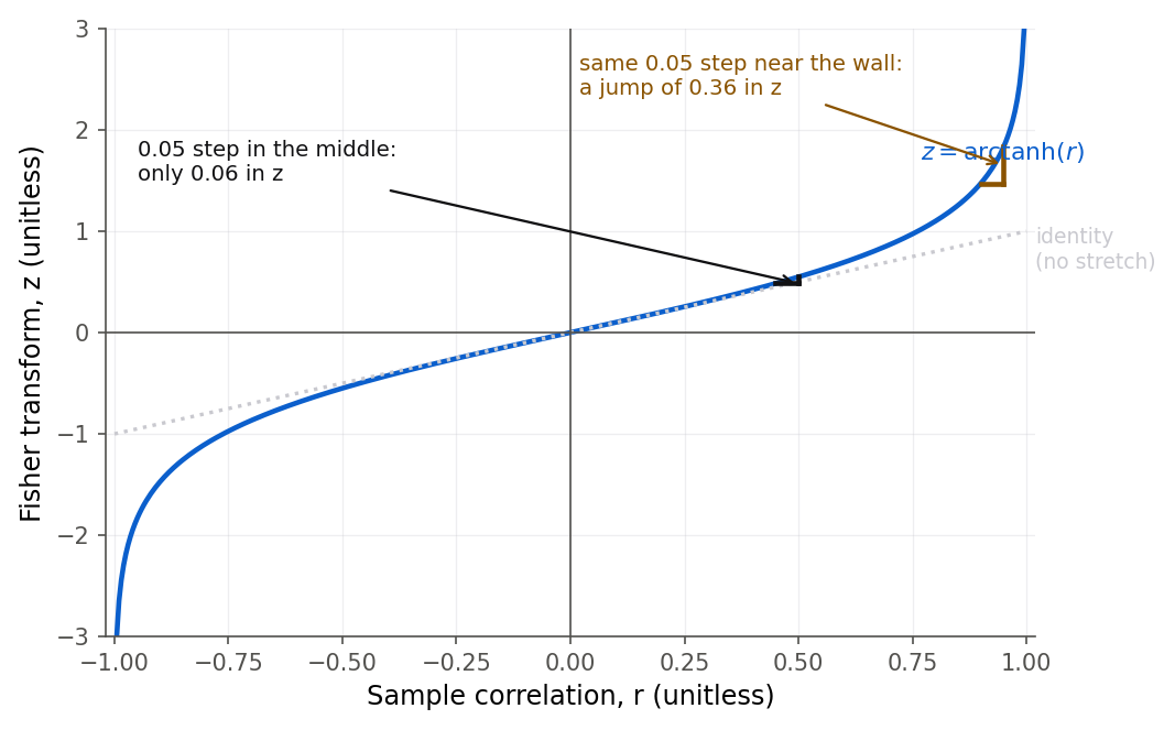
Figure 5:Fisher’s z leaves the middle of the correlation scale almost untouched but stretches the ends: the same 0.05 step in r that barely moves z in the middle becomes a large jump near the wall at 1. That stretching un-crowds the pile of correlations near the ceiling.
On this scale the sampling distribution of is approximately normal with a spread that no longer depends on the unknown , ; the next derivation shows why, and Theorem 4.7 states it precisely.
is the test statistic; under the null of no correlation it follows a distribution with degrees of freedom.
is the inverse hyperbolic tangent; it stretches the crowded ends of the scale out toward .
The transformed statistic is approximately normal with a variance, , that no longer depends on the unknown .
In words: the correlation test is a test with degrees of freedom, and to build an interval we move to a scale where the sampling distribution is normal with a known spread, make the interval there, and transform back.
Derivation (the correlation test is the slope test)
Proof. From 3.7 The F test and its equivalence to the t test the slope is tested with , where and . Two facts from 4.2 Correlation and the regression slope do the work. First, , since . Second, . Substitute:
The cancels, and the slope statistic and the correlation statistic are the identical number. Testing “is the slope zero” and “is the correlation zero” are the same test, as they must be, since and share a sign and vanish together.
Derivation sketch (Fisher’s transformation)
The test handles , but a confidence interval for a nonzero is harder, for two reasons. When is far from zero the sampling distribution of is skewed, because is trapped below the ceiling at 1 (or above the floor at -1) and piles up against it. And the variance of depends on itself, so we cannot even write down a fixed standard error. Fisher’s idea was to find a transformation that cures both problems at once.
Proof (sketch). For a sample from a bivariate normal population, large-sample theory gives an approximate mean and variance
We want a function so that has a variance free of . The delta method (a first-order Taylor expansion, ) says
To kill the dependence, demand . Integrating that derivative gives
and with this choice , constant at last. Fisher’s finer analysis replaces the by for a better small-sample match and shows the distribution of is close to normal, not skewed. So .
Two honesty notes. The exact sampling distribution of under bivariate normality is known in closed form but is a messy special function; the normal approximation to is what everyone actually uses, and the next simulation shows why it is safe. And the whole argument assumes the data really are bivariate normal. When that is in doubt, the bootstrap of Chapter 5 (5.4 The bootstrap for regression) gives a confidence interval for that leans on no distributional assumption at all.
To build a 95 percent interval: compute , form , and transform both ends back with .
The transformation, checked by simulation
The Fisher argument leaned on two claims: that is skewed while is nearly normal, and that the standard deviation of is about . Both are checkable without any more algebra. Draw many samples from a bivariate normal with a known , compute each time, and look at the pile of results.
set.seed(4210)
simulate_r <- function(n, rho, reps = 10000) {
  replicate(reps, {
    z1 <- rnorm(n)
    z2 <- rnorm(n)
    xa <- z1
    ya <- rho * z1 + sqrt(1 - rho^2) * z2
    cor(xa, ya)
  })
}
rs <- simulate_r(n = 20, rho = 0.7)
zs <- atanh(rs)
round(c(mean_r = mean(rs), sd_r = sd(rs),
        mean_z = mean(zs), sd_z = sd(zs),
        theory_sd_z = 1 / sqrt(20 - 3)), 4)
mean_r sd_r mean_z sd_z theory_sd_z
0.6919 0.1250 0.8906 0.2412 0.2425 rng = np.random.default_rng(4210)
def simulate_r(n, rho, reps=10000):
out = np.empty(reps)
for i in range(reps):
z1 = rng.standard_normal(n)
z2 = rng.standard_normal(n)
xa = z1
ya = rho * z1 + np.sqrt(1 - rho ** 2) * z2
out[i] = np.corrcoef(xa, ya)[0, 1]
return out
rs = simulate_r(20, 0.7)
zs = np.arctanh(rs)
print(round(rs.mean(), 4), round(rs.std(ddof=1), 4),
round(zs.mean(), 4), round(zs.std(ddof=1), 4),
round(1 / np.sqrt(20 - 3), 4))0.6893 0.1254 0.8852 0.2405 0.2425The simulated standard deviation of is 0.2412 (R) and 0.2405 (Python), both a hair under the theoretical , confirming the variance formula. The mean of lands near , close to the simulated 0.89. Figure 6 tells the visual half of the story: the raw correlations bunch up and skew toward the ceiling at 1, while the transformed values sit under a symmetric normal curve. That skew is exactly why we never build the interval on the raw scale.
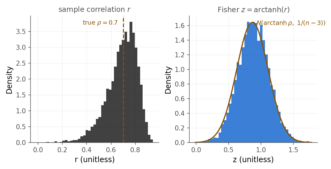
Figure 6:Ten thousand sample correlations at true rho 0.7 and n 20. Raw r (left) is skewed and crowds the ceiling at 1; the Fisher-transformed z (right) is nearly normal with the predicted spread, which is why confidence intervals are built on the z scale.
4.4 The bivariate normal model
Intuition
So far we have pictured one variable as a set of dials we fix in advance, with only the other left to vary, the regression setup of Chapter 2. Correlation has a second, more even-handed home, where both measurements are random and arrive together as a pair, like a random person’s height and weight measured at the same moment. In that picture the two variables are drawn together from a single joint distribution. The cleanest such distribution is the bivariate normal, whose contour lines are ellipses. When the correlation is zero the ellipse is a circle; as the correlation grows the circle stretches and tilts toward the 45-degree line, becoming a thin cigar as it approaches . Figure 7 shows the progression.
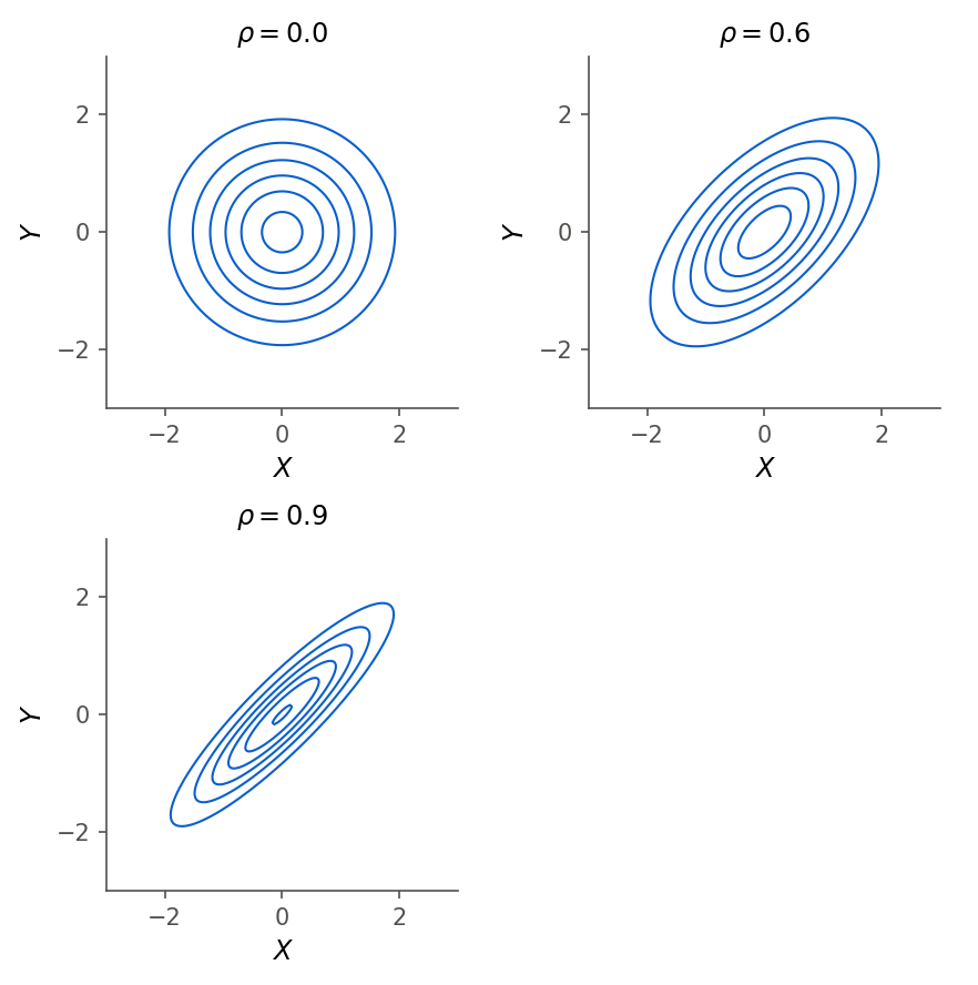
Figure 7:The bivariate normal at three correlations. The parameter rho controls how far the circular contours stretch and tilt into ellipses; at rho near 1 the two variables are nearly a straight line.
Formula
In words: the formula is scarier than the idea. The density piles up highest at the center point and falls off in oval rings around it, and the single number decides how much those rings tilt and stretch away from circles. Read the pieces one at a time.
are the two means and the two standard deviations.
is the population correlation; it is the only parameter that ties and together, and makes the density factor into two separate normals.
The bracketed quadratic form is what draws the elliptical contours; its cross term carries the .
The single most useful fact about this model is what it says about once you know . The conditional distribution of given is again normal, with
In words: inside a bivariate normal, the regression of on is exactly linear, with population slope , and the leftover variance is the original variance shrunk by the factor .
Derivation (the hidden regression line)
Proof. The joint density factors as , where is the marginal. Divide the full density by that marginal. The terms that depend only on cancel, and after completing the square in inside the exponent, what remains is a normal density in with mean and variance . The completing-the-square step is the same algebra used for the univariate normal; the cross term is what pushes the center of the conditional distribution off by an amount proportional to .
Compare the population slope with the sample slope from 4.2 Correlation and the regression slope: they are the same formula, one with population quantities and one with their sample estimates. The regression line of Chapter 2 is the sample version of the bivariate normal’s conditional mean. And the variance identity is the population twin of : knowing removes the fraction of ’s variance, leaving . When , knowing explains 0.49 of the variance and leaves just over half.
4.5 Spearman rank correlation
Intuition
Pearson’s measures straight-line association, and it trusts every value at face value, so a single wild point can swing it hard. Often you care about a gentler question: as goes up, does tend to go up, whether or not the increase is along a straight line? That is a question about order, not distance, and it has its own coefficient. Spearman’s rank correlation (Definition 4.10) replaces each value by its rank (smallest is 1, next is 2, and so on) and then computes the ordinary Pearson correlation of those ranks. Because ranks ignore how far apart the values are and see only their order, Spearman is unbothered by a lone outlier and by curves that are monotone but not straight.
Figure 8 shows the curve case. On the left is a relationship that always rises but bends, so Pearson reads only 0.91, penalizing the bend. Replace each value by its rank, and the same points snap onto a perfect diagonal: rank 1 in pairs with rank 1 in , rank 2 with rank 2, all the way up. Because the order is perfect, even though the spacing is not, Spearman is exactly 1. Ranks straighten any monotone curve.
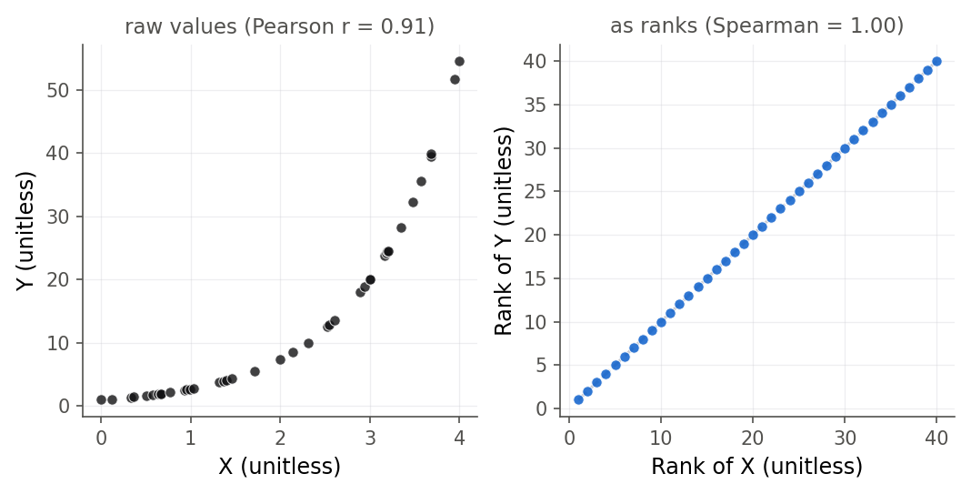
Figure 8:The same monotone-but-curved data seen two ways. Pearson reads only 0.91 because the raw cloud bends, but the ranks fall on a perfect line, so Spearman is exactly 1. Spearman rewards order and ignores spacing.
Formula
is the position of in the sorted list of the values, and likewise for .
lies in just like Pearson’s , equals +1 for any strictly increasing relationship (not only a straight line) and -1 for any strictly decreasing one.
In words: Spearman is Pearson applied to the rankings, so it measures whether the two variables rise and fall together in order, and it does not care about the exact spacing of the values.
R and Python
The savings data has a natural test case. The growth rate of income, ddpi, correlates
with the savings rate, but one country, Libya, had an enormous income growth rate over
the period and only a middling savings rate. That single point drags the Pearson
correlation down. Spearman, seeing Libya merely as “the highest-growth country” rather
than as a point far off to the right, is less disturbed.
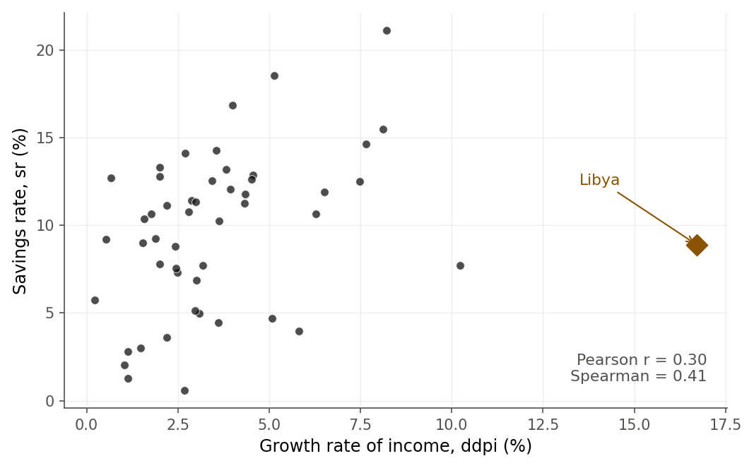
Figure 9:Libya’s extreme income growth makes it an outlier that pulls the Pearson correlation down to 0.30; Spearman, which reads only ranks, reports the stronger 0.41 seen in the bulk of the countries.
Neither number is “right.” They answer different questions. Pearson asks about straight-line strength and counts Libya’s distance; Spearman asks about monotone order and does not. When they disagree, that disagreement is information: it says an outlier or a curve is present, and you should look at the plot before quoting either one.
The gap between the two coefficients is easiest to believe when you open and close it with your own finger, so drag the stand-in for Libya and watch which number reacts.
Drag the far-right point sideways and Pearson’s r falls from 0.85 to 0.46 while Spearman’s rank correlation holds at 0.885, because no two points ever changed places.
4.6 Four ways a correlation lies
A single number that compresses a scatterplot must throw information away, and sometimes it throws away the part that mattered. The founding demonstration is Anscombe’s quartet: four datasets, built by the statistician Frank Anscombe in 1973, that share the same means, the same standard deviations, the same correlation of 0.816, and the same fitted line, yet look nothing alike.
anscombe <- read.csv("data/anscombe.csv")
stats_row <- function(i) {
  xi <- anscombe[[paste0("x", i)]]
  yi <- anscombe[[paste0("y", i)]]
  f <- lm(yi ~ xi)
  c(set = i, mean_x = mean(xi), mean_y = mean(yi),
    r = cor(xi, yi), b0 = coef(f)[[1]], b1 = coef(f)[[2]])
}
round(t(sapply(1:4, stats_row)), 3)
set mean_x mean_y r b0 b1
[1,] 1 9 7.501 0.816 3.000 0.5
[2,] 2 9 7.501 0.816 3.001 0.5
[3,] 3 9 7.500 0.816 3.002 0.5
[4,] 4 9 7.501 0.817 3.002 0.5anscombe = pd.read_csv("data/anscombe.csv")
for i in range(1, 5):
xi = anscombe[f"x{i}"]
yi = anscombe[f"y{i}"]
f = smf.ols(f"y{i} ~ x{i}", data=anscombe).fit()
print(i, round(xi.mean(), 2), round(yi.mean(), 3),
round(xi.corr(yi), 3), round(f.params.iloc[0], 3),
round(f.params.iloc[1], 3))1 9.0 7.501 0.816 3.0 0.5
2 9.0 7.501 0.816 3.001 0.5
3 9.0 7.5 0.816 3.002 0.5
4 9.0 7.501 0.817 3.002 0.5The four rows are identical to three decimals. Figure 11 plots them, and only the plot reveals the truth. Set I is a genuine linear scatter, the honest case. Set II is a smooth curve, where a straight-line correlation is the wrong summary entirely. Set III is a perfect line with one outlier that tilts the fit and lowers from 1 to 0.82. Set IV is the most alarming: ten points stacked at a single value carry no information about slope at all, and one lone point far to the right invents the entire correlation. Delete that one point and is undefined. The lesson Anscombe drew, and the first habit of any honest analyst, is to plot the data before trusting the number.
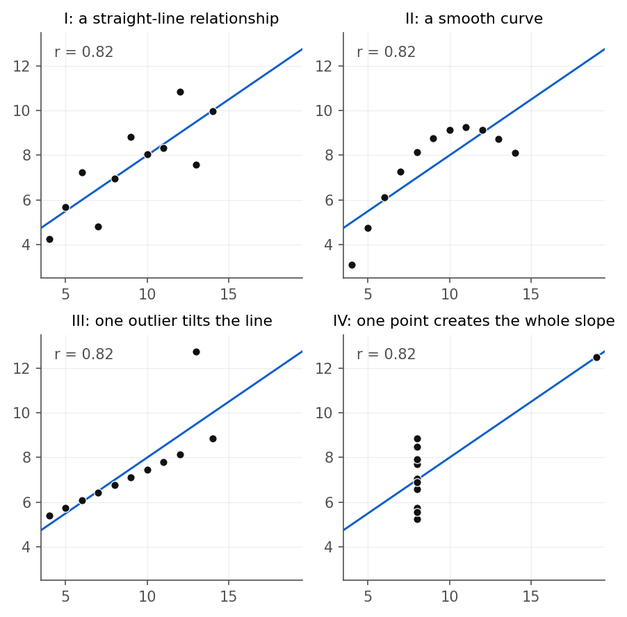
Figure 11:Anscombe’s quartet: four datasets with identical means, correlations of 0.82, and fitted lines, but four different shapes. Only panel I is well summarized by a correlation; the number is misleading for the curve, the outlier, and the single leverage point.
The quartet is a museum piece, built to make the point. The same four failures show up in real data, so here they are one at a time, with the mechanism named.
Nonlinearity. Correlation measures straight-line association only. A relationship can be perfectly predictable and yet have a Pearson correlation near zero, as in a symmetric U-shape where falls and then rises: the downhill and uphill halves cancel. A small never means “no relationship.” It means “no straight-line relationship,” and the only way to tell the difference is to look. Anscombe’s set II is this trap; the fix is a scatterplot and, if a curve appears, the transformations of Chapter 10.
Outliers. Because squares distances, one point far from the crowd can dominate the sum, either manufacturing a correlation (set IV) or destroying one (set III). The Libya example in Figure 9 is the mild, real-data version. The defenses are to plot the data, to check whether one or two points are driving the result by recomputing without them, and to report Spearman alongside Pearson when they disagree.
Restriction of range. Correlation depends on the spread of . Squeeze that spread and the correlation shrinks toward zero, even though the underlying relationship has not changed at all. The Galton height data shows this cleanly.
galton <- read.csv("data/galton_heights.csv")
band <- galton[galton$midparentHeight >= 69 & galton$midparentHeight <= 71, ]
round(c(full_r = cor(galton$midparentHeight, galton$childHeight),
        full_n = nrow(galton),
        band_r = cor(band$midparentHeight, band$childHeight),
        band_n = nrow(band),
        sd_full = sd(galton$midparentHeight),
        sd_band = sd(band$midparentHeight)), 3)
full_r full_n band_r band_n sd_full sd_band
0.321 934.000 0.143 393.000 1.802 0.527 Across all 934 children the correlation between midparent height and child height is 0.32. Keep only families whose midparent height is between 69 and 71 inches, cutting the standard deviation of the parent heights from 1.80 to 0.53, and the correlation falls by more than half to 0.14, as Figure 12 shows. Nothing about heredity changed; we just stopped looking at short and tall parents. This is why a correlation computed inside a narrow group, admitted students, hired employees, surviving patients, routinely understates the association in the full population. Whenever you read a weak correlation, ask what range of it was computed over.
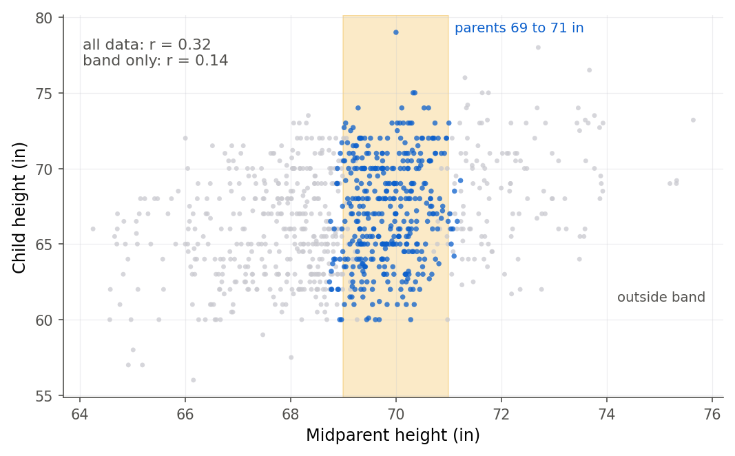
Figure 12:Restricting midparent height to the narrow yellow band cuts its spread by two-thirds and halves the correlation, from 0.32 to 0.14, even though the relationship itself is unchanged. Correlation depends on the range of X you sample.
Set the width of that band yourself, and see how much of a correlation you can destroy without touching a single data point.
Two sliders move and resize the shaded band, which is the only slice of parent heights being correlated. Narrowing it to 69 through 71 inches cuts r from 0.321 to 0.100 while all 220 children stay exactly where they were.
Ecological correlation. A correlation computed on group averages is not the correlation for individuals, and it is usually larger, because averaging cancels the within-group scatter. Group the Galton children by family and correlate the family-average child height with the midparent height.
fam <- aggregate(cbind(midparentHeight, childHeight) ~ family,
                 data = galton, FUN = mean)
round(c(individual_r = cor(galton$midparentHeight, galton$childHeight),
        family_r = cor(fam$midparentHeight, fam$childHeight),
        n_families = nrow(fam)), 3)
individual_r family_r n_families
0.321 0.399 205.000 The individual-level correlation is 0.32; the family-average correlation is 0.40, as Figure 14 shows. Averaging smooths away the sibling-to-sibling differences and leaves a tighter picture, so the aggregate number overstates how well one child’s height can be predicted from the parents. Inferring individual behavior from group averages is the ecological fallacy, and it has led to real errors: a correlation across countries, states, or precincts can be strong while the same correlation across the people inside them is weak or even reversed. The unit you correlate is part of the claim.
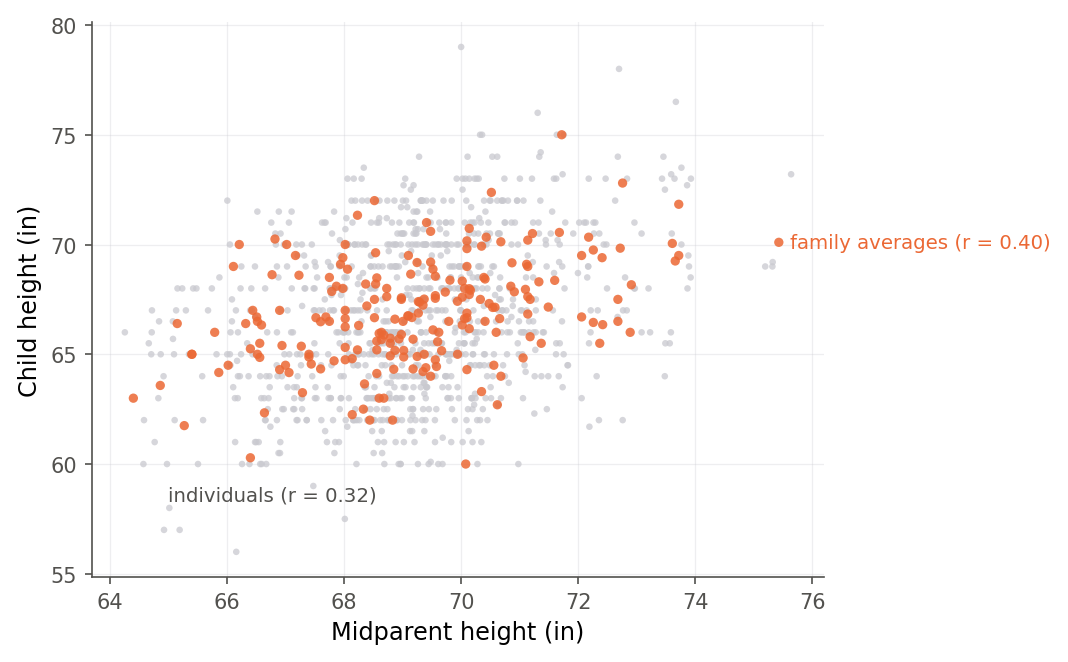
Figure 14:The 205 family averages (orange) correlate more strongly (0.40) than the 934 individual children (gray, 0.32), because averaging removes the within-family scatter. A correlation on group means is not the correlation for individuals.
Anscombe’s claim only lands if you confirm that the numbers really do stay put while the picture changes, so step through all four sets yourself and keep your eye on the readouts rather than the plot.
One slider steps through Anscombe’s four datasets, refitting the line each time. The correlation, the intercept, the slope, and the mean of Y barely move off 0.816, 3.00, 0.50, and 7.50 while the shape of the data changes completely.
4.7 Regression to the mean, and why correlation is not causation
There is a fifth confusion that deserves its own section, because it fooled the inventor of regression himself and still fills the news. When Francis Galton plotted children’s heights against their parents’ in the 1880s, he found that tall parents had children who were taller than average but not as tall as the parents, and short parents had children who were shorter than average but not as short. He first suspected some biological force pulling the population toward mediocrity. There is no such force. The pull toward the average is a mathematical certainty whenever the correlation is less than perfect, and it has a name: regression to the mean.
The identity from 4.2 Correlation and the regression slope makes it exact. In standard units, where both variables are z-scores, the standard deviations are both 1, so the regression slope is . A parent who is 2 standard deviations above the mean has children predicted at only standard deviations above the mean. For the Galton data , so the children of very tall parents are predicted just standard deviations up, well short of their parents.
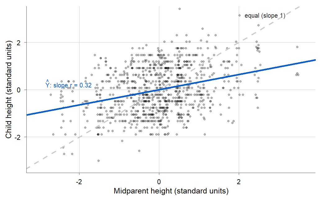
Figure 16:In standard units the fitted slope is exactly r equals 0.32, far shallower than the dashed equal-height line of slope 1. Tall parents’ children are predicted only a third of the way out toward tall; short parents’ children only a third of the way toward short. That gap is regression to the mean.
Regression to the mean is not a special fact about heredity. It happens any time two measurements are imperfectly correlated, which is almost always. The student who scores highest on the midterm tends to score lower (still good, just less extreme) on the final. The rookie athlete featured on a magazine cover after a spectacular season tends to do worse the next year, the so-called cover jinx, with no jinx involved. A clinic enrolls patients with the highest blood pressure, treats them, and sees their pressure fall on average, partly because the most extreme readings were extreme partly by luck and drift back on their own. In every case the naive reading blames a cause, the pressure of fame, a miracle drug, when the imperfect correlation between two measurements already predicts the drift. Whenever you select cases because they were extreme and then measure them again, expect regression to the mean, and do not hand the credit or the blame to a story.
This is the deepest form of the oldest warning in statistics: correlation is not causation. A correlation between and is consistent with causing , with causing , with some third variable driving both, and with pure coincidence. The savings correlation of -0.46 does not prove that having children makes a country thrifty or spendthrift; income, culture, and history sit behind both. Correlation earns its keep as a description and a first clue, not as a verdict. Sorting genuine causes from lookalikes needs either a designed experiment or the careful causal reasoning that Chapter 16 takes up (16.1 Drawing a causal story: path diagrams), and it is the single hardest thing this book asks you to keep straight.
4.8 Chapter summary
You can now describe a straight-line relationship with a single, unitless number and say how much to trust it. You met the Pearson correlation as a standardized covariance, proved it lives in , tied it to the regression slope and to , tested and interval-ed the population value , placed it inside the bivariate normal model, softened it into Spearman’s rank version, and learned the five ways it misleads: nonlinearity, outliers, restriction of range, ecological aggregation, and the leap to causation.
Key results at a glance
| Result | Statement or formula | Valid when |
|---|---|---|
| Pearson correlation (Def 4.1) | any paired numeric data | |
| Bounds of (Thm 4.2) | ; iff an exact line | always |
| Correlation, slope, (Thm 4.4) | , | simple linear regression |
| Correlation test (Thm 4.6) | , normal errors | |
| Fisher distribution (Thm 4.7) | bivariate normal, large | |
| Bivariate normal conditional (Thm 4.9) | , | bivariate normal |
| Spearman correlation (Def 4.10) | Pearson of the ranks | monotone order; ordinal data or outliers |
Key terms. Correlation coefficient, sample covariance, correlation matrix, coefficient of determination, Fisher’s transformation, bivariate normal distribution, conditional distribution, Spearman rank correlation, restriction of range, ecological correlation (and the ecological fallacy), regression to the mean.
You should now be able to
Compute the Pearson correlation by hand and with software, and read it as a unit-free standardized covariance.
Derive the identity and show that .
Test with the statistic and build a confidence interval for with Fisher’s , checking it by simulation.
State the bivariate normal model and read its population regression line and leftover variance.
Compute Spearman’s rank correlation and decide when ranks are safer than raw values.
Diagnose nonlinearity, outliers, restriction of range, and ecological correlation.
Explain regression to the mean and why a strong correlation is still not evidence of causation.
Where this fits. In the modeling workflow of The modeling workflow, correlation serves the
EXPLORE stage: before fitting anything, you look at how each pair of variables moves
together, and the correlation matrix is the numeric companion to the scatterplot. It
reaches into USE as well, through the inference for and the warnings that keep you
from turning a described association into a claimed cause. It builds directly on the
least-squares line of 2.2 Least squares from first principles and the ANOVA decomposition of
3.6 The analysis of variance approach, since , , and are three views of one fit. Its tools get
used again soon: the -versus- identity of 4.2 Correlation and the regression slope returns in Chapter 12
as a check on an inflating (12.2 Choosing among models: selection criteria); the same savings data becomes a second
worked multiple regression in Chapter 8, where the strong pop15-pop75 correlation you
saw in the matrix turns into a real collinearity problem; Libya’s outsized pull becomes a
named influence diagnostic in Chapter 9 (9.3 Influence: which points actually change the fit); and the “correlation is
not causation” thread is picked back up in Chapter 16 with the tools to reason carefully
about it (16.1 Drawing a causal story: path diagrams).
4.9 Frequently asked questions
Q1. Is a correlation of 0.5 twice as strong as 0.25? Not in the sense that matters most. If “strength” means share of variance explained, then gives and gives , so the first explains four times as much variance, not twice. Correlation and variance-explained are different scales; always be clear which one you mean.
Q2. What is a “big” correlation? It depends entirely on the field. In a tightly controlled physics experiment might be disappointing; in social science, where outcomes have many causes, can be a real and useful finding. There is no universal threshold. Report the number, the interval, and the plot, and let the reader judge against the norms of the subject.
Q3. Correlation is symmetric but regression is not. Why? Correlation asks whether two variables move together and does not distinguish a response from a predictor, so . Regression singles out one variable as the response and minimizes vertical distances to it, so swapping the roles changes which distances you minimize and gives a different line. Their slopes multiply to , meeting only when the fit is perfect.
Q4. If , are and independent? No. Zero correlation means no straight-line association, but a strong curved relationship (a U-shape, a circle) can have while and are anything but independent. Independence implies zero correlation; the reverse holds only inside special models like the bivariate normal, where does force independence because the density factors.
Q5. Which should I report, Pearson or Spearman? Report Pearson when you care about straight-line strength and the data are roughly linear with no wild outliers. Reach for Spearman when the relationship is monotone but curved, when outliers are pulling Pearson around, or when the variables are ordinal ranks to begin with. If the two disagree a lot, that gap is a signal to plot the data and find out why, not to quietly pick the bigger number.
Q6. Why does the confidence interval for come out lopsided around ? Because the interval is built symmetrically on the Fisher scale and then bent back through , which is nonlinear near the ends. For the savings data sits at the center of the symmetric interval, but after transforming back the bounds are not equidistant from -0.46. That asymmetry is a feature: it respects the hard walls at that a symmetric interval on the raw scale would ignore.
Q7. Does a significant correlation mean the relationship is strong? No. Significance and strength are different things. With a large enough sample, a tiny correlation of 0.05 can be statistically significant, meaning “probably not exactly zero,” while explaining a quarter of one percent of the variance. Always read the size of and its interval, not just the -value; a small says the effect is real, not that it is big.
4.10 Practice problems
(A) In one sentence each, say what the sign and the size of a correlation tell you, and why has no units.
(A) A report gives between two variables and calls it “80 percent agreement.” Explain what is wrong and give the correct interpretation of 0.8.
(A) The savings correlation between
srandpop15is -0.46. Interpret both the sign and the magnitude for a reader who has never seen a correlation.(A) Explain why a correlation of exactly 0 does not mean and are unrelated. Sketch or describe a relationship with that is nonetheless perfectly predictable.
(A) Give the four-question checklist you would run before trusting any reported correlation, and say which trap each question guards against.
(A) A weak correlation of 0.1 is found between SAT score and college GPA, computed only among admitted students at a selective school. Name the trap and predict whether the full-population correlation is larger or smaller.
(A) Explain regression to the mean in your own words, and give an everyday example that is not heights or test scores.
(A) Why are the two regression slopes (of on and of on ) generally different, and when are they reciprocals of each other?
(B) Prove that (Theorem 4.2) using the fact that for the standardized values . State the condition for equality and what it means geometrically.
(B) Derive the identity from the definitions and .
(B) Show that in simple linear regression (Theorem 4.4), starting from and .
(B) Prove that the two regression slopes satisfy , where is the slope of on . Explain why this forces to be an equality, not an inequality.
(B) Derive the correlation statistic (Theorem 4.6) from the slope statistic , using .
(B) Explain the delta-method argument behind Theorem 4.7: starting from , show that makes approximately constant, and carry out the integral .
(B) In the bivariate normal, use the conditional-mean result (Theorem 4.9) to show that the population regression slope of on is , and that the fraction of ’s variance left after conditioning on is .
(B) Show that if every exactly (a perfect line, ), then . Which of the bound-derivation’s equality conditions does this meet?
(B) A sample has with . Compute the 95 percent Fisher confidence interval for by hand, showing the , the standard error, and the back-transformation.
(B) Prove that Spearman’s rank correlation equals +1 for any strictly increasing relationship , not only a linear one, by considering what the ranks of and look like.
(C) Load
savings.csvand reproduce the full correlation matrix ofsr,pop15,pop75,dpi,ddpi. Identify the strongest positive and strongest negative correlations and explain each in words.(C) For
srandpop75, compute , run the test, and build the Fisher 95 percent interval in R or Python. State whether the correlation is significant and interpret the interval.(C) Confirm on the savings data that and for the regression of
srondpi. Report all four numbers.(C) Compute both Pearson and Spearman correlations between
dpiandsr. They differ; make the scatterplot and explain which countries drive the gap.(C) Using
anscombe.csv, reproduce the table showing all four sets share the same mean, correlation, and fitted line, then plot all four and describe how each departs (or not) from a straight line.(C) Using
galton_heights.csv, demonstrate restriction of range: compute the correlation on all children, then on the subset with midparent height between 68 and 70 inches, and report how much the correlation and the standard deviation of the parent height each shrink.(C) Using
galton_heights.csv, fitchildHeight ~ midparentHeight, report the standardized slope, and explain the number as regression to the mean. Predict the height of a child whose midparent height is 3 standard deviations above the mean, in standard units.(C) Simulate the sampling distribution of for and with 5000 draws (seed 4210), and check that the standard deviation of is close to . Report both numbers.
(C) Aggregate
galton_heights.csvby family and compare the individual-level and family-average correlations between midparent and child height. Explain the direction of the difference as an ecological effect.(C) Take any pair from the savings data with a moderate correlation and delete the single most extreme point. Recompute and report how much it moved, then say whether that point qualifies as influential.
4.11 Exam practice
These five questions are written in the style of the course exams. Every one asks you to explain your reasoning in full sentences, not just to report a number, because that is how the exams are graded: a bare value earns little credit, and clear reasoning with a small slip earns most of it. Work each one on paper before you open the model answer. Where a question shows software output, it is genuine output from the book’s datasets.
EP 4.1 Interpret the output in context
For the 50 countries in savings.csv, the savings rate sr is correlated with the share
of the population over 75, pop75. Here is the cor.test output.
	Pearson's product-moment correlation

data:  savings$sr and savings$pop75
t = 2.3118, df = 48, p-value = 0.02513
alternative hypothesis: true correlation is not equal to 0
95 percent confidence interval:
 0.04186153 0.54670273
sample estimates:
      cor
0.3165211
Report the sample correlation and interpret its sign and size in the context of the two variables. Say whether the correlation is significantly different from zero at the 5 percent level and how you read that from the output. Interpret the confidence interval, explain in one sentence why it is not symmetric about the sample correlation, and say whether the result shows that having more elderly people makes a country save more.
Model answer
The sample correlation is , positive and moderate-to-weak. The positive sign
says the two move in the same direction: countries with a larger share of people over 75
tend to have higher savings rates, which is the pattern the life-cycle theory predicts for
the elderly. The size, about a third, is weak enough that the cloud would still look
fairly shapeless in a scatterplot; it is far from a tight line. The correlation is
significantly different from zero at the 5 percent level, because the -value 0.025 is
below 0.05, and equivalently because the 95 percent confidence interval
does not contain zero. That interval is the set of population values consistent with
the data, and it is wide: the true correlation could be almost nothing (0.04) or
moderately strong (0.55), so the evidence is real but far from precise. The interval is
not symmetric about because it is built symmetrically on the Fisher scale
and then bent back through , which is nonlinear and respects the hard wall at
. Finally, the result does not show that elderly people cause higher saving: this
is observational data, and income, culture, and especially the youth share (which
correlates -0.908 with pop75) sit behind both variables. A weak answer stops at
“positive and significant” without noting that the interval nearly touches zero, or reads
the correlation as proof of a cause.
EP 4.2 A student’s claim
A classmate runs the correlation between the savings rate sr and the income growth rate
ddpi and gets the following.
r = 0.3048 r^2 = 0.0929 t = 2.2171 p = 0.031385She writes: “The correlation between income growth and saving is statistically significant (), so income growth is a strong driver of national saving.” Evaluate her claim, correcting every error you find.
Model answer
Her sentence packs two distinct mistakes. The first is confusing significance with strength. The small -value tells us only that the population correlation is probably not exactly zero; it says nothing about how large the association is. Here the correlation is , and squaring it gives , so income growth accounts for only about 9 percent of the country-to-country variation in savings rates, leaving 91 percent unexplained. That is a weak relationship, not a strong one, however small the -value. With 50 countries even a modest correlation clears the significance bar. The second mistake is the word “driver,” which asserts causation from an observational correlation. A positive correlation between growth and saving is equally consistent with saving fueling growth, with a third factor such as overall economic development lifting both, or with coincidence. The honest reading is that savings rates and income growth are weakly and positively associated across these countries, an association unlikely to be pure sampling noise, and that the data alone cannot tell us which way the causal arrow points or whether one exists. A weak answer corrects only one of the two errors, typically catching the causation slip but still accepting “strong,” or the reverse.
EP 4.3 What would change if
Across all 934 children in galton_heights.csv, the correlation between midparent height
and child height is as follows.
full_r = 0.321 full_n = 934 full_sd(midparent) = 1.802Suppose you recomputed this correlation using only the families whose midparent height is between 69.5 and 70.5 inches. Predict whether the correlation would rise, fall, or stay the same, explain the mechanism, and say whether the underlying parent-child relationship has changed.
Model answer
The correlation would fall, and the underlying relationship would not change at all. This is restriction of range. A correlation depends on how much the predictor varies: narrowing the midparent heights to a one-inch band cuts their spread sharply, from a standard deviation of 1.80 down to about 0.30, so the parent height now explains a much smaller slice of the variation in child height even though each extra inch of parent height still predicts the same fraction of an inch of child height. Recomputing on the band gives with only 221 children, down from 0.321 on the full data, roughly a third of the original. The heredity itself is untouched: the regression slope, the biology, and the scatter of children around the line are all the same. We simply stopped looking at short and tall parents, and a relationship measured over a narrow slice of looks weaker than the same relationship measured over the full range. This is exactly why a correlation computed inside a selected group, such as admitted students or hired employees, understates the association in the full population. A weak answer predicts the correlation would rise, or concludes that the parent-child relationship itself weakened rather than that only the sampled range of shrank.
EP 4.4 Explain why
For income growth ddpi against the savings rate sr, the two correlation coefficients
disagree, and one country stands out.
pearson  = 0.3048   spearman = 0.4082
country    ddpi    sr
Libya     16.71   8.89
Explain why the Pearson and Spearman correlations differ here, using Libya to make the mechanism concrete. Then say which of the two numbers is “correct” and what their disagreement should prompt you to do.
Model answer
Pearson and Spearman disagree because they read Libya very differently. Pearson works from the raw values and effectively squares distances, so a point far from the crowd carries outsized weight. Libya’s income growth of 16.7 percent is more than double any other country’s, which places it far to the right, while its savings rate of 8.9 is unremarkable. That combination, extreme in but ordinary in , pulls the least-squares line toward the flat and drags the Pearson correlation down to 0.30. Spearman first replaces every value by its rank, so Libya becomes merely “rank 50 in growth,” one step beyond the next country; its enormous raw distance is compressed to a single rank gap. Freed of that one leverage point, Spearman reports the stronger monotone pattern, 0.41, that holds among the other 49 countries. Neither number is the “correct” one, because they answer different questions: Pearson measures straight-line strength and counts Libya’s distance, while Spearman measures monotone order and does not. Their disagreement is itself information. It signals that an outlier or a curve is present, and the right response is to plot the data and look at Libya before quoting either coefficient. A weak answer declares one number simply right, or blames the gap on the sample size or rounding instead of Libya’s position as a high-leverage outlier in the growth variable.
EP 4.5 A student’s claim about regression to the mean
The regression of child height on midparent height in galton_heights.csv gives the
following.
r = 0.321 slope = 0.637 sd(midparent) = 1.802 sd(child) = 3.579A student reasons: “Children of tall parents are on average shorter than their parents, so tall families are reverting toward the average, and over enough generations everyone’s height will converge to the mean.” Evaluate the reasoning, using the standardized slope, and say what will actually happen to the spread of heights across generations.
Model answer
The student has rediscovered Galton’s own mistake. In standard units the slope equals the correlation, , so a child is predicted only about a third of the way out from the mean that the parents stood. That pull toward the average is real, but it is arithmetic, not a biological force. It follows automatically whenever two measurements are less than perfectly correlated: because part of a tall parent’s height is transmissible and part is chance, the children inherit only the transmissible part on average and so land closer to the middle. Crucially, regression to the mean is symmetric and does not shrink the population. Children of average parents include some very tall and some very short ones, and extreme children are born to non-extreme parents just as often, which refills both tails. The standard deviation of the children, 3.579 inches, is not collapsing toward zero; the height distribution stays about as spread out generation after generation. So the “convergence to a single height” conclusion is wrong: there is no drift toward uniformity, only a stable spread in which extreme cases on one side tend to be less extreme on the other. The reasoning also quietly reads a cause into a correlation, which the data cannot support. A weak answer accepts the idea of a reverting force or predicts the spread of heights will shrink over time, missing that regression to the mean is a two-way consequence of an imperfect correlation and leaves the population variance intact.
Chapter game
Resumen del capítulo (en español)
Este capítulo trata la correlación (correlation), el número entre -1 y +1 que
resume qué tan fuerte es la relación lineal entre dos variables. Usamos los datos de
ahorro de 50 países (savings): la tasa de ahorro sr frente a la proporción de
población joven pop15. El coeficiente de Pearson (Pearson correlation)
es la covarianza estandarizada, sin unidades, y aquí
vale -0.46: más jóvenes, menos ahorro. Demostramos que usando que una
suma de cuadrados nunca es negativa.
La correlación y la pendiente de regresión están ligadas exactamente:
y , el coeficiente de determinación. Para sr frente a pop15,
y : la recta explica el 21 por ciento de la variación.
Para inferir sobre , la prueba resulta idéntica a la prueba de la pendiente. El intervalo de confianza usa la transformación de Fisher, , que estabiliza la varianza; una simulación lo confirma. Para el ahorro, el intervalo del 95 por ciento para es .
El modelo normal bivariado es el hogar natural de la correlación: sus contornos son elipses y su media condicional es la recta de regresión poblacional. La correlación de rangos de Spearman aplica Pearson a los rangos y resiste valores atípicos, como Libia en los datos de ahorro.
Finalmente vemos cómo miente la correlación: la no linealidad, los valores atípicos, la restricción del rango, la correlación ecológica, y el salto a la causalidad. La regresión a la media, ilustrada con las alturas de Galton, explica por qué los casos extremos tienden a moderarse sin causa especial alguna. La correlación describe; no demuestra causa.