Three people are staring at three tables of numbers, and each of them has to decide something.
A production engineer at the Toluca Company has records from 25 manufacturing runs: the size of each lot and the labor hours it took. She has to recommend a lot size that keeps costs down, and to do that she needs to know how hours grow with lot size. A single number would settle it: how many extra hours does one more unit in the lot cost? Figure 1 is her data.
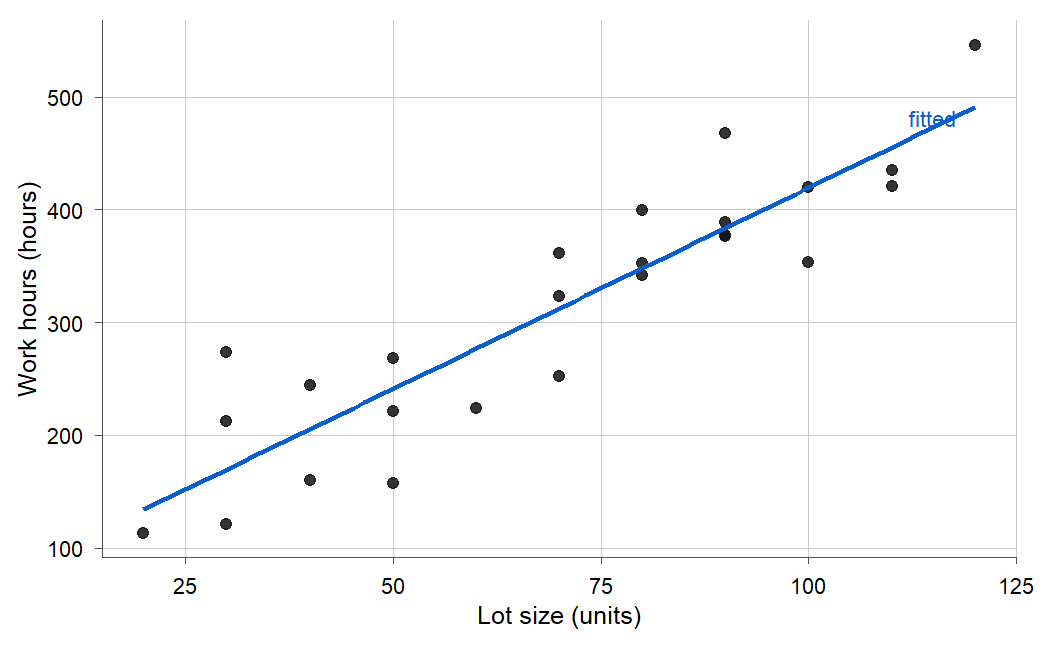
Figure 1:Twenty-five production runs at the Toluca Company. Bigger lots take more hours, and the trend looks straight, but which line is the right one, and how far can you trust its slope? Chapter 2 answers both.
On the night of January 27, 1986, a very different table sat in front of engineers deciding whether to launch the space shuttle Challenger the next morning. For 23 earlier flights they had the launch temperature and the number of O-rings, out of six, that showed heat damage. The forecast for launch was about 31 degrees Fahrenheit, colder than any flight on record. Could they say what the damage risk would be at a temperature they had never flown? Figure 2 is what they had to reason from.
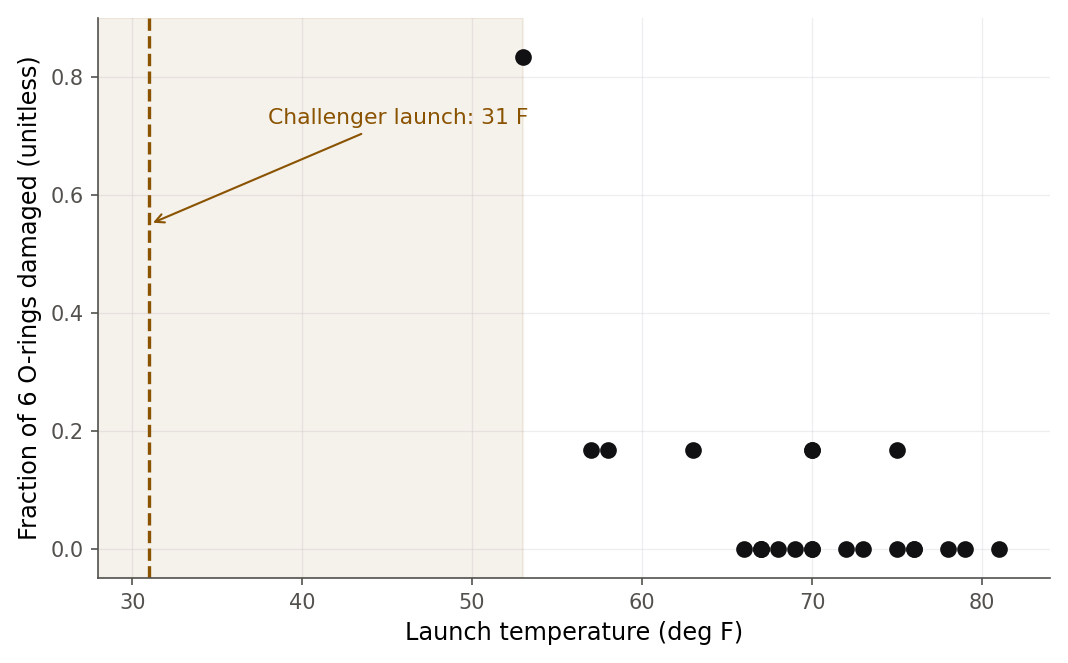
Figure 2:The 23 flights before Challenger. Damage was worst at the coldest launches, and the launch under discussion (dashed line, 31 degrees) sat far below anything ever flown. Judging that risk means extending a pattern past the last data point. Chapter 13 takes it on.
A dean at a US college has a third table: for 397 professors, their rank, discipline, years of experience, sex, and salary. The table was built to answer a pointed question. Men in the data earn about fourteen thousand dollars a year more than women, on average. Is that gap evidence of unequal pay, or does it just reflect that the two groups differ in rank and experience? A raw average cannot tell the difference. Figure 3 shows how salary climbs with rank alone, which is one of the things that has to be accounted for before the sex gap means anything.
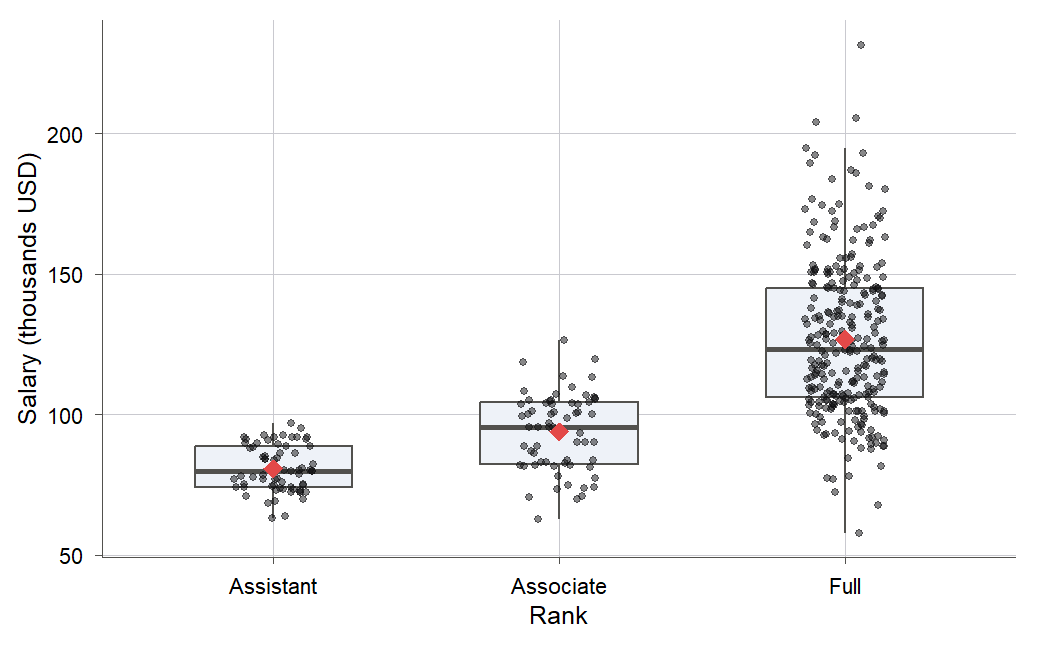
Figure 3:Nine-month salary rises steeply with rank. Before a raw male-female salary gap can mean anything, a model has to hold rank, discipline, and experience fixed. Chapter 11 builds that model.
A cost, a catastrophe, and a question of fairness. On the surface they have nothing in common. But each one is the same kind of problem: someone wants to know how one quantity depends on others, so they can describe it, predict it, or act on it. That is what regression does (Definition 1.1), and it is the subject of this book. This first chapter is a map. It says what regression is and what it is for, where the word came from, how the idea grew over two centuries, where it sits in modern data science and machine learning, and what each of the next fifteen chapters will teach you. There is almost no math here and nothing to memorize. The goal is to give you the lay of the land before you start walking it.
1.1 What regression does
The three opening stories look unrelated, but each one asks the same question, and one tool answers all three. Regression studies how one quantity, the response, changes with one or more others, the predictors (Definition 1.2). Write the response and a predictor . Regression fits a rule that says what value of to expect at each value of . It does this without pretending the world is tidy: two lots of the same size took different hours, and two flights at the same temperature had different damage. The rule describes the average behavior and treats the leftover scatter honestly.
People reach for that rule for three different reasons, and keeping them straight is the first habit this course wants to build.
Description. Sometimes you just want to summarize a relationship that is already in front of you. How much do work hours rise, on average, per extra unit of lot size? The answer is a slope, a single interpretable number, and reporting it is description. You are not predicting anything new or claiming that lot size causes hours in some deep sense; you are compressing a cloud of points into a sentence a manager can use.
Prediction. Sometimes you want a number for a case you have not seen yet. Next week’s run is 100 units: how many hours should we budget? A prediction plugs a new into the fitted rule and reads off the expected , ideally with a margin of error attached. Good prediction does not require that you understand why and move together, only that the pattern that held in the data keeps holding. This is the goal that dominates modern machine learning.
Causal reasoning. Sometimes you want to know what would happen if you changed something. Would paying women the same starting salary close the gap? Would a warmer launch have saved the shuttle? These are causal questions, and they are the hardest of the three, because a regression fit to observed data measures association, not cause. You can sometimes reason about cause with regression, but only with extra assumptions and, ideally, the right kind of data. Confusing a predictive fit with a causal claim is the single most common and most costly mistake in applied statistics, and this book returns to the warning again and again.
The same fitted line can serve all three goals, but the confidence you are entitled to differs wildly. Figure 4 puts the three side by side: one line, three questions, and a trust meter that drops as the questions get bolder.
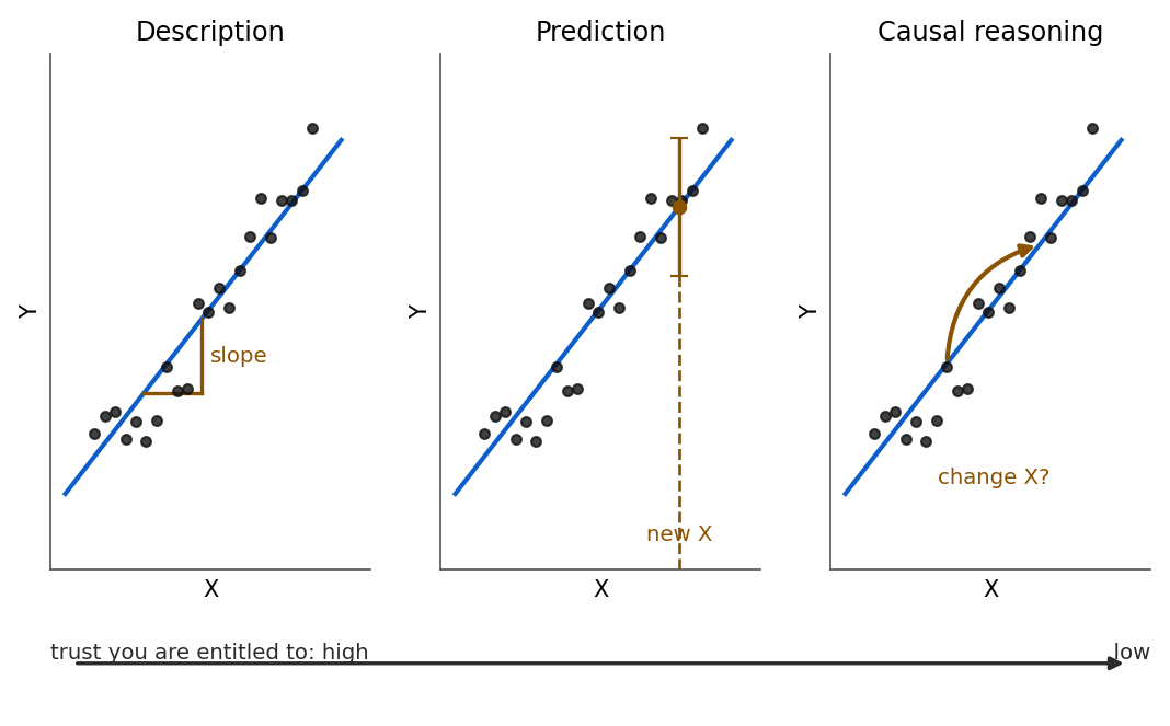
Figure 4:The same fitted line does all three jobs, but they do not earn the same trust. Description just reads a slope off the data you have; prediction plugs in a new X; causal reasoning asks what an intervention would do, and needs the most from the data. Trust shrinks from left to right.
To make the three uses concrete, here are the three opening datasets reduced to three real numbers.
Description and prediction sound like separate jobs, but they come off the same line, so move the data and you move both at once. The engineer’s slope and her hour budget are in the widget below; drag a run and see which one is fragile.
The 25 Toluca runs, with the least-squares line refitting as you drag any point. The readouts show the slope , the intercept , the predicted hours at a lot of 100 units and at a lot of 200, and the SSE.
What to notice. The slope is the description and is the prediction, and a single dragged run moves both at once. Try this. Drag the run at lot size 120 straight up and compare how far at 100 moves against at 200, a lot size nobody ever ran: the prediction inside the data barely flinches while the one past the edge swings hard. Back to Section 1.1.
1.2 The word “regression”: Galton’s heights
The word “regression” is older than the modern method and comes from a surprising place: a study of human height. In the 1880s Francis Galton collected the heights of 934 adult children and their parents, 205 families in all, and asked whether tall parents have tall children. They do, but Galton noticed something stranger, and the strangeness gave the field its name.
For each child, Galton computed a mid-parent height, a weighted average of the two parents’ heights. Then he plotted child height against mid-parent height. Figure 6 shows that plot with two lines drawn on it. The red dashed line is : where children would land if each one exactly matched their parents. The blue line is the actual best-fit line through the data.
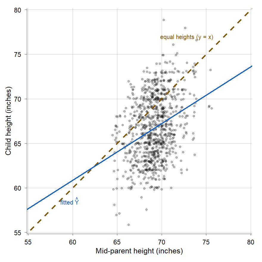
Figure 6:Galton’s 934 children. The least-squares line (blue) is much shallower than the equal-heights line (red dashed): tall parents have children who are tall but closer to average, short parents have children who are short but closer to average. Galton called this pull toward the middle “regression.”
The blue line is clearly flatter than . Read it from the right: the children of very tall parents are taller than average, but not as tall as their parents. Read it from the left: the children of very short parents are shorter than average, but not as short. In both directions the children’s heights are pulled toward the overall average. Galton called this pull “regression toward mediocrity,” meaning the middle, and the name stuck to the whole method even though the method now has nothing to do with heights. Figure 7 makes the pull impossible to miss by averaging the children within narrow bands of parent height.
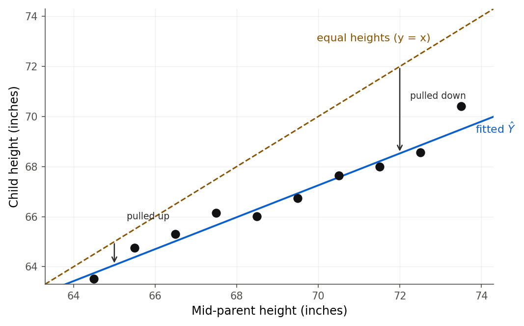
Figure 7:The average child height in each band of parent height sits on the shallow blue line, below the red equal-heights line on the right and above it on the left. Every extreme parent group produces a less extreme child group. That is regression to the mean.
We can put a number on the pull. Fitting the least-squares line of child height on mid-parent height gives the slope and intercept below.
Two cautions that this small example already teaches. First, “regression to the mean” is a fact about averages, not about any one family: plenty of tall parents have children taller than themselves; the average child of tall parents is shorter than the parents. Second, the effect is easy to misread as something causal or mysterious, and it is neither. It happens whenever two measurements are less than perfectly correlated, for a purely statistical reason. The next Try-it shows the trap in a modern setting.
Reading the pull off a static scatterplot takes work. It is easier to feel it by choosing a parent height yourself and watching how much of their advantage the child keeps.
Galton’s least-squares line against the equal-heights line , with a slider for mid-parent height. The readouts show how far the parents sit above average, the predicted child , and how far that child sits above average.
What to notice. The predicted child always lands between the parents’ height and the overall average, on the tall side and on the short side alike. Try this. Slide from 75 inches down to 65 and watch the fraction kept hold at 0.637 the entire way: the same that shrinks a tall family’s advantage lifts a short family’s deficit. Back to Section 1.2.
The Galton data comes back in 4. Correlation, where the shallow slope becomes a correlation and we study correlation’s uses and abuses in full.
1.3 The anatomy of a statistical model
Every regression in this book is built from the same two pieces, and naming them now will make the whole course easier to follow. Look again at any of the scatterplots so far. The points do not sit on a single curve; they scatter around one. A statistical model takes that seriously (Definition 1.3) by splitting the response into a part a rule can explain and a part it cannot.
In words: each observed response is the sum of a signal, , the average value of that the predictor accounts for, and a noise term , everything else pushing the observation off that average. Figure 9 draws the split for a single dataset.
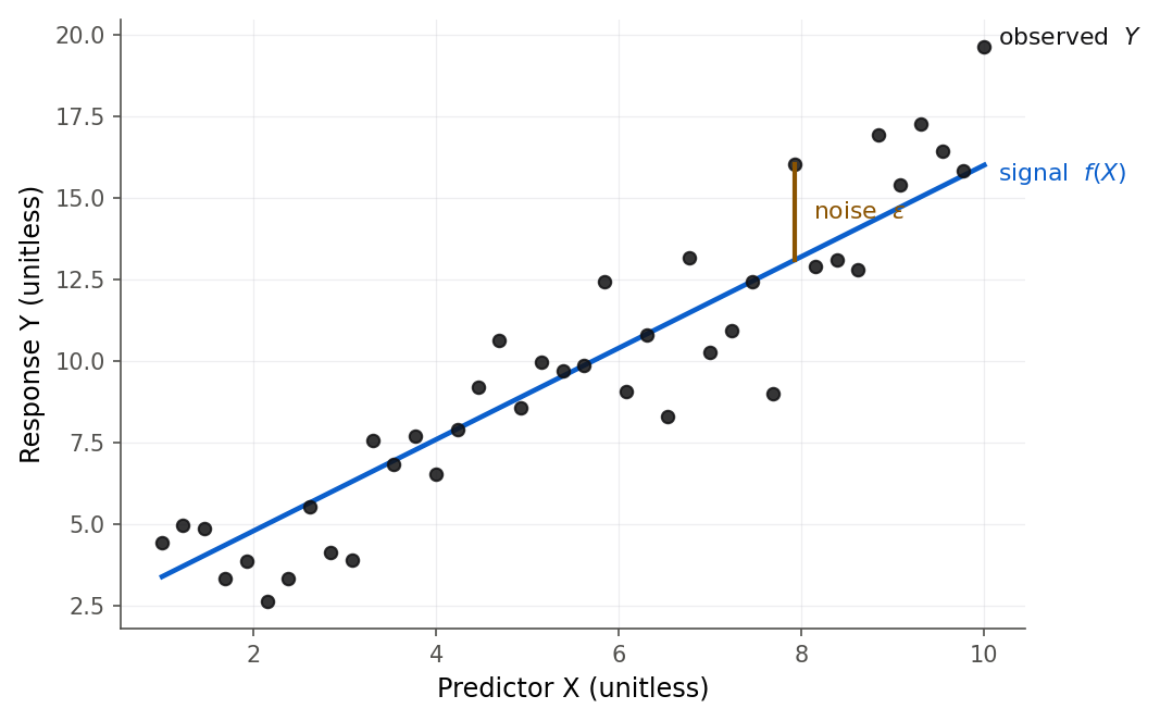
Figure 9:A model splits each observation into two parts: the systematic signal f(X) that the predictor explains (blue line), and the random noise epsilon that it does not (one error drawn in orange). Regression is the craft of estimating the signal without being fooled by the noise.
The systematic part is what we estimate. In most of this book is a straight line, , and the model becomes the simple linear regression model that 2.1 The simple linear regression model builds carefully. In words: the average response climbs (or falls) by a fixed amount for every one-unit step in , and is where the line starts. The Greek letters and are parameters (Definition 1.4): fixed numbers describing the true relationship in the whole population, which we never get to see directly. From a sample of data we compute estimates of them, written and , which are our best guesses. It is like the difference between the true average height of every adult alive, a fixed number nobody could ever measure, and the average height of the hundred people you actually surveyed, a number you can compute that is close to the truth but not exactly it. The distinction between a parameter (the truth we want) and an estimate (the number we can compute) runs through every chapter, and blurring it causes no end of confusion.
The random part is not a mistake or a failure of the model. It is the honest admission that lot size does not determine hours exactly, that temperature does not determine O-ring damage exactly, that the world has variation the predictors do not capture. A good model does not pretend the noise away; it estimates the signal and describes the size of the noise, so that predictions come with error bars and claims come with margins.
The split sounds abstract until you do it to a single row of real data. Take one Toluca run and pull it apart into the two pieces the equation promises.
The cleanest place to watch the two parts separate is a mechanism with no mystery in it at all. Toss a fair coin twenty times, where the signal is fixed at ten heads and everything else on screen is the random part.
Twenty tosses of a fair coin, repeated as many rounds as you like. The systematic part is fixed at ten heads, marked in amber, and the histogram collects the count from every round.
What to notice. The count almost never lands on exactly ten, yet the pile it builds is perfectly orderly. Try this. Run 1000 rounds and watch the mean settle near 10 while the spread holds near 2.24: the noise never shrinks, it just becomes describable, which is why a model carries an instead of pretending the scatter away. Back to Section 1.3.
1.4 Association is not causation
Section 1.1 called causal reasoning the hardest of the three uses. This section says why. A regression line through observed data measures association (Definition 1.5): it tells you that tends to be higher when is higher. It does not, by itself, tell you that changing would change . That gap between association and causation is the most important idea in this chapter, and one of the few that a whole career in data will keep testing you on.
The classic illustration needs no equations. Across the summer, ice-cream sales and drownings rise and fall together; their correlation is strong and real. No sane person concludes that ice cream causes drowning, or that banning ice cream would save swimmers. A third variable, hot weather, drives both: heat sends people to buy ice cream and, separately, sends them into the water where a few drown. Figure 11 draws the situation. The hidden driver is called a confounder or lurking variable (Definition 1.6), and whenever one is present, the association between and can be large while the causal effect of on is zero.
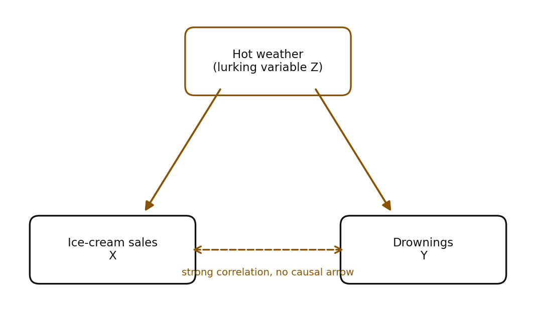
Figure 11:Hot weather (Z) causes both ice-cream sales (X) and drownings (Y), so X and Y are strongly correlated even though neither causes the other. A confounder can manufacture an association out of nothing causal.
This is exactly why the salary example is hard. Men and women in the data differ not only in sex but in the mix of ranks, disciplines, and years of service, and all of those affect salary. Rank is a lurking variable for the raw sex gap. A responsible analysis has to hold the confounders fixed before the remaining gap can be read as anything about sex, and even then the reading takes care. 11. Categorical predictors and interactions does this work; 16. Path analysis and a look ahead makes reasoning about direct and indirect effects its whole subject.
Two things help you fight confounding, and the difference between them organizes much of statistics.
Observational data (Definition 1.7) is collected by watching the world as it is. Galton did not assign heights to parents; the Toluca engineers did not set the lot sizes to study them; nobody chose professors’ sexes. In observational data the predictor and the confounders come tangled together, and no amount of clever fitting fully untangles them. You can adjust for the confounders you thought to measure, but never for the ones you did not.
Experimental data is collected by intervening. If you can randomly assign the value of , say by flipping a coin to decide each unit’s treatment, then on average the treatment groups match on every confounder, measured or not, because randomization balances them. That is why a randomized experiment can support a causal claim that observational data cannot. Figure 12 shows the one structural change that makes the difference. Most data you will meet after this course is observational, which is precisely why the association-causation distinction deserves the drilling it gets here.
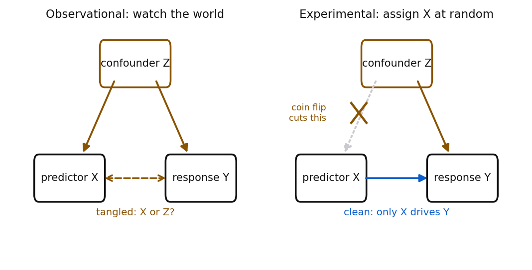
Figure 12:Observational and experimental data differ by one arrow. When you watch the world (left), a confounder Z feeds both X and Y, so their link is tangled. When you assign X at random (right), the coin flip cuts the arrow from Z into X, so any remaining X-Y link is causal.
One more discipline protects you against both confounding and plain misreading: look at the data before you trust a summary of it. Figure 13 shows four small datasets built by the statistician Frank Anscombe. All four have the same mean of , the same mean of , the same correlation, and the same fitted regression line. On paper they are identical. Plotted, they could not be more different.
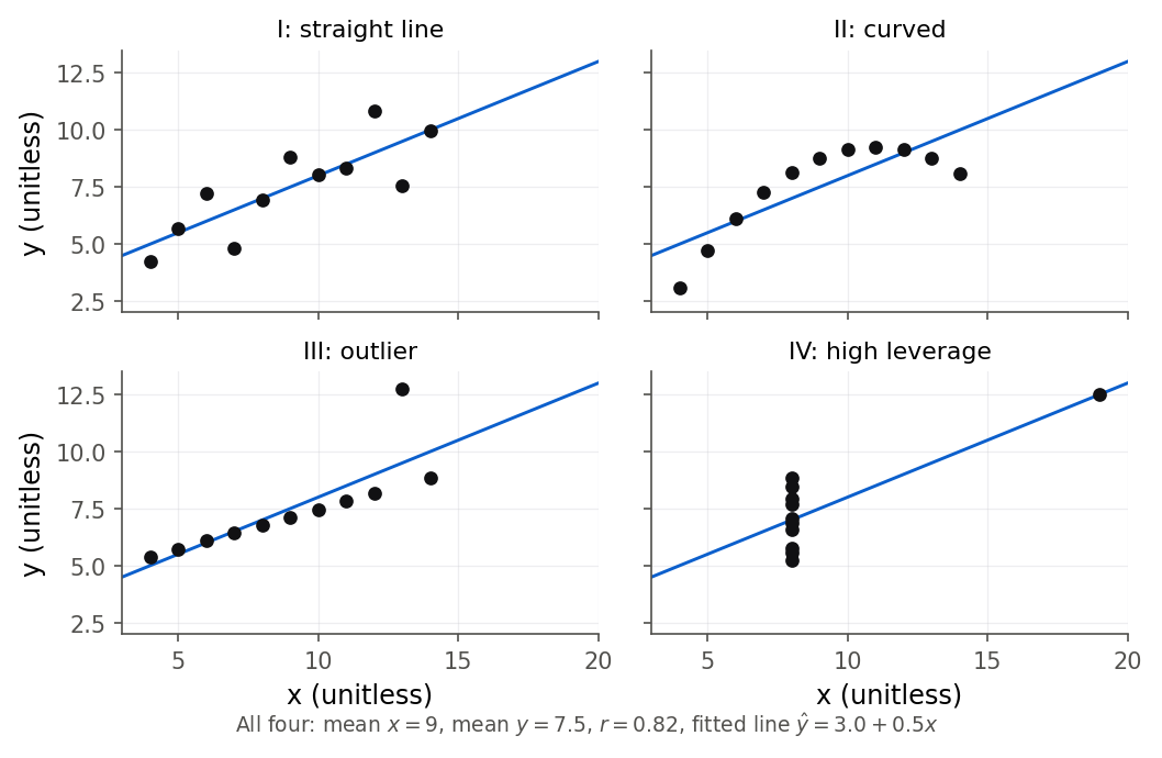
Figure 13:Anscombe’s quartet: four datasets with identical means, variances, correlation, and fitted line, yet four different shapes. Only one is a genuine straight-line relationship. The summary numbers cannot tell them apart, but a two-second plot can.
1.5 A short history, from Gauss to statistical learning
Regression did not arrive all at once. It grew over two centuries as people kept needing to pull a signal out of noisy measurements, and the tools we use today are the accumulated answer. Figure 14 marks the milestones.
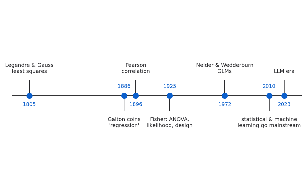
Figure 14:Two centuries of regression in seven steps, from least squares for planetary orbits to models anyone can now fit with a sentence of code.
Least squares (around 1805). The method at the heart of this book was invented to track the sky. Adrien-Marie Legendre published the least-squares recipe in 1805, and Carl Friedrich Gauss, who claimed earlier use and supplied the probability theory, applied it to predict the orbit of the dwarf planet Ceres from a handful of noisy telescope readings. The problem was the same one the Toluca engineer faces: many imperfect measurements, one underlying line, find the line that fits best. 2. Simple linear regression derives their answer from scratch.
Correlation and the word “regression” (1886 to 1896). Galton, studying heredity, gave us regression to the mean and the first regression lines. His younger colleague Karl Pearson turned Galton’s ideas into the correlation coefficient, the standardized measure of association that 4. Correlation covers, and built much of the machinery of modern statistics around it.
Fisher and the inference framework (1920s and 1930s). Ronald Fisher, working on agricultural experiments, gave regression its inferential backbone: the analysis of variance that splits variation into named pieces (3. Inference for simple linear regression), maximum likelihood as a general principle for estimation (2. Simple linear regression, 13. Logistic regression), and the theory of randomized experiments that grounds the causal reasoning of Section 1.4. Much of what a statistician means by “significance” traces to Fisher.
Generalized linear models (1972). For a long time regression meant a straight line with normal, constant-variance noise. But many responses are not like that: yes-or-no outcomes, counts, rates. In 1972 John Nelder and Robert Wedderburn showed that linear regression, logistic regression for binary data, Poisson regression for counts, and several others are all special cases of one framework, the generalized linear model. 13. Logistic regression and 14. Poisson regression and the GLM idea build two of these and 14.6 One family: the generalized linear model shows the unifying idea.
Statistical learning and machine learning (1990s to now). As computers grew cheap, the same core idea, fit a rule that predicts from and check it honestly on new data, expanded into a field obsessed with prediction: cross-validation, regularization, trees, and neural networks. Regression is the foundation this field is built on, and the ideas of overfitting and validation that dominate it appear in this course in 12. Multicollinearity, variable selection, and validation. The most recent chapter of the story is the one you are living in, and it is worth its own section.
1.6 Where regression sits today
It would be easy to think regression is a quaint relic next to modern artificial intelligence. The opposite is true: regression is the thing modern AI is mostly made of. Figure 15 shows how the pieces nest.
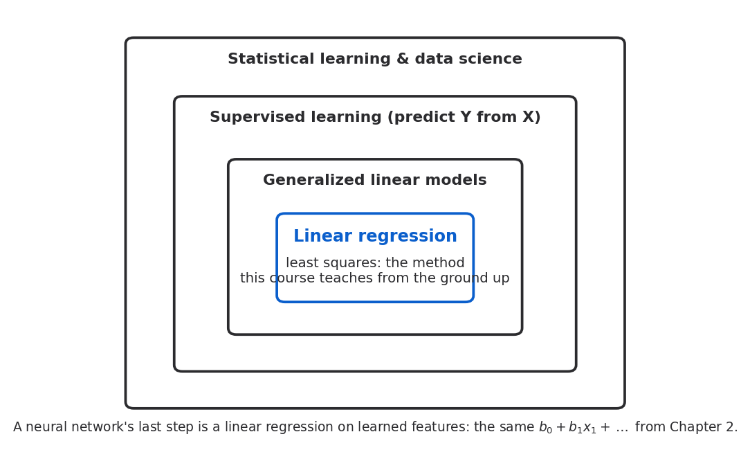
Figure 15:Linear regression sits at the center of a set of nested fields. Generalized linear models extend it to other kinds of response; supervised machine learning extends it to flexible signals; and it is still the last step inside a neural network. Master the center and the rest has a home to attach to.
Supervised machine learning, the branch of AI that learns to predict an output from inputs, is regression with the signal allowed to be far more flexible than a straight line. A neural network spends most of its effort transforming raw inputs into useful features, but its final step is almost always an ordinary linear regression or logistic regression on those features: the same you will fit by hand in 2. Simple linear regression, sitting inside the machine. Large language models, the systems behind modern AI assistants, are trained by a form of this same prediction game played billions of times. The vocabulary changes (“loss functions,” “gradient descent,” “embeddings”), but least squares and maximum likelihood, the two ideas 2. Simple linear regression is built on, are underneath.
This has a sharp consequence for what is worth learning, and it is the thesis of this course. Fitting a model used to be the hard part. It took tables, careful arithmetic, and a mainframe. Now anyone can fit a regression, a random forest, or a neural network in one line of code, and an AI assistant will write that line on request and even interpret the output for you. The scarce skill is no longer fitting a model. It is judging one: knowing whether the model is appropriate, whether its assumptions hold, whether the data can support the claim being made, whether a confounder is lurking, whether the confident-looking prediction is actually an extrapolation off the edge of all experience, the way the Challenger decision was. A machine will hand you an answer in seconds. Deciding whether to trust it is human work, and it is the work this book trains.
1.7 A tour of the semester
Here is the road ahead. The book teaches one repeatable process, the modeling workflow that 2. Simple linear regression names in full (The modeling workflow): ASK a question and get the data, EXPLORE it with plots and summaries, FIT a model, CHECK whether it can be trusted, and USE it to interpret, predict, or decide. Every chapter is one trip around that loop on a real dataset. Figure 16 draws the loop so you can hold the whole book in one picture.
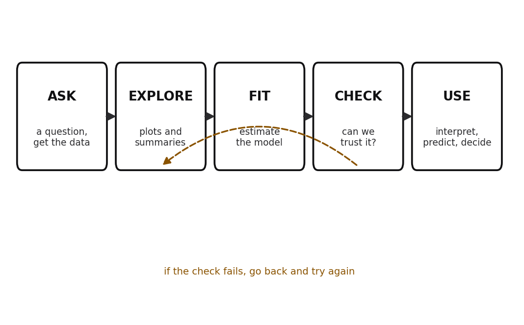
Figure 16:The one workflow the whole course repeats: ASK, EXPLORE, FIT, CHECK, USE. The dashed arrow is the honest part: when a model fails its check, you go back and try again rather than pushing a bad model forward. Every chapter is one trip around this loop.
What follows is the one question each chapter answers.
Part I: Regression from the ground up.
2. Simple linear regression, Simple linear regression. What is the single best line through a cloud of points, and can we prove that no other line beats it? You will fit the Toluca line by hand and prove its optimality (2.2 Least squares from first principles).
3. Inference for simple linear regression, Inference for simple linear regression. You budgeted about 419 hours for next week’s 100-unit run, but how far off might you be? The chapter separates a narrow interval for the average run from a much wider interval for a single new run (3.5 Prediction interval for a new observation), the distinction in Figure 1 that most people get wrong.
4. Correlation, Correlation. How do you put one honest number on the strength of a relationship, and how does that number lie to you when the data curve, when an outlier sneaks in, or when the sample is narrow? Galton’s heights and the correlation-slope link return here (4.2 Correlation and the regression slope).
5. Randomization and bootstrap inference for regression, Randomization and bootstrap inference. With only 13 punters, is a slope you see real or a fluke of a tiny sample? When the usual assumptions are shaky, you let the computer shuffle and resample the data to find out (5.2 The permutation test for the slope, 5.4 The bootstrap for regression).
Part II: The linear model in matrix form.
6. Matrix algebra for regression, Matrix algebra for regression. How do you write a regression with twenty predictors without drowning in twenty equations? Matrix algebra packs the whole dataset into two symbols. No prior linear algebra is assumed; the chapter builds it from nothing.
7. The general linear model, The general linear model. Why does least squares work for any number of predictors at once, and what is the elegant geometry (a projection) hiding underneath it?
8. Multiple regression in practice, Multiple regression in practice. When two predictors overlap, what does a single coefficient even mean? You will learn the careful “holding the others fixed” reading and see it in a picture with added-variable plots.
Part III: Building and checking models.
9. Model diagnostics, Model diagnostics. A model can explain most of the variation and still predict a negative number of species. How do you catch a model that is wrong in every way that matters, and find the one high-leverage point quietly steering the whole fit (9. Model diagnostics)?
10. Remedial measures and transformations, Remedial measures and transformations. Brain and body weights across 62 mammals look hopeless on a plot until you take logarithms and the mess snaps into a clean straight line. When is the problem your model, and when is it just your scale (10.2 The log transformation and reading its coefficients)?
11. Categorical predictors and interactions, Categorical predictors and interactions. Back to the salary gap: once you hold rank, discipline, and experience fixed, how much of the raw is left, and how do you even put a category like rank into a regression (11.1 From categories to numbers: indicator coding, 11.2 One categorical and one continuous predictor)?
12. Multicollinearity, variable selection, and validation, Multicollinearity, selection, and validation. With thirteen tangled body measurements predicting body fat, which do you keep? And why will a model chosen to fit your data always look better on that data than it deserves (12.4 Validation: train, test, and cross-validate, 12.5 A look at shrinkage: ridge and lasso)?
Part IV: Regression for other kinds of response.
13. Logistic regression, Logistic regression. Back to the shuttle: how do you put a number on the O-ring failure risk at 31 degrees when the outcome is not a quantity but a yes-or-no (13.1 Why a straight line fails, and what to use instead, 13.3 Reading coefficients as odds ratios)?
14. Poisson regression and the GLM idea, Poisson regression and the GLM idea. Species counts cannot be negative or fractional, and their spread grows with their size. What model respects that, and how are linear, logistic, and Poisson regression all one idea (14.1 Why counts break the linear model, 14.6 One family: the generalized linear model)?
Part V: Special topics (guided self-study).
15. Regression with time: autocorrelation and forecasting, Regression with time. Twelve years of monthly airline passengers trend up and cycle every summer. How do you forecast the next year honestly, and why do time-ordered errors break the standard formulas (15.5 Forecasting honestly: test on the future)?
16. Path analysis and a look ahead, Path analysis and a look ahead. Does an occupation earn prestige because it pays well or because it takes schooling? Path analysis uses chains of regressions to split an effect into direct and indirect routes (16.1 Drawing a causal story: path diagrams), and the chapter closes by walking the whole workflow one last time.
1.8 How to teach yourself from this book
This book is written so that a student who misses class can learn a chapter alone and still do the homework. A few habits make that work.
Read in the order the chapter is written. Each concept section goes intuition first, then the formula, then the same computation in R and in Python. The intuition is what makes the formula stick, so do not skip ahead to the symbols. Read the opening vignette before anything else; it is the real question the chapter exists to answer.
Run the code yourself, in both languages if you can. Every worked example reads a real CSV from
the book’s data/ folder and shows real output. Type it out, run it, and change something to see
what happens. R is this course’s primary language, but Python appears beside it in every example
because you will likely use it after graduation, and seeing the same idea twice cements it.
Do every Try-it as you reach it. Each one is a short task with a full solution hidden in a dropdown just below. Attempt it honestly before you open the solution; the small struggle is where the learning is. Watch for the Durable skill boxes too: each names a habit worth more than any single formula.
Work the practice problems in order. They come in bands. Band A checks that you understood the ideas; Band B (in later chapters) asks you to derive and prove; Band C asks you to analyze real data in R or Python. Answers to the odd-numbered problems are in Appendix H, so you can grade yourself. The promise of the book is simple: a reader who does every Try-it and every odd problem can solve the even problems and the exams.
Expect to reread. You do not have to understand something the first time you see it. Reread the intuition, run the code, sleep on it, and come back. Understanding usually arrives on the second or third pass. That is normal, and it is not a sign that you are behind.
Before Chapter 2’s first worked example you will need R and Python installed and working. Full setup instructions, the list of packages, and a function-by-function reference for every chapter live in Appendix C (R) and Appendix D (Python). A datasheet for every dataset in the book, including the ones you met in this chapter, is in Appendix E.
1.9 Chapter summary
You now have the map. Regression studies how a response depends on one or more predictors, and it serves three different goals: describing a relationship, predicting a new outcome, and reasoning about cause, in rising order of difficulty. You saw where the word came from in Galton’s heights and what regression to the mean means, both as a fitted slope below one and as a trap that dresses up plain statistics as a story. You learned the anatomy shared by every model in the book, a systematic signal plus random noise, and the difference between a parameter and its estimate. You saw why association is not causation, how a confounder manufactures a false link, and how observational and experimental data differ in what they can prove. You placed regression in its history, from Gauss’s orbits to Fisher’s inference to the generalized linear model to modern machine learning, and you saw why, now that any model can be fit in one line, the scarce skill is judging models rather than fitting them. And you have a tour of the fifteen chapters ahead.
Key results at a glance.
| Result | Statement or formula | Valid when |
|---|---|---|
| Statistical model (Definition 1.3) | : response equals systematic signal plus random noise | every model in the book |
| Simple linear regression | ; the mean of is a straight line in | the signal is taken to be a line |
| Parameter vs estimate (Definition 1.4) | are the unknown truth; are computed from data | always |
| Three uses of regression | description (a slope), prediction (a new ), causal reasoning (an intervention) | trust decreases across the three |
| Regression to the mean | Galton’s line ; slope below 1 | two imperfectly correlated measurements |
| Association is not causation (Definition 1.5) | and moving together need not mean changing changes | any observational data |
| Observational vs experimental (Definition 1.7) | random assignment balances confounders on average | causal claims need an experiment or strong assumptions |
Key terms. regression, response, predictor, description, prediction, causal reasoning, regression to the mean, statistical model, systematic part (signal), random part (error), parameter, estimate, association, causation, confounder (lurking variable), observational data, experimental data, extrapolation, generalized linear model, supervised machine learning, modeling workflow.
You should now be able to:
Say what regression is and tell its three uses apart: describing a relationship, predicting a new outcome, and reasoning about cause.
Explain where the word “regression” came from in Galton’s heights and what regression to the mean means, as a slope below one and as a trap.
Name the parts of a statistical model: the systematic signal, the random noise, the parameters, and their estimates.
Distinguish association from causation, and observational from experimental data, and say why the difference matters.
Place regression inside statistics, machine learning, and data science, and explain why judging a model now matters more than fitting one.
Name the question each chapter of the semester answers.
Set up R and Python and use this book to teach yourself.
Where this fits. This chapter is the ASK stage of the whole course: it frames the questions and the way of thinking, and it previews the workflow that The modeling workflow will name in full. Everything from here on adds tools. 2. Simple linear regression turns the loose idea of a “best line” into a precise, provable recipe on the Toluca data (2.2 Least squares from first principles), and the machinery only grows from there. You will not need to have memorized anything in this chapter, but if the difference between description and prediction, between association and causation, and between a parameter and an estimate is clear to you, the rest of the book will feel less like a pile of formulas and more like one idea, carefully extended.
1.10 Frequently asked questions
Q1. Is “regression” the same as “line of best fit”? For most of this book, yes: the systematic part is a straight line and regression finds the best one. But the word is broader. Logistic regression (13. Logistic regression) and Poisson regression (14. Poisson regression and the GLM idea) fit curved rules for non-continuous responses, and in machine learning the fitted signal can be very flexible. What unites them all is the shape : estimate a systematic part, describe the noise.
Q2. If regression only shows association, why is it used to argue about causes all the time? Because with the right data (ideally a randomized experiment) or the right assumptions (adjusting for the confounders you can measure and defending that you have caught the important ones), an association can support a careful causal claim. The point of Section 1.4 is not that regression can never speak to cause; it is that it does so only with extra work and extra honesty, never automatically. 11. Categorical predictors and interactions and 16. Path analysis and a look ahead show what that work looks like.
Q3. Why teach this when an AI can fit any model in one line? Precisely because it can. When fitting is free, the value moves to judgment: choosing the right model, checking its assumptions, spotting the confounder, catching the extrapolation, and knowing when the confident output is wrong. Those are the skills this course grades, and they are the skills that make you useful next to a machine rather than replaceable by one.
Q4. Do I really need both R and Python? R is required (it is the course’s primary language and a catalog requirement), and every example is in R. Python runs alongside it because it is what much of industry uses, and seeing the identical analysis in two languages makes the concept, rather than the syntax, the thing you remember. If you are stretched for time, follow R closely and treat Python as a bonus, but do install both.
Q5. I have not taken linear algebra. Can I still do this course? Yes. Chapter 6 builds every piece of matrix algebra the book uses, from the definition of a matrix up, tied at each step to a regression use. Chapters 2 through 5 use no matrices at all. If you have taken linear algebra, Chapter 6 will read like review; if not, it is written to teach you.
Q6. What is the difference between the error and the residual? The error is the gap between an observation and the true line, which we never see because we never know the true parameters. The residual is the gap between an observation and our fitted line, which we can compute. Residuals are our visible estimates of the invisible errors, and Chapter 2 makes the distinction precise. It matters because we use the residuals to estimate the size of the noise.
Q7. Is regression to the mean the same as “things always average out”? No, and this is a common muddle. Regression to the mean is about extremes being followed by less extreme values, because extremes are usually part skill and part luck and the luck does not repeat. It does not say that a tall person’s next measurement will be average, or that a good team is due for a loss. It is a statement about the average of a group selected for being extreme, nothing more.
1.11 Practice problems
(A) In your own words, what does regression do? Answer in two sentences, using the words “response” and “predictor.”
(A) Name the three uses of regression discussed in Section 1.1, and give a one-line example of each that is not in the chapter.
(A) For each question, say whether it is description, prediction, or causal reasoning: (a) “How much does average blood pressure rise per year of age in this clinic?” (b) “If we raise the price by one dollar, how many fewer units will we sell?” (c) “What sales should we expect next quarter given our ad budget?”
(A) Explain the difference between a parameter () and an estimate () in one or two sentences. Why can we never know exactly?
(A) Write the general anatomy of a statistical model, , and explain in plain words what each of the two pieces represents.
(A) A classmate says the error term means the model made a mistake and a better model would remove it. Correct the misunderstanding.
(A) Explain “regression to the mean” in your own words, and give an everyday example other than heights or sports.
(A) Galton’s fitted slope of child on mid-parent height is about 0.64. What would a slope of exactly 1 have meant? What would a slope of 0 have meant?
(A) Why is a raw difference in average salary between two groups not, by itself, evidence of unequal pay? Name one confounder and explain its role.
(A) Define “confounder” and draw (in words or a sketch) the ice-cream-and-drownings diagram, labeling the causal arrows.
(A) Explain the difference between observational and experimental data, and why randomized assignment helps establish cause.
(A) Anscombe’s four datasets share the same mean, variance, correlation, and fitted line. What is the single lesson Anscombe wanted you to take from this, and what one-word action does it recommend before trusting any summary?
(A) Give an example of a strong correlation between two variables that you are confident is not causal, and name the likely lurking variable.
(A) In one sentence each, state what least squares was originally invented to do (around 1805) and who gave “regression” its name.
(A) The chapter claims regression is “the core that modern machine learning is built on.” Explain what a neural network’s final step has to do with the regression in this course.
(A) State the course thesis about the AI era in your own words: what skill has become scarce, and why?
(A) You are handed a confident-looking prediction from an AI assistant. List four questions you would ask before trusting it (draw on the “Judge a model you did not fit” box).
(A) Why does the Challenger example illustrate the danger of extrapolation? What was special about the 31-degree launch relative to the data?
(A) Name the five stages of the modeling workflow in order, and give a one-phrase description of each.
(A) For each chapter question below, name the chapter (2 through 16) that answers it: (a) which of thirteen tangled body measurements to keep; (b) whether a slope from only thirteen punters is real; (c) how to forecast next year’s monthly airline demand.
(A) Explain the difference between the confidence interval for a mean response and the prediction interval for a new observation, using Figure 1 as your reference. Which is wider, and why?
(A) A headline says “people who drink red wine live longer, so drink red wine.” Identify the causal claim, name a plausible confounder, and say what kind of study would be needed to support the advice.
(A) Why does this book show every example in both R and Python? Give two distinct reasons from Section 1.8.
(A) Explain the “sophomore slump” (Try it 1.2) as regression to the mean, and predict what you would see if you instead followed the worst rookies into their second year.
(C) Read
galton_heights.csvin R or Python. Fit the line predictingchildHeightfrommidparentHeight, report the slope, and confirm it is below 1. In one sentence, connect the number to regression to the mean.(C) Using
galton_heights.csv, predict the child height for a mid-parent height of 66 inches and of 72 inches. Confirm that the taller prediction is closer to the overall mean child height (about 66.7 inches) than 72 is, illustrating the pull toward the middle.(C) Read
anscombe.csvand reproduce the summary table from Example 1.4 for all four x-y pairs (means, variance of x, correlation, and fitted line). Then make the four scatterplots. Which of the four is a genuine straight-line relationship, and which one has its slope set by a single point?(C) Read
orings.csv. Report the number of flights, the coldest launch temperature in the data, and the total number of damage incidents. Explain why predicting the damage risk at 31 degrees is an extrapolation, referring to the coldest temperature you found.
1.12 Exam practice
The problems above check that you can recall and apply the ideas. The exams ask for something harder: to explain your reasoning in full sentences, to judge a claim someone else made, and to read real software output in context. The five questions here are written in that exam style. Each one wants prose, not a bare word or number. Attempt a complete written answer before you open the model answer, and compare not just the conclusion but the reasoning. A grader gives full marks for the reasoning.
EP 1.1. One line, three requests. A marketing analyst fits a single least-squares line of monthly sales (in thousands of dollars) on monthly advertising spend (also in thousands). She then uses that one line for three requests. She tells the finance team that each extra thousand dollars of advertising goes with about four thousand dollars more in sales. She forecasts next month’s sales from the budget already approved for next month. And she advises the CEO that raising the ad budget by ten thousand dollars will raise sales by about forty thousand dollars. Explain why the same fitted line can serve all three requests, yet the trust the analyst is entitled to is not the same for each. Rank the three requests from most to least trustworthy and defend the ranking.
Model answer
All three requests read off the same fitted rule, : the first reports its slope, the second plugs a new value of into it, and the third asks what moving would do. One line can answer all three because description, prediction, and causal reasoning are three questions you can put to a single fit, not three different fits.
The trust differs because each request asks more of the data than the one before it. Reporting the slope is description: it only summarizes the pattern already in the data, so it is the most trustworthy of the three. Forecasting next month’s sales is prediction: it assumes the same pattern keeps holding for a new month, and it is safe only if next month’s budget sits inside the range of budgets the line was fit on, rather than being an extrapolation past them. Advising the CEO that more spending will cause more sales is causal reasoning, and it is the least trustworthy, because the line measures association, not cause. If some third variable, say the season, drives both ad spend and sales together, then raising the budget need not raise sales at all, even though the line slopes upward. So the ranking, most to least trustworthy, is description, then prediction, then causal reasoning.
A weak answer names the three uses but does not connect the shrinking trust to the extra assumption each use adds: pattern-stability (and staying inside the data range) for prediction, and the absence of a confounder for the causal claim.
EP 1.2. A claim about regression to the mean. A student writes: “Regression to the mean proves that extremes disappear over time. So a very tall father should expect a son of about average height, and a team that just won the championship is due for a losing season next year.” Evaluate the claim. State precisely what regression to the mean does and does not assert, and correct the two specific errors.
Model answer
The claim starts from a true observation, that cases selected for being extreme on one measurement tend to be less extreme on a second, but it draws two wrong conclusions from it.
The first error is the size of the pull. Regression to the mean does not drag the second measurement all the way back to the average; it predicts a value that is less extreme than the first but usually still on the same side of the average. Galton’s fitted slope of about 0.64 says the son of a very tall father is predicted to be tall, only about two-thirds as far above average as his father, not average. Expecting “about average” confuses a slope below one with a slope of zero.
The second error is treating a statement about groups as a fact about single cases and about the future. Regression to the mean describes the average of a group selected for being extreme, and it works because an extreme value is usually part skill and part luck, and the luck does not repeat. Skill does carry over. A championship team is expected to stay above average next year, just less extreme, so it is not “due” for a losing season; believing a good team owes the world a bad year is the gambler’s fallacy, not regression to the mean.
A weak answer correctly names regression to the mean but does not catch that the predicted value stays on the extreme side of the average (a slope below one, not zero), and does not separate the luck that fails to repeat from the skill that does.
EP 1.3. Interpreting a fitted line in context. Galton’s data on 934 children are used to fit child height (inches) on mid-parent height (inches). Here is the R output, then the Python coefficients, then predicted child heights at three mid-parent heights. The mean child height in the data is 66.75 inches.
Coefficients:
                Estimate Std. Error t value Pr(>|t|)
(Intercept)     22.63624    4.26511   5.307 1.39e-07 ***
midparentHeight  0.63736    0.06161  10.345  < 2e-16 ***
---
Residual standard error: 3.392 on 932 degrees of freedom
Multiple R-squared:  0.103,	Adjusted R-squared:  0.102
Intercept 22.636241
midparentHeight 0.637361
predicted child height at midparent = 64, 68, 72:
63.42734 65.97678 68.52623(a) Interpret the slope 0.637 in the units of this problem. (b) Explain why you should not read the intercept 22.64 as “a child whose parents average zero inches is predicted to be 22.64 inches tall.” (c) Using the three predicted values and the mean child height of 66.75 inches, explain how the predictions at mid-parent heights of 64 and 72 inches illustrate regression to the mean. (d) A classmate says the low of 0.103 means the regression is wrong and should be thrown out. Respond.
Model answer
(a) Each additional inch of mid-parent height goes with about 0.637 of an inch more child height, on average. The relationship is positive but shallow: taller parents do have taller children, but the increase is well under one inch per parental inch.
(b) A mid-parent height of zero is nowhere near the data, which sit around 64 to 72 inches, so the intercept is not a real prediction for anyone. It is only the number that pins the line at the right height over the range that was actually observed. Reading it as a prediction at zero is extrapolating far past every data point, where the straight-line relationship was never checked.
(c) A mid-parent height of 64 inches is below the average parent, and the model predicts a child of 63.43 inches, which is below the mean child height of 66.75 but closer to it than 64 is. A mid-parent height of 72 inches is well above average, and the model predicts 68.53 inches, above the mean child height but closer to it than 72 is. In both directions the predicted child is pulled toward the middle relative to the parents. That pull, produced by a slope below one, is exactly regression to the mean.
(d) A low does not mean the model is wrong. It means mid-parent height explains only about 10 percent of the variation in child height, which is honest: height has many causes beyond the parents’ average, so most of the scatter is left unexplained. The slope is still real and sharply significant (its value is over ten). Whether to keep the model depends on the question. For describing how child height tracks parent height it is fine; for predicting one child’s height precisely it is weak, and the large residual standard error of 3.39 inches says so.
A weak answer reads the intercept as a literal prediction, or treats the low as proof the fit is broken, missing that measures explained variation, not correctness.
EP 1.4. The salary gap: what would change if. The dean’s data show men earning about more per year than women, on average. A trustee reads this raw gap as proof that the college underpays women. For each change below, say what it would do to the strength of a causal reading of the gap, and why. (a) The analyst refits holding rank, discipline, and years of service fixed, and the gap shrinks to a small amount. (b) Even after that adjustment, some variable nobody measured (say, field-specific outside job offers) still differs between the two groups. (c) Imagine, hypothetically, that sex could have been randomly assigned to faculty. Close with one sentence on why observational salary data can rarely settle the causal question on its own.
Model answer
(a) Rank, discipline, and years of service all affect salary and may be distributed differently between the groups, so they are confounders for the raw gap. Holding them fixed removes the part of the that was really a difference in rank or experience. If the gap shrinks to a small amount, most of the raw difference was confounding, and the smaller remaining gap is a better, though still imperfect, estimate of any true unequal-pay effect.
(b) Any confounder you cannot measure stays tangled in the comparison, because you can only adjust for variables you have. So even the adjusted gap can be biased in either direction by the unmeasured outside-offer difference, and it is still not proof of underpayment. Adjustment strengthens the case only for the confounders you actually caught.
(c) Random assignment would balance every confounder, measured or not, between the groups on average, so a gap that remained after randomization could be read as causal. But sex cannot be assigned by a coin flip, which is precisely why this causal question is hard and why no amount of adjustment fully substitutes for an experiment.
Because observational salary data always leaves some unmeasured confounder uncontrolled, it can establish that the groups differ in pay, an association, but rarely that unequal treatment caused the difference on its own.
A weak answer treats the adjusted gap as either fully proving or fully disproving discrimination, missing that unmeasured confounders survive adjustment and that only randomization balances them all.
EP 1.5. The Challenger launch: reading a figure. Refer to Figure 2, the 23 shuttle flights before Challenger. Every flight on record launched at 53 degrees Fahrenheit or warmer, and the launch under discussion was forecast at about 31 degrees. (a) Using the figure, explain in context why forecasting O-ring damage at 31 degrees is an extrapolation, and why that makes the prediction unreliable even when a fitted curve reports a confident-looking number. (b) What would change about the reliability of the 31-degree prediction if the coldest earlier flight had been at 30 degrees instead of 53? (c) A manager says, “The fitted line already gives a damage estimate at 31 degrees, so we have accounted for the cold.” Evaluate that statement.
Model answer
(a) In the figure every point sits at 53 degrees or warmer, so 31 degrees lies far to the left of all the data. The relationship between temperature and damage was only ever observed over the warm range, and the shape of any curve below 53 degrees is an assumption the data cannot check. A model will still return a number at 31 degrees, and its interval may even look narrow, but that narrowness reflects only the fitted line’s uncertainty over the observed range, not the real and much larger uncertainty about a temperature no flight ever saw. That is what makes an extrapolated prediction untrustworthy.
(b) If a flight had launched near 30 degrees, then 31 degrees would fall inside the observed range, making the prediction an interpolation rather than an extrapolation. The data would then speak directly to how the O-rings behave in the cold, and the prediction at 31 degrees would be far more trustworthy, because the pattern would have been tested near that temperature instead of assumed.
(c) Fitting a line does not “account for” a temperature that was never observed. The line only summarizes flights at 53 degrees and warmer, so reading it at 31 degrees extends that summary past the edge of all experience. Having an equation to plug the number into gives a false sense of safety; the cold was not accounted for, it was assumed away.
A weak answer says the prediction is merely uncertain without identifying that 31 degrees lies outside the range of the data, or believes that once an equation exists any input value is safe to plug in.
Chapter game
Resumen del capítulo (en español)
Este capítulo es un mapa panorámico de la regresión (regression), la herramienta que estudia cómo una respuesta (response) depende de uno o más predictores (predictors) . Se abre con tres problemas reales: estimar horas de trabajo a partir del tamaño del lote en la empresa Toluca, decidir el lanzamiento del transbordador Challenger a partir del daño en los anillos con la temperatura, y evaluar una diferencia salarial de unos entre hombres y mujeres. Los tres son la misma clase de pregunta.
La regresión sirve para tres fines de dificultad creciente: describir (describe) una relación mediante una pendiente, predecir (predict) un valor nuevo, y razonar sobre causas (causal reasoning), lo más difícil, porque un ajuste mide asociación, no causa. La palabra “regresión” proviene de Francis Galton, quien notó que los hijos de padres muy altos son altos pero menos que sus padres: la regresión a la media (regression to the mean). La pendiente ajustada de la altura del hijo sobre la de los padres es aproximadamente 0.64, claramente menor que 1.
Todo modelo del libro tiene la misma anatomía, : una parte sistemática (la señal que explica) más una parte aleatoria (el ruido). Distinguimos un parámetro (parameter) , la verdad desconocida, de su estimación (estimate) , lo que calculamos. La asociación no es causa (association is not causation): una variable oculta (confounder) como el calor puede crear una correlación fuerte entre ventas de helado y ahogamientos sin ningún vínculo causal. Los datos experimentales (experimental) con asignación aleatoria permiten afirmar causa; los observacionales (observational) no. El cuarteto de Anscombe recuerda que siempre hay que graficar los datos.
Una breve historia va de los mínimos cuadrados de Gauss y Legendre (hacia 1805) a Fisher, a los modelos lineales generalizados (1972) y al aprendizaje automático actual. La tesis del curso: ahora que cualquier modelo se ajusta en una línea de código, la habilidad escasa es juzgar (judge) los modelos, no ajustarlos. El capítulo cierra con un recorrido por los quince capítulos siguientes y consejos para estudiar de forma autónoma.